
No, it's not the next chapter of the Sex and the City reboot now called And Just Like That. Rather, just like that, after Tuesday's drubbing the stock market is either hanging by a thread, or over the cliff already.
It's something we mentioned on Sunday's Weekly Market Outlook... the prospect that both the S&P 500 as well as the NASDAQ Composite were both within striking distances of major technical support. The S&P 500 is testing that key floor as of right now, while the composite has already broken under the last of its key support lines.
As is usually the case, a picture is worth a thousand words, and best explains what just went wrong (for the bulls).
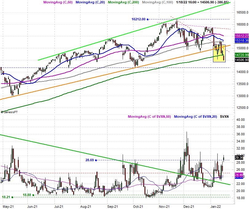
Let's start with a look at the daily chart of the NASDAQ. As we've previously discussed, the index's pullback from November's highs has been chipping away at potential support offered by key moving average lines, and the straight-line support that had connected all the key lows going back to March (orange) was broken two weeks ago... and rebroken last week. The last remaining floor was the 200-day moving average line (green) at 14,721. Well, as the chart below makes clear, that support line is no longer acting as support.
The S&P 500 isn't quite as far gone. As the image below shows us, the index closed under its straight line support (pink) that's been steering it upward since 2020. The 100-day moving average line (gray), however, appears to have stopped Tuesday's bleeding at the last possible moment. Today's close was right at the 100-day line, at 4577.
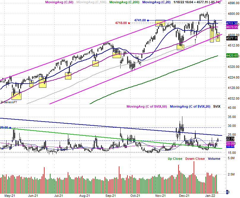
Also take note of the fact that while the S&P 500's volatility index didn't, the NASDAQ Composite's volatility index punched through a key ceiling at 28.7.
While the long-term rally is now clearly on the defensive, it's too soon to say a more prolonged corrective move is guaranteed. There's still a chance the bulls could step up and put an end to the weakness. Indeed, the S&P 500 hasn't even yet broken down... at least not broken under one of its key technical floors.
It's close though. It's close enough to at least start thinking about downside targets.
To do this we want to take a step back and look at longer-term weekly charts, which give us a little more perspective.
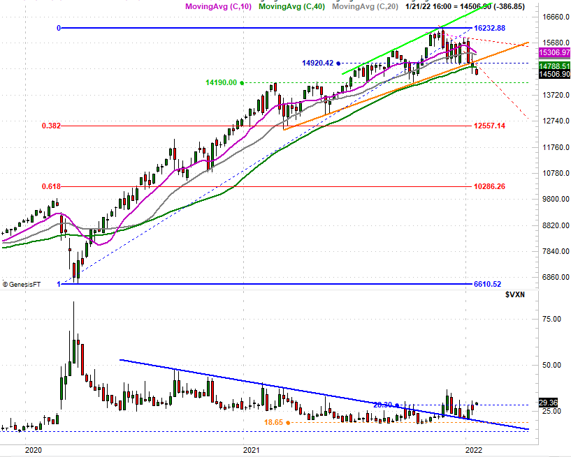
Here's the NASDAQ's. Obviously we need to acknowledge the ceiling-turned-floor level of 14,190 could still come into play as a floor again. A pullback to that mark would represent a 12.5% dip from the recent high. That's more than enough to hit the market's proverbial reset button, though somehow a 38.2% Fibonacci retracement of the entire rally since the March 2020 low makes sense too. We've seen the composite make a bottom around this 12,557 area before too, which marks a 22.6% slide from the recent high. That would technically be a bear market, but given our current economic backdrop, that wouldn't necessarily evolve into the sort of long-term slide we tend to know as a bear market.
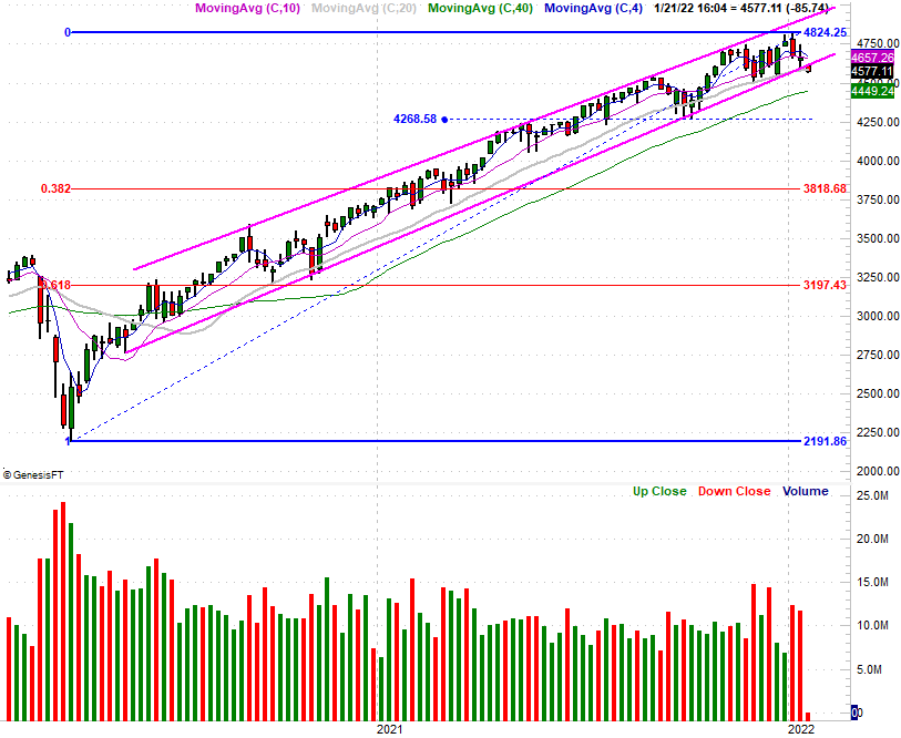
As for the S&P 500, we have to assume the 200-day moving average line (green) at 4449 is a possible floor, but that would be less than an 8% pullback from the recent peak. That's not really "enough." The bottom made near 4269 back in October could be a floor again. That would be an 11.5% selloff... probably enough to be a capitulation. A 38.2% Fibonacci retracement to 3819, however, would be a much more meaningful capitulation characterized as a 21% tumble. Again, that's bear market territory, though somehow doesn't seem like it would devolve into much more than a long overdue correction.
These are all hypotheticals and possibilities, of course. Stocks could find a way to keep on trucking higher, shrugging off the recent red flags.
To wait until things are completely unraveling to start looking at these lines in the sand, however, isn't the right approach. Even though our only purpose in this exercise is to make mental footnotes of what's happening, where, and why, waiting until after the fact to start doing this kind of stuff is too late. If we start a pullback without a plan, you might step into a bad decision.
Bonus observation: While the weekly volume has been choppy of late, it's clearly been net-bearish since early December. This is evident on the weekly chart of the S&P 500. And, although it's not being shown here, we're seeing the same bearish volume spikes for the Dow Jones Industrial Average as well as for the Russell 2000 small cap index. A bunch of people were getting out of stocks late last year, and they're still getting out of stocks... at a pace not seen in a long while.