Weekly Market Outlook - On The Fence Amid Presidential Cycle
Weekly Market Outlook - August 15, 2016
Though the market finished on a bullish foot two Friday's ago, that tone didn't help stocks one iota last week. When all was said and done, the S&P 500 (SPX) (SPY) pretty much ended last week where it started it, and still on the fence as it's been for the better part of the past several weeks. Just for the record though, the uptrend is still the bulls' to lose. The bears just haven't been able to land any real damaging blows.
We'll examine the market's odds and undertow below, after running down last week's and this week's economic reports.
Economic Data
Last week's economic-news dance card wasn't terribly busy, and the data we got was relatively well mixed... some bullish, some bearish.
On the bullish side of the table, the job openings tally for June ('Jolts') rekindled a march toward multi-year highs by virtue of its reading of 5.624 million openings, suggesting employment opportunities are robust if workers want them. It's a direct indication of economic strength, jibing with July's solid employment data from Department of Commerce released two weeks ago.
Jolts Chart
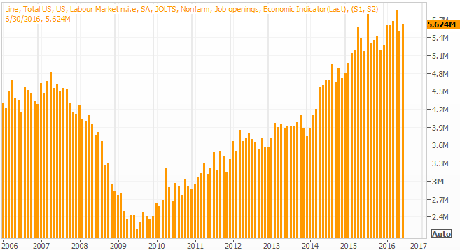
Source: Thomson Reuters
Though it's not the whole picture yet, producer price inflation was flat to negative last month -- otherwise known as deflation -- implying supply is in excess of demand again. The overall PPI rate was down 0.4% versus expectations for no change, while core PPI (ex-food and energy) was down 0.3% compared to expectations for a 0.2% rise. Though the coming week's consumer inflation rate may give the Fed and investors something to think about, most likely the CPI data will follow the PPI data's lead.
Annualized Inflation Trend Chart
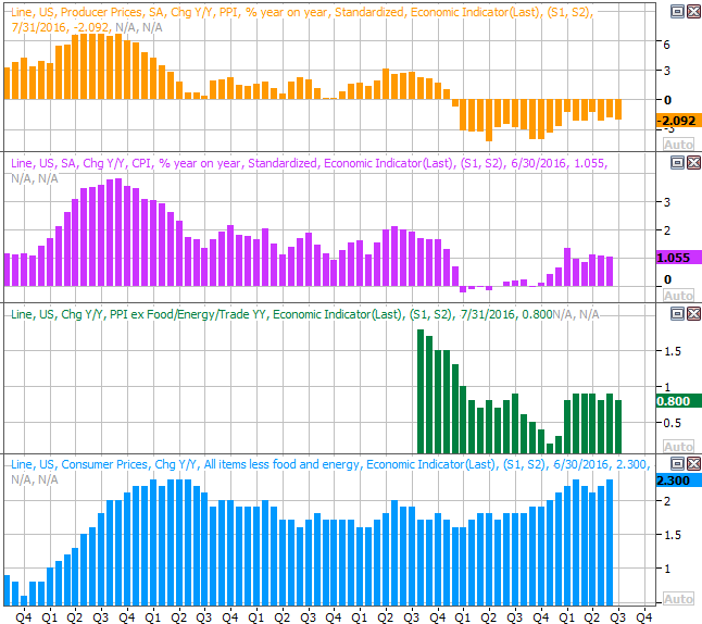
Source: Thomson Reuters
The puts a modest headwind in place for the Federal Reserve's rate hike plans, which were accelerated only a week ago following a strong July jobs report. Still, on an annualized basis it's worth noting consumer inflation is broadly moving higher, and the Fed may need to move anyway if the CPI data diverges from last week's PPI dip.
Finally, don't read too much into the reported slide in retail sales for July. Retail spending was down 0.3% not counting cars, and flat with automobiles in the picture. But, July's retail spending is always weaker than June's.... the comparison being made. Even more noteworthy is the fact that spending at gasoline stations is the key cause for any weakness gasoline is historically cheap. On a year-over-year basis, consumer spending is up despite weak gas station sales.
Retail Spending Chart
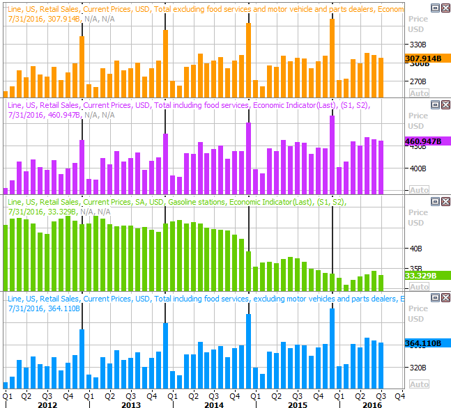
Source: Thomson Reuters
Everything else is on the following grid:
Economic Calendar
Source: Briefing.com
This week isn't going to be quite as busy, but there are some big announcements on the calendar.
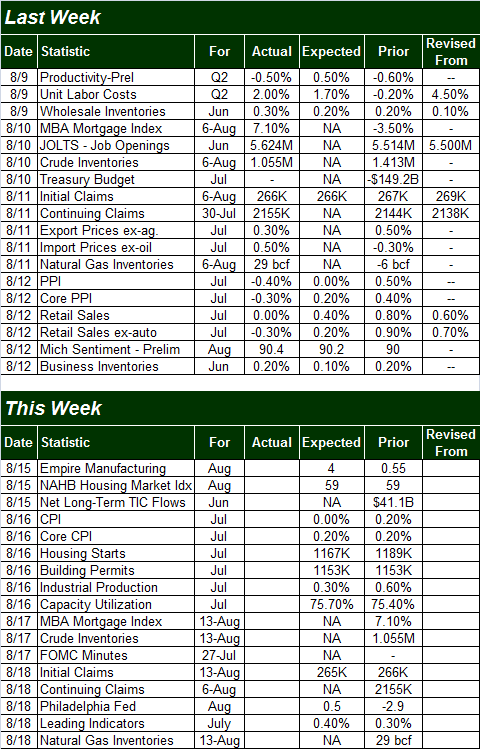
We already mentioned last month's consumer inflation data would be unveiled on Tuesday. Look for that to possibly move the market since it has interest rate implications. Also on Tuesday we'll be getting July's housing starts and building permits numbers. Both have been healthy, but the growth trend is slowing. Economists aren't expecting that stagnation to change either. This could turn into a problem soon.
Housing Starts and Building Permits Chart
Source: Thomson Reuters
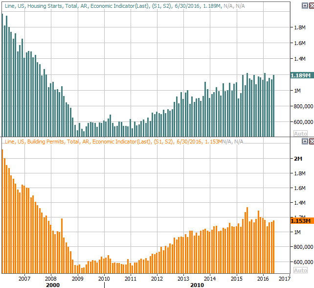
Also on Wednesday look for last month's capacity utilization and industrial productivity data. The latter has been shrinking for over a year now, mostly as the energy sector has hit a headwind. Productivity has held up, though is still fighting an uphill battle. If the productivity trend turns negative, that too could present problems for the market.
Industrial Productivity, Capacity Utilization Chart
Source: Thomson Reuters
Finally, though there's nothing to chart, on Wednesday the Federal Reserve will release the minutes from its most recent meeting. As usual, the pros will dissect every word, and traders will respond to it. It will be interesting to see if the Fed backs off on its hawkish stance. Some of last week's economic news says they should.
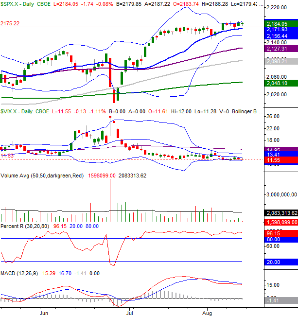
Stock Market Index Analysis
To be crystal clear, the trend is still bullish. The S&P 500 hit an all-time high of 2185.44 last week, and the close of 2184.05 is still within easy striking distance of record highs. Meanwhile, the nagging technical ceiling at 2175 that kept a lid on stocks for the latter half of July is not only still in the rearview mirror, but almost seems to be serving as a support line now. Ditto for the 20-day moving average line.
All the same caution is advised here. This tends to be a bearish (or at least lethargic) time of year, and while the undertow may be modestly bullish, the volume behind the advance has pretty much dried up.
In other words, the recent buying may or may not be the majority opinion.
Take a look at the daily chart of the S&P 500. Not surprisingly, the upper 20-day Bollinger band ran interference with the rally effort, as it has for well over a year now. This does not inherently mean the index can't move higher without moving lower first. It was mostly just a test. Check out what happened in early July the last time the upper band was brushed. It ended up moving higher, clearing out some room for the S&P 500 to keep advancing. If you look closely, you'll see the upper band line has started to curl higher within the past couple of trading days, and will make some room for the index to move higher.
S&P 500 & VIX Daily Chart
Chart created with TradeStation
The question is, of course, will the S&P 500 use that room?
The daily chart of the NASDAQ Composite (COMP) looks similar, though with a couple of nuanced differences. One of those differences is the slow, arching slowdown we've seen from the composite over the course of the past couple of weeks.... even with the surge to new highs two Friday's ago. As of the end of last week, we've got a bearish MACD crossunder, which have been meaningful warnings when we got them for the past several months.
NASDAQ Composite & VXN Daily Chart
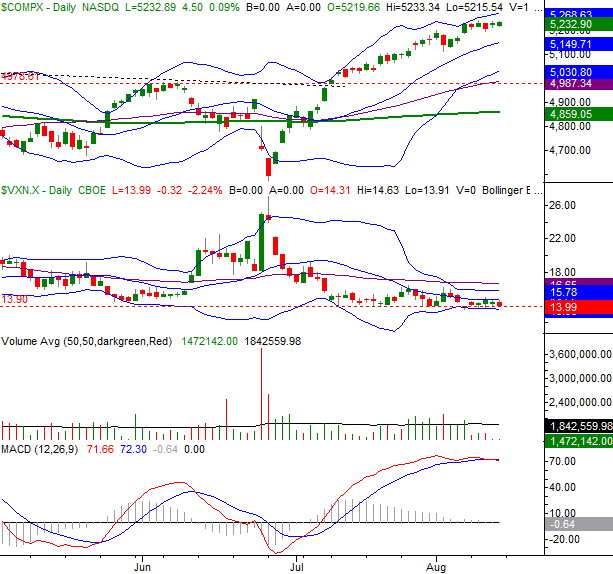
Chart created with TradeStation
Zooming out to the weekly chart of the NASDAQ we can get a better understanding of how and why the rally may be slowing down here. Last week's high of 5238.54 was pretty much in line with the record-peak of 5231.94 hit back in July of last year. Is it possible the market simply needed to eclipse that high just to meet expectations. Now that it has, will traders start driving the market lower again just because that seems like the next logical move based on the calendar and the situation? The composite has rallied 14% from its late-June low, which is about as much of a continuous rally the index has been able to muster in years.
NASDAQ Composite & VXN Weekly Chart
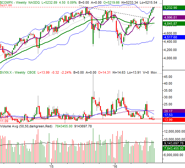
Chart created with TradeStation
On the flipside, notice there's still room for the Nasdaq Volatility Index (VXN) to keep edging lower before reaching its absolute floor at 11.1.
This is clearly going to be an interesting week, with stocks mostly on the fence. Just don't jump to conclusions after one rough day. The S&P 500 will need to break its 20-day moving average line at 2172 -- and really, under its lower band line at 2153 -- before assuming the worst, and the CBOE Volatility Index (VIX) (VXX) will need to break above 15.0 to confirm traders' opinions have taken a turn for the worst.
Presidential Cycle Likely Meaningless This Time Around
With a heated Presidential election right around the corner, a great deal of discussion has been devoted to the market's performance relative to the four-year Presidential-term cycle. This time around though, that may be a pointless discussion.
The chart below tells the story. Generally speaking, the first two years of a President's term are just so-so, while the third and fourth years are quite bullish. President Obama's first two years of his second term were wildly bullish though, leaving little room for the usual third-year rally.
S&P 500 Average Performance During Presidential Terms Chart
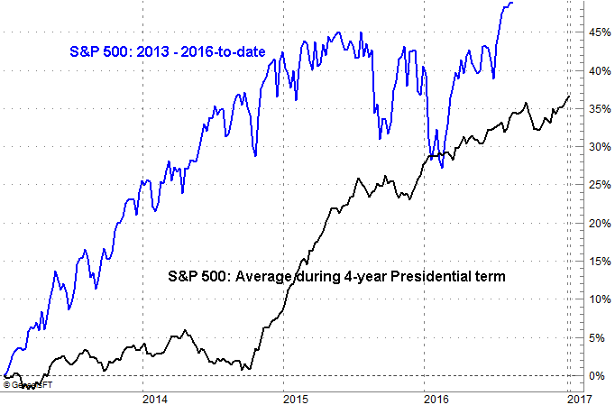
Chart created with TradeNavigator
The fourth year of the current Presidential term has been unusually bullish, carrying the S&P 500 far ahead of its usual four year pace AND its usual fourth-year pace.
There are two interpretations here. The first one is, the current rally has been and will continue to be better than average. The other one is, if the historical tendencies mean anything, then the S&P 500 is destined to pull back before the end of the year. Traders just need to decide if the average four-year cycle means enough to bet on.
Trade Well,
Price Headley
BigTrends.com
1-800-244-8736