Weekly Market Outlook - The Right Move, But Not Quite the Right Way
No major complaints. The market gained a little more than 12% last week, making it another one of the "best weeks for stocks in years" weeks just two weeks after the same was said about the week ending on March 27th. As of right now, the S&P 500 is up more than 27% from its March 23rd low. At this point it's essentially recovered half of what it lost in the rout between its late-February peak and its late-March bottom. Not bad.
It's not an ideal rebound effort though, particularly of late. It'll work, though the character and nuances of the move so far leave the market a little more vulnerable than most of the bulls might like. We're also approaching a major test that could thwart the effort.
The good news is, we know exactly what's wrong with the move, just as we know what's right about it. We'll look at those things in detail, right after running down last week's and this week's economic announcements.
Economic Data Analysis
There were only a couple of pieces of data released last week that were of any real interest. One was the first look at this month's Michigan Sentiment Index, and the other was an update on our inflation landscape. Both were expected to be radically altered by the impact of the coronavirus lockdown, and economists were just guessing as to the impact. Still, where we are is where we are.
On the sentiment front, the Michigan Sentiment Index plunged from 89.1 to 71.0, far surpassing the expected drop. Just bear in mind that poll was taken when the COVID-19 mania was most frenzied and shocking. Those consumers being polled may have been ready and willing to exaggerate their true perception of things at the time.
Michigan Sentiment Index Chart
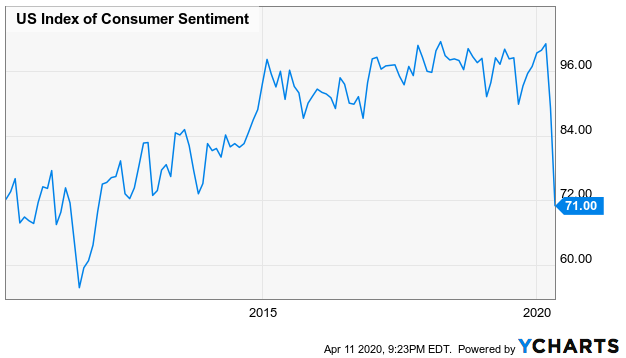
Source: YCharts
As for inflation, with consumers largely shut in at home and many businesses shuttered until further notice, demand for much of anything is minimal. That's why prices fell, more or less as expected. Do keep it in perspective though. The drop was relative to February's prices. March's overall prices are still up from March-2018's prices, by an average of 2.0%.
Inflation Rate Chart
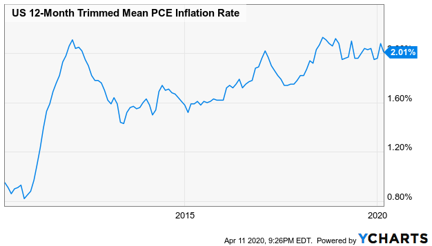
Source: YCharts
Everything else is on the grid.
Economic Calendar
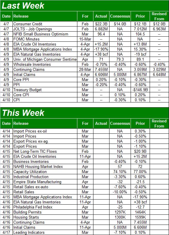
Source: Briefing.com
This week is a busy one, and for the obvious reasons, much of the data is likely to look bad.
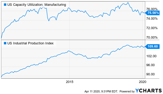
Case in point: Last month's capacity utilization and industrial production are projected to fall, by quite a bit.
Capacity Utilization and Industrial Production Charts
Source: YCharts
Don't panic if the numbers are as bad as expected, or even worse. The economy's underpinnings are strong, ready to snap back once people are able to return to work.
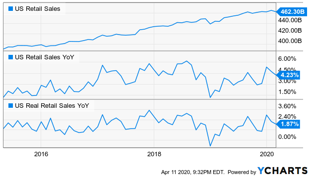
In the same vein, retail sales could and likely will plummet when that data is released on Wednesday. They may even come in below year-ago levels... a first year over year dip in several years. Again, don't overreact. If the coronavirus is contained soon enough, they should rebound nicely.
Retail Sales Charts
Source: YCharts
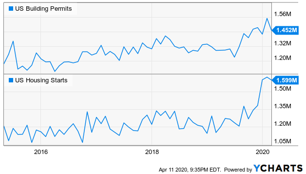
Finally, on Thursday look for housing starts and building permits. Like everything else, economists are calling for a pretty drastic reduction on both fronts, ending what had become a rather impressive wave of building activity.
Housing Starts and Building Permits Charts
Source: YCharts
Stock Market Index Analysis
To cut to the chase about what's not quite right about last week's advance, it's a bit overextended and/or not particularly well supported. We could do with a pullback.
That's not to suggest we're going to see another meltdown. A small step back could be enough to hit the "reset" button and free up the market to make another leg higher. There are even encouraging signs that point to bullishness ahead. One of them is the impressive amount of buying volume behind Thursday's fairly modest gains. There's also an important technical floor in place now that could stop a selloff from racing out of control.
We're just saying, let's not get too presumptuous about last week's strength.
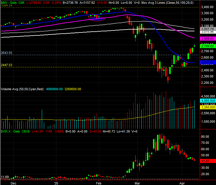
All of these ideas are readily evident on the daily chart of the S&P 500 below. After leaving a gap behind with Monday's big jump, the index continued to advance. It's difficult to see, but Thursday was another bullish gap day. That makes three gaps now unfilled; the first one was made back on (as you probably guessed) March 24th. That's problematic... potentially.
S&P 500 Daily Chart, with VIX and Volume
Source: TradeStation
It's not all bad though. The S&P 500 managed to make a higher high -- a high above the late-March peak -- and the early April low was above the late-March bottom. Higher highs and higher lows are a good sign, as is the move above the 20-day moving average line (blue) at 2528. The VIX continues to trend lower as well.
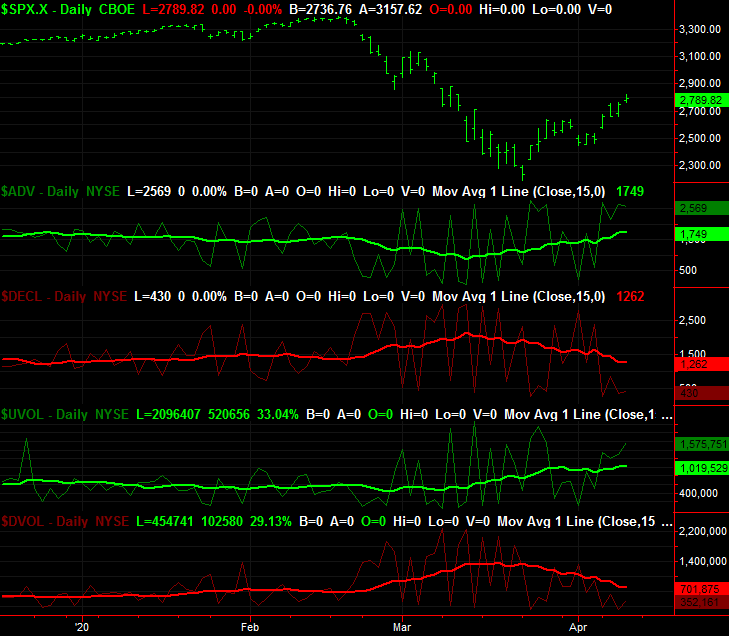
Perhaps the most encouraging aspect of the S&P 500's daily chart is in the middle of the image though... volume. Friday's total activity was the highest volume day in more than a couple of weeks, and it was bullish. In fact, it may have been even more bullish than it seems on the surface.
The graphic below explains why. It's a comparative look at the S&P 500 to the NYSE's daily advancers ($ADV) and decliners ($DECL), and its bullish volume ($UVOL) and its bearish volume ($DVOL). The daily buying volume continues to grow, and the daily bearish volume continues to broadly sink. This isn't mere one-off kinds of days. This is a developing trend. [The thicker, less erratic lines overlaid on each data set is a moving average of each, indicating that trend.]
S&P 500 Daily Chart, with NYSE Advancers, Decliners, Up and Down Volume
Source: TradeStation
The same basic underpinnings apply to the NASDAQ Composite, though there is one thing we want to add about the NASDAQ's daily chart. That is, we're about to see a so-called death cross from the composite, where the 50-day moving average line (purple) is about to cross below the 200-day moving average line (white)... a signal that's supposed to suggest more bearishness lies ahead because the bigger-picture trend had decidedly taken a turn for the worst.
NASDAQ Composite Daily Chart, with VXN
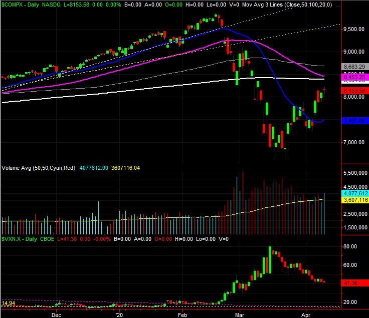
Source: TradeStation
We're not going to necessarily buy into the premise though. History has shown more often than not that these death crosses are actually buying opportunities rather than reasons to sell. The noteworthy exceptions are of course death crosses that coincide with the beginnings of bear markets. But, you don't need a death cross to know bear markets are... well, bearish.
Is this the beginning of a bear market, with the rebound effort in April just being a sucker's rally? That's the million-dollar question. The good news is, we actually have a very good framework for figuring that out. It's just going to take some time to get our answer.
What we're watching closest this week is how the indices respond to their 50-day and 200-day moving average lines if-and-when they're approached. Both the S&P 500 and the NASDAQ are close to both, and a little more progress would not only test those critical moving average lines, they'd also stretch stocks to a serious (potential) breaking point. That should be a major showdown, if tested.
On the flipside, the 20-day moving average lines are now in the rearview mirror, but each could still easily be tested as support. In some regards, in fact, the bulls should be hoping they're tested again just to prove this rebound effort has some staying power.
In the meantime, traders are stuck in the proverbial no-man's land in between those ceilings and floor.