Weekly Market Outlook - Stocks Rebound, But Not Enough
Following through on the reversal effort made two weeks ago, the market eked out another gain last week despite Thursday's drubbing. At the very least stocks backed away from the edge of the cliff, and back to within sight of key technical ceilings.
More upside is hardly a foregone conclusion though. Those ceilings still stand in the way, and it's entirely possible the bounce that took shape early last week and the latter part of the week before was merely a dead-cat bounce that wasn't built to last. Rather, it may have only been a temporary bounce rooted in the sheer severity of January's rout.
We'll look at that possibility in some detail below, as we always do. First though, let's run through last week's key economic reports and preview what's in the lineup for this week.
Economic Data Analysis
It was a busy week in terms of economic news, although there are only a couple of data sets worth diving into.
The first of those is January's key numbers from the Institute of Supply Management. The organization's service index slipped a little bit, from 62.3 to 59.9, while the manufacturing measure fell from 58.8 to 57.6.
ISM Index Charts
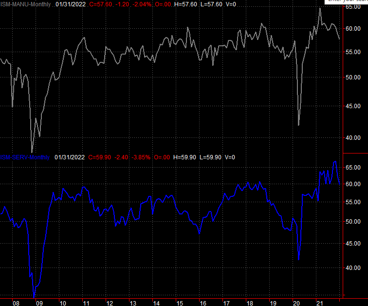
Source: Institute of Supply Management, TradeStation
That's neither a big surprise nor a big worry. December's data was unusually strong, and both figures remain well above the critical 50 level that defines the difference between growth and contraction. Note that the resurgence of the coronavirus pandemic and weather may have also adversely impacted these figures.
The only other noteworthy economic numbers from last week were very, very noteworthy. The unemployment rate edged up from 3.9% to 4.0%, on the heels of 467,000 new nonfarm jobs. Also note that December's payroll growth figure was revised much higher, from 199,000 to 510,000.
Payroll Growth and Unemployment Rate Charts
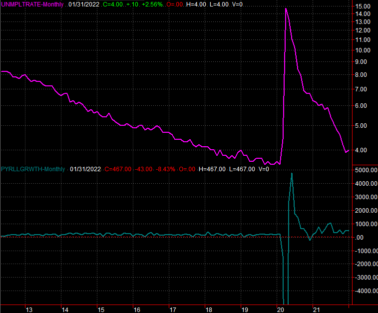
Source: Department of Labor, TradeStation
It's admittedly counterintuitive to see the unemployment rate rise in light of so many newly-filled jobs. The explanation lies in how the figure is calculated. The unemployment rate is based on the number of individuals officially considered unemployed (eligible for jobless benefits) versus the nation's total active labor pool. While the labor force grew a little bit bigger, the number of unemployed individuals grew from 6.32 million to 6.51 million... a 190,000 person swing, which was just enough to tick the unemployment rate upward. Note that the total number of people working also grew by about 100,000, from 162.3 million to 163.7 million.
Everything else is on the grid.
Economic Calendar
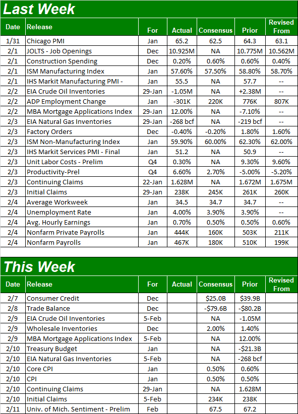
Source: Briefing.com
This week is a light one, which is perhaps for the best. It will give investors a chance to process earnings while they regroup from all the recent volatility. But, one of the items in the lineup is monumentally important. That's the first half of last month's inflation picture -- consumer inflation. It's still going strong. Economists believe, in fact, that January's price increases will be almost as brisk as they were in December. For perspective, the current annualized inflation rate now stands at 7.0%, or 5.5% on a core (ex food and energy) basis.
Inflation Rate (Annualized) Charts
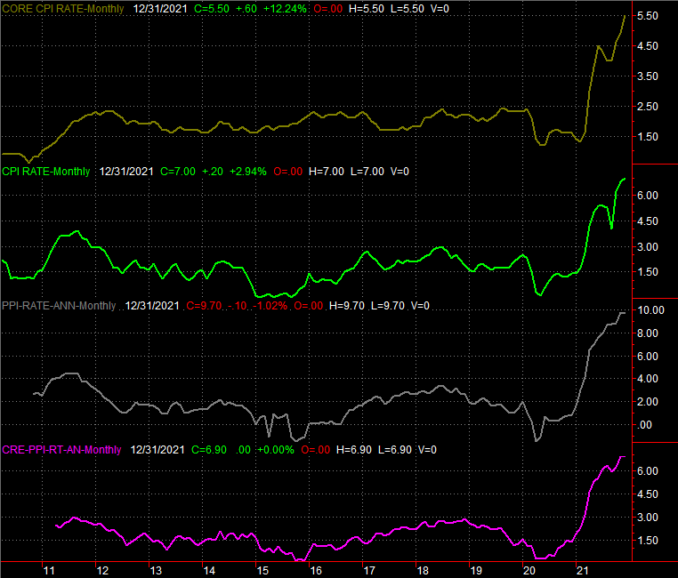
Source: Bureau of Labor Statistics, TradeStation
The other half of January's inflation report will be out next week, when the Bureau of Labor Statistics drops the producer inflation data.
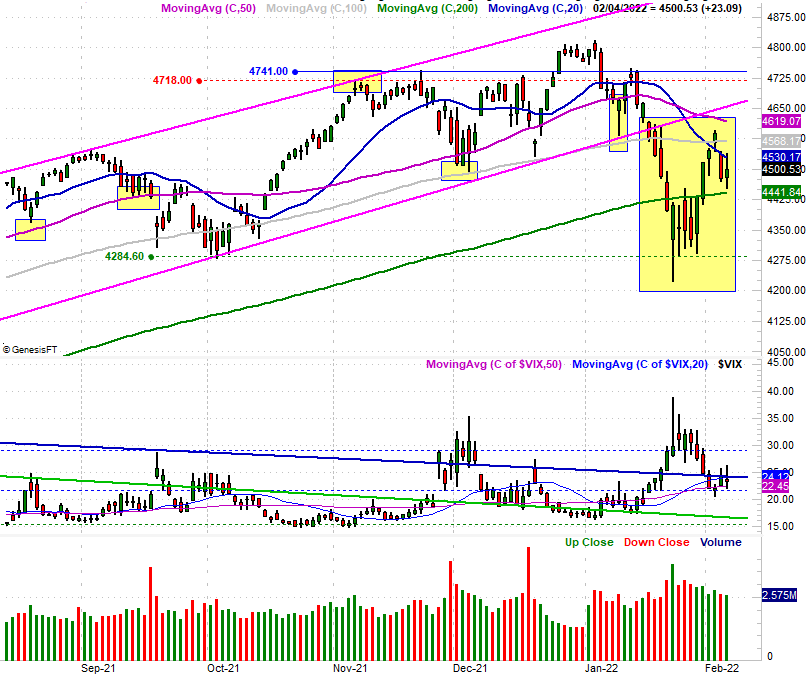
Stock Market Index Analysis
It was a winning week.... technically. But, it wasn't as thrilling one. Up as much as 3.7% at one point, Thursday's retreat dragged the S&P 500 back to a lesser gain of 1.5% for the five-day stretch.
It's curios, however, where the index bumped into trouble. It may be a sign that the stall was something of a foregone conclusion. If that's the case, buckle up.
On the other hand, the S&P 500 held above a major technical floor. This thing could still go either way.
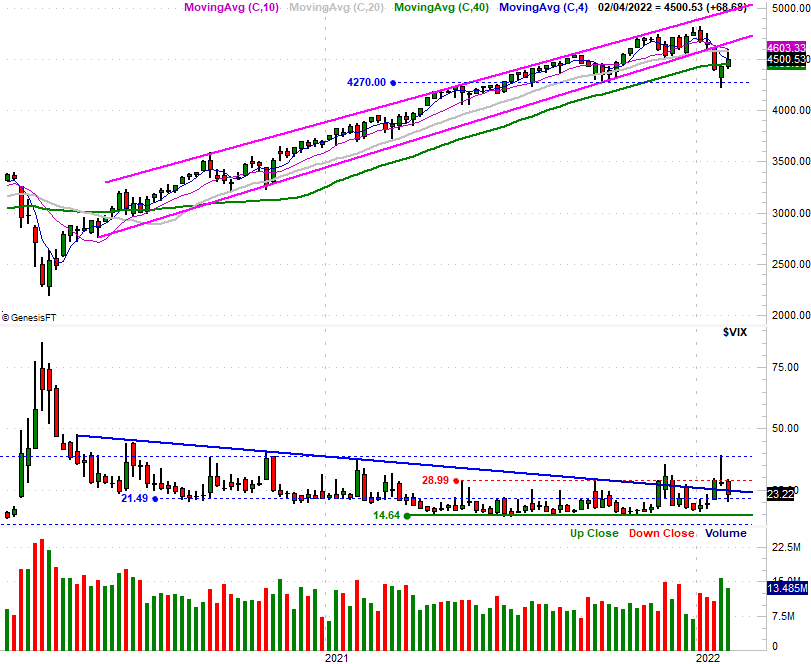
Take a look at the daily chart of the S&P 500 below. The index briefly traded above the 100-day moving average line (gray) on Wednesday, but by Thursday (and Friday) the 20-day moving average line (blue) was keeping the rally in check. On the flipside, the 200-day moving average line (green) is still a potential floor that it wasn't late last month. As long as this is the case, the market's got a decent shot at regrouping and then moving higher without suffering another, bigger correction.
S&P 500 Daily Chart, with VIX and Volume
Source: TradeNavigator
Backing out to a weekly chart of the S&P 500 doesn't give us any more details. But, it does put this whole thing in perspective. The rising support line that had guided the index higher since the middle of 2020 is still broken while the 200-day moving average line is being tested for the first time since around the same time. And, the S&P 500 is clearly bumping into resistance... another first-time-in-a-long-time kind of thing. Perhaps most noteworthy of this weekly chart, however, is the way the Volatility Index (VIX) seems to be inching its way higher, testing one horizontal ceiling at 29.0 after moving above the falling resistance line that had capped the VIX since the middle of 2020.
S&P 500 Weekly Chart, with VIX and Volume
Source: TradeNavigator
The thing is, the NASDAQ Composite is holding up nearly as well. As the daily chart of the composite illustrates, it never even cam close to testing its 100-day moving average line as a technical ceiling last week, and appears to be hitting resistance at the 20-day moving average line. The NASDAQ even ended last week below the 14,180 level that was formerly a floor.
NASDAQ Composite Daily Chart, with VXN
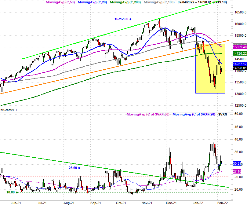
Source: TradeNavigator
As is the case with the S&P 500, the weekly chart of the NASDAQ really paints the bigger picture. The picture here is, the composite has really been shellacked the past few weeks. It can't be terribly surprising the index bounced a little in the latter part of January and the first part of last week. On that note....
NASDAQ Composite Weekly Chart, with VXN
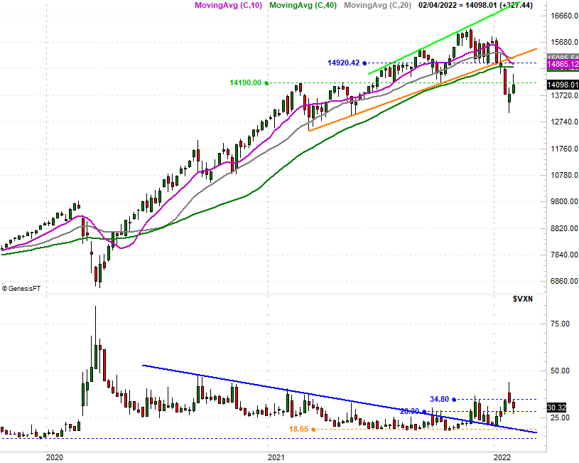
Source: TradeNavigator
Yes, the NASDAQ's Volatility Index (VXN) is pushing higher with a lot more "umph" than the S&P 500's VIX is, underscoring the NASDAQ Composite's recent meltdown. That's not the big takeaway though. Rather, notice the shape of last week's bars for both the S&P 500 as well as the NASDAQ. Both the open and close were nearer the low than the long-tailed high. It's a strong sign of a major swing from net-bullish to a net-bearish momentum. And yes, we know that bullish momentum only lasted a few days, meaning it may have been nothing more than a dead-cat bounce.
The VXN and VIX also made similar, mirror image bars that suggest the uptrends started early last month are actually, already resuming.
It's too soon to dig into that assumption, to be clear. We can only wait and see, knowing sentiment can still stop and turn on a dime (and lead stocks with it). Earnings season will only exacerbate this volatility. A few lower lows from the indices and a few higher highs from the volatility indices, however, may be all that's needed to convince traders a bigger pullback has to play out. That's dangerous, because the market will subconsciously do whatever it takes to make that happen.