
Can anything stop this market? For 2018 so far, the answer seems to be no, it can't. We just logged our third weekly gain, and it was another good one. Thanks to last week's 0.9% march, the S&P 500 is now up 5.0% just since the end of last year?
 [1]Too much for our own good? Sure, stocks are overbought and ripe for some profit-taking. On the flipside, this hasn't been a train you'd want to step in front of since two Novembers ago. We'll need more than an "enough already" argument to assume the rally is going to hit a wall now.
Just know that we are seeing some bearish rad flags waving on the fringes.
We'll dissect it all below – as always – after a look at last week's and this week's economic announcements. They are, after all, still the underpinnings for all the sentiment driving this market movement.
Economic Data
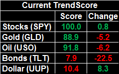
The party didn't start in earnest last week until Wednesday, but what a party once it got going. Last month's industrial production and capacity utilization were not only got, they both greatly exceeded expectations. This strength suggests we may be underestimating how well the economic engine is revving.
Industrial Production and Capacity Utilization Charts
 [2]
[2]
Source: Thomson Reuters Eikon
We've said it before but it merits repeating now – the correlation between corporate earnings, the market and these two data sets is strong. They all tend to rise and fall together.
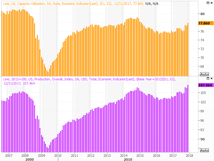
Last month's housing starts and building permits were…. meh.
Though the data is seasonally adjusted and should theoretically negate the impact of the weather-related construction slowdown we tend to see this time of year, it's not a perfect adjustment. Either way, with starts and permits essentially flat for last month (leveling off at healthy levels), this isn't a particular problem.
Housing Starts and Building Permits Charts
 [3]
[3]
Source: Thomson Reuters Eikon
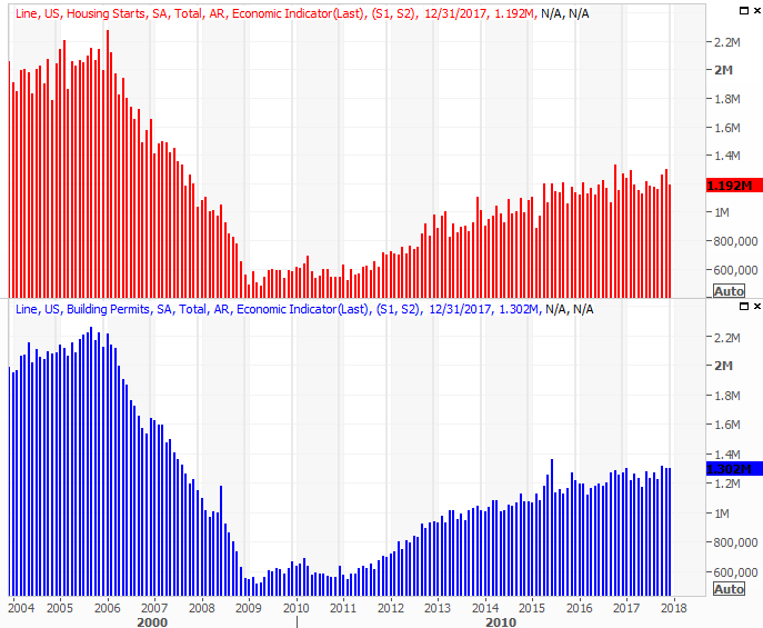
Finally, once again the nation's crude oil stockpile fell a week ago, to 412.6 million barrels. That's the lowest level we've seen since 2015, and it's still falling fast. This bodes bullishly for long-term oil prices, even if we're due for a short-term pullback.
Crude Oil and Natural Gas Inventory Charts
 [4]
[4]
Source: Thomson Reuters Eikon
Natural gas levels fell too, though that's not unusual this time of year.
Everything else is on the grid.
Economic Calendar
 [5]
[5]
Source: Briefing.com
This week looks busier, but not much of what's coming is a game-changer. That said, one of the two data sets on the docket could prove to be a major market-moving catalyst. That's Friday's GDP report for the fourth quarter.
It's been above 3% for the past couple of quarters. Economists are looking for a slight contraction, to 2.9%, this time around. That's still pretty good. That said, a reading above expectations could spark a rally, and a reading below 2.9% could be all the reason traders need to take some money off the table.
It's only the first of three readings for Q4's GDP, but it's a data point that could send a message.
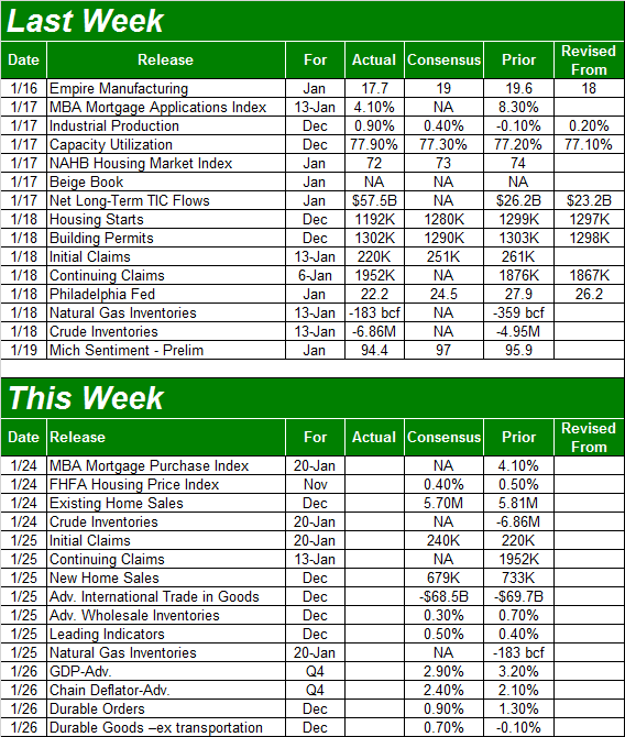
The other item were going to be watching closely are homes sales… new and existing. The former will be posted on Wednesday, with the pros calling for a slight dip, while the latter will be posted on Thursday. Economists are looking for a slight lull on that front as well. Just bear in mind – and the chart makes this clear – the comparison is to a crazy November surge.
New and Existing Home Sales, Inventory Charts
 [6]
[6]
Source: Thomson Reuters Eikon
Note that a lack of inventory could be holding home sales back, even as it keeps home prices propped up/.
Index Analysis
Let's start this week's analysis by taking a step back and looking at the big picture.. and stating some obvious facts.
First and foremost, the market's overbought and ripe for a pullback. That's been the case for months, however, and it hasn't mattered yet. Even if we're just talking about the past three weeks though, stocks are off to an unusually bullish start. The graphic below compares the S&P 500's year-to-date performance to the average yearly to-date track, the average bullish year's day to day performance, and the average bearish year's day to day performance.
S&P 500 Performance-to-Date vs. Average YTD Performance
 [7]
[7]
Source: TradeNavigator
Again though, until something clearly stops this train, one can't afford to step in front of it.
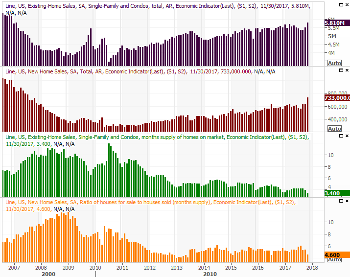
Earnings season (which is now upon us) could to the trick, if things go badly… or more accurately, are perceived as going badly. That said, that's not likely. Earnings are projected to grow 22% year over year for the fourth quarter, and realistically speaking, we'll see that target met.
At that earnings level, the S&P 500 is valued at a trailing P/E of 22.5. That's high by historical standards, but the forward-looking P/E of 18.7 is considerably more palatable.
S&P 500 Monthly Chart, With Earnings Outlook and P/E Ratio
 [8]
[8]
Source: TradeStation
Note that 2018's earnings estimates were greatly increased of late, largely in response to the recent tax-rate overhaul. And it's the sheer euphoria of the new tax code that could keep stocks moving in a bullish direction until earnings truly catch up with stock prices.
There may be room for one big "reset" between now and then though… a pullback or correction that right-prices the market but also serves as a buying opportunity. And the reason to keep your eyes peeled for such a corrective move hasn't been bigger or more blatant in months.
We're talking about sentiment – it's too bullish. The put/call ratio (equity only) for the broad market is as low as it's been since late 2014, suggesting traders are less concerned about a pullback now than they've been in two years. A little confidence is healthy, but this much confidence is dangerous.
S&P 500 Daily Chart, With Equity-Only Put/Call Ratio
 [9]
[9]
Source: TradeNavigator
(For more on how to interpret put/call ratios, go here [10].)
The Arms Index, or TRIN Index, is also unusually, uncomfortably low, suggesting the number of stocks rising or falling doesn't quite jibe with the amount of volume behind those advancers and gainers. The end result is a TRIN reading that usually — though not always — coincides with weakness. (Note that the Arms Index hasn't been a fantastic tool of late, so take it with a grain of salt now.)
S&P 500 Daily Chart, With Arms Index and Moving Average
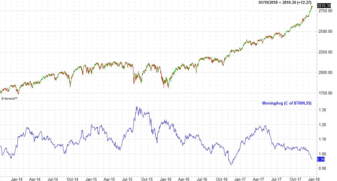 [11]
[11]
Source: TradeNavigator
(For more on the Arms Index and how to use it, go here [12].)
With all of that as the backdrop, traders are left in a predicament. Do they side with momentum, or do they side with the logic that says this rally is due for a correction?
The S&P 500 ended last week with plenty of the aforementioned momentum, and writing service [13] with plenty of volume behind the gains dished out last week. Friday's close was a record best, and at least for that day, the lower VIX said people aren't hedging their bullish bets. Though the index is now a whopping 12% higher than the 200-day moving average line (green), we can't afford to not side with the momentum we can clearly see is in place.
S&P 500 Daily Chart, with VIX and Volume
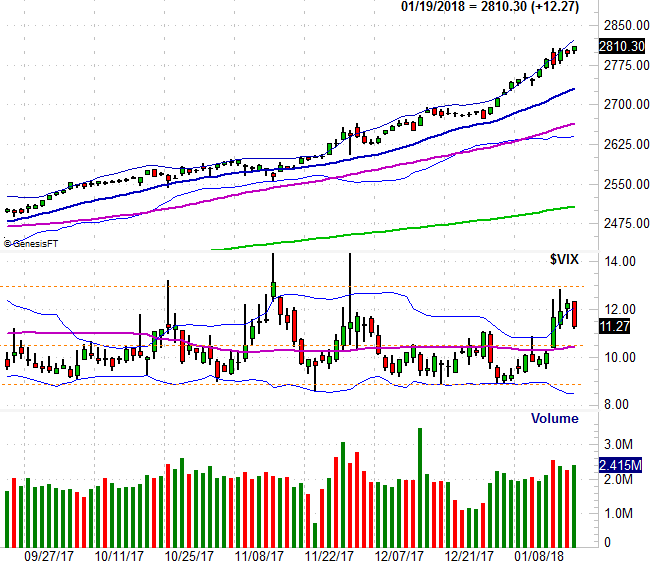 [14]
[14]
Source: TradeNavigator
The daily chart of the NASDAQ Composite or less looks the same. When we zoom out to the weekly chart of the NASDAQ though, something starts to change. Namely, the NASDAQ's Volatility Index (the VXN) is putting some serious pressure on a falling resistance line (orange) that extends all the way back to mid-2016. If it fails to hold the VXN down, it may be a sign that traders are actually starting to lean in a bearish direction… at least mentally. Stocks will soon follow that lead.
NASDAQ Composite Weekly Chart, with VXN and Volume
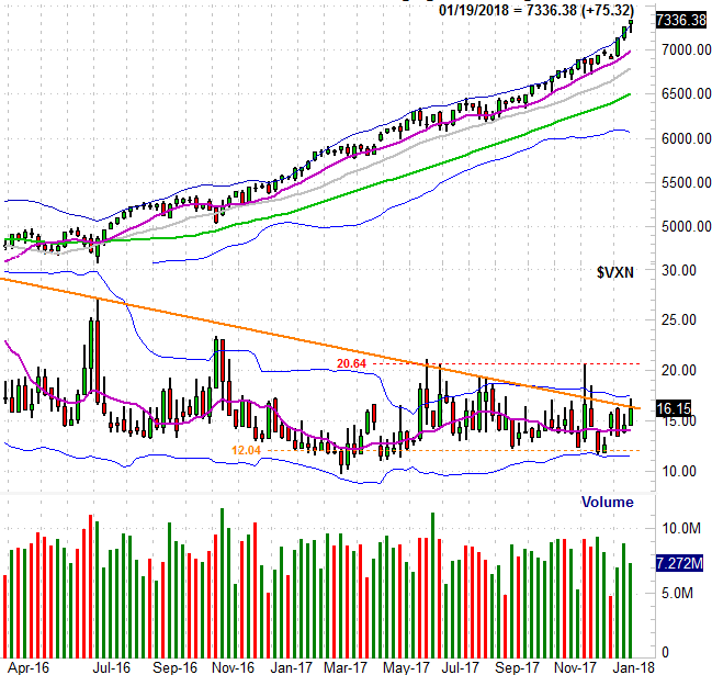 [15]
[15]
Source: TradeNavigator
We still need to see the VXN get and stay above the ceiling at 20.6 before assuming the worst, and of course, the NASDAQ Composite itself needs to make a clear sign that it's topped out. A break below its 50-day moving average line (purple) at 6941 and/or the 100-day moving average line (gray) at 6730 would be such a sign… though the trip between here essay writer [13] and there could be a painful one in and of itself. It also seems unlikely, given their recent temperament, traders would be willing to let the market fall that much and that fast without a clear reason. Political scandal? That could do the trick.
NASDAQ Composite Daily Chart, with VXN and Volume
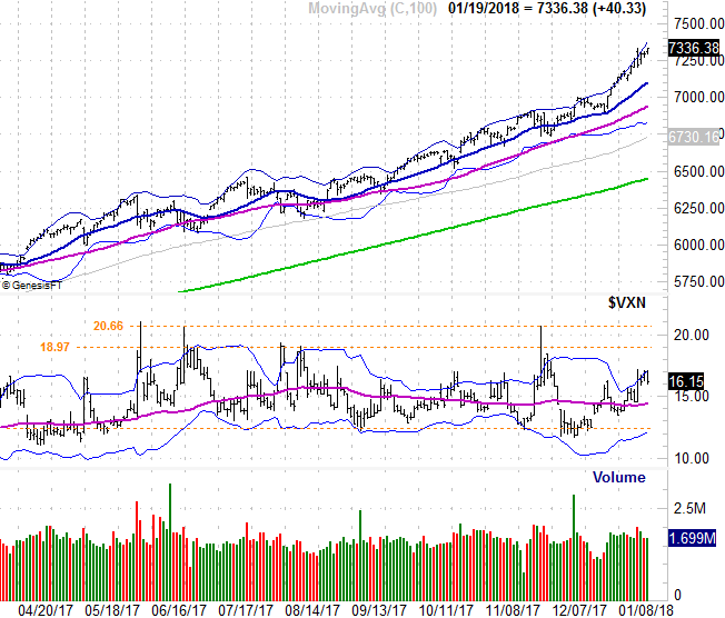 [16]
[16]
Source: TradeNavigator
The bottom line is, there is no bottom line. This market environment is asking traders to choose between two rather irrational directions. As such, trading it remains a day to day affair. Just know that each day the rally picks up speed, the bigger the drop will be once it starts. Timing it is the key. But, timing it is proving to tricky. We should have already suffered the correction, but the fact that we haven't yet means we can't assume the rally will end now.