
Unfazed by election drama, traders plowed back into stocks last week, wiping away the previous week's huge loss with an even bigger gain. In fact, last week's 7.3% advance was the biggest weekly win for the S&P 500 since April, when stocks were first coming out of the coronavirus-inspired meltdown. The market's back within sight of record levels. Good luck finding a good reason exactly why stocks popped.
To that end, was last week's big jump too good for our own good? Remember, just a week earlier the market was knocking on the door of a pretty severe meltdown, and little's actually changed in the meantime. The answer to the question is…. maybe.
We'll look at what's not quite right about the rally below, after recapping last week's big economic announcements and previewing this week's news. The biggie, of course, was last month's jobs report. It was much better than expected.
Economic Data Analysis
The week kicked off with some good news. The ISM Manufacturing Index not only improved, but improved a lot. Last month's print of 59.3 is the highest since late-2018. The snap-back from shutdowns earlier this year is in full swing. The services version of the index fell a bit, to 56.6, but that's still well above the pivotal 50 level.
ISM Manufacturing and Services Index Charts
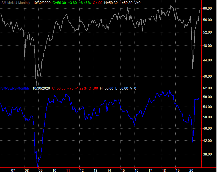 [1]
[1]
Source: Institute of Supply Management, TradeStation
Automobiles sales fell, albeit just a little bit. The annual pace of 16.78 million is still strong though, particularly given challenges linked to a resurgence of new COVID cases.
Auto Sales Chart
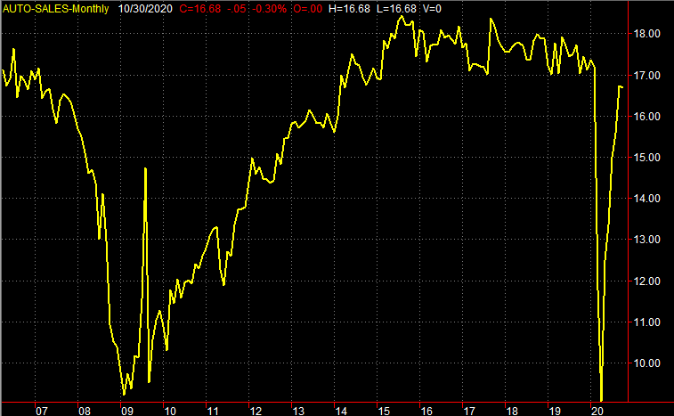 [2]
[2]
Source: St. Louis Federal Reserve, TradeStation
The Federal Reserve opted to keep the Fed Funds Rate at a rock-bottom target level of 0.13% (a range of 0.0% to 0.25%), citing the obvious concerns. No surprise there.
Of course, last week's biggie was October's jobs report, which was impressively healthy. Economists were modeling a modest dip in the unemployment rate, from 7.9% to 7.7% thanks to the creation of 570,000 new jobs. The economy actually added 638,000 new payrolls though, driving the unemployment rate all the way down to 6.9%. That's clearly not back to pre-COVID levels, but it's well below the post-COVID peak of 14.7% in April.
Unemployment Rate and Payroll Growth Charts
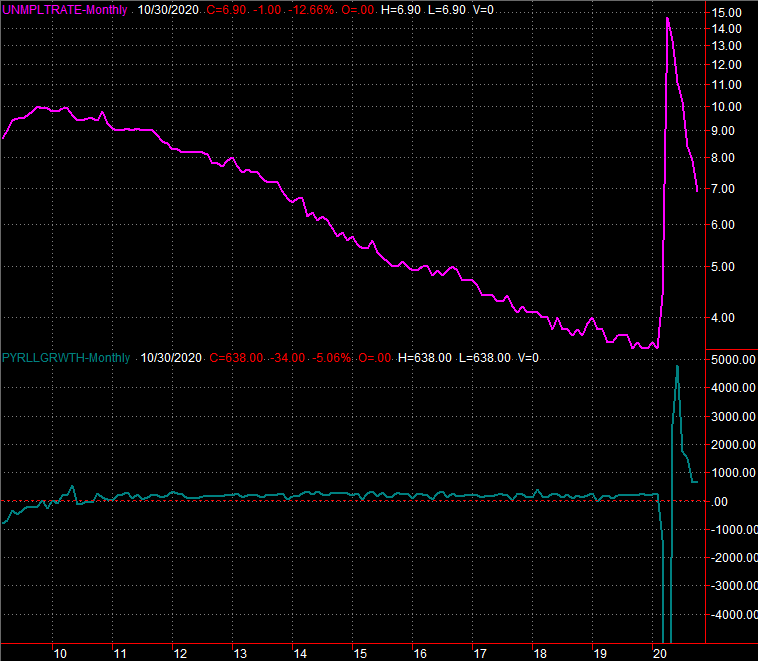 [3]
[3]
Source: Bureau of Labor Statistics, TradeStation
Everything else is on the grid.
Economic Calendar
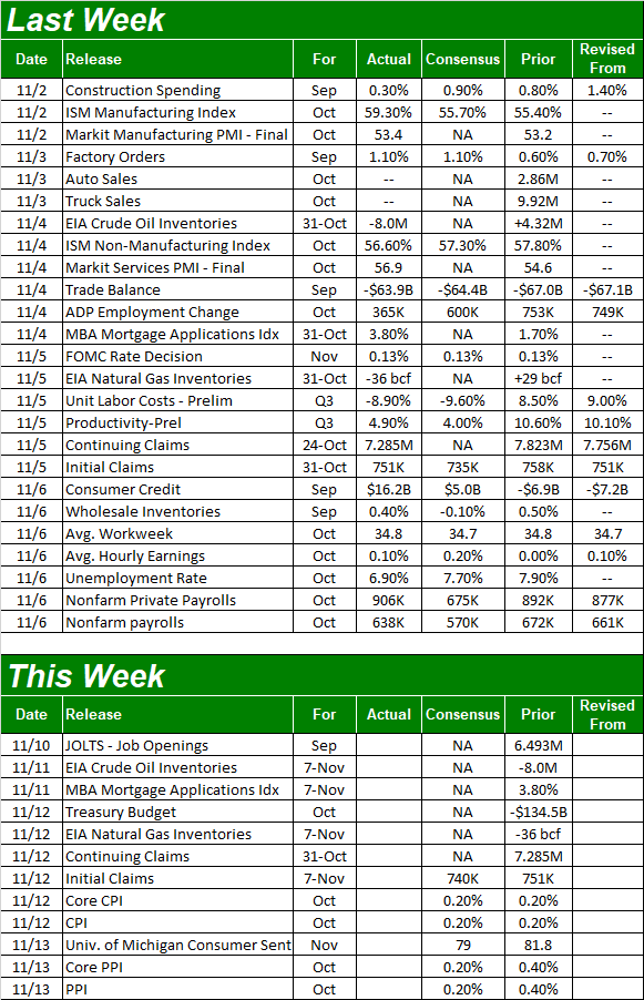 [4]
[4]
Source: Briefing.com
This week is going to be a light one. In fact, there's only one data set we're interested in…. and it's not the first (of three) looks at the University of Michigan Sentiment Index. Rather, look for inflation reports this week. Economists are looking for measurable but muted price increases, for consumers as well as factories and assembly plants. That should leave the annualized paces — in all of its forms — well below the Fed's intended level of around 2%.
Consumer, Producer Inflation Charts (Annualized)
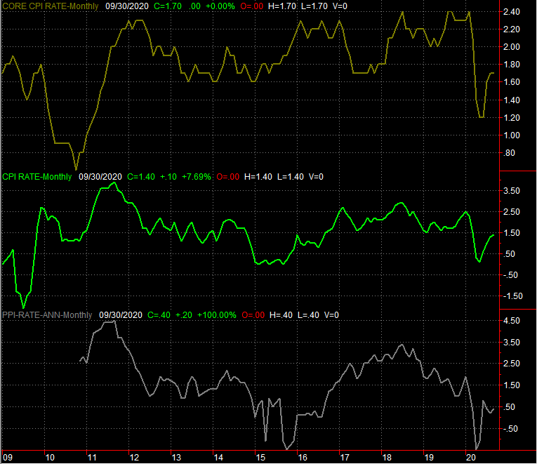 [5]
[5]
Source: Bureau of Labor Statistics, TradeStation
Bear in mind that the quickly rekindling economy and ultra-low interest rates is a recipe for an equally quick surge in the Fed's target interest rate. The problem is not knowing when or even if that may happen. It's simply a lingering risk acting as a dark cloud over any bullish progress.
Stock Market Index Analysis
Like last week, we'll start this week's analysis out with a look at the weekly chart of the S&P 500…just for perspective. Unlike last week, we need this perspective for a completely different reason. Last week's action was the biggest gain in months, largely silencing the developing bearish chatter from the week before. The speed and scope of the bounce is a bit concerning; it's almost too much to trust.
S&P 500 Weekly Chart, with VIX and Volume
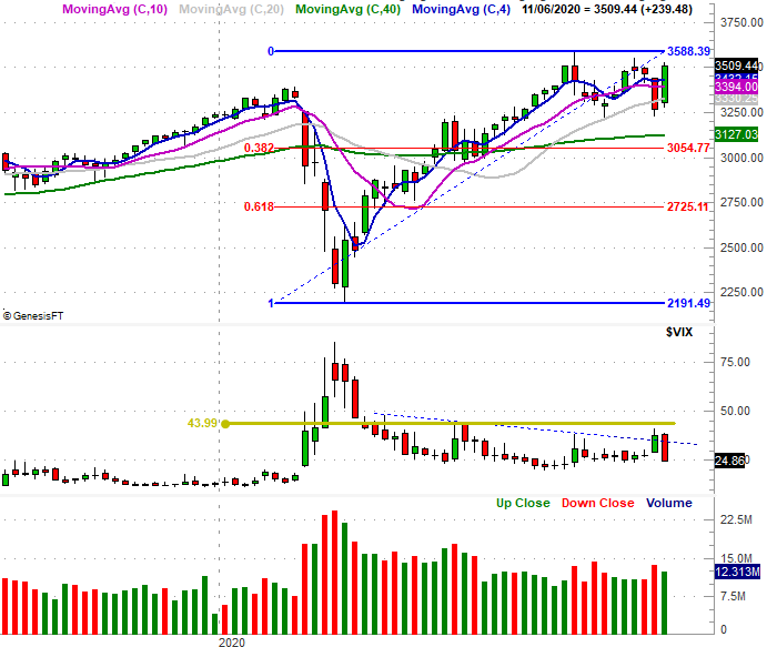 [6]
[6]
Source: TradeNavigator
That being said, there's good reason not to completely trust the move besides the distance the bulls covered last week… two reasons, actually.
One of them is the lack of volume behind the move. The weekly chart above shows there was less buying volume last week than there was bearish volume during the prior week's selloff.
The other reason is, Thursday's and Friday's highs align with the index's previous two peaks, from October and early September (orange). Something is somehow keeping the buyers in check.
S&P 500 Daily Chart, with VIX and Volume
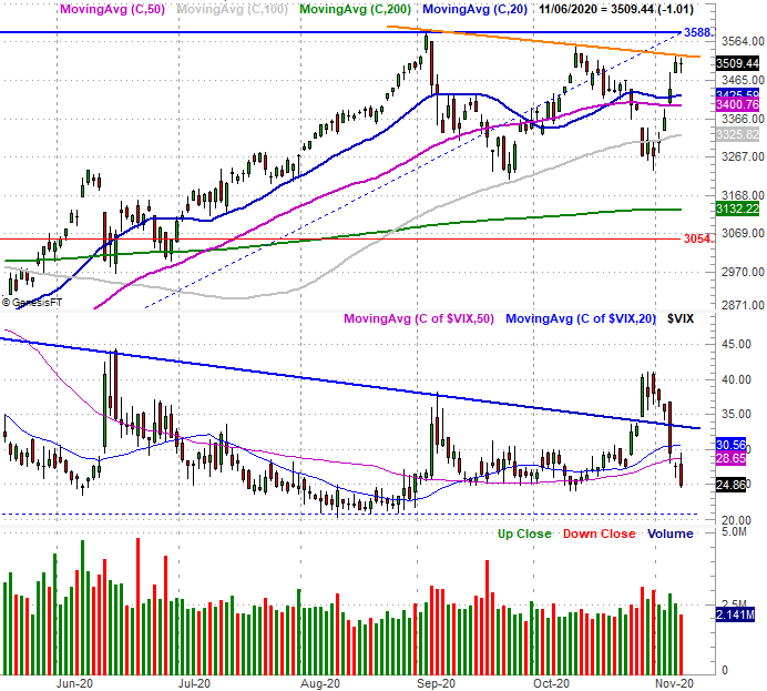 [7]
[7]
Source: TradeNavigator
The Dow Jones Industrial Average is in a similar – though not identical – situation. The big difference here is, the Dow's ceiling connects the three key peaks including February's high. Even with last week's 6.9% rally, the index isn't testing this technical ceiling even though it used the 200-day moving average line as a pushoff point two weeks ago (highlighted). Until that line is crossed, the Dow Jones Industrial Average still has something big to prove. Also note that like the S&P 500, the Dow's volume last week was pretty tepid.
Dow Jones Industrial Average Weekly Chart, with Volume
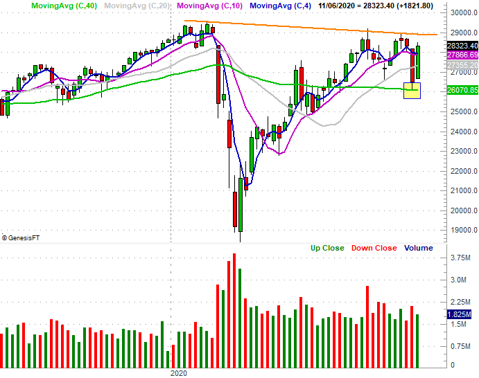 [8]
[8]
Source: TradeNavigator
The same basic idea even applies to the NASDAQ Composite, though its technical ceiling isn't quite as well organized. The only noteworthy nuance is the fact that last week's high of 11,924 is more or less in line with October's peak. The reason the NASDAQ's daily chart is of so much interest, however, is once again the volume story it's telling is.
The portion at the top of the chart is of course the daily bars for the composite. The bottom two histograms compare the exchange's daily bearish volume (red, DVOLQ), and its daily bullish volume (green, UVOLQ). The squiggly thin red line in the middle is a comparison of those two data sets, but the line of interest is the slower-moving blue one, which is the moving average of that comparison… it smooths out the data into more useful, easier-to-interpret information.
NASDAQ Composite Daily Chart, with Bullish, Bearish Volume and Comparison
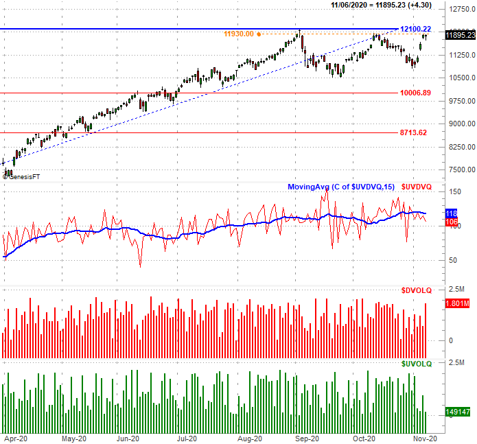 [9]
[9]
Source: TradeNavigator
We mentioned above that the volume picture was casting doubt on the gains. This chart underscores just how un-bullish the volume trend has been. Clearly there was never any major buying volume for the NASDAQ last week, but there's growing bearish volume. Notice the moving average of this daily data pretty well coincides with the NASDAQ's ebb and flow.
With all of that being said, we still contend stocks are range-bound, and boxed in by some pretty tough floors and ceilings. The key moving averages are floors, though as we've plotted on the S&P 500's charts, there's an important Fibonacci retracement line at 3054. The ceilings are of course recent highs, or at least the lines connecting the recent peaks. This sets the stage for some range-bound volatility.
Still, the volume trend and the way the S&P 500's 20-day (blue) and 50-day (purple) moving average lines are starting to inch back toward its 100-day moving average line (gray) suggests the bulls have hardly proved there's more gains in the immediate future.