
Following through on the previous week's unlikely bullishness, the market logged another gain last week, moving deeper into record-high territory as a result. Better still, there remains plenty of room for more gains… in multiple ways.
It's not a perfect scenario for the bulls though.
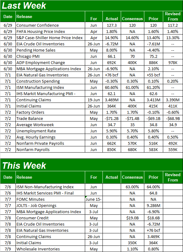
We'll dissect what's going on below. First though, let's look at last week's biggest economic news and preview what's coming this week. We ended last week on a bullish foot mostly thanks to a great jobs report for June, but there's another market-mover report on this week's dance-card.
Economic Data Analysis
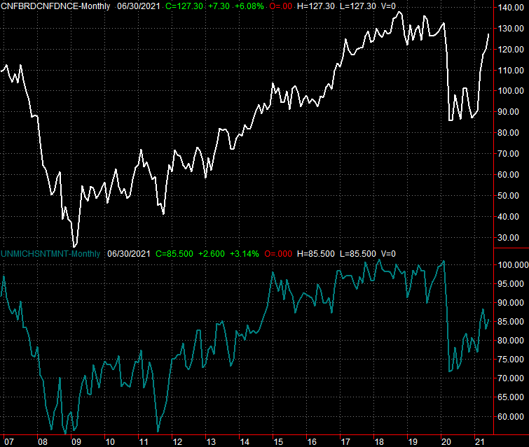
Given the market's continued bullishness in the wake of at least measurable progress on the coronavirus front, it should come as no real surprise confidence jumped in June. The Conference Board's consumer confidence improved to a pandemic-high of 127.3. For perspective, this figure was 132.6 right before the pandemic took hold in March.
Consumer Sentiment Charts
 [1]
[1]
Source: Conference Board, University of Michigan, TradeStation
The University of Michigan's version of a sentiment index clearly isn't at its best level since COVID-19 made landfall in the U.S. early last year. But, it's making bigger-picture progress. That's more important than any absolute level.
Home prices continue to soar, of course… at least through April. For that month, both the Case-Shiller index and the FHFA Home Price Index moved deeper into record-high territory.
Home Price Charts
 [2]
[2]
Source: Standard & Poor's, FHFA, TradeStation
Yes, home prices have reached uncomfortably high levels at an uncomfortably brisk pace.
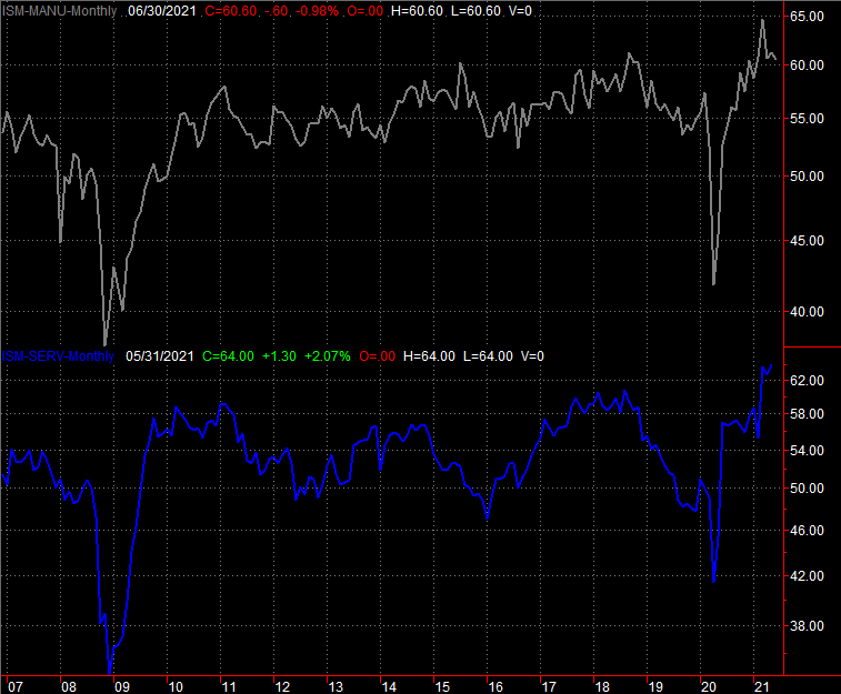
We got the first set of Institute of Supply Management's data last week as well, in the form of June's manufacturing index. It slipped a little lower for the second time in three months….after peaking in March. Just bear in mind that manufacturing activity may be peeling back from unsustainable levels linked to the surge of the post-pandemic "return to normal."
ISM Manufacturing and Service Charts
 [3]
[3]
Source: Institute of Supply Management, TradeStation
The services version of the index is due this week.
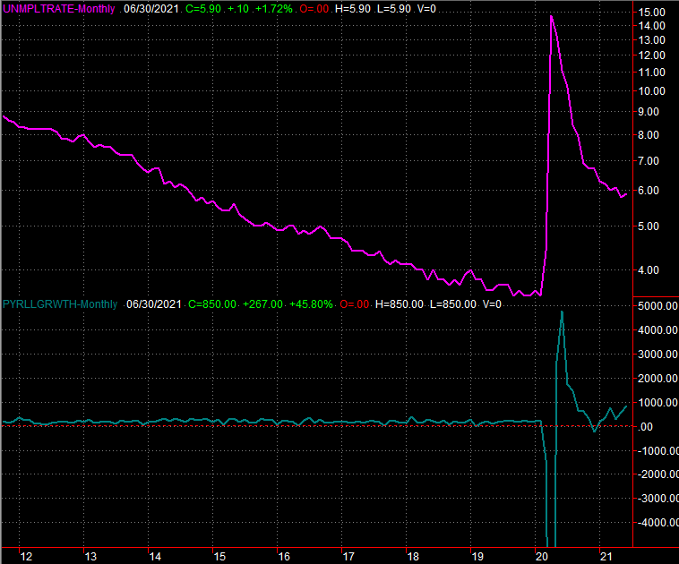
Last week's big Kahuna was of course last month's jobs report. It was a good one. Yes, the unemployment rate moved up from 5.8% to 5.9%, versus the expected slide to 5.7%. That's actually an encouraging twist though, given the circumstances. The economy added 850,000 new employees last month versus expectations of only 680,000, and May's payroll growth was adjusted upward. The unemployment rate only grew because so many people are losing their emergency benefits and are now scrambling to get back to work, (re)joining the labor pool as a result.
Unemployment Rate and Payroll Growth Charts
 [4]
[4]
Source: Department of Labor, TradeStation
Everything else is on the grid.
Economic Report Calendar
 [5]
[5]
Source: Briefing.com
Aside from the services update from the Institute of Supply Management on Tuesday, we'll hear the minutes from the Federal Reserve's most recent meeting on Wednesday. This isn't a scheduled opportunity to change interest rates (and the FOMC probably won't make an exception to that schedule this time around). But, the minutes will offer a deeper look into what the Fed's governors see looming on the inflation front. You can bet traders will respond.
Stock Market Index Analysis
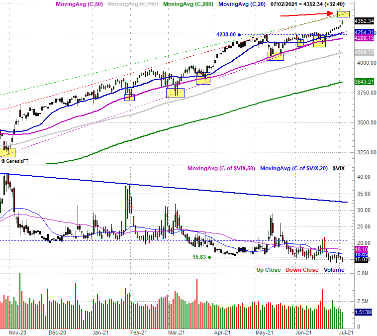
This week's analysis kicks off with a zoomed-out look at a daily S&P 500 chart, just because there's so much packed into it!
Clearly the bulls followed through on the break above 4238 (blue, dashed) from two weeks ago, accelerating as the week came to a close. Take a look. But…
S&P 500 Daily Chart, with VIX and Volume
 [6]
[6]
Source: TradeNavigator
…there are a handful of concerns built in here.
Chief among these worries is how close the index is now to the upper boundary of a long-term trading channel (green, dashed line, and the red, dashed line). There's room for a little more upside, but once — if — the index gets near the 4410 level (highlighted, pointed out with a red arrow), the advance will find a great deal more technical resistance.
The other concerns are the fact that the VIX didn't really edge any lower last week, and that the volume behind the gain was never great last week, but faded as the rally moved on. The former suggests traders aren't exactly becoming more confident in the advance the longer it persists. The latter implies the same; more on that in a second. The weekly chart offers up some more perspective on all of these details.
S&P 500 Weekly Chart, with VIX and Volume
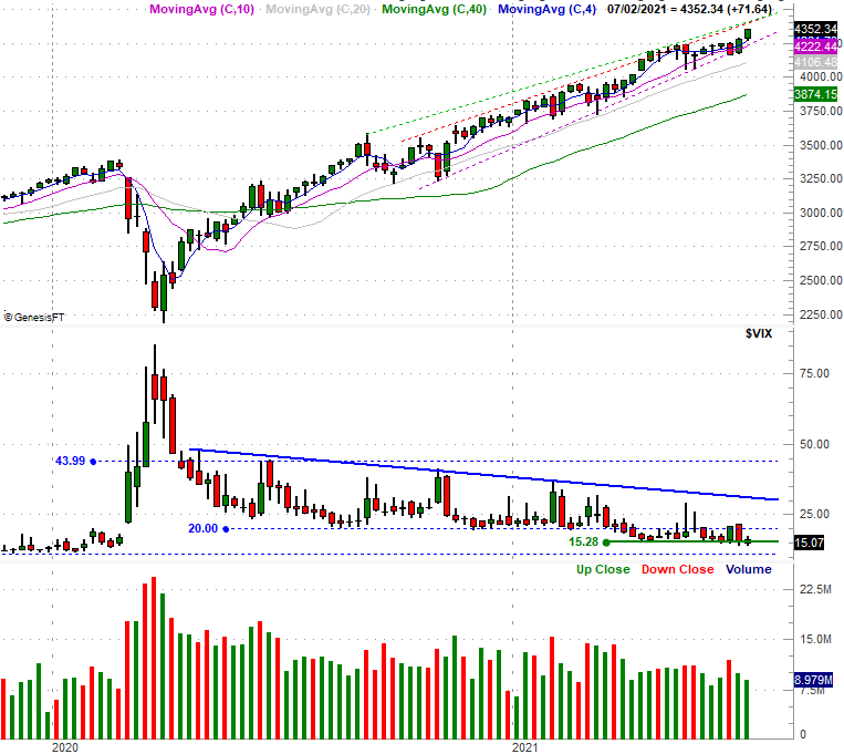 [7]
[7]
Source: TradeNavigator
The NASDAQ Composite's daily chart looks similar, but not identical. Namely, the composite lagged so badly earlier in the year that even after the break above 14,189 (blue, dashed) two weeks ago, there's still tons of room to keep rising before bumping into the upper ceiling of the long-term rally (red, dashed).
NASDAQ Composite Daily Chart, with VXN
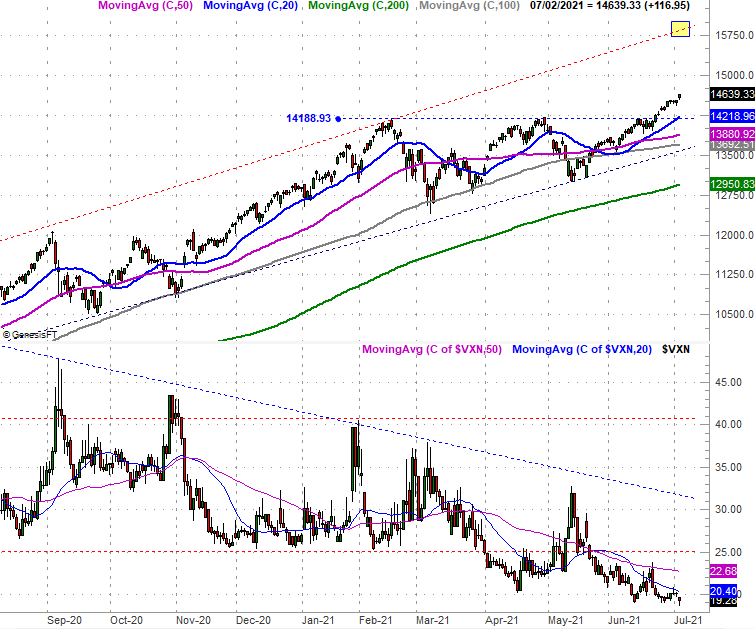 [8]
[8]
Source: TradeNavigator
Here's the weekly version of the NASDAQ Composite. Not a lot changes with this view. Similar to the VIX, the NASDAQ's Volatility Index (or VXN) didn't budge last week, implying traders aren't entirely convinced this rally is rock-solid. And don't think for a minute the VXN can't move any lower. It was near 13.5 early last year, before the pandemic wrecked things.
NASDAQ Composite Weekly Chart, with VXN
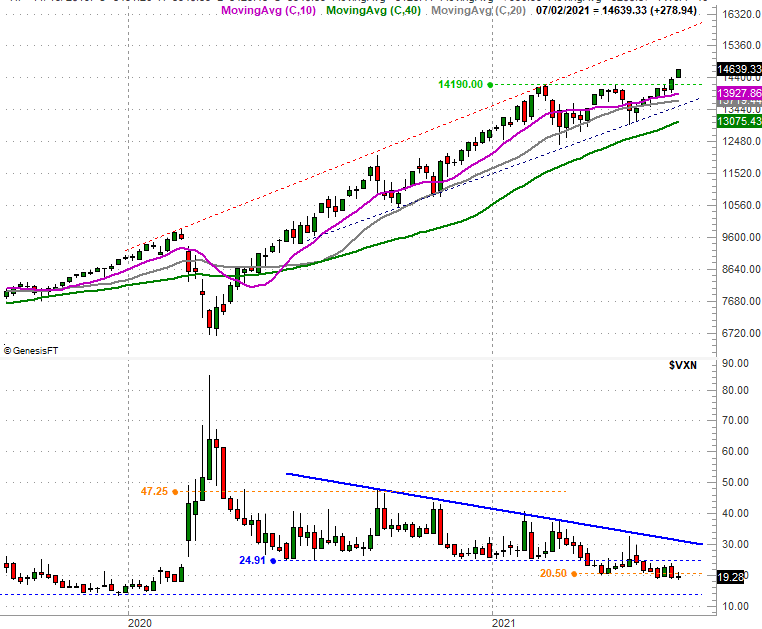 [9]
[9]
Source: TradeNavigator
Maybe the subtle clues from the VXN and VIX don't matter. As was noted though, they're not the only red flags we're seeing wave right now.
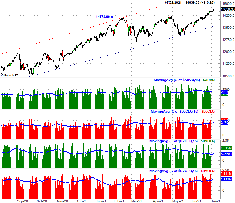
The NASDAQ's bullishness since late-May has been market-beating, but it's been tainted the whole time. Not only is participation — as measured by volume and advancers and decliners — in the rally not improving, it's deteriorating.
On the graphic below, the second and third (red and green) bars immediately below the chart of the NASDAQ Composite show us the number of advancers ($ADVQ) has steadily fallen since early June, while the number of decliners ($DECLQ) has steadily grown; the blue moving average lines overlaid on each shows us the true trend. On the bottom portion of the chart, the NASDAQ's "up" volume (UVOLQ) has been falling since early May while its "down" volume ($DVOLQ) continues to ramp up. Again, the moving average lines are showing — or even confirming — the trends.
NASDAQ Composite Daily Chart, with Advancers, Decliners, Up and Down Volume
 [10]
[10]
Source: TradeNavigator
For the record, the NASDAQ is the only exchange showing us bearish breadth and depth; the NYSE's advancers and decliners as well as its up and down volume is pretty well balanced. In that the NASDAQ tends to lead the market both higher and lower though, this is a more concerning nuance than not.
It just doesn't matter… at least not yet. While the market is overbought and ripe for profit-taking, you can't (or at least shouldn't) fight the tape. The trend is bullish, like it or not. In fact, even a sizeable stumble won't really break this uptrend. The S&P 500 would have to break below its 50-day moving average line currently at 4208 to change the market's bigger tide, and the VIX and VXN would have to break above their long-term technical ceilings (blue) to confirm the market's character has finally taken a bearish turn.