
We knew a week ago that the market was vulnerable, and even toying with a corrective move. Despite last week’s rout, however, stocks didn’t fall off the edge of the cliff. They tested it with perfection before easing back from the precipice, in fact.
And there’s the rub. The perfection with which Friday’s intraday turnaround took shape suggests it was something of a (mentally, subconsciously) planned effort that proverbially “clears the decks” for a rekindling of the bigger-picture rally.
That’s one theory anyway.
We’ll of course look at the action in some detail below. Let’s first look at last week’s biggest economic news and then preview what’s in the lineup for this week.
Economic Data Analysis
Spoiler alert: Investors were thrown a couple of economic curve balls last week, none of which were bullish. But first things first.
The party started on Tuesday with a big dose of real estate news. While still up year over year, the Case-Shiller Index continues to lose ground, falling further from last June’s peak. Not so with the FHFA’s comparable measure though. Not only did this latter barometer continue its trek higher, it appears to be accelerating higher now.
Home Price Index Charts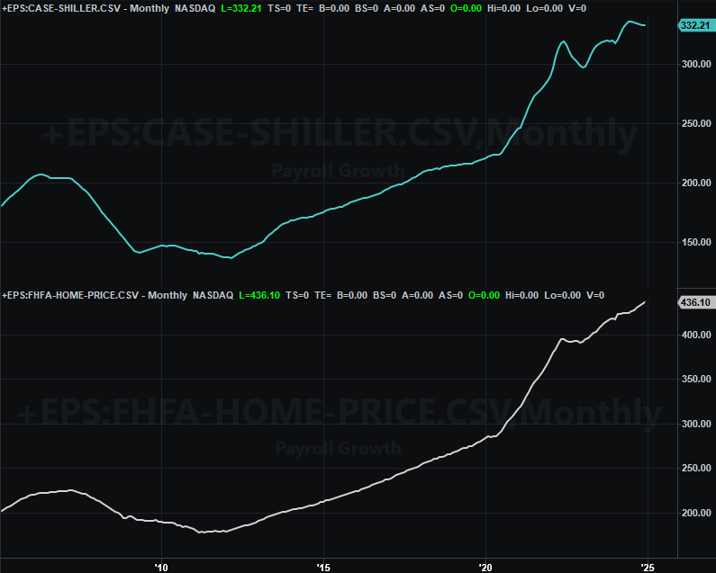
Source: FHFA, Standard & Poor’s, TradeStation
What gives? Good question. We’ve long theorized that bigger city real estate prices are peeling back from records, while the FHFA’s data better reflects the average across all geographies including lots of rural areas where home prices are generally more stable. This theory hasn’t been abandoned in the meantime. Either way, our bigger-picture interpretation is just that home values are just so-so here.
Indeed, it may not even be that good. As we learned on Wednesday, sales of new homes tumbled a bit — and more than expected — in January, indicating that actual buying interest remains muted even if prices remain firm. That is to say, some people are paying more for a home, but most aren’t willing or able to do so. (As reminder, January’s sales of existing homes also cooled back to ho-hum levels rather than ramping up.)
New, Existing Home Sales Charts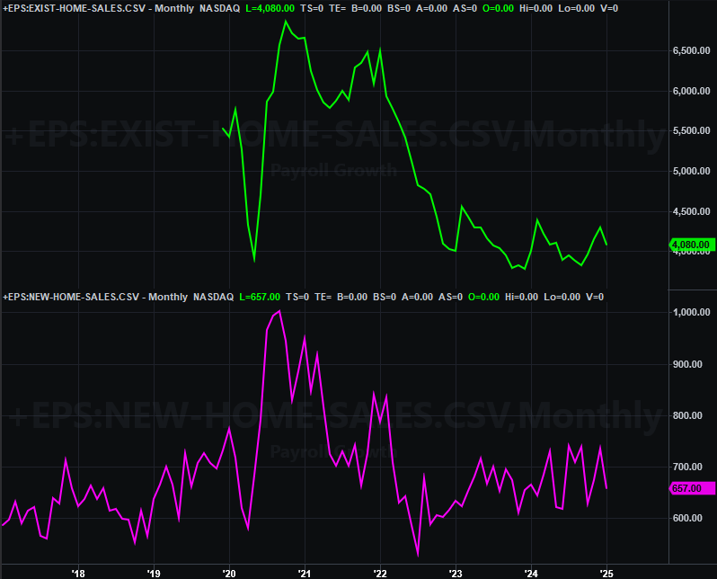
Source: National Assn. of Realtors, U.S. Census Bureau, TradeStation
Underscoring this argument is last week’s consumer confidence report from the Conference Board posted on Tuesday, for February. Like the University of Michigan’s consumer sentiment score did last month, it fell quite a bit.
Consumer Sentiment Charts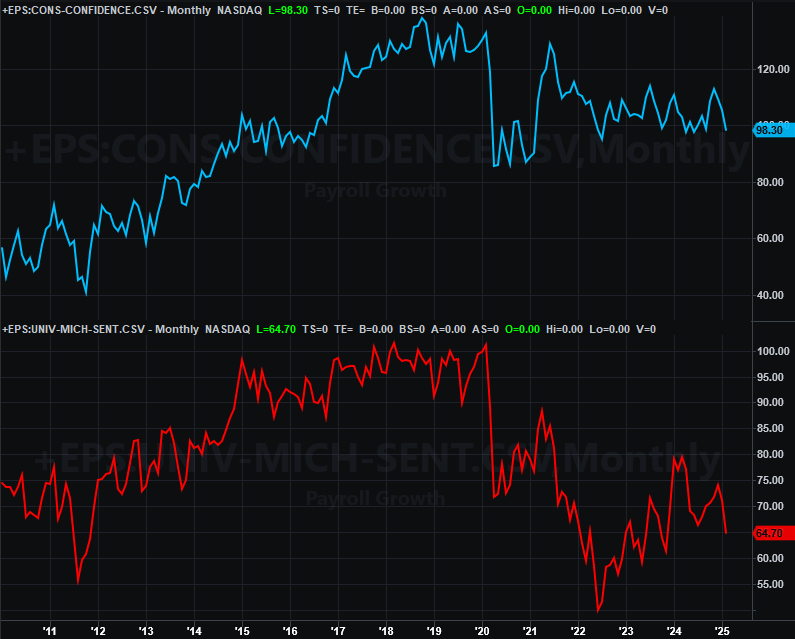
Source: Conference Board, University of Michigan, TradeStation
And for what it’s worth, people are putting their money where their mouth is (or isn’t), so to speak. Although we’re not charting it here, January’s personal spending outlays actually fell following December’s healthy growth despite income growth that was even more positive than anticipated. This suggests consumers are “hunkering down” for an economic headwind, which the market itself is also saying.
The good news is, if this is the new norm, the Federal Reserve has a little more room and reason again to lower interest rates… not that it was going to happen aggressively or immediately.
Everything else is on the grid.
Economic Data Report Calendar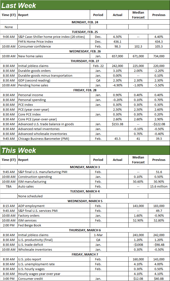
Source: Briefing.com, TradeStation
This week’s going to be a bit raucous as well. On Monday we’ll hear February’s ISM manufacturing data, followed by the Institute of Supply Management’s look at the nation’s services industries activity for last month on Wednesday. Economists believe February’s numbers will be more or less in line with January’s, both of which were above the pivotal 50 level.
ISM Manufacturing, Services Index Charts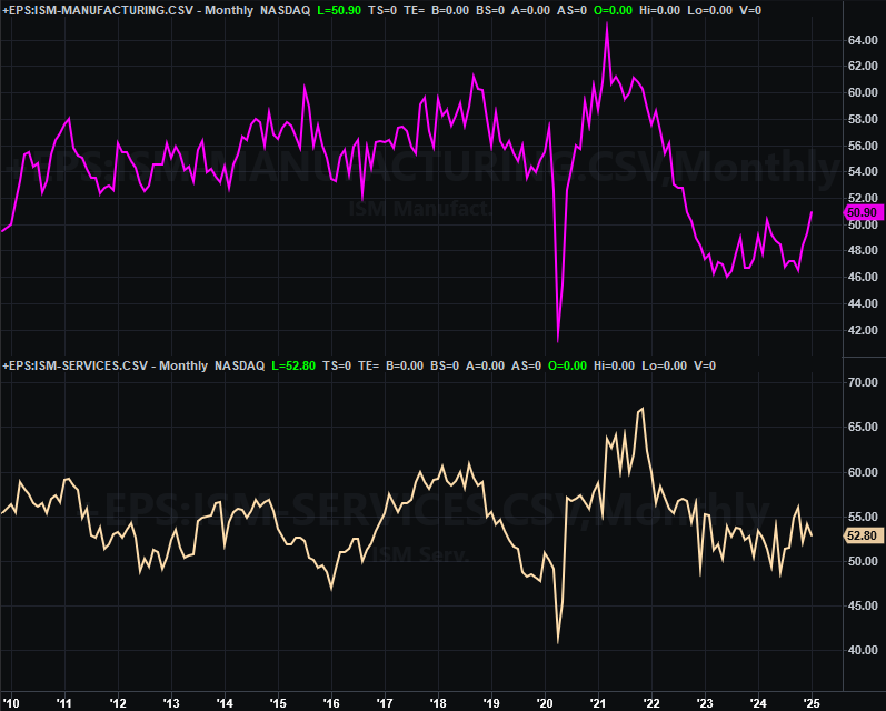
Source: Institute of Supply Management, TradeStation
This week’s biggie of course is Friday’s jobs report for February. Economists believe things worsened slightly last month…sort of. Although payroll growth is expected to have accelerated slightly from January’s numbers, an increase in the number of unemployed people versus the size of the workforce means the unemployment rate likely increased from 4.0% to 4.1%.
Payroll Growth, Unemployment Rate Charts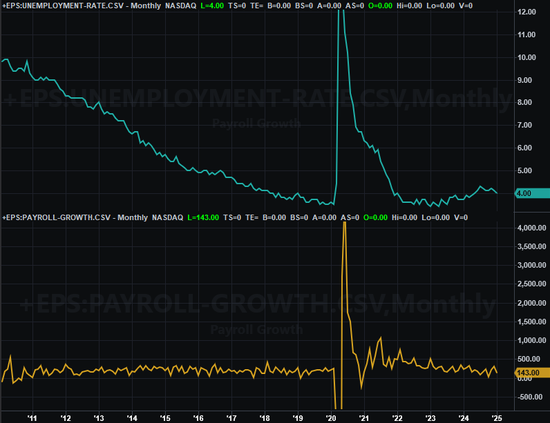
Source: Bureau of Labor Statistics, TradeStation
Stock Market Index Analysis
What a week! The bulls were starting to show signs of fatigue a couple weeks back, but were at least holding their ground. Then, pow! Last week happened. The NASDAQ Composite ended up losing 3.5% of its value despite Friday’s solid bounceback, while the S&P 500 gave up about 1%. And in both cases, key floors were broken.
Still, other important technical support is not only still intact, but strangely-well proven. There’s actually a decent case to be made that the bigger bullish trend has been rekindled specifically because of the shape and scope of last week’s action.
We’ll begin with a look at the daily chart of the NASDAQ Composite to make this point… and it’s not hard to make. The index merely had to kiss the pivotal 200-day moving average line (green) on Friday to begin the pivot.
NASDAQ Composite Daily Chart, with VXN and Volume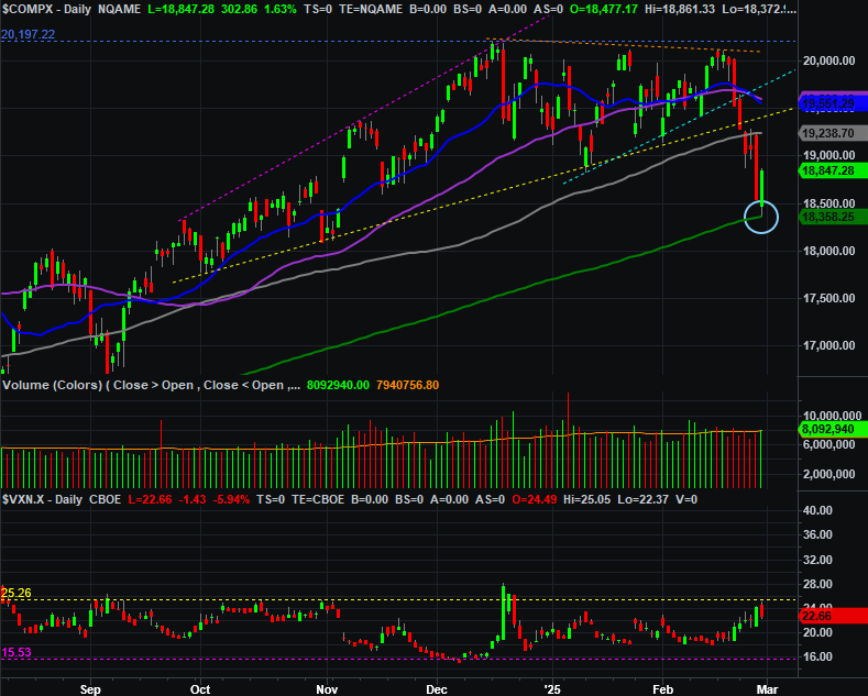
Source: TradeNavigator
It’s not terribly surprising. The 200-day average is the proverbial grandaddy of indicators. Plenty of people keep on eye on it. Some of them likely had buy orders set up if-and-when it was touched.
Now here’s a view of the weekly chart of the composite to put last week’s action in more perspective. As you can see, not only did the sellers turn into buyers at the 200-day moving average line, but there’s something of a rising support line (purple, dashed) around that same level. It certainly assisted in the support effort.
NASDAQ Composite Weekly Chart, with VIX and MACD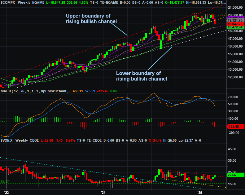
Source: TradeNavigator
Perhaps the most noteworthy detail of both charts above, however, isn’t the NASDAQ’s action. It’s the NASDAQ Volatility Index’s (VXN) you’ll see at the bottom of both charts. It touched resistance that’s more or less equivalent to the NASDAQ technical floor, but ended up moving slightly above that ceiling and even closed above it. This is a modest hint that traders are shifting from an offensive to a defensive mindset.
And the S&P 500 looks similar even if not identical. It’s not yet testing its 200-day moving average line (green) currently at 5,720. But, the 50-day line (purple) that was serving as support just a couple weeks ago now looks like resistance. That is to say, after failing under this floor on Monday, it acted as a ceiling later in the week, repelling the buying effort.
S&P 500 Daily Chart, with VIX and Volume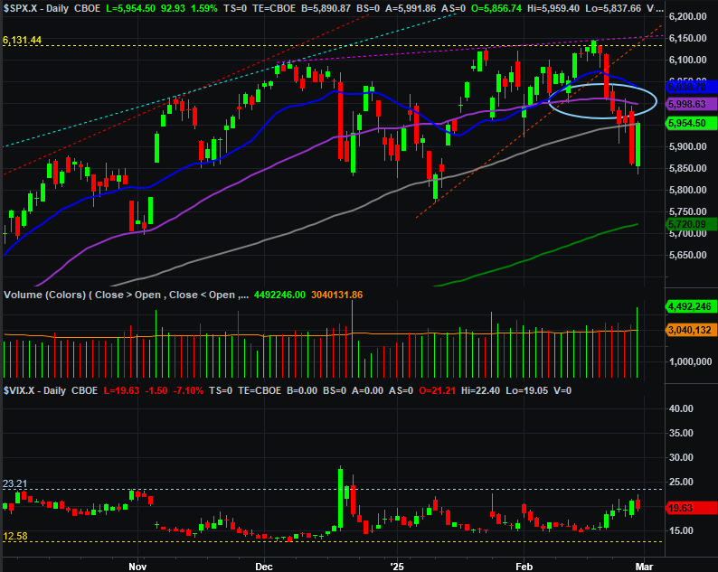
Source: TradeNavigator
Note that Friday’s rebound still didn’t actually get the S&P 500 back above its 100-day moving average line (gray) at 5,955.
Here’s the weekly chart of the S&P 500 for a bit more bigger-picture perspective. As it turns out, the index’s low on Friday was more or less in-line with a long-term rising support line (yellow, dashed) that extends all the way back to the late-2023 low. Also notice, however, the index has been capped by a horizontal ceiling around 6,144 since late-January. Traders may have been fearing such weakness has been due for a while.
S&P 500 Weekly Chart, with VIX and MACD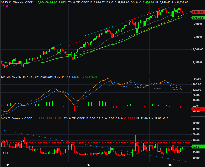
Source: TradeNavigator
Even so, the S&P 500’s bull market has hardly been broken. This isn’t even a full-blown correction yet. It’s just got the potential to become one.
Just keep your powder dry for now. The good news is, the market’s lines in the sand are very well defined right now. All of them. Bullish as well as bearish. The showdown is upon us.