
We mentioned a week ago that things could get a bit tough for the bulls. Last week’s action proved it. Although the S&P 500’s 0.4% setback is hardly disastrous. The intraweek 1.3% swing from its peak to close at its low, however, is more concerning… a concern made even worse by where the reversal started. Never even mind the other red flag.
And yet, there’s a still a chance that the selling can be halted before taking on a self-fueling life of its own.
We’ll show what that chance consists of in a moment below. Let’s first review last week’s biggest economic news and preview the reports that are in the lineup for this week.
Economic Data Analysis
There was really only one data set of any real interest reported last week. That’s May’s inflation. It remains muted. Although non-core consumer inflation edged just a but higher to an annualized rate of 2.4%, that’s still low enough to satisfy the Federal Reserve. In the meantime, producer inflation continues to fall rather decisively. There’s certainly room for the FOMC to lower interest rates, which the market is betting it will do in September.
Consumer, Producer Inflation Rate Charts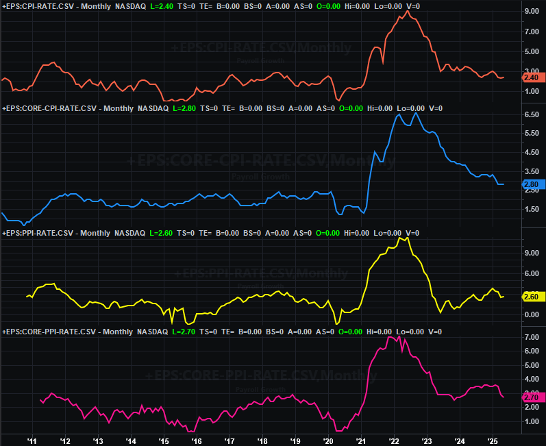
Source: Bureau of Labor Statistics, TradeStation
You may have also heard Friday’s buzz that consumer sentiment improved for the first time this year. Just take that report with at least a small grain of salt. That’s in reference to the University of Michigan’s monthly sentiment score, which is revised twice before the end of the month. Even if it doesn’t change though, it’s still rather low. One better month doesn’t exactly make a trend. (It’s still slightly encouraging though, in that things are getting worse.) We’ll take a more in-depth look at it later in the month.
Everything else is on the grid.
Economic Data Report Calendar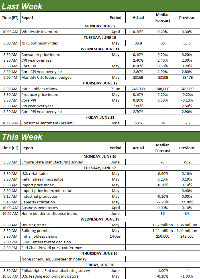
Source: Briefing.com, TradeStation
The coming week’s going to be a big one (in terms of economic news), with the highlight being Wednesday’s decision on interest rates. As was noted, the market’s currently betting the FOMC won’t change the Fed Funds target rate. There’s plenty of other data due that could impact stocks though.
One of those data sets is Tuesday’s look at May’s retail sales. They ticked a little higher again in April, but economists believe this spending measurably fell in May. Just know that the National Retail Federation’s numbers for May have already been posted, and it reported growth. We could be due for a pleasant surprise.
Retail Sales Charts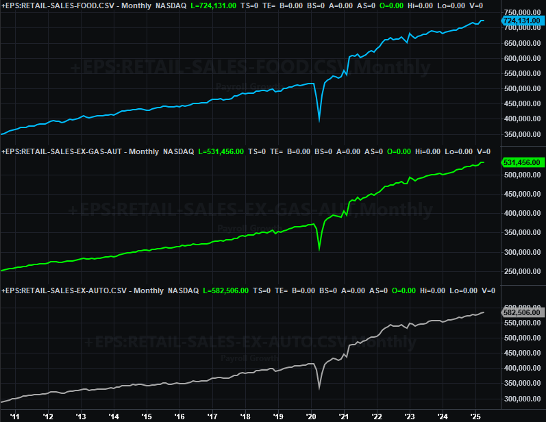
Source: Census Bureau, TradeStation
Also on Tuesday we’ll hear May’s industrial production and capacity utilization. April’s figures were mostly even with March’s, and forecasters expect more of the same this time around.
Industrial Productivity and Capacity Utilization Charts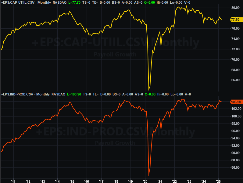
Source: Federal Reserve, TradeStation
This isn’t insignificant data. There’s a strong correlation between corporate earnings, the market itself, and this capacity utilization and production data. Being directionless for a while now, however, there’s not much helpful data to be gleaned here at this time.
Finally, on Wednesday look for May’s housing starts and building permits. They’ve been drifting lower (albeit erratically) since peaking in early-2022. While both will likely tick a little higher this time around, neither is likely to moved meaningfully higher this time around.
Housing Starts, Building Permits Charts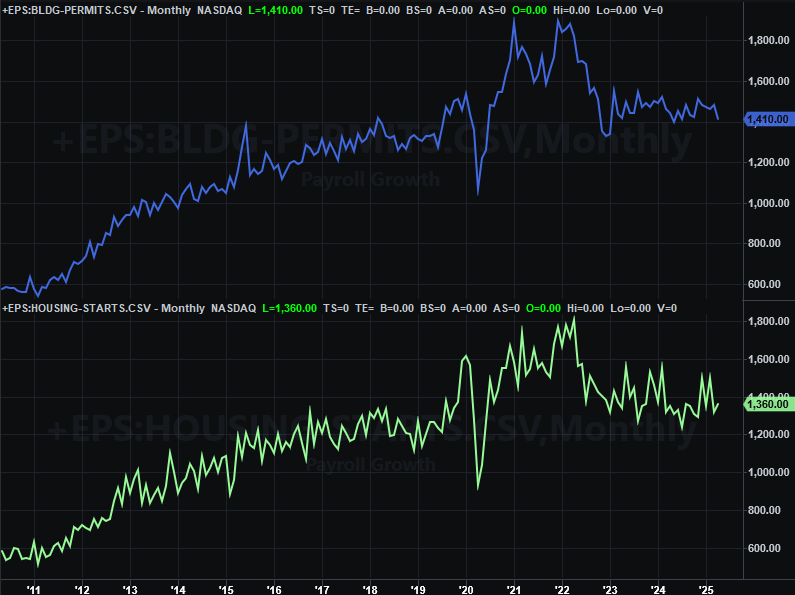
Source: Bureau of Labor Statistics, TradeStation
Yes, this piece of the economy needs a jolt. Lower home prices would help even more than lower interest rates.
Stock Market Index Analysis
The bulk of last week’s stumble is the result of Friday’s drama in the Middle East. And, understandably so. It wasn’t a horrific day, but it was reason for pause. Fortunately the selling didn’t take too big of a bite out of the market.
On the flipside, there’s still certainly ample opportunity for the bears to do more damage…particularly if tensions in the Middle East continue to escalate (which it looks like they will).
The good news is, the next big line in the sand is pretty clear. That’s the 20-day moving average lines. For the S&P 500 on the daily chart below, that’s currently at 5,944, plotted in blue. The pullback almost tested this technical floor on Friday, but seemed to sense it wouldn’t simply be able to break under it. It ended the week on the fence, so to speak. But, it also ended the week on the defensive, and certainly ripe for some profit-taking.
S&P 500 Daily Chart, with VIX and Volume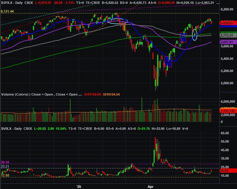
Source: TradeNavigator
This weekly chart of the S&P 500 is a reminder of just how big the rally from April’s low has been (not to mention the February-April pullback), and why there’s so much risk of profit-taking now. The bears will just have to break down a thick layer of support between 5,668 and 5,944.
S&P 500 Weekly Chart, with VIX 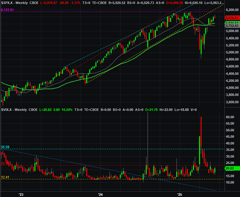
Source: TradeNavigator
The weekly chart of the S&P 500 also shows us something else worth watching. That’s the volatility index, or VIX. It’s not starting to test a technical ceiling right around 23 (red, dashed). It’s not punched through it yet, and may not do so. It’s another “trigger” level to watch though.
The weekly chart of the NASDAQ Composite looks similar, but with one noteworthy difference. That is, it peaked on Friday when it bumped into an established technical ceiling that connects the weekly highs near the end of last year and early this year (orange, dashed). There may be a mental line in the sand that that traders don’t even recognize is in the way. Just remember that – like the S&P 500 — there’s plenty of technical support immediately below. It would take a bit of persistent “umph” from the bears to tip stocks over.
NASDAQ Composite Daily Chart, with VXN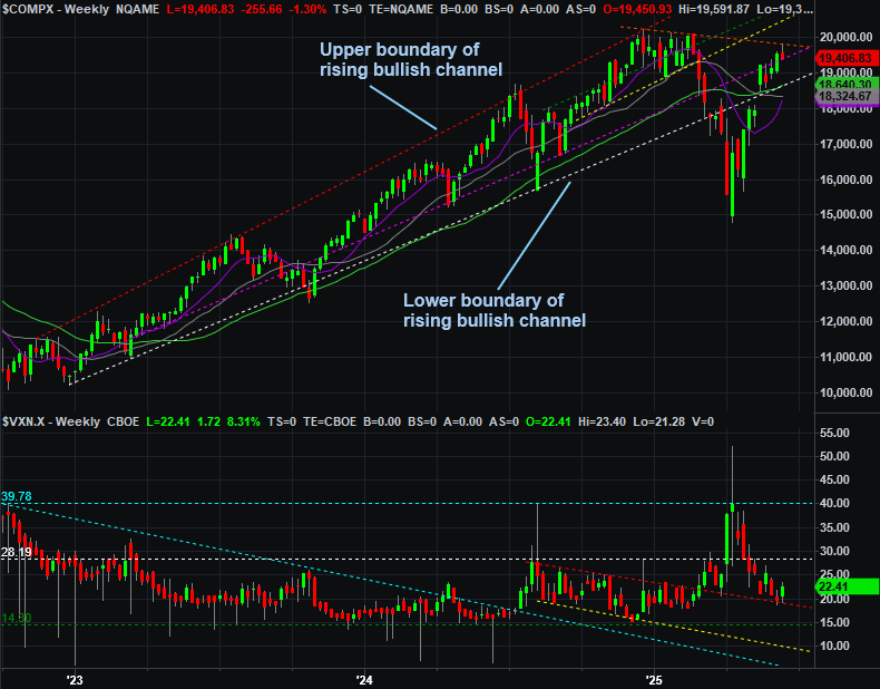
Source: TradeNavigator
It wouldn’t exactly take a heroic effort, however.
Last week we took a look at the NYSE’s up and down volume, and the number of stocks that were above and below their 200-day moving average line. They were, on balance, still leaning in a bearish direction. We’re offering a similarly but slightly different image this week, comparing the S&P 500 to the NYSE’s advancers and decliners (ADV and DECL, respectively), and the NYSE’s up volume (UVOL) and down volume (DVOL). The daily data is too erratic to interpret. By plotting moving averages for each of these four data sets, however, we can get a good feel for the underlying trend. As you can see, the up-volume and advancer trends are in decline, while the down-volume and decliner trends are rising.
S&P 500 vs. NYSE Advancers/Decliners and Up/Down Volume 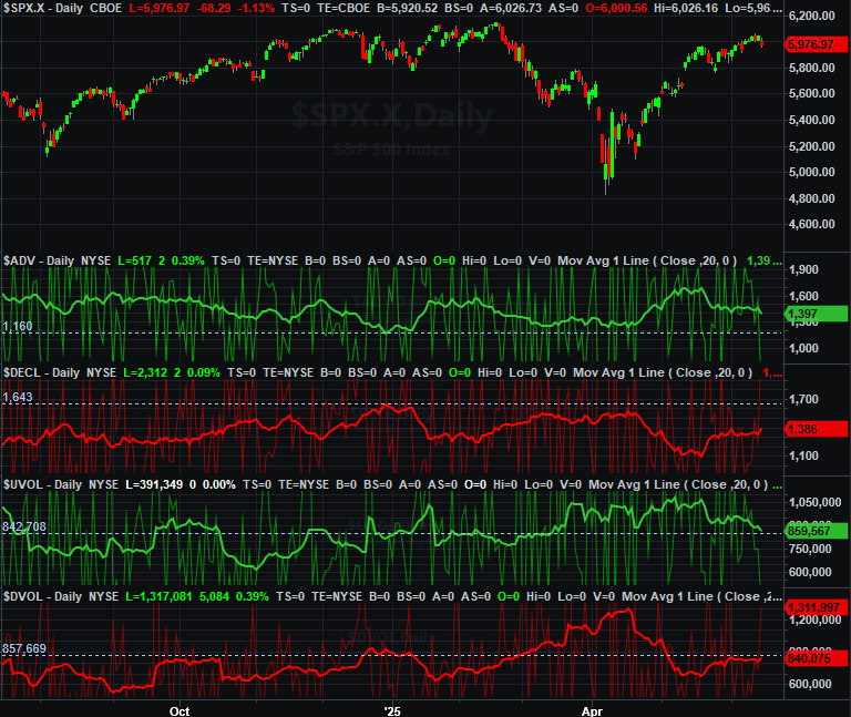
Source: TradeNavigator
It’s not a rock-solid sign of inevitable disaster. Breadth and depth naturally turn bearish when the market falls. But, these underlying trends are a little better developed than the market’s budding pullback. The undertow has actually been net-bearish for some time to get the chart above into its current state.
That doesn’t have to mean something. It can mean something though. With the market being as vulnerable to a correction as it is here, it would be naïve to ignore this dynamic.