
Despite the rough start to the holiday-shortened week, the bulls got back in the saddle early in, and didn’t really get off. While stocks peeled back a little from Friday’s intraday highs, they still reached record highs that day, and closed high enough to leave the indexes in the black for the four-day stretch. That’s encouraging after a couple weeks of weakness.
It’s still too soon to say the market’s going to escape its usual September weakness though. The bulls did seem hesitant to push much farther beyond Friday’s new intraday highs, and volume is still conspicuously missing from any bullish day. In fact, the S&P 500 appears to be running into a newly-established technical resistance line that may well be setting the stage for a sizeable setback.
We’ll look at that in a moment. Let’s first review last week’s biggest economic announcements and preview what’s in the lineup for this week.
Economic Data Analysis
Last week’s party started on Tuesday with August’s ISM Manufacturing Index update. The Institute of Supply Management it ticked up a little more than first anticipated, reaching 48.7 (although that’s still below the critical 50 mark). Meanwhile, Thursday’s ISM Services Index update for last month also edged deeper into positive territory, improving from 50.1 to 52.0 versus estimates of 50.8. Although
ISM Services, Manufacturing Index Charts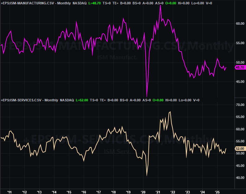
Source: Institute of Supply Management, TradeStation
Although both measures are now moving in the generally bullish direction, these aren’t yet trends that meaningfully work in the market’s long-term favor.
Last week’s big news was of course Friday’s jobs report. Economists had a feeling it would be less than thrilling. They didn’t know how right they’d be. We only added 22,000 new (net) jobs in August — a multiyear low that extends a well-established downtrend — which was enough to push the unemployment rate back up to 4.3%,
Unemployment Rate, Payroll Growth Charts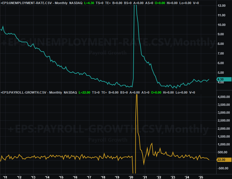
Source: Census Bureau, TradeStation
Neither number in and of itself is disastrous. It’s getting more difficult to deny we’re seeing clear trends here… for the worse. But, this may ultimately work in the market’s favor. Friday’s bullishness was of course spurred by assumptions that a weak jobs market will actually spur the Fed to lower interest rates as hoped later this month. In this vein, the market’s now saying there’s a 92% chance of a quarter-point rate cut on September 17th (when the FOMC is scheduled to make the decision).
Everything else is on the grid.
Economic Data Report Calendar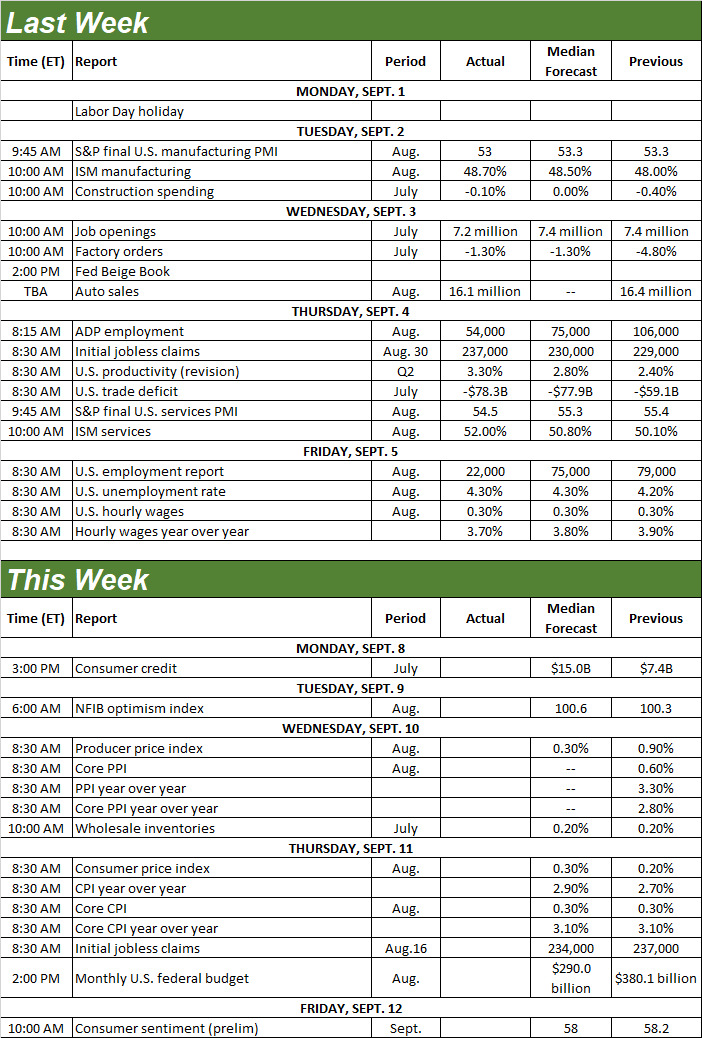
Source: Briefing.com, TradeStation
And speaking of rate cuts, the Federal Reserve just might get the last incentive it needs to make it happen this week. Last month’s producer inflation rates will be posted on Wednesday, while the consumer inflation figures for August will be released on Thursday. You may recall all of them have been creeping higher for a few weeks now, and it doesn’t appear that’s likely to change much this time around.
Consumer, Producer Inflation Charts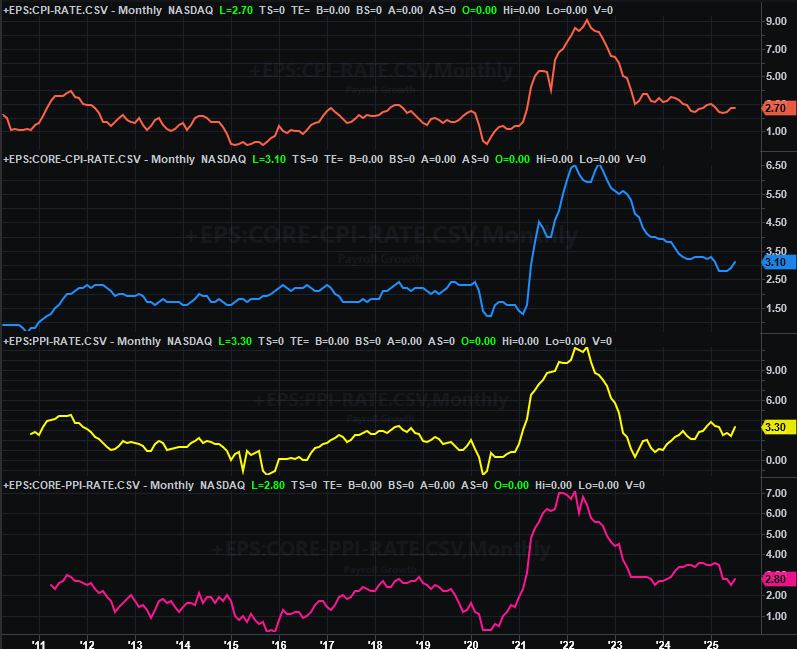
Source: Bureau of Labor Statistics, TradeStation
This of course is a problem for the Fed. Lower interest rates will very likely spur inflation, which is already on the rise. Ideally for the rate-cut doves, last month’s inflation rates will roll in much less than July’s levels, and much less than what forecasters expect.
Stock Market Index Analysis
We kick things off this week with a rather zoomed-in view of the daily chart of the S&P 500, since there’s some detail here that’s pretty much driving everything else that needs to be discussed. Note that while the index popped back above its 20-day moving average line (blue) on Wednesday and appears to have found support there at Friday’s low, it’s not undeniable that there’s some sort of technical resistance developing that connects all the key highs since late-July (yellow, dashed).
S&P 500 Daily Chart, with Volume and VIX 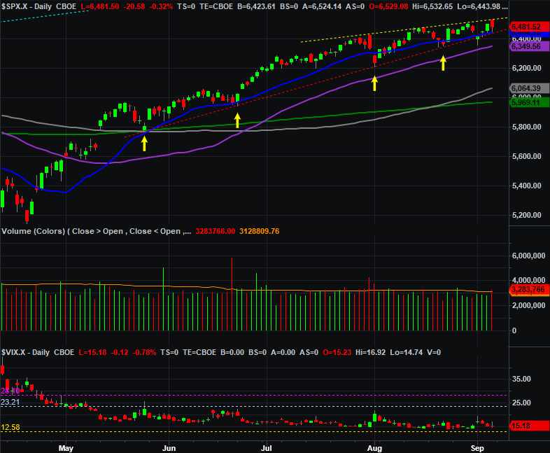
Source: TradeNavigator
This may mean little in the end. Heck, it may ultimately mean nothing. Perhaps it’s all just a coincidence, or maybe the bulls are simply regrouping and consolidating in this ever-narrowing trading range.
A narrowing trading range can be just as bad as it’s good though. A move above this resistance could prove to be a bullish catalyst. In light of the steep 26% climb since mid-April though — in addition to the time of year — the downside vulnerability feels palpable. (Remember, September is more often than not a loser for the market.)
And the daily chart of the NASDAQ Composite looks similar, even if not identical. Its 20-day moving average line looks like it’s acting as support again. But, it’s also failed as support a few times now, and it’s clear that each subsequent high being made since the middle of last month lacks the “umph” you’d really like to see. Again, it’s likely that that sheer weight of the 15% runup from April’s low is holding something — or someone — back.
NASDAQ Composite Daily Chart, with Volume and VXN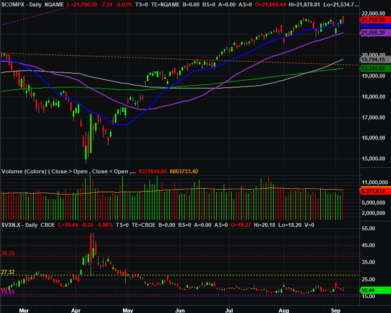
Source: TradeNavigator
Here’s the weekly chart of the NASDAQ for a little more perspective. We’re still making higher highs (mostly), but one is a little more anemic than the last.
NASDAQ Composite Weekly Chart, with MACD and VXN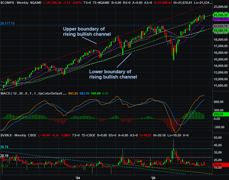
Source: TradeNavigator
The S&P 500’s weekly chart is even more interesting though. The technical resistance line that’s now formed on the daily chart? It’s not exactly new. That’s the same line that used to previously be the lower boundary of the bullish channel that steered the index higher from late-2023 to early-2025. It’s not terribly common for a floor to become a ceiling. When it does though, it’s worth noting… especially when it’s been an effective ceiling for nearly two months.
S&P 500 Weekly Chart, with MACD and VIX 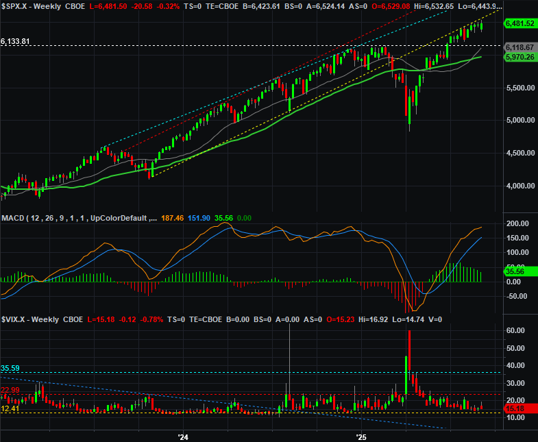
Source: TradeNavigator
So what’s the call? That’s just it. There’s isn’t one. The momentum is still technically bullish, but there’s very little to like about it. Even on the surprise “up” days like Friday there’s still very little volume behind the move, when there should be. It seems like there are some would-be buyers waiting in the wings. The fact that the market can’t get enough sustained bullish traction to actually get them off the sidelines, however, is undeniable. It’s almost as if traders are waiting to see if we get a September swoon, or perhaps quietly waiting for one. Either way, they may ultimately make it happen just to create that self-fulfilling prophecy.
The good news is, the S&P 500’s got quite a bit of technical support just below its current level, the lowest of which is its 50-day moving average line (purple) at 6,350. If it snaps, odds are good we’ll see the September stumble. We’re kind of hoping that’s the outcome from here, in fact… it would be far more manageable than one that starts from an even-higher level.