Another week, another win. The S&P 500 shrugged off the potential spread of the coronavirus — again — gaining 1.57% to plow deeper into record-high territory. Once again though, the volume behind the move was not only modest, but slumped. There's just not a lot of investor participation in the move. There's simply less interest in challenging it. In the same vein, the move continues to be led by a small number of the very biggest stocks, while most others continue to fade. Something has to change, now sooner than later.
We'll look at those factors (and look at why they just haven't mattered yet) below, as always. First, let's run down last week's and this week's economic announcements.
Economic Data Analysis
It was a fairly busy week, though notably, it was a week that didn't dish out any major surprises in terms of economic news. That let investors focus on earnings, and to the extent it matters, the continued spread (though slowing) of the corona contagion.
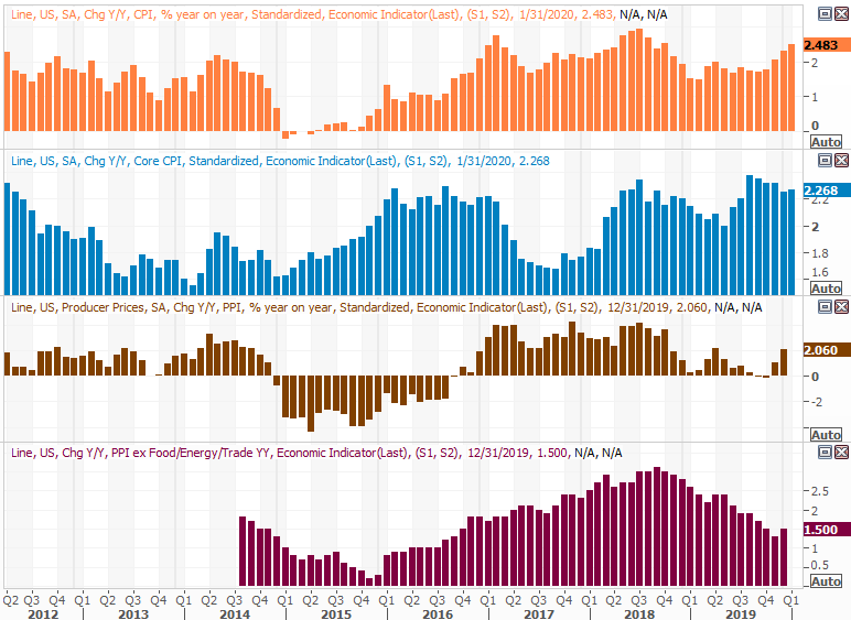
Inflation remains tame… not too hot, not too cold. Core prices were up 0.2% from December's levels, and were up a cooler 0.1% over all. The annualized inflation rate now stands at 2.5%, which is at the upper edge of what the Fed says it can tolerate. But, somehow it doesn't look like the FOMC is looking for a reason to raise rates.
Consumer, Producer Inflation Charts
 [1]
[1]
Source: Thomson Reuters Eikon
We'll get producer price changes this week, on Wednesday, though they're expected to be as tame as consumer inflation has been.
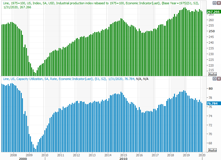
On Friday we also heard from the Fed about last month's industrial output and utilization of the nation's industrial capacity. As expected, both fell a little, though not enough to cause a panic. One lackluster month doesn't make a trend, but this is clearly more than one month's worth of tepidness.
Industrial Production, Capacity Utilization Charts
 [2]
[2]
Source: Thomson Reuters Eikon
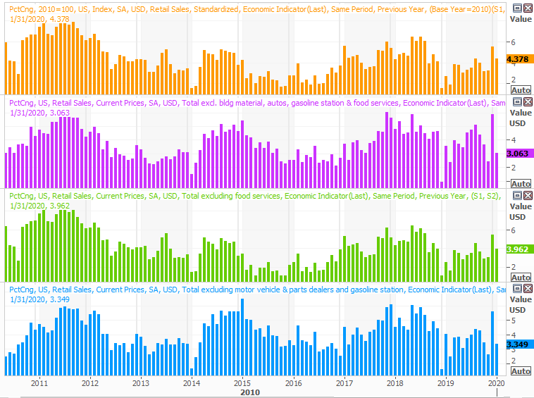
Finally, also on Friday we heard January's retail sales figures. Exactly as expected, they were 0.3% better than December's spending, counting and not counting vehicle sales.
Retail Sales Charts
 [3]
[3]
Source: Thomson Reuters Eikon
Technically speaking, January's retail spending growth fell from December's growth pace. December's growth, however, was a statistical outlier. Either way, the trend remains strong, and broadly appears to be accelerating.
Everything else is on the grid.
Economic Calendar
 [4]
[4]
Source: Briefing.com
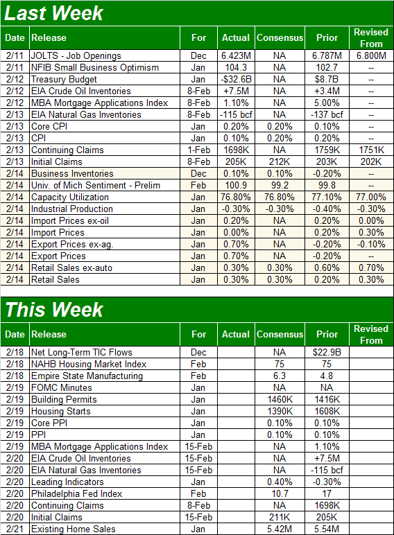
This week's got a couple of big announcements lined up, though it shouldn't be too dramatic…. except for more earnings news. Aside the producer inflation figures, on Wednesday we'll be able to review the minutes from the most recent FOMC meeting, as well as review last month's housing starts and building permits. You'll recall starts surged in December, though that likely had something to do with a year-end rush. Even so, a dip from December's pace wouldn't likely alter the longer-term uptrend we've seen take shape since 2012.
Housing Starts, Building Permits Charts
 [5]
[5]
Source: Thomson Reuters Eikon
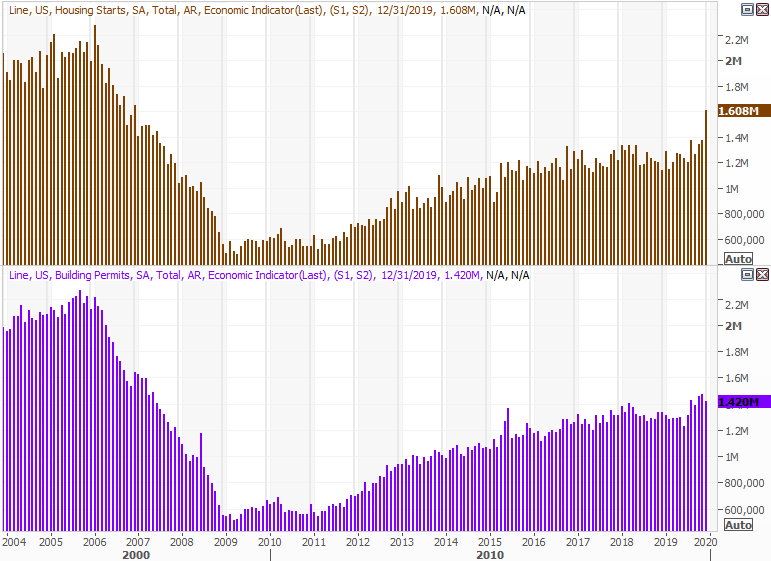
On Friday we'll hear January's existing home sales figure. The pros are calling for a slight tapering of the pace seen in December, but at 5.42 million, that's still strong. You'll see that sales of existing homes as well as sales of new houses (due next week) are both in a broad, occasionally choppy uptrend, with a lack of supply of existing homes perhaps holding buying and selling activity back. That said, it's not like there's a ton of supply of new homes either.
New, Existing Home Sales Charts, with Inventory Levels
 [6]
[6]
Source: Thomson Reuters Eikon
Stock Market Index Analysis
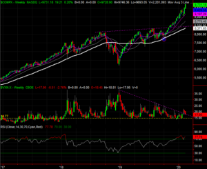
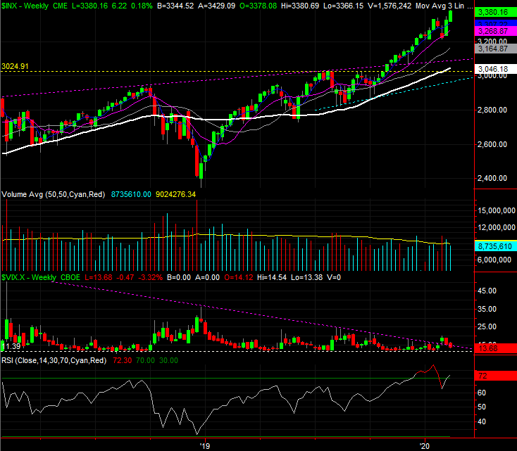
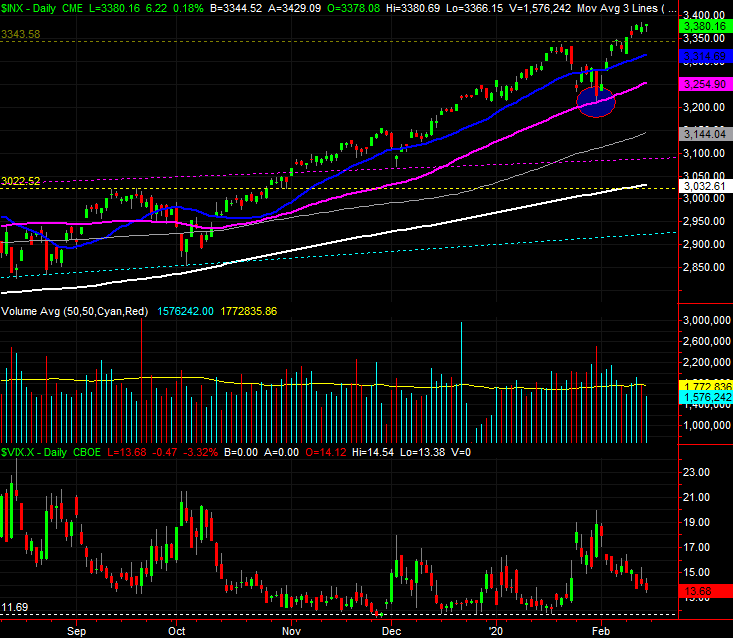
We'll start this week's analysis with a look at the weekly chart, mostly to show you how big last week's jump was following the previous week's jump. The S&P 500's gain of 1.57% last week after the prior week's 3.1% advance is impressive, but also unusual. The index is back into the same overbought situation it was in a month ago, up 44% since the December-2018 low.
S&P 500 Weekly Chart, with VIX and Volume
 [7]
[7]
Source: TradeStation
The weekly chart shows us a couple of other important details as well. Namely, we can see that volume continues to fade the higher the market travels, and we can see the VIX has fallen back below the technical ceiling that had been driving it lows for months now. That's technically bullish (the VIX part), but it also opens the door to a pullback. Sometimes the bears have to punch the bulls in the nose a couple of times to turn the tide. If the VIX moves above its technical ceiling — plotted in purple — a second time and the S&P 500 falls back below its 50-day moving average line (also purple), that could be enough to start the correction that's now well overdue.
Zooming into the daily chart fleshes out some of the details of where we've been, and what's likely to lie ahead. Specifically, we can see just how big of a deal the S&P 500's 50-day moving average line is, and we can see just how disinterested the buyers are… as suggested by low and thinning volume.
S&P 500 Daily Chart, with VIX and Volume
 [8]
[8]
Source: TradeStation
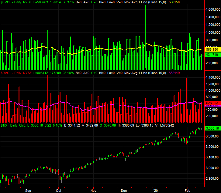
That's not a judgment call either. The chart below compares the NYSE's bullish volume (green) to its bearish volume (red), with the S&P 500 at the bottom. Stocks were up on Friday, but there was more selling volume than buying volume. Even without Friday's oddity, however, there's been more bearish volume for weeks, relative to bullish volume.
NYSE Daily Bullish, Bearish Volume vs. S&P 500
 [9]
[9]
Source: TradeStation
Ditto for the NASDAQ's bullish and bearish volume, though arguably more so.
NASDAQ Daily Bullish, Bearish Volume vs. NASDAQ Composite
 [10]
[10]
Source: TradeStation
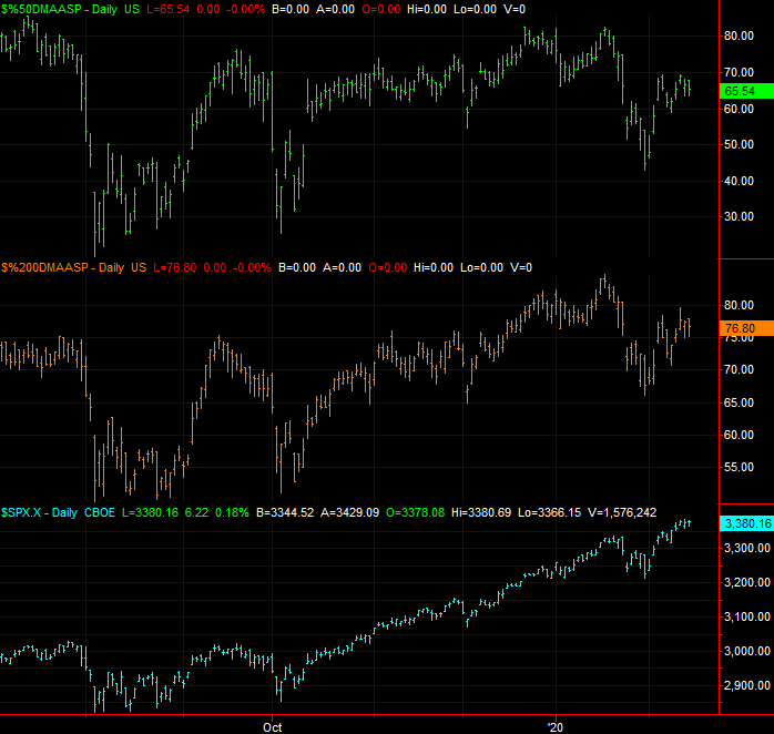
Perhaps more concerning is how more and more stocks are dropping out of the marketwide advance, even as the index continues to climb. The number of the S&P 500's stocks that are now above their 50-day moving average line now stands at 65.5% (green), and has actually pulled back a bit from just a couple days prior. It's nowhere near the number of S&P 500 names above their 50-day lines from just mid-January, above 80%. It's unusual, because the S&P 500 itself is now 3.8% above its 50-day average. That's a little less than the 4.5% divergence from mid-January, but not so much that so fewer stocks should be below their 50-day moving averages. It's a concern just because it indicates the rally is being driven by fewer and fewer names, meaning a smaller number have to do more of the heavy lifting.
S&P 500 Stocks Above 50, 200 Day Moving Average Lines vs. S&P 500
 [11]
[11]
Source: TradeStation
The same analysis of the number of S&P 500 constituents above their 200-day line reveals even more trouble. The index is now 11.46% above its 200-day moving average, versus 11.2% as of mid-January. But, only 77% of those tickers are now above their 200-day lines, versus 84% a month ago. Again, it says more and more names are not participating in the advance.
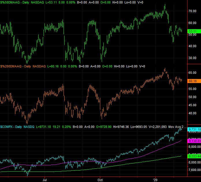
The same goes for the NASDAQ Composite and its stocks, though seemingly more so. Only a little more than half of the NASDAQ's names are above their 50-day moving average lines, and only 60% are above their 200-day lines even though the NASDAQ Composite itself hasn't been as far above either of those moving average lines in years as they are right now.
NASDAQ Stocks Above 50, 200 Day Moving Average Lines vs. NASDAQ
 [12]
[12]
Source: TradeStation
And just for kicks, a weekly view of the NASDAQ Composite. Notice in this timeframe just how far above the 200-day moving average line the index is now. That's a 16.8% divergence.
NASDAQ Composite Weekly Chart, with VXN and Volume
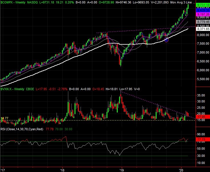 [13]
[13]
Source: TradeStation
The challenge remains the same as it has for months… few argue the market is overbought and ripe for a pretty big correction. Until they're willing to look down and see how overextended stocks are though — and until the bears are willing to plow in for more than just a couple of weeks — that prospect is nothing more than a prospect. We have to side with the present momentum, and we even have to let the indices fall under their 50-day moving average lines (rather than just to them) before we can entertain the worst-case scenario.