– The next leg of the bull market may depend on the Nasdaq breaking through a strong trend line –
By Ryan Vlastelica, MarketWatch [1]
The Nasdaq Composite Index has been the standout stock-market index in 2018, as massive gains in large-capitalization technology and internet stocks have powered it past the Dow and S&P 500, which have themselves been performing notably better than overseas indexes.
Thus far this year, the Nasdaq is up about 15%, well above the 8% rise of the S&P 500 and the 5.3% gain of the Dow. Recently, however, the Nasdaq has struggled. It has dropped 2.1% thus far in September, a steeper decline than the 0.4% drop of the S&P 500, and well below the 0.2% rise of the Dow.
A key question for investors, then, is this: Where will the Nasdaq be going from here, and will the rest of the market follow?
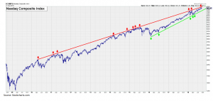
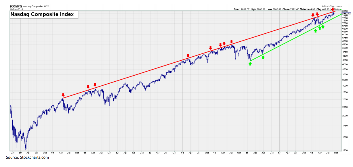
An answer to that question comes in what Andrew Adams, senior research associate at Raymond James, dubbed "the most important chart in the world," a look at the Nasdaq over the past 10 years.
 [2]
[2]
Courtesy Raymond James
What the chart demonstrates, Adams wrote in a report, is the clear trend line that the Nasdaq has repeatedly bumped up against, representing "the upper limit to how high the Nasdaq can go" unless it breaks through it in a more definite fashion. Another line, in green on the chart, shows the lower limit to the index.
"This line has stopped the Nasdaq in its tracks several times over the last few years, and the broad market typically doesn't make it very far without the tech-heavy Nasdaq leading the way," Adams wrote. "The overhead resistance is also why it may be tough to see significant upside in the near term without the index breaking out above the line."
In other words, Wall Street may have trouble moving decisively higher if the Nasdaq doesn't lead the way. The prospects for that could be somewhat difficult, given how many of the biggest weights in the Nasdaq – notably, the FAANG group of Facebook, Apple , Amazon, Netflix and Google parent Alphabet – have stalled after massive moves over the past several years.
Adams conceded that the Nasdaq could break through this trend line but noted that "so far it has not," and that "nothing is stopping the index from just riding that line higher as it did in 2014-2015 either." (See the arrow cluster on the chart's midpoint.)
The Nasdaq has tested both ends of this trading range in 2018, and "until we get a break in either direction," Adams wrote, "we must assume these lines will continue to act as upper and lower boundaries for the Nasdaq."
Raymond James isn't alone in suggesting stocks could be stuck in a range. Also on Wednesday, Morgan Stanley wrote that 2018 could mark "the beginning of a wide trading range that could last several years."
The bank said the boundaries for the S&P 500 would be at the 2,400 and 3,000 levels, a range of 25% at the middle of which the benchmark index currently sits. It closed Tuesday at 2,887.89; based on that, the low end of Morgan Stanley's range would represent a drop of 16.9% from its current level, while the high end would make for a gain of 3.9%. The firm's "base case" price target for the S&P is 2,750, or down 4.8% from current levels.
From MarketWatch [1]