
We knew the market’s persistent gains were getting a bit long on the tooth, leaving stocks vulnerable to a setback. What was a bit surprising was how quickly and dramatically it happened. Starting with Thursday’s unprompted intraday pullback from a new record high that bled into the sizable selloff following Friday morning’s jobs report for July, things changed in an instant. Both of our key indexes are now below the first and nearest technical support levels.
And yet, it’s still far too soon to panic. The sheer scope and size of the setback, in fact, might actually work in the bulls’ favor. It really all depends on how we start things off this week.
We’ll look at the vulnerability that just presented itself in a moment. Let’s first look at last week’s economic announcements that pulled the rug out from underneath the market as quickly as it did.
Economic Data Analysis
Pretty big week in terms of economic news, with what was arguably supposed to be the biggest ending up getting trumped by Friday’s surprisingly disappointing jobs report for July. (That was Wednesday’s decision on the Fed Funds Rate.) Making matters even more confusing was Thursday’s personal income and personal spending numbers for July, which shows both are still growing pretty firmly even without the rate cuts that the jobs figures now suggest are in order.
But first things first. Let’s go through things (mostly) in order of appearance, beginning with Tuesday’s look at home price data. You may recall from a week ago that starts, permits, and home purchases remain at very low levels. Pricing more or less jibes with these clues. While the Case-Shiller Index improved year over year, the pace of this progress is still slowing. Meanwhile, the FHFA Home Price Index fell in July… again.
Home Price Charts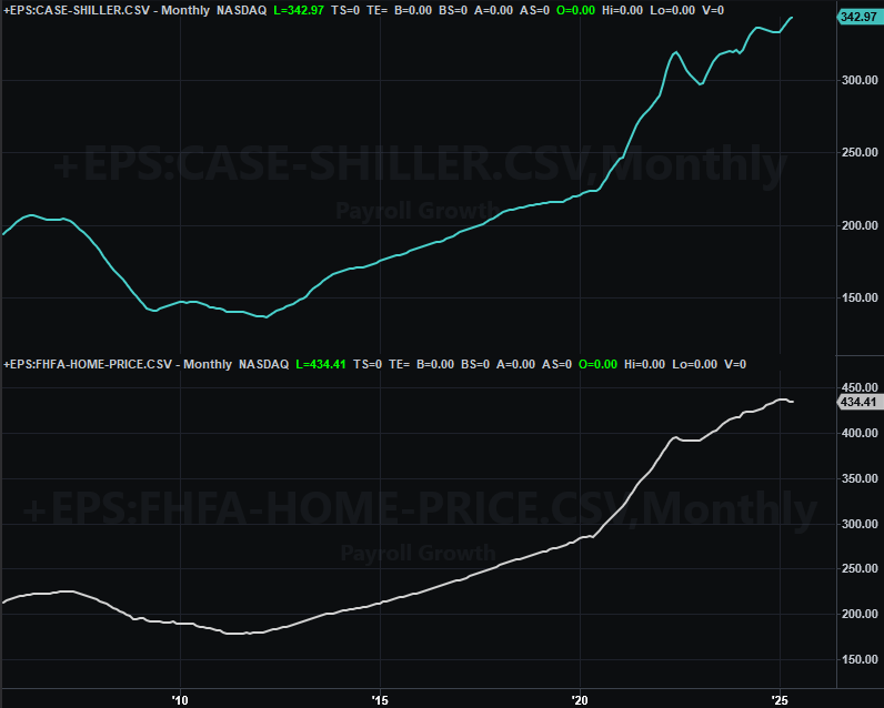
Source: Standard & Poor’s, FHFA, TradeStation
The argument that the lower-cost housing arena where FHFA is more likely to serve as the middleman is showing trouble for middle-income and lower-income families still holds water.
As we’ve also recently suggested though, residential real estate seems to be in its own little world, irrespective of other markets, as well as irrespective of the employment picture. Consumer confidence perked up again last month, and though we’re not charting it here, it’s important to note that consumer expenditures as well as personal income were also up year over year in July (2.8% and 2.6%, respectively). This may be why bigger-picture sentiment continues to improve when the wildly-expensive housing market suggests it shouldn’t. It’s almost as if consumers are watching — and in somce cases even buying — real estate as if it in no way impacts their finances.
Consumer Sentiment Charts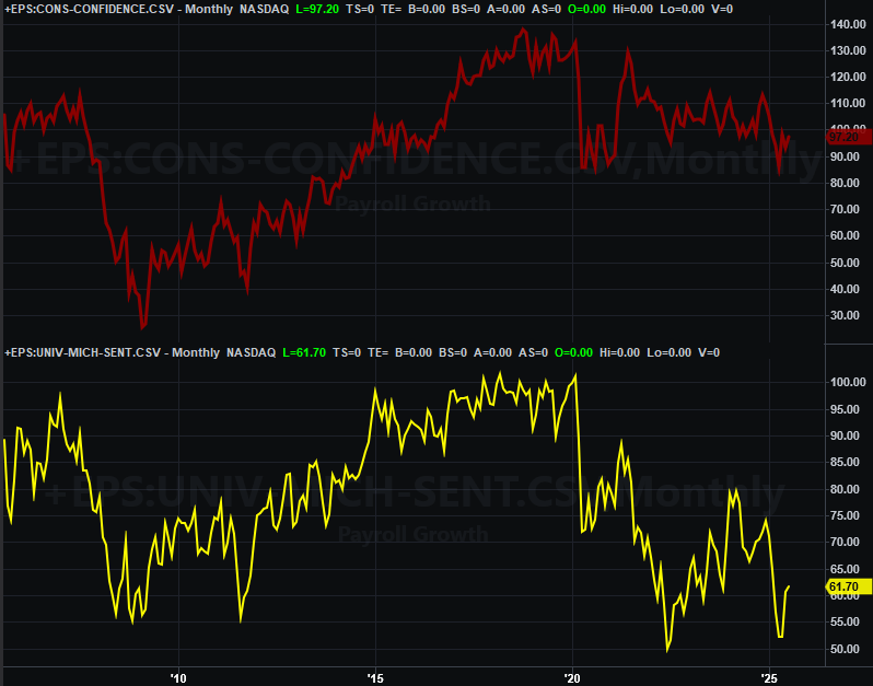
Source: Standard & Poor’s, FHFA, TradeStation
There’s still arguably room for the rate cut we unsurprisingly didn’t get on Wednesday though. On Friday we learned the nation only added 73,000 new jobs last month, down from June’s count of 147,000, and short of the 100,000 economists were expecting. That was just enough job-loss to ratchet the unemployment rate up from 4.1% to 4.2%, which is still a reasonably healthy number though.
Payroll Growth, Unemployment Charts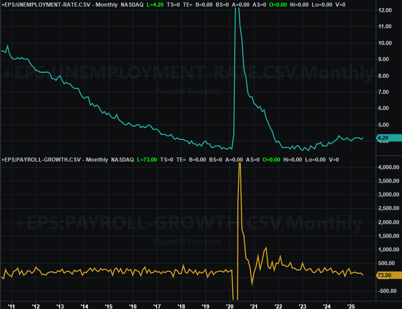
Source: Standard & Poor’s, FHFA, TradeStation
In this vein, as of the latest look traders say there’s a 90% chance of a quarter-point interest rate cut for September, with another quarter-point reduction in the Fed Funds Rate more likely than not before the end of the year.
Economic Data Report Calendar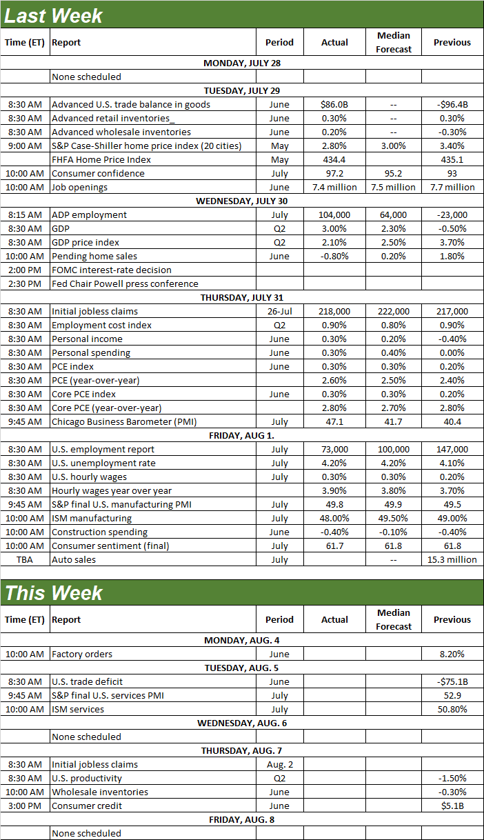
Source: Briefing.com, TradeStation
The only item of interest this week is Tuesday’s services index from the Institute of Supply Management, following last week’s management index update, which fell, and now seems to be making a new downtrend. There’s no outlook yet the services index, although there’s no denying it’s starting what’s becoming longer-term downtrend of its own.
ISM Manufacturing, Service Index Charts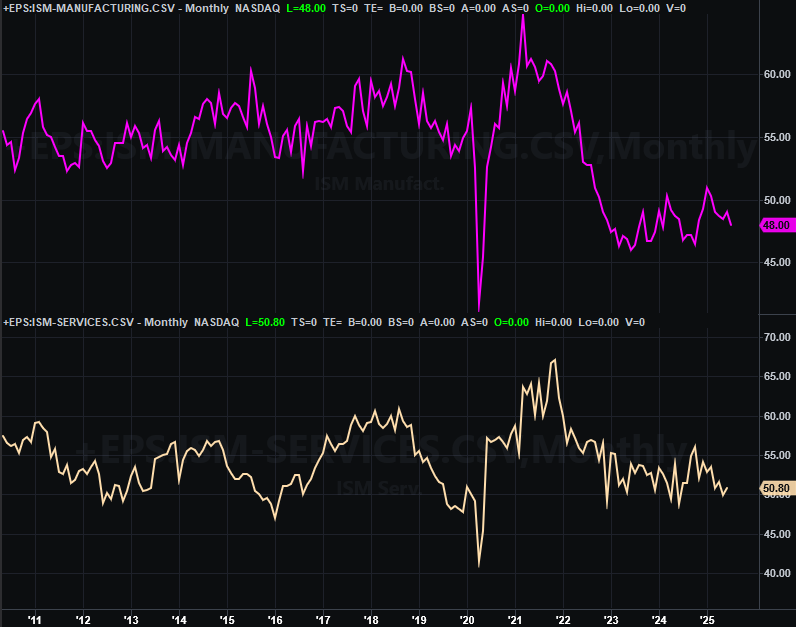
Source: Institute of Supply Management, TradeStation
Stock Market Index Analysis
It feels like Friday’s setback following July’s lousy jobs report was the cause of last week’s setback. And to be fair, on a net basis it was. Friday’s 1.6% pullback from the S&P 500 accounts for most of the week’s 2.4% selloff. But, the weakness actually started well before that. As the daily chart of the S&P 500 below illustrates, on a closing basis the index lost ground every day beginning on Tuesday, but lost a massive amount of intraday ground on Thursday after reaching a new record high.
S&P 500 Daily Chart, with Volume and VIX 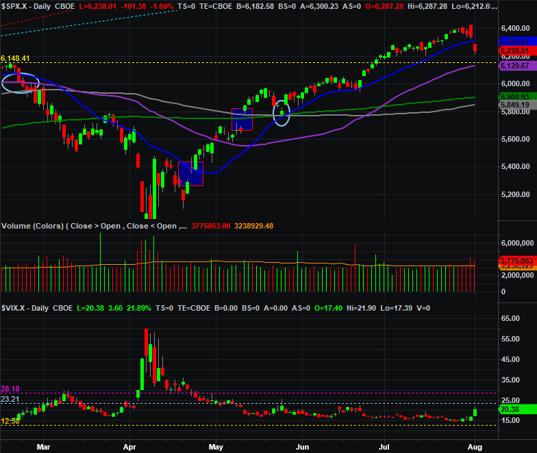
Source: TradeNavigator
So what? It means most traders may have mentally planned to start taking profits soon anyway. They were just waiting for the right catalyst. They seemingly got it with Friday’s payroll growth and unemployment data, but there’s a good chance something like this was apt to happen sooner than later anyway.
It’s not exactly the ideal setback. There was a big gap left behind with Friday’s bearish open, and the market doesn’t exactly like to leave gaps behind. This could create bullish pressure soon, to go back and back and fill the gap in, which could rekindle bullishness. Some traders are certainly looking and waiting for that trigger.
Regardless, the selling that led into Friday’s plunge still did some notable technical damage. It dragged the S&P 500 below its 20-day moving average line (blue) at 6,312. That’s how a more serious correction would get going.
And the NASDAQ Composite’s daily chart looks just about the same. That is, it started Thursday on such a bullish foot that it opened at a record high. But, all of that had been given up by the end of the day, leading to a loss that followed through on Friday following the jobs report.
NASDAQ Composite Daily Chart, with Volume and VXN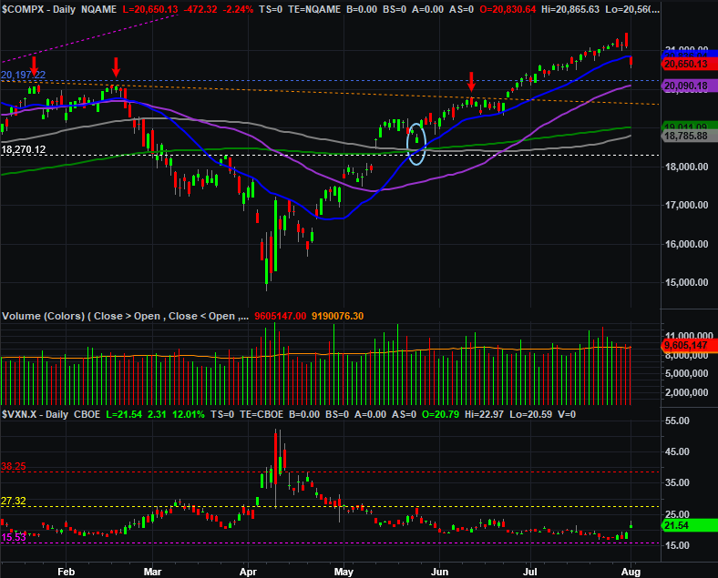
Source: TradeNavigator
More to the point, given the shape and position of the daily bars, it looks like traders had mentally prepared for this reversal before Thursday’s intraday reversal actually started materializing… maybe not to this extreme volatile degree, but at least in a bearish direction.
And zooming out to a weekly chart of the S&P 500 only bolsters the bearish argument. Take a look. Last week’s open was above the previous week’s high, but last week’s close was under the prior week’s open. This is called an “outside day” reversal, and is a major bearish clue by virtue of the extreme speed and severity of the turnabout. This would be an easy pivot to bearishness to follow through on.
S&P 500 Weekly Chart, with VIX 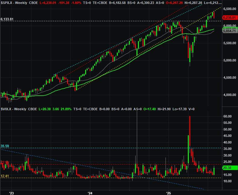
Source: TradeNavigator
Also notice that the reversal happened at what had been a technical floor (yellow, dashed) between late-2023 and well into 2024. This line appears to have become a technical ceiling just within the past couple of weeks, which isn’t necessarily common, but certainly not abnormal either.
The only element that’s missing here that would push the market over the proverbial edge is higher highs from the indexes’ volatility indexes at the bottom of all the charts above. The S&P 500’s VIX did poke higher last week, but we can reasonably say that it would need to move above its horizontal ceiling at 23 (red, dashed) to put a pullback into motion that won’t be stopped until running its full course. That would also likely mean the S&P 500 slides under its previous peak at 6,134.
The good news is, even that correction wouldn’t have to be catastrophic. We still contend the support that’s apt to be supplied by the now-converging 100-day (gray) and 200-day (green) moving average lines around 5,900 will hold, bringing an end to any pullback soon enough.
But first things first. Let’s see how traders are behaving after last week’s shock setback. They should be at least a little more level-headed, giving the market a chance to regroup and rekindle the rally. It might take a few days to catch their breath, leaving stocks on the fence in the meantime.