
The market ended last week in the red, with Friday’s stumble quelling any hope of wiping away Monday’s big setback. Still, stocks closed above all the key moving average lines that suggest the tide remains net-bullish. We’ll lean in agreement.
And yet, there are too many red flags to pretend none are waving here.
We’ll detail what those worries are in a moment. Let’s first look at last week’s key economic announcements and then preview what’s coming this week. That’s quite a load of information.
Economic Data Analysis
The party started on Monday with more real estate data. Namely, rounding out the previous week’s sales of existing homes, new home sales followed suit by also climbing again to an annualized pace of 698,000 units. This might be evidence that the worst of the real estate turbulence is now in the rearview mirror. But, there’s still not quite enough data to confidently support that claim.
New, Existing Home Sales Charts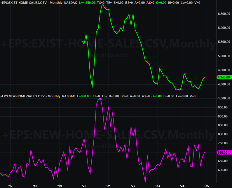
Source: Census Bureau, National Assn. of Realtors, TradeStation
Things really are starting to move more in that direction though… at least as suggested by home prices. While the S&P Case-Shiller Home Price Index continued to inch its way lower from its mid-November peak, the FHFA Home Price Index continued marching into record territory. This might be an indication that higher-priced urban and metropolitan homes are still leveling off from wild price runups during the pandemic. The FHFA’s measure includes all homes, and in particular, rural houses.
Home Price Index Charts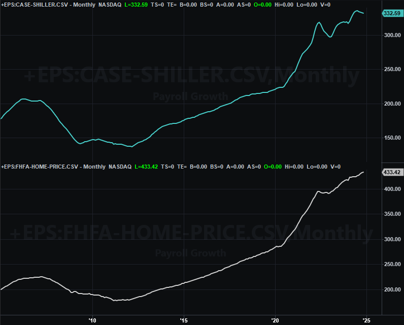
Source: Standard & Poor’s, FHFA, TradeStation
Also on Tuesday we heard the Conference Board’s measure of consumer sentiment for January. It fell, and by even more than expected, following the University of Michigan’s sentiment index’s similar setback. Consumer confidence remains more of a worry than an encouragement, still well shy of pre-pandemic levels.
Consumer Sentiment Charts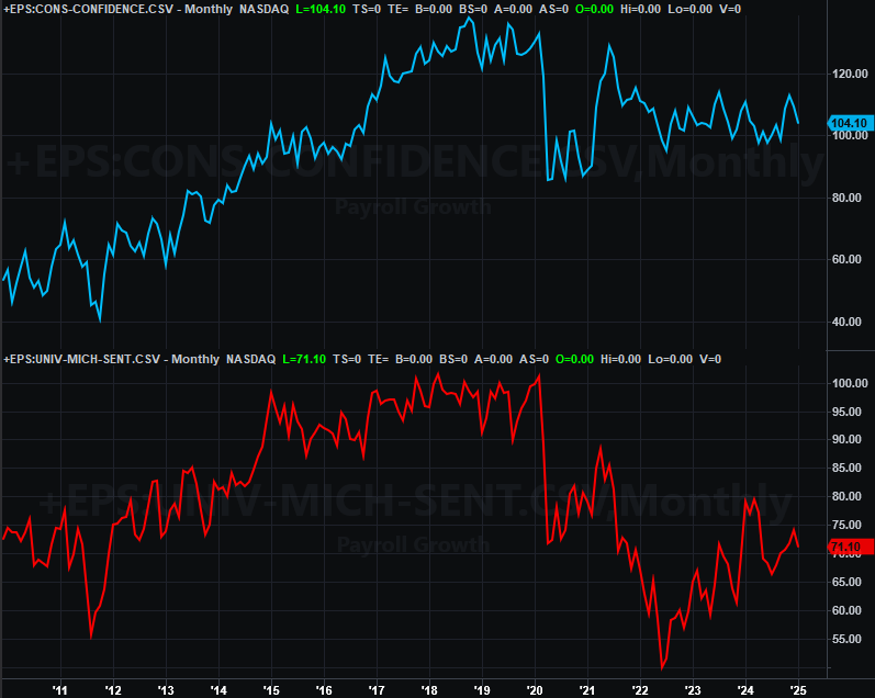
Source: Conference Board, University of Michigan, TradeStation
Last week’s fireworks, however, started in earnest on Wednesday with the Federal Reserve’s decision on interest rates. As expected, they didn’t change…. the first time they’ve not been lowered when the FOMC had a scheduled chance to do so since fall of last year. Also as expected though, the committee remains open to more cuts in the future, but doesn’t seem to be in any hurry to do so.
And, that open-ended thinking is arguably appropriate in light of the news we got Friday. That’s December’s personal income and consumer expenditures… which is data the Fed closely considers when making interest rate decisions. Spending as well as income growth remain steady, and at sustainable levels.
Everything else is on the grid.
Economic Data Report Calendar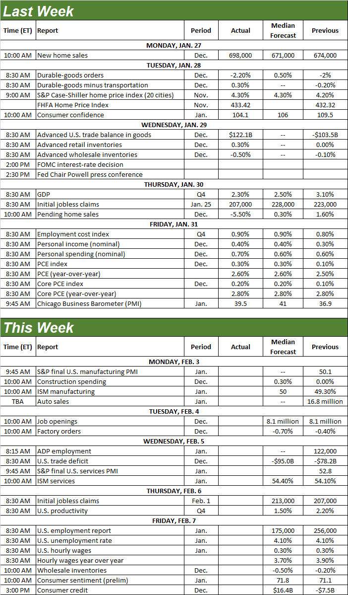
Source: Briefing.com, TradeStation
This week’s schedule is slightly lighter.
On Monday we’ll hear last week’s manufacturing report from the Institute of Supply Management, while the services barometer will be posted on Wednesday. Both are expected to grow just a bit from December’s levels, and more than that, the manufacturing index is finally set to reclaim the pivotal 50 level. As you can see, both indicators are showing budding forward progress. Another good month should be productive for the market’s longer-term trend.
ISM Services, Manufacturing Charts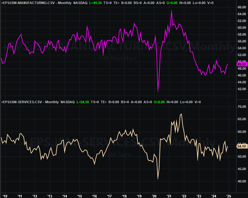
Source: Institute of Supply Management, TradeStation
Finally, on Friday look for January’s jobs report. Economists believe payroll growth will fall from December’s levels, and extending a shallow downtrend that’s been in place since early-2022. But, don’t read too much into it. It may simply be an indication that people who want a job already have one. These same economists also believe the nation’s unemployment rate will remain at a structurally low 4.1% following a bit of a rise since 2023. On balance, the jobs market is healthy, which of course is bullish for stocks.
Unemployment Rate, Payroll Growth Charts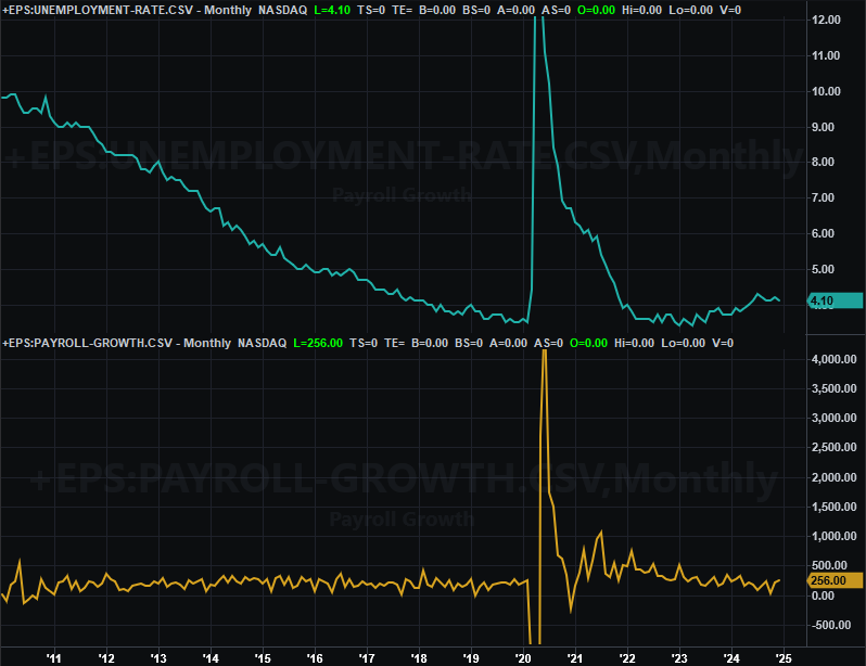
Source: Bureau of Labor Statistics, TradeStation
Stock Market Index Analysis
Just when it looked like the bulls were rolling again, BAM! Monday’s rout threated once again to start what’s still a long overdue correction. The bulls immediately fought back, making the market’s highest high for the week on Friday afternoon. They didn’t stay in a buying mood though. Friday’s close was near the low for the day, and well below Thursday’s solid close. As the daily chart of the NASDAQ Composite below shows us, the index was testing the 20-day (blue) and 50-day (purple) moving average lines as technical support.
NASDAQ Composite Daily Chart, with VXN and Volume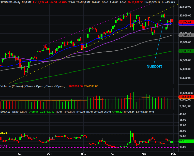
Source: TradeNavigator
The S&P 500 is in seemingly better shape. It suffered the same setback on Monday, and then spent the rest of the week clawing that loss back. When push came to shove on Friday — when the index more or less tested the prior week’s peak near 6,120 — the bulls were in retreat here as well. Nevertheless, at least the S&P 500 finished the week above its 20-day and 50-day moving averages, or the bullish side of these two short-term indicator lines.
S&P 500 Daily Chart, with VIX and Volume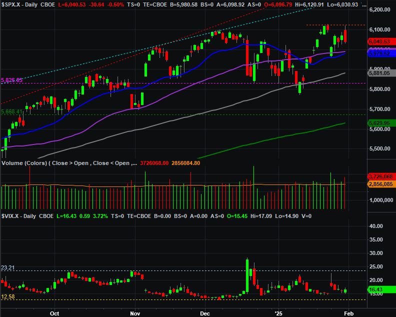
Source: TradeNavigator
Zooming out to the weekly charts of these two indexes adds some better understanding of what’s going on here. Take the weekly chart of the S&P 500 for example. As much whiplash as the index has suffered over the course of the past four weeks, it’s still smack dab in the middle of its long-term (and rising) trading range, and still generally moving in that direction.
S&P 500 Weekly Chart, with VIX and MACD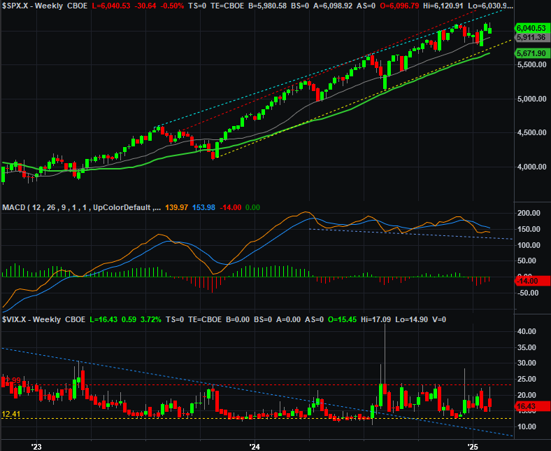
Source: TradeNavigator
One other observation about the weekly chart of the S&P 500…. Its volatility index, or VIX, at the bottom of the image above. It didn’t appear to be dropping many (if any) hints in this somewhat involatile environment. But, maybe it is after all. It seems to have only needed to kiss a technical ceiling around 23 to start peeling back, more or less mirroring the market’s recent back-and-forth action. It’s nothing to really sweat right now, but we will want to keep an eye on this level in the future.
Here’s the weekly chart of the NASDAQ, which does offers us added perspective. Like the S&P 500, it’s edging higher within a rising channel that’s been in place since early 2023. And like the S&P 500’s volatility index, the NASDAQ’s volatility index (VXN) is also suddenly well-framed by technical support and resistance; the VXN’s technical ceiling (red, dashed) connects all the key highs going back to the fall of last year. It’s nothing to sweat now, but like the VIX, it might come into play sooner or later.
NASDAQ Composite Weekly Chart, with VIX and MACD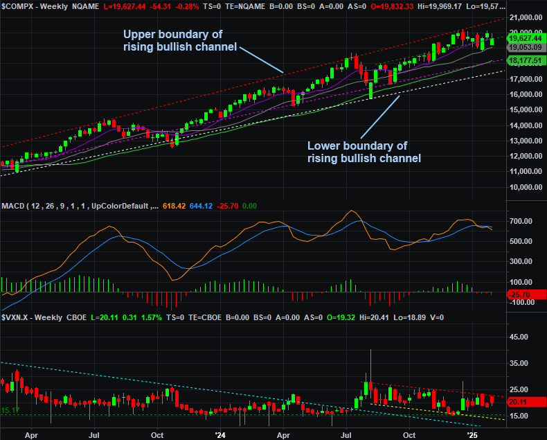
Source: TradeNavigator
That’s not the most noteworthy detail hiding in plain sight on this chart, however. Notice that even with the recent (albeit modest) strength the market’s shown us of late, the NASDAQ Composite’s weekly chart’s MACD lines actually turned bearish a month ago, and affirmed that bearishness last week. Whether or not it seems like it, the bigger-picture momentum here at this time is indeed bearish. The market just needs to snap a couple more technical support lines to get the ball rolling. The VXN and the VIX’s technical ceilings will also fail to cap these volatility indexes once the market starts taking on too much water to fend it off.
Just don’t hold your breath expecting it to happen anytime soon. Even though it’s not actually doing so, it feels like most traders still want the market to move higher from here.