
It could have gone either way, but thanks to a last-minute rally from Friday's lows, the market managed to end last week with a gain. The S&P 500 added 1.7% worth of value to itself last week, pushing up and off of a key support level to do so. The NASDAQ fared even better. The Dow did worse. Even within that disparity though, there's a clue. It says traders are seeking out riskier names again, and shedding slower blue chips to do so. Either way, even the blue chip-laden Dow Jones Industrial Average found technical floors right where it needed to.
We'll take a detailed look at all of it below, as always, but first, let's recap last week's major economic announcements and preview what's in store for this week.
Economic Data Analysis
What a week! The big Kahuna of course was the first look at Q2's GDP estimate. It was better than expected, but meaninglessly so. Rather than contracting the expected 35%, the nation's GDP "only" shrank to the tune of 32.9%. It's all coronavirus, and a huge piece of that headwind has already reversed in the meantime. Don't dwell on it.
That said, the steeply, deeply tumble from the United States' GDP was matched with a decision from the Federal Reserve to simply stand pat with interest rates. The targeted Fed Funds rate is already at a rock-bottom range of around 0.13%.
Still, consumers recognize the temporary nature of the economic headwinds. The Conference Board's consumer confidence reading for July didn't quite hold at June's level of 98.3, but 92.6 is a decent score. The similar University of Michigan Sentiment Index rolled in at 72.5 for last month,
Consumer Sentiment Charts
 [1]
[1]
Source: Bureau of Labor Statistics, TradeStation
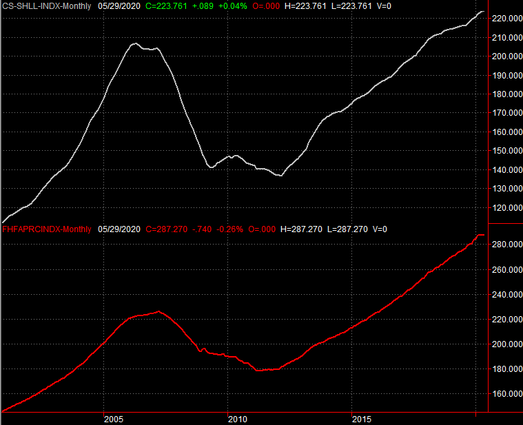
Finally, we also wrapped up July's total look at the real estate market last week with an update of the Case-Shiller Home Price Index. The data is for May, but that's still recent enough to matter in that the real estate market tends to move slowly… up or down. Home prices didn't quite rise the expected 4.1% on a year over year basis, but the 3.7% improvement is still healthy. The similar FHFA Housing Price Index for May didn't rise from April's level, but it was comparably up on a year over year basis.
Home Price Index Charts
 [2]
[2]
Source: Federal Reserve, TradeStation
Everything else is on the grid.
Economic Calendar
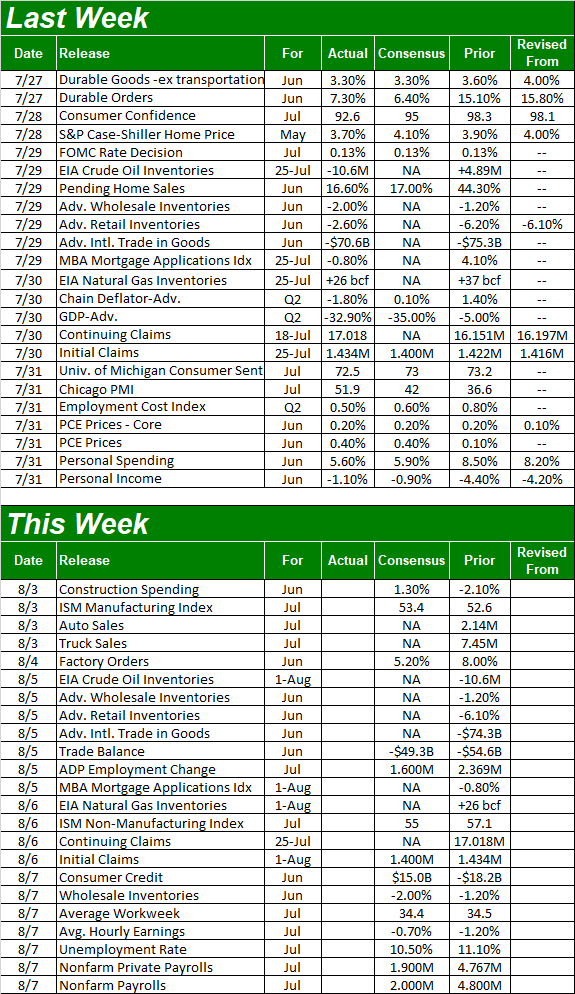 [3]
[3]
Source: Briefing.com
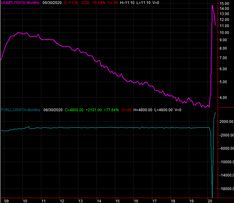
This week is another big one, ending with an update from the Department of Labor about the jobs picture. You'll remember we made shockingly big progress a month ago. That pace won't be sustained. Economists are calling for progress though, modeling the addition of 2.0 million new jobs to drive the unemployment rate down from 11.1% to 10.5%.
Payroll Growth, Unemployment Rate Charts
 [4]
[4]
Source: Department of Labor, TradeStation
Again, keep it in perspective. This is the reversal of an unprecedented degree of job losses. On the other hand, it takes more time to bring them back than it does to lose them.
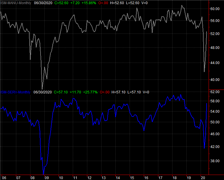
We're also going to get ISM data this week…. manufacturing, and services. You may recall a month ago that both measures shot above their pivotal 50 levels. Both are expected to remain above that mark this time too, though the manufacturing measure should edge up a little while the services reading slides a tad lower.
ISM Index Charts
[1]
Source: Institute of Supply Management, TradeStation
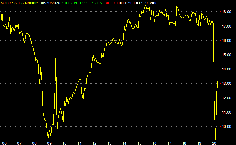
Finally, auto sales reports will start to flow this week, from those manufacturers that still report them. It takes some time to compile them all, but there's no reason to believe they aren't still on the mend. They just remain at very suppressed levels, for logistical reasons as much as demand-based ones.
Auto Sales Charts
 [5]
[5]
Source: Institute of Supply Management, TradeStation
Stock Market Index Analysis
In retrospect, last week's eventual gain can't be a complete surprise. The underpinnings for at least a small bounce were already in place.
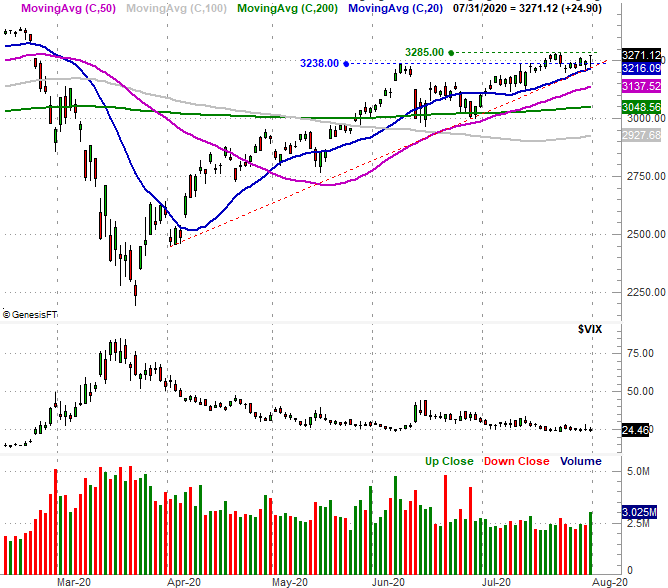
Nowhere is this more evident than with the S&P 500. Take a look at the daily chart. The 20-day moving average line (blue) was already below it, as was a rising support line (red, dashed) that goes all the way back to the early April low. [That latter technical floor is not “huge,” as it only had two nodes made before last week. But, in that it’s now perfectly aligned with the 20-day moving average line, that made it a bit more important.]
S&P 500 Daily Chart, with VIX and Volume
 [6]
[6]
Source: TradeNavigator
The S&P 500 didn't make a new multi-week high, failing to move above the previous week's peak near 3285 (green, dashed). That's not terribly troubling though, as forward progress has been choppy and inconsistent since May. Besides, the buying volume is seemingly starting to come out of the woodwork. Friday's volume behind the bullish move was the best we'd seen in a couple of weeks.
Except, it wasn't.
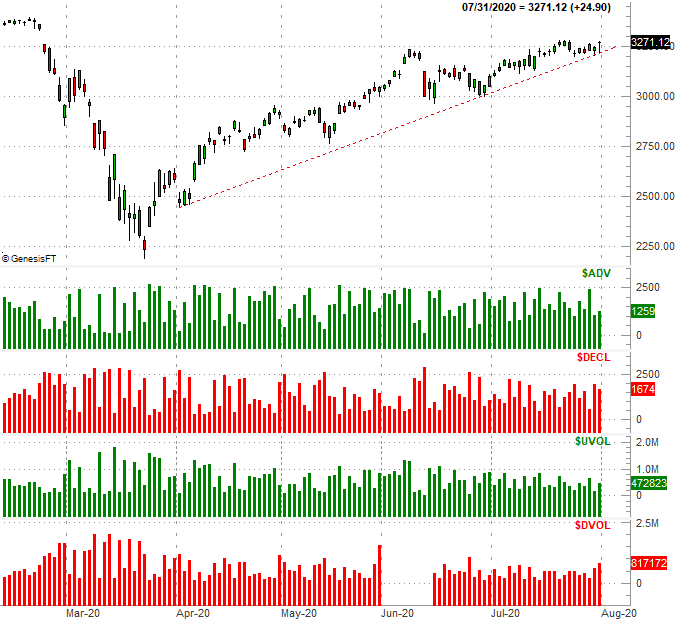
A closer look at the NYSE's daily advancer, decliner, up volume and down volume day tells us that even though "the market" managed to log a gain, it did so with a minority of stocks contributing to the effort. There was more bearish volume than bullish volume – at least for the NYSE's tickers – and more decliners than advancers. [We’re only showing the NYSE’s chart here compared to the S&P 500, but the NASDAQ’s breadth and depth were similarly bearish. It’s just the biggest heavy-hitters doing ALL of the bullish legwork on Friday, offsetting the bearish impact of the index’s/exchange’s losers.]
S&P 500 Daily Chart, with NYSE Up/Down Volume and Advancers/Decliners
 [7]
[7]
Source: TradeNavigator
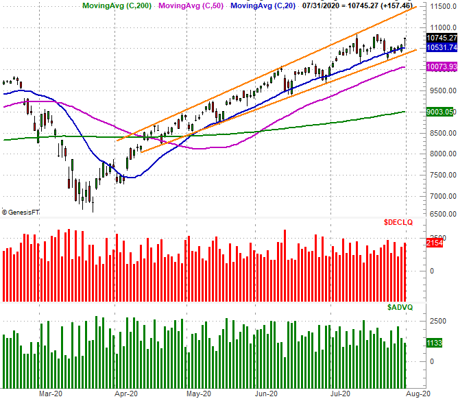
The same ideas essentially apply to the NASDAQ Composite. That is, the composite once again found support at a well-established support line (orange) that's part of a bigger, rising trading range that extends back to April. Yet, the number of decliners is at the very least holding steady, while the number of advancers appears to be waning. This is despite the fact that last week's 3.7% advance for the NASDAQ was one of the better weeks in a long while.
NASDAQ Composite Daily Chart, with Advancers/Decliners
 [8]
[8]
Source: TradeNavigator
As for the Dow, this is where things get interesting. It actually lost a little ground last week, and remains trapped right around a convergence of several key moving average lines (20, 50, and 200). It also remains below a minor technical ceiling (orange) that connects the key highs going back to February's peak.
Dow Jones Industrial Average Daily Chart, with Volume
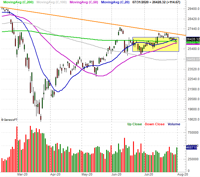 [9]
[9]
Source: TradeNavigator
In some regards this is actually kind of bullish, in that it says traders are steering away from the general safety that blue chips would normally provide in favor of some of the bigger, more aggressive big tech names found in the NASDAQ. Still, we'd still rather see all the indices at least somewhat participate in a rally to believe in it, and we'd rather see more bullish volume and advancers than bearish volume and decliners. We're just not seeing that.
That doesn't mean in can't happen from here. But, we're in a slow time of year for stocks anyway, with the worst month of the year for the market in sight. That's September, which on average translates into about a 0.6% loss for the S&P 500. In the shadow of its 50% gain since March's low, a little weakness seems inevitable sooner than later. The good news is, the NASDAQ and the S&P 500 both have plenty of moving averages not too far below them that could step up as support. A small blip should be enough to hit the "reset" button and set the stage for the usual year-end bullishness.
Of course, if the S&P 500 and the NASDAQ manage to move to higher highs (than two weeks ago), that may well inspire a fresh wave of buying. The fear-of-missing-out has been strangely strong of late. Also of course, the coronavirus outbreak and its corresponding headlines are in the driver's seat.