
The market ended up closing last week more or less in line where it closed the previous week. So, no harm, no foul. For the second week in a row, however, it ended the trading week losing ground, and once again logged a lower high. The lack of ability to make sustained forward progress is a red flag to be sure, but it’s too soon to say the trend is bearish.
That’s certainly a legitimate concern though. A few more tough days could still push stocks over the cliff, so to speak. The good news is, those lines in the sand are pretty well defined.
We’ll take our usual detailed look at everything in a moment. Let’s first work through last week’s biggest economic reports and then preview what’s coming this week.
Economic Data Analysis
Not a terribly busy week, but what we got… well, let’s just say it delivered mixed messages. Take January economic activity measured by the Institute of Supply Management as an example. Manufacturing activity finally fought its way back above the pivotal 50 mark, and by more than expected. Conversely, although still above 50, services activity fell by more than projected. In both cases it looks like these opposing moves are part of budding or rekindled trends. Unfortunately, it’s not clear what they’re telling us.
ISM Services, Manufacturing Charts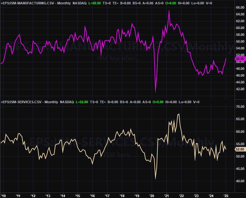
Source: Institute of Supply Management, TradeStation
The only other major item from last week came on Friday. That’s January’s jobs report, which of course is the chief reason for that day’s sizeable intraday swing back to bearishness to end the week on a bearish foot. Although payroll growth of only 143,000 jobs fell short of expectations and fell quite a bit from December’s adjusted figure of 307,000, that was still enough to dial the unemployment date down to 4.0% versus forecasts of 4.1%. Although the labor force grew quite a bit, the number of people with jobs improved just a bit more, while unemployed numbers fell just a tad.
Unemployment Rate, Payroll Growth Charts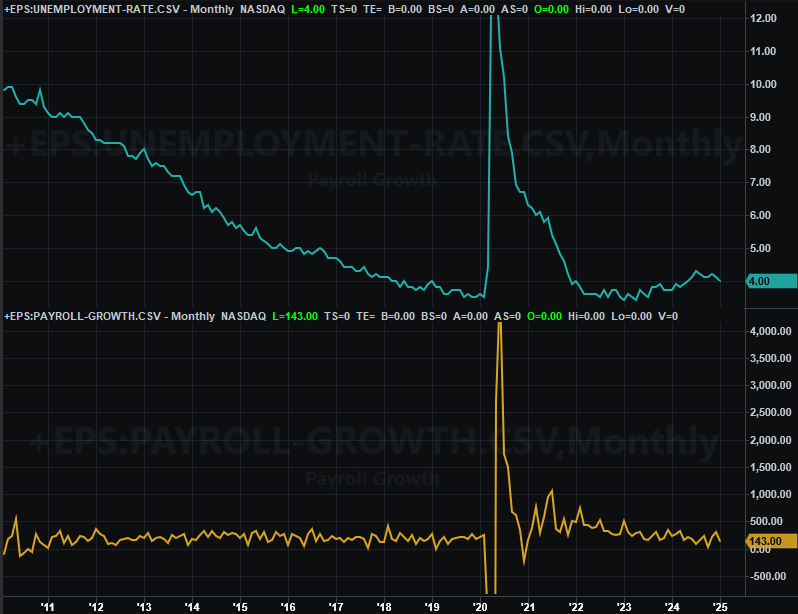
Source: Bureau of Labor Statistics, TradeStation
On balance, it’s difficult to interpret these numbers and current status as anything but net-bullish, even of only modestly. Nevertheless, these solid figures weren’t solid enough, prompting some interpretations that the economy is actually weakening, sending stocks lower as a result. The Federal Reserve may not be in much of a position to help with interest rates either, which need to be supported since inflation isn’t exactly waning. More on this in a moment.
Everything else is on the grid.
Economic Data Report Calendar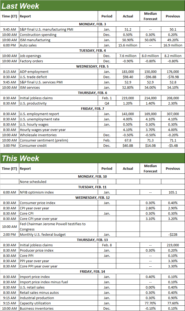
Source: Briefing.com, TradeStation
And exactly how persistent is inflation? We’ll find out this week, with Wednesday’s look at last month’s consumer inflation rate, followed by producer inflation data on Thursday. All stratifications are leveling off at levels slightly above the Fed’s targets, where they’re likely to hold this time around too. The healthy jobs report only bolsters this possibility, since it supports consumers’ ability to pay current prices.
Consumer, Producer Inflation Rate Charts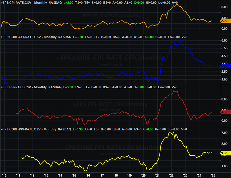
Source: Census Bureau, TradeStation
We’ll know for sure — at least a little better — about this premise on Friday when we get last month’s retail sales numbers. Excluding automobile sales, they’re expected to continue improving at the same basic pace we’ve seen for the past several months.
Retail Sales Charts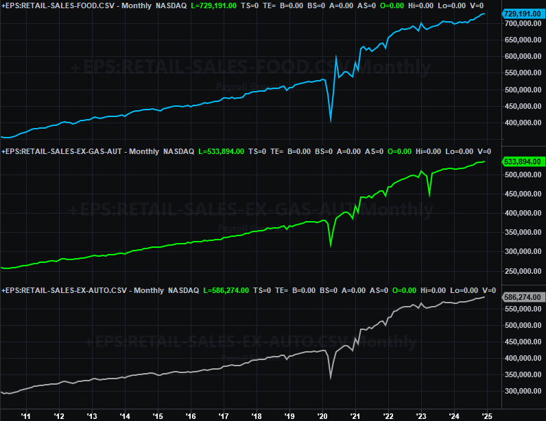
Source: Census Bureau, TradeStation
Also on Friday look for January’s capacity utilization and industrial productivity report from the Federal Reserve. Both are important economic barometers, as well as long-term market barometers. It looks like both are now pointed upwards here, with a bit more improvement on both fronts expected this time around.
Capacity Utilization, Industrial Productivity Charts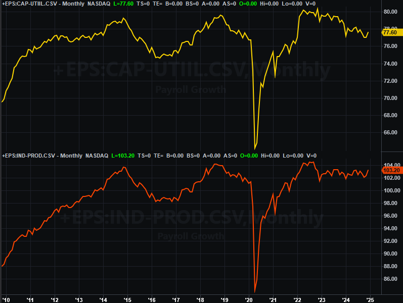
Source: Federal Reserve, TradeStation
If we had to give the total of last week’s economic news a school grade, it would be a B+.
Stock Market Index Analysis
Despite Monday’s and Friday’s stumbles, it feels like the market performed reasonably well last week. And it did. Both indices basically broke even, and both managed to hold above key technical resistance. Perhaps the bulls are still firmly in control.
There are a few more worries than it seems like there are with just a superficial look though.
Let’s start with a look at the daily chart of the S&P 500 below. As you can see, although all it took was a brush with an established — and falling — short-term resistance line (orange, dashed), the index still managed to remain above its now-converged 20-day (blue) and 50-day (purple) moving average lines, the former of which crossed above the latter on Thursday. This is technically bullish.
S&P 500 Daily Chart, with VIX and Volume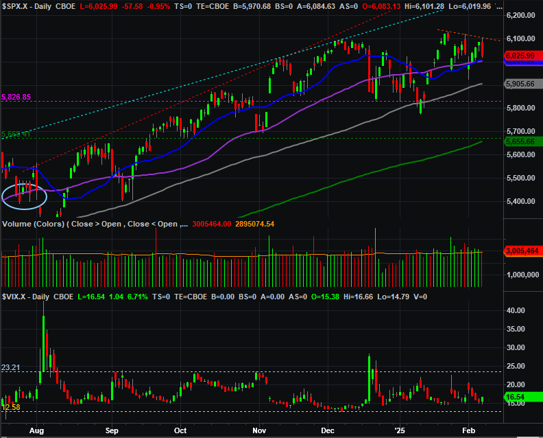
Source: TradeNavigator
Now let’s take a step back and look at the weekly chart of the S&P 500, which again shows us the index more or less ended the week even with the prior week’s close, as well as above the 100-day moving average line (gray). Moreover, the bigger-picture uptrend that’s been in place since early-2023 is still very much intact.
S&P 500 Weekly Chart, with VIX and MACD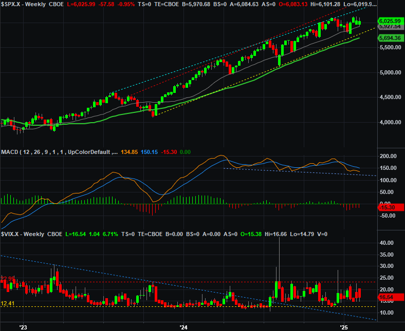
Source: TradeNavigator
Now take a closer look. We also saw a lower low and lower high last week, and the bearish MACD divergence that first took shape late last year is widening again. The weekly chart also reminds that even though the index remains inside the confines of a rising trading range, there’s still at least a little bit of room for it to keep falling within this channel.
The daily chart of the NASDAQ Composite looks similar, but worse. This index closed back under its 20-day and 50-day moving average lines after bumping into its falling resistance line that’s been in place since late January. Moreover, notice that — unlike the S&P 500 — the NASDAQ never quite touched its peak from late December, while the S&P 500 slightly surpassed it before pulling back.
NASDAQ Composite Daily Chart, with VXN and Volume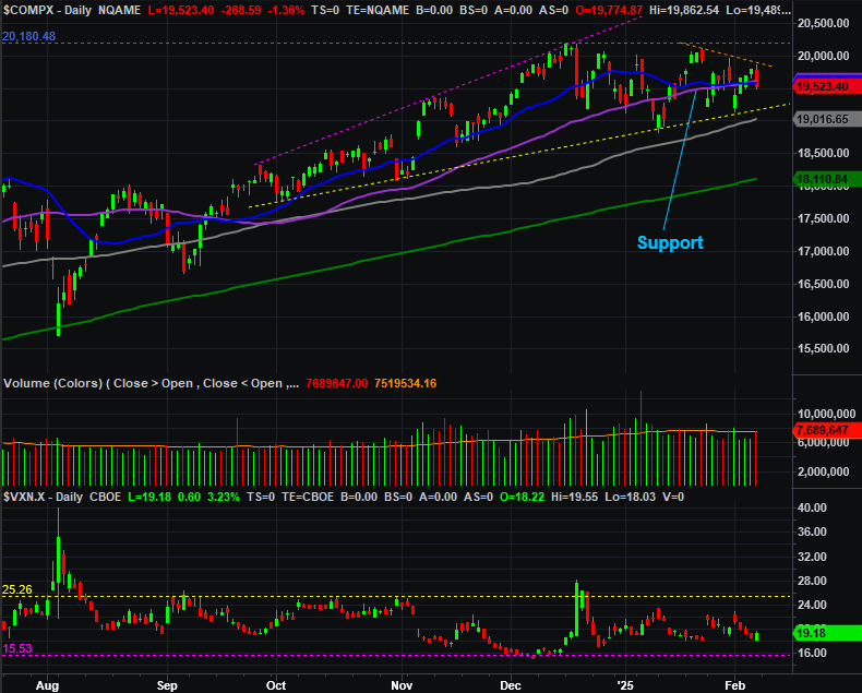
Source: TradeNavigator
The weekly chart of the composite still puts this action in perspective though. Like the S&P 500, there’s still plenty of room for the NASDAQ to continue falling without actually breaking under the lower boundary. The index may well be about to use all of that room, however. As the weekly chart of the NASDAQ Composite also shows, the bearish MACD cross from early this year is also widening.
NASDAQ Composite Weekly Chart, with VIX and MACD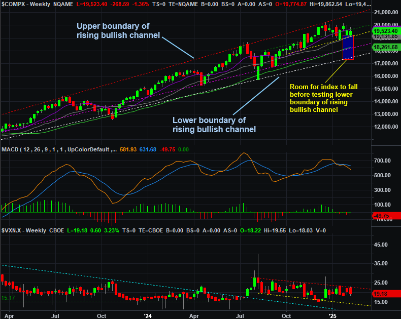
Source: TradeNavigator
Just because there’s reasonable room for an index to keep falling, however, doesn’t necessarily mean it will. It just means it might happen.
On the note, the signal for the beginning of a trade-worthy pullback that we’re watching for isn’t a particular pattern or level from the NASDAQ Composite, but rather, the NASDAQ’s volatility index (or VXN) at the bottom of the chart above. As you can see, it tested its own falling ceiling (red, dashed) last week at 22.9. It ultimately peeled back, in step with stocks’ rebound. Both are testing the equivalent technical support/resistance though, underscoring the idea that there may be something more to them.
Let’s not jump to any directional conclusion here, since the market’s not offering up any really strong hints that a move is brewing in either direction. Rather, let’s bide our time here and wait for one side or the other to make a clear commitment to a direction.