
 [1]What a week! After slumping (hard!) in the holiday-shortened week before, stocks erased brewing doubts with some conviction last week, with the S&P 500 gaining 4.8%. It was the best week the market's had in seven years, though circumstances may have helped. Whatever the case, it was a much-needed confidence boost.
Still, despite the big gain, the major indices haven't cleared a handful of major hurdles. It's possible the bounce was largely the result of the big pullback the week before, and there's no life left in the move. The odds and clues, however, point to more upside, if…
We'll look at the move and what's apt to be in store for December below, as always. Before we get to that, though, let's run through last week's major economic news and preview this week's economic announcement. The biggie is on Friday – last month's employment report.
Economic Data Analysis
Last week's announcements got started with a huge update on the state of the nation's real estate industry. Home prices continued to rise, but as we've seen for a few months now, the pace of that growth is slowing.
Home Price Index Charts
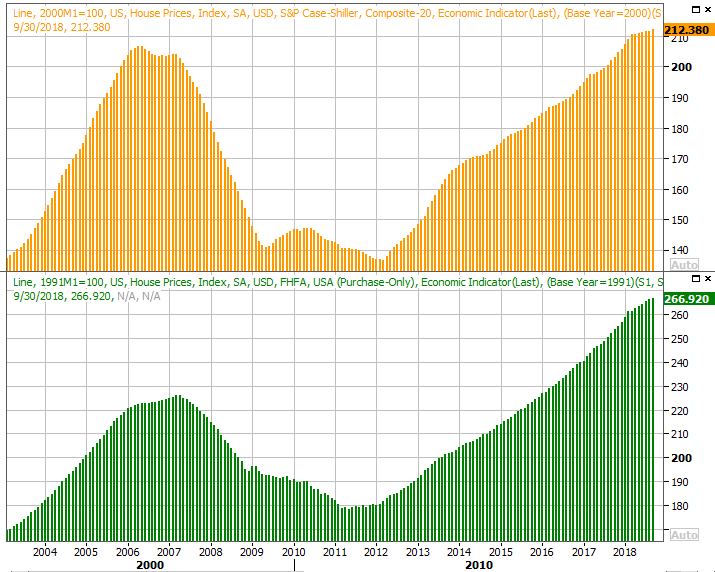 [2]
[2]
Source: Thomson Reuters
In step with that slowdown, sales of new homes fell from September's 553,000 to only 544,000, in conjunction with an uptick in inventory. In fact, on a year-over-year basis, last month's 8.9% dip in new home sales was the biggest slide in a long while, dragging the rate to a two-year low. We're seeing a similar trend in existing home sales.
New, Existing Home Sales and Inventory Charts
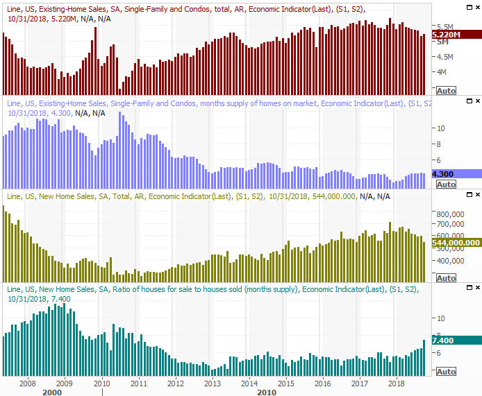 [3]
[3]
Source: Thomson Reuters
Everything else is on the grid.
Economic Calendar
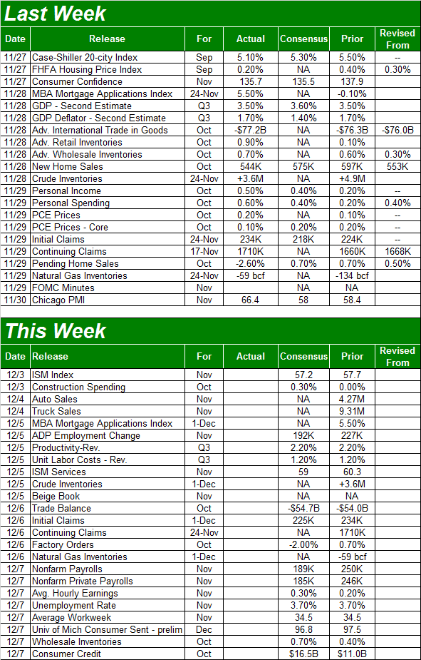 [4]
[4]
Source: Briefing.com
The big news for this week is a look at last month's job numbers, but there are some other big announcement to process before then. Namely, we'll get both ISM numbers (manufacturing and services) on Monday and Wednesday, respectively. And, on Tuesday we'll last month's automobile sales figures.
The services side of the data continues to trend higher, though manufacturing is cooling off. Both are still above the key 50 level, but both are expected to inch a little lower this time around. We'd like to at least see the numbers holding level.
ISM Index Charts
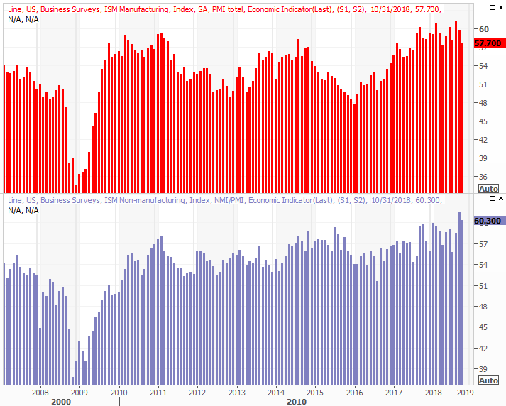 [5]
[5]
Source: Thomson Reuters
After a lengthy slump, auto sales have been solid for a couple of months. That may mostly be the result of reimbursed replacements following a couple of destructive hurricanes. It remains to be seen if that upswing is sustainable, though it probably isn't.
Automobile Sales Charts
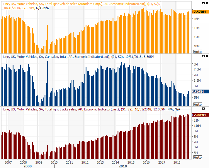 [6]
[6]
Source: Thomson Reuters
Finally, the big news this week will be Friday's jobs report for October. With just a superficial glance it looks like we're hitting a headwind here, but put it in perspective. Things have been about as strong as they could be on this front for over a year. The year-over-year comparisons are getting tough. Analysts aren't calling for a lot of net progress, but that doesn't mean things are bad. There's just not a lot of room left for net progress.
Payroll Growth, Unemployment Rate Charts
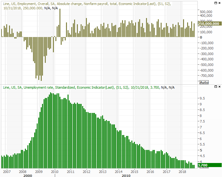 [7]
[7]
Source: Thomson Reuters
We'll have our usual deeper analysis of the employment report for you at the website later in the day on Friday.
Stock Market Index Analysis
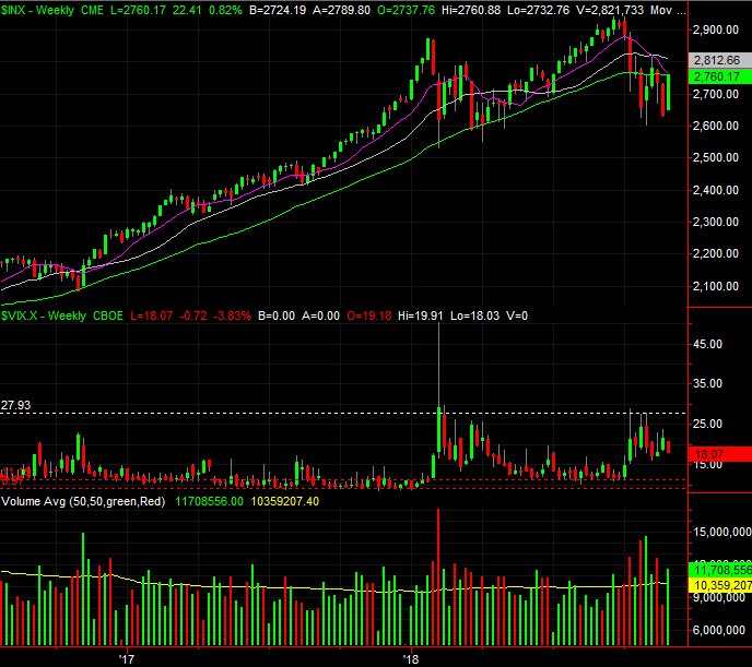
It was clearly a win for the bulls last week, leaving many traders wondering what the previous week's loss was really all about. Even with the big move though, the market's key indices still failed to move back above the most critical of all the key moving average lines… the 200-day moving average line. And, last week's big gain leaves stock's vulnerable to some profit-taking, even if only as a short-term dip.
The S&P 500's 200-day moving average line is plotted in green on the daily chart below.
S&P 500 Daily Chart, with Volume
 [8]
[8]
Source: TradeStation
There are some encouraging details also on that chart. Namely, the VIX is trending lower, but hasn't crashed to the pre-pullback lows seen in September. And, last week's gain unfurled on increasing buying volume.
Zooming out to a longer-term weekly chart of the S&P 500 doesn't tell us anything new, but it certainly puts things in perspective. Primarily it shows us how much farther the VIX could fall before it reaches levels that are 'too low.' It also illustrates how the October/November weakness looks quite a bit like the February/March pullback. That correction ultimately set up a pretty good run for those who were willing to step in at or near the bottom.
S&P 500 Weekly Chart, with Volume
 [9]
[9]
Source: TradeStation
We're also catching a tailwind thanks to the calendar.
The graphic below is one we showed you last week, but we're probably going to look at it every week from now until the end of the year, as it really shows us the usual year-end tendencies regardless of the environment. In good years and bad, the S&P 500 averages a 2% gain in December. And, we started this year's December at an unusually low starting line. We may be able to do even more than that, as the index plays "catch up."
S&P 500 YTD Performance, vs. Average
 [10]
[10]
Source: TradeNavigator
And are you a believer in the idea that the market can be impacted by a President? The mathematical tendencies actually support the notion. That's why you might want to remain in the bullish camp here.
The graphic below compares where the S&P 500 is under President Trump's (almost) first two years on office. The best, most bullish period of a four year term is the end of the second year though the middle of the third year; maybe the midterm shakeup is good for the economy.
S&P 500 Presidential Term Performance, vs. Average
 [11]
[11]
Source: TradeNavigator
Granted, Trump's first two years were far more bullish than usual, which might work against stocks this time around. Then again, the recent pullback has almost brought the S&P 500 back to where it should be.
Finally, a quick look at the daily chart of the NASDAQ Composite… just for good measure. It looks a great deal like the S&P 500's chart, in that it's also not yet above its 200-day line, and we're seeing rising volume on the way up. The VXN is also trending lower.
NASDAQ Composite Daily Chart, with Volume
 [12]
[12]
Source: TradeStation
And yet, the NASDAQ has given us a so-called 'death cross,' where the 50-day moving average line (purple) has crossed below the 200-day moving average line (green). That's supposed to be trouble for stocks, but don't worry too much about that. The track record for that signal isn't all that great. It's got more to do with the condition of the economy and whether or not we're in a bull market as to how stocks perform over the course of the few months following a death cross.
Bottom line? We need to give the profit-takers a chance to relieve some of the short-term overbought pressure here, so don't sweat the failure to cross the 200-day line as a problem just yet. As long as the S&P 500 stays somewhere near the 2760 area, it'll remain in the hunt, with the wind at its back.
And, also don't lose sight of the fact that there are a couple of other moving average lines above 2760 that could keep any bullish effort in check.
This market is bullish in the grand scheme of things, and aside from some wild political news, only a misstep from the bulls (like overly aggressive buying) will likely up-end the advance.