
That makes the ninth consecutive winning week for the S&P 500, carrying the index deeper into record high territory. It still feels strained, forced, and artificial though, as if the bulls are simply trying to extend an already-over-extended rally by celebrating the potential end of the conflict in Iran… as if that conflict was a problem for the market. (It wasn’t.)
Whatever the case, the path of least resistance remains to the downside. As has been the case for a while now though, somebody’s going to have to have enough guts to get that ball rolling. Once it is, it shouldn’t take much to turn it into a full-blown corrective move.
We’ll take a detailed look at the whole thing in a moment. Let’s first look at last week’s biggest economic news and preview what’s coming this week.
Economic Data Analysis
The holiday-shortened trading week started on Tuesday, when we also got a major update for the real estate sliver of the economy. That’s when we heard the Case-Shiller Index as well as the FHFA Home Price Index, both for March. The FHFA’s measure inched a little higher, while the Case-Shiller figure continued to drift lower. This could be a sign that the homes that are being bought are the lower-priced ones.
Home Price Charts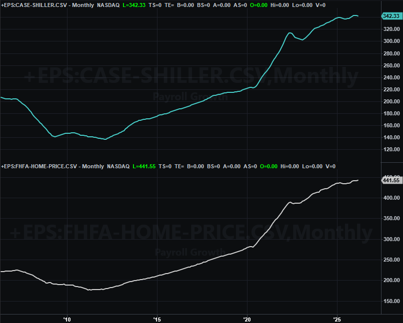
Source: Standard & Poor’s, FHFA, TradeStation
Either way, it still looks like the residential real estate market’s wild price runup is leveling off. Also remember that home sales/transaction remain near multiyear lows. More on that in a moment.
Also on Tuesday we got consumer confidence measures from the Conference Board, rounding out the University of Michigan’s consumer sentiment reading for May a week earlier. Although not yet updated on our chart below, both continued their downward treks. It’s surprising stocks are still moving higher, given this degree of pessimism.
Consumer Sentiment Charts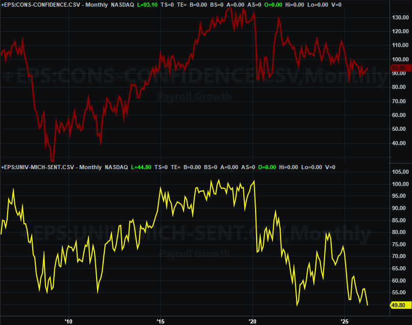
Source: University of Michigan, Conference Board, TradeStation
We’re not charting it here. But, for the record, we learned on Thursday that last month’s personal spending remained at March’s strong levels, but personal income’s growth ground to a halt, defying expectations for another solid month of progress. You really shouldn’t have one without the other. The fact that we do is worse for the economy than not, suggesting consumers are spending their way deeper into debt not because they want to, but because they have to.
Also on Thursday — and again, we’re not bothering charting it — we saw Q1’s GDP growth estimate was dialed back from 2.0% to only 1.6%.
The bright spot in all this? It does give the Federal Reserve a little more room to be a little more dovish.
Finally, on Thursday the Census Bureau reported April’s new home sales. Not great. The figure didn’t match March’s number of 663,000 units, as expected. Rather, it slumped to a pace of only 622,000. There’s clearly weakness here. It’s surprising home prices have held up as well as they have.
New, Existing Home Sales Charts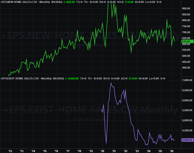
Source: Census Bureau, National Assn. of Realtors, TradeStation
Everything else is on the grid.
Economic Data Report Calendar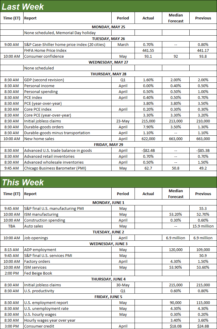
Source: Briefing.com, TradeStation
This week’s not going to be terribly busy. We are, however, going to be getting one biggie. That’s Friday’s jobs report. Before that though, on Monday look for a slight improvement of the already-solid ISM Manufacturing Index, followed by a slight improvement of the already-solid ISM Services Index when it’s updated on Wednesday.
ISM Services, Manufacturing Charts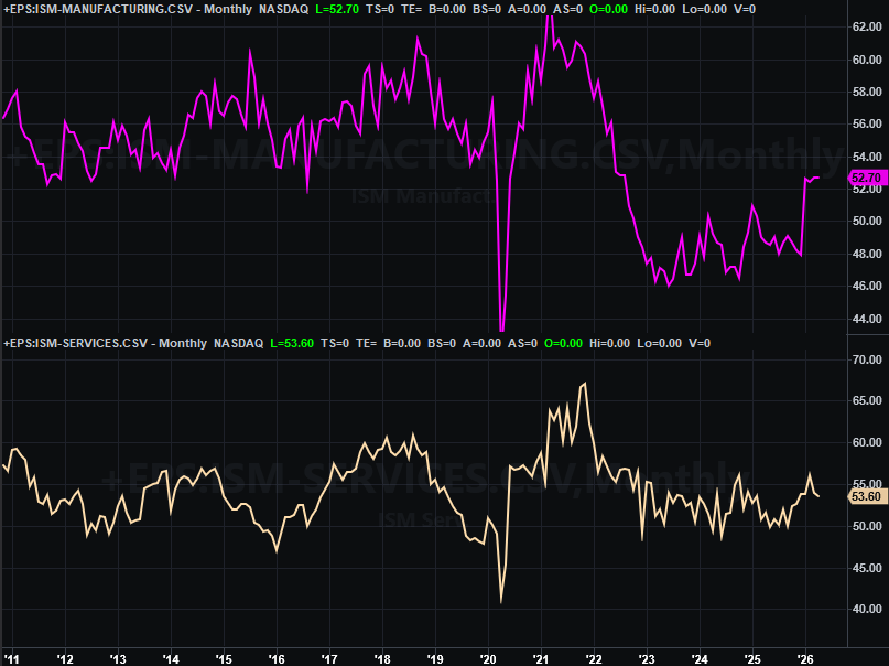
Source: Institute of Supply Management, TradeStation
As for Friday’s jobs report, look for a slowdown of Apri’s payroll growth of 115,000 jobs. Forecasts are only calling for 90,000 new payrolls, likely reflecting the recent wave of layoffs. Even so, that shouldn’t be enough to move the unemployment needle away from the current unemployment rate of 4.3%.
Payroll Growth, Unemployment Rate Charts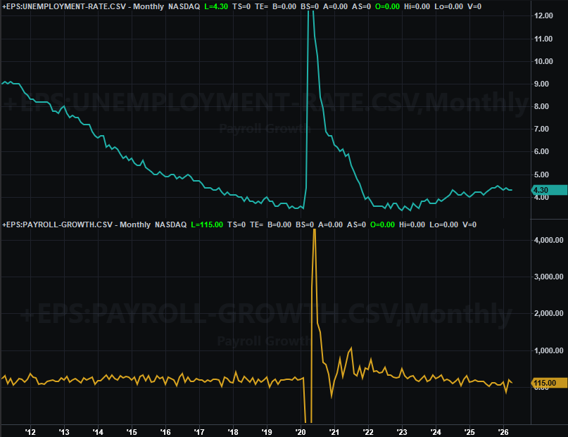
Source: Department of Labor, TradeStation
Stock Market Index Analysis
Time for some truth — the market isn’t behaving normally right now. Specifically, the market isn’t behaving in ways that basic technical analysis can predict. Blame the backdrop, mostly. Traders are ultimately betting that the military conflict in Iran will end sooner than later. Never mind the fact that they’ve been continually making that bet since early April.
It would also be naïve to pretend enthusiasm — if not euphoria — surrounding artificial intelligence and these companies’ earnings isn’t inspiring unbridled bullishness. As of the latest look, the S&P 500 is priced at a trailing price/earnings ratio of 23.3… or more, if using GAAP numbers. It’s the highest in years no matter how you measure it.
Still, the bulls are marching. Stocks are going higher just because they’re going higher. But, it works… right up until it doesn’t.
With that stage set, here’s the daily chart of the S&P 500. It took four small, staggered bullish steps last week to end at a record high. However, none of those steps was on convincingly strong volume. Maybe that’s the key. There’s no “blowoff top” forcing the profit-takers to crawl out of the woodwork.
S&P 500 Daily Chart, with Volume and VIX 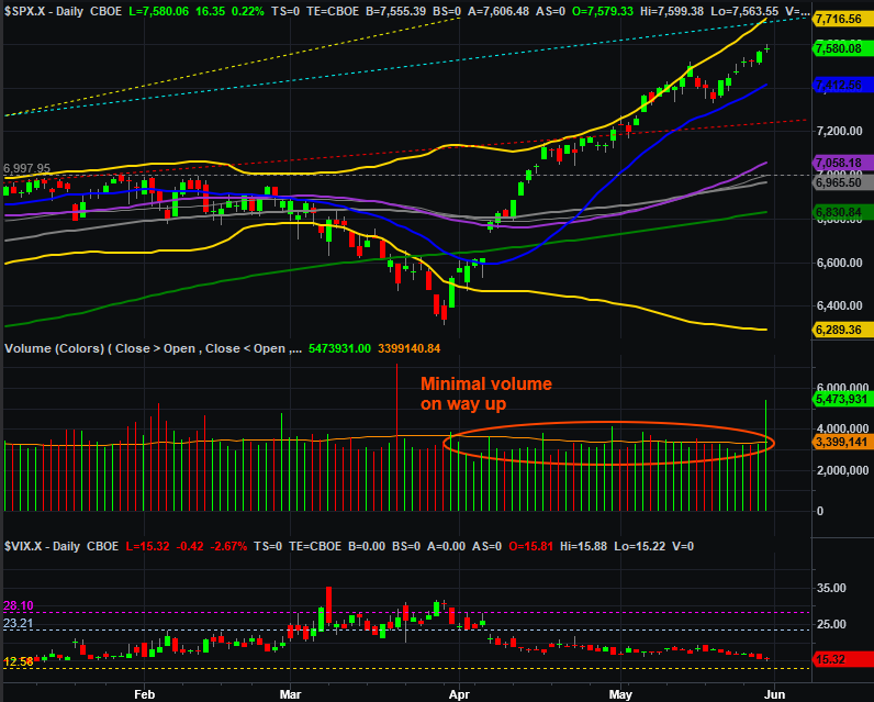
Source: TradeNavigator
It’s evident on the daily chart above, but undeniable on the weekly chart of the S&P 500 below. That is, now up a little more than 19% from its early April low, the index is about as far above its 200-day moving average line (green, at 6,868) as it’s ever been willing to get. Also notice on the weekly chart that the S&P 500 is now within striking distance of the technical ceiling (light blue, dashed) that’s been capping the long-term rally since it began back in the middle of 2023.
S&P 500 Daily Chart, with MACD and VIX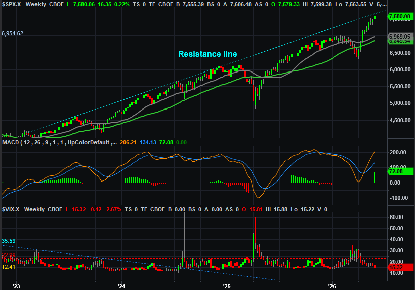
Source: TradeNavigator
The NASDAQ Composte blasted through its same ceiling this week, as the weekly chart below shows us. But, the weekly chart also shows us that the composite is also further separated from its 100-day (gray) and 200-day (green) moving average lines than it typically likes to get.
NASDAQ Composite Weekly Chart, with MACD and VXN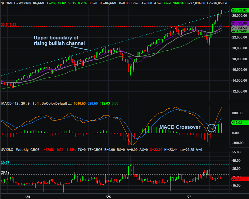
Source: TradeNavigator
As much as we’d like to talk downside targets here, there’s really no reason to just yet. There’s plenty of profit-taking fuel in the tank. We only have to look at both weekly charts above, however, to remind ourselves of what can happen when it seems like stocks are overextended and ripe for a pullback. As we saw last year, the rally can simply slow down to a more sustainable pace.
Still, another true correction might actually be the best thing for the market in the long run. It’s just going to take some technical triggers to make that happen. We’ll discuss those cues if-and-when we see them. Here’s a spoiler alert though… the first red flags will be moves below each index’s 20-day moving average line (blue).