
Stocks basically ended last week where they ended the previous week, calling the then-red-hot rally into question. But, don’t be too quick to jump to conclusions. The market had been through a pretty big two-week gain, extending an unusually big gain from April’s low. It deserved to take a breather, and that’s all this may be. We’re far from being in a situation that merits panicking just yet.
That’s what the usual analysis of our charts below will illustrate. Before we get to that though, let’s first paint the bigger picture with the broad brush strokes of recent and impending economic news.
Economic Data Analysis
Not a lot of economic news to parse was dished out last week, and none worth charting. Wednesday’s release of the minutes from the most recent FOMC meeting, however, is at least worth mentioning.
In short, most everyone agrees interest rate cuts are on the horizon. But, opinions still vary quite a bit as to exactly when and by how much. As of the latest look the market’s overwhelmingly betting there won’t be a quarter-point cut when the Federal Reserve as a scheduled chance to lower rates later this month. But, there’s about a 60% chance of a cut in September, and an almost-even chance of seeing another quarter-point cut in October.
Everything else is on the grid.
Economic Data Report Calendar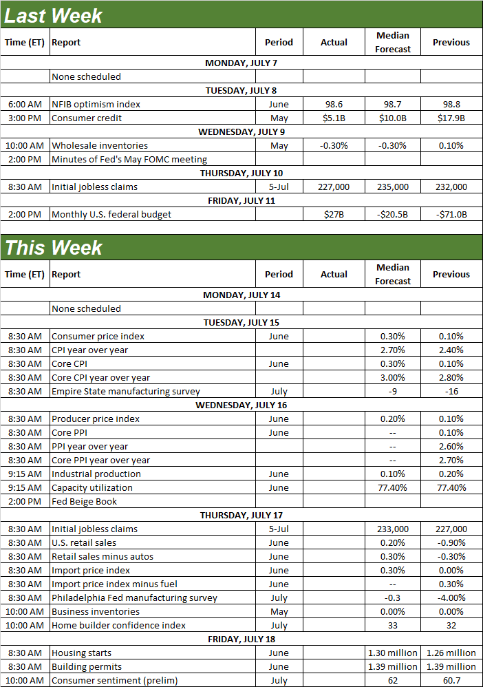
Source: Briefing.com, TradeStation
And speaking of interest rates, the discussion is sure to be rekindled this week, when we get June’s consumer inflation numbers on Tuesday, and the producer inflation report on Wednesday. Forecasts are a calling for a slight tick higher from mostly-anemic and still-slightly-falling rates. The thing is, that might be just enough glimmer of higher prices to prompt the Fed into delaying the next interest rate cut as long as is feasibly possible.
Consumer, Producer Inflation Charts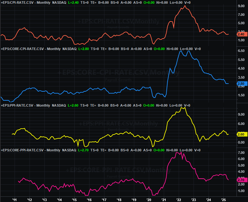
Source: Bureau of Labor Statistics, TradeStation
Also on Wednesday we’ll hear June’s capacity utilization and industrial production data for June from the Fed. Although the Federal Reserve doesn’t officially consider this data when making decisions about the Fed Funds Rate, unofficially there’s quite a bit of correlation between these numbers and everything else. Note that both are currently sinking, and aren’t expected to improve much this time around.
Industrial Production, Capacity Utilization Charts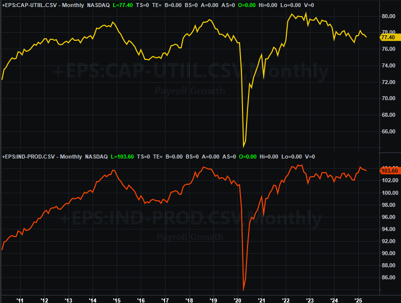
Source: Federal Reserve, TradeStation
On Thursday look for last month’s retail sales figures from the Census Bureau. You might recall they tanked a month earlier, after several months of subpar progress. Economists are calling for a slight improvement this time around, but not enough of a rekindling to say consumerism is fully back on track.
Retail Sales Charts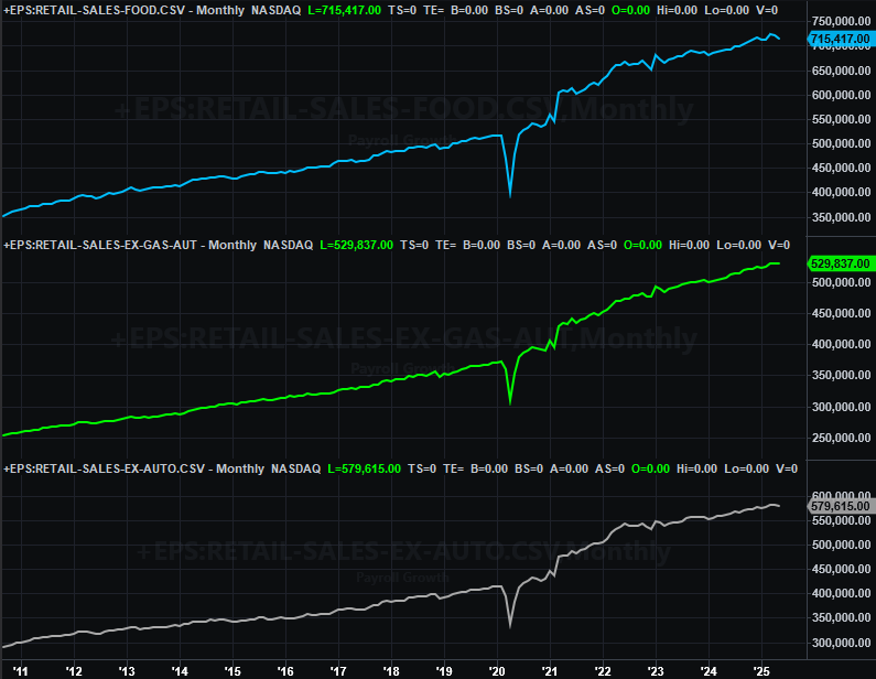
Source: Federal Reserve, TradeStation
Finally on Friday we’ll get June’s housing starts and building permits data from the Census Bureau. Both of these numbers have also been in a marked decline for a few months now. Forecasts are only calling for a modest rebound last month… certainly not enough to say starts and permits are back on the mend.
Housing Starts, Building Permits Charts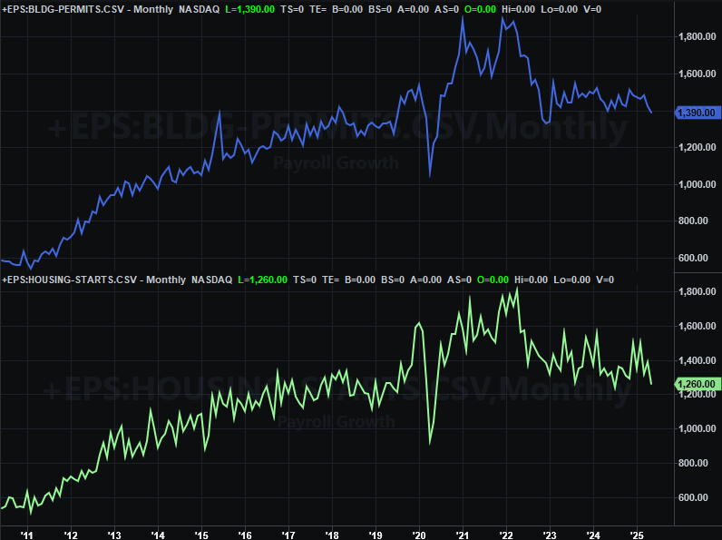
Source: Federal Reserve, TradeStation
Blame interest rates, mostly. Although inventories are edging higher, they’re still mostly low, and prices are still strangely high. Home sales are also still quite low (new as well as existing). The starts and permits numbers confirm the residential real estate market remains far more weak than not.
Stock Market Index Analysis
The daily chart of the S&P 500 doesn’t say it all, but it certainly says a lot. The S&P 500 ended up being unable to continue forging ahead last week after two previous weeks of solid gains. It just needed to take a break. Notice that it didn’t actually lose ground, and remains above February’s peak of 6,148 (yellow, dashed) where the 20-day moving average line (blue) may now be setting up as technical support.
S&P 500 Daily Chart, with VIX and Volume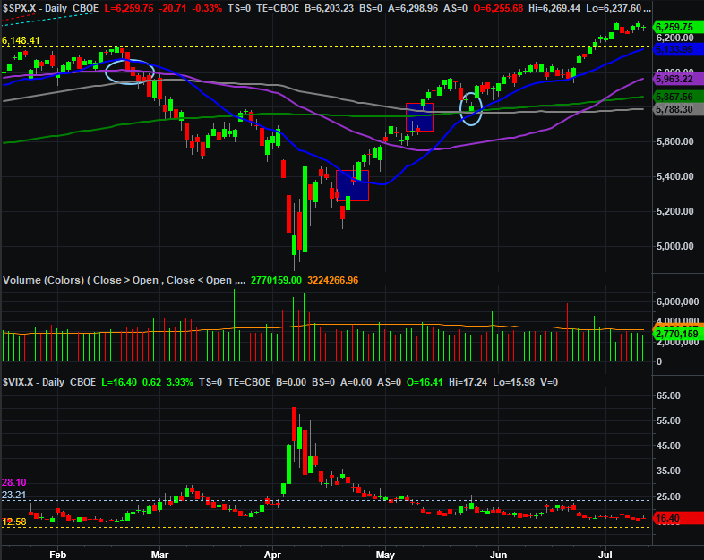
Source: TradeNavigator
Yes, volume faded… or is fading on the way up. The bulls would like to see volume growing on the way up to make sure the rally is gathering participants — and steam — as it unfurls. One off-week, however, isn’t fatal.
The NASDAQ Composite’s daily chart looks similar even if not identical. It’s also still above the peak made earlier this year then hurdled a couple of weeks ago. And, although its volume is lightening up as well, the 20-day moving average line is also moving into position as a floor. Notice that all of the NASDAQ’s other moving average lines are also entering what’s apt to become a thick band of support between 18,480 and 20,000. Even if the bears push back, they’re going to have to push back a lot to do any real damage.
NASDAQ Composite Daily Chart, with VXN and Volume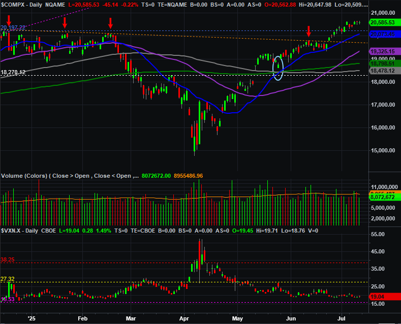
Source: TradeNavigator
Now take a step back and look at the weekly chart of the S&P 500. One has to wonder if what used to be the lower boundary (yellow, dashed) of the rising channel that steered the index upward from 2022’s low.
S&P 500 Weekly Chart, with VIX 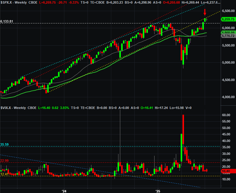
Source: TradeNavigator
And the weekly chart of the NASDAQ looks similar, albeit with one stark difference. Rather than bumping into the lower boundary of the bull market, the composite is right back into the middle of its bull market range, bumping into a secondary support line that may have since become resistance.
NASDAQ Composite Weekly Chart, with VXN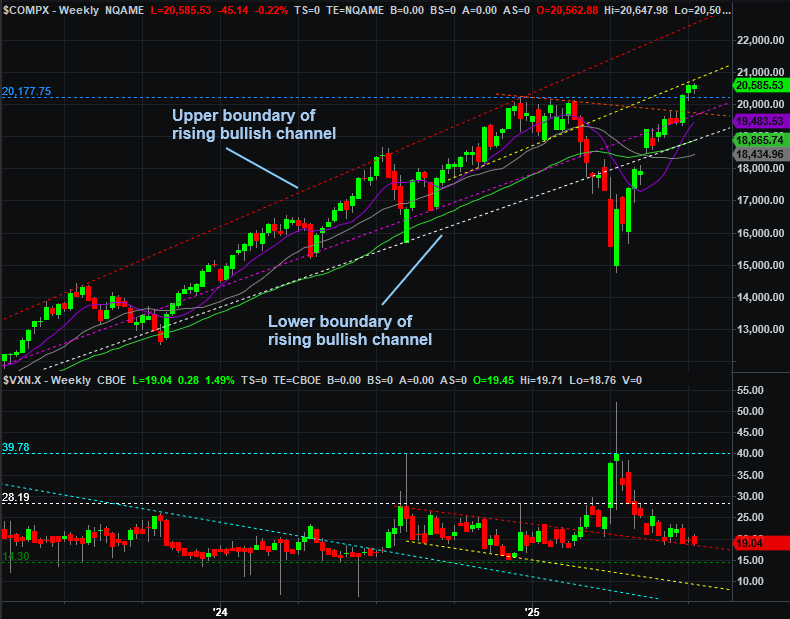
Source: TradeNavigator
You can definitely overthink this. Don’t. Take it all at face value, but not more. The uptrend is still intact, and technical support is firming up. One so-so week doesn’t change that. In fact, a breather might be the best thing for the rally at this point, allowing it (and the buyers) to reset. Moreover, even a more serious stumble won’t necessarily break the advance. Again, there’s a ton of technical support taking shape below us.