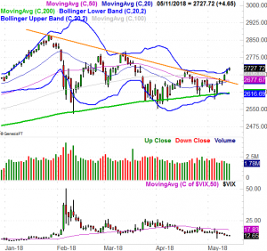
A week ago, stocks were only toying with the idea of a break above some major resistance levels. As of the end of last week, they punched through that ceiling.
It was a tepid effort, and so far hasn't attracted any meaningful follow-through. The volume behind the move has been pretty pathetic too. We're also at a time of year that's less-than-stellar for stocks. Nevertheless, we've got to respect how well the market's overcome the odds thus far. We're still not entirely convinced there's enough healthy momentum to actually make a big bet on stocks though.
We'll dissect it all below, but first let's run through last week's and this week's economic announcements.
Economic Data
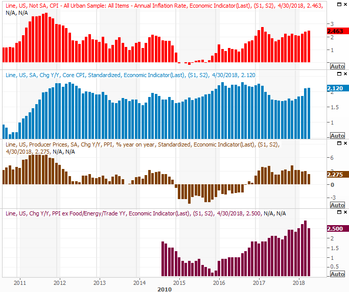
Last week's economic data dance card may have felt pretty full in terms of the length of the list/calendar, but there were only two big themes. One of them was a look at last month's inflation. We're seeing some, but as has been the case for a while, it's under control. The overall inflation rate now stands at 2.46%, but stripping out volatile food and energy prices doesn't change the fact that inflation is healthy, but not debilitating.
Inflation Rate (Annualized) Charts
 [1]
[1]
Source: Thomson Reuters
That being said, the modest rise in inflation seems to be picking up again. If this persists like we've seen the past couple of months, the Fed will have little choice but to go ahead and impose the three to four rate hikes the market is betting on this year.
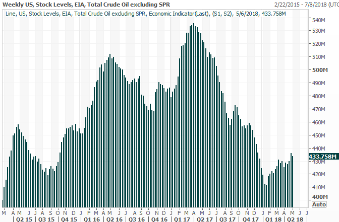
The only other graphic we want to look at this week is crude inventory levels, if only because we haven't in a while. Of course, it's prescient that we do anyway in light of the fact that President Trump is likely to impose new sanctions on Iran, which could impact the global supply.
If that's going to be an actual problem though, it's going to have to overcome a rising supply. And, bear in mind that once an oil supply trend starts to take shape, it can remain in motion for quite some time.
Crude Oil Supply Charts
 [2]
[2]
Source: Thomson Reuters
That doesn't mean oil prices won't continue to climb. It does mean, however, that there's more assumption and emotion driving the bullishness than supply and demand.
Everything else is on the grid.
Economic Calendar
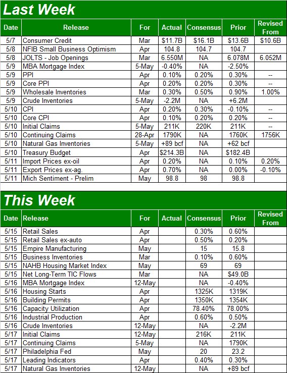 [3]
[3]
Source: Briefing.com
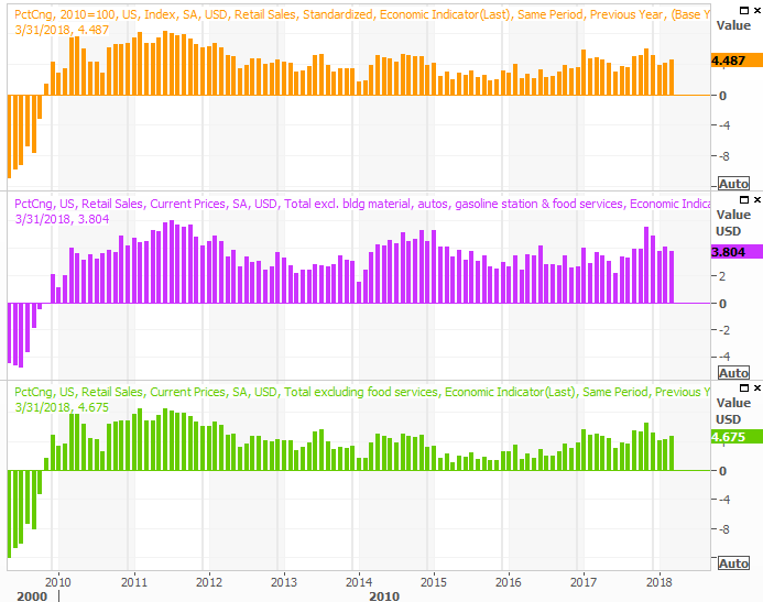
This week is going to be a pretty heavy-duty one, starting with April's retail sales report on Tuesday. Once again they should be up, firmly, extending a long trend of forward progress.
Retail Sales Growth (Annualized) Charts
 [4]
[4]
Source: Thomson Reuters
As long as we're seeing continued strength in consumer spending, our consumer-driven economy should continue to move forward (taking the market with it).
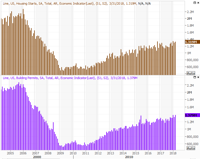
On Wednesday we'll hear about last month's housing starts and building permits, serving up an updated look at real estate market. The pros are looking for about the same numbers we saw in March.
Housing Starts and Building Permits Charts
 [5]
[5]
Source: Thomson Reuters
The bigger picture trend is still pointed upward. Don't fear the prospect of constructing too much inventory though. Real estate for sale remains at multi-year lows while demand continues to soar.
We'll round out the look at real estate with last month's new and existing home sales. The market looks pretty solid though.
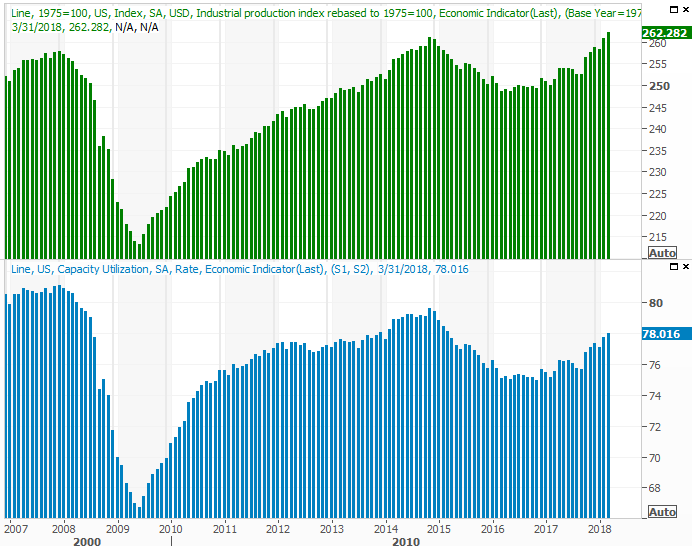
Finally, also on Wednesday we'll get the capacity utilization and industrial productivity reports for last month. Both have been trending higher, and economists expect another round of growth this time around.
Capacity Utilization and Industrial Productivity Charts
 [6]
[6]
Source: Thomson Reuters
Though the market tends to gloss over the industrial activity report, it shouldn't. This data coincides quite well with corporate earnings, and the stock market. It's only a long-term correlation, but a correlation nonetheless. That doesn't mean the figures can't impact stocks in the short run… just as a reactionary move. Just don't confuse the near-term and long-term implications.
Index Analysis
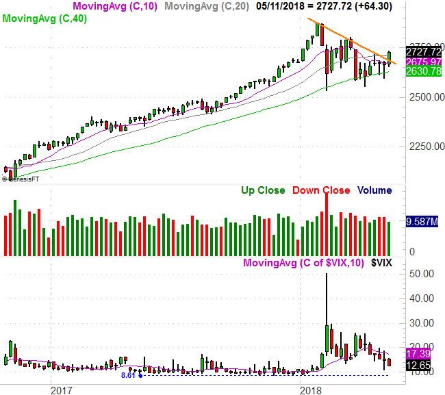
The good news is, the S&P 500 punched through a nagging resistance line (orange) that had been holding it back since January. In fact, the index is now above all of its key moving average lines. Friday's slowdown isn't even that alarming – on the surface – in light of the fact that a bump into the upper Bollinger band is where we'd expect to see the bears start to create a little resistance.
S&P 500 Daily Chart, with VIX and Volume
 [7]
[7]
Source: TradeNavigator
The bad news is, that upper Bollinger band could still turn into a pivot point, and the volume behind last week's bullishness was downright pathetic.
You can see on the chart above that volume was already tepid with the breakout move, but deteriorated as the week wore on. But, for a more detailed perspective, take a look at the detailed view below, which plots the NYSE's 'up' volume and 'down' volume day by day. The 'up' volume bars should be rising, but they're not.
S&P 500 Daily Chart, with NYSE Up and Down Volume
 [8]
[8]
Source: TradeNavigator
Granted, the 'down' volume bars aren't rising either. In fact, they're shrinking; you could possibly argue there's more bullish depth than not. That's a tepid bullish case though, and either way, bullish volume is supposed to grow on the way up. It's just not.
Maybe that lack of volume has more to do with seasonality. It doesn't matter though.
The weekly chart, just for good measure…
S&P 500 Weekly Chart, with VIX and Volume
 [9]
[9]
Source: TradeNavigator
From this perspective the breakout move looks even juicier, as it was mostly prodded by support at the 200-day moving average line (green). That's where you'd expect the bulls to draw a line in the sand, and kick-start a bigger bullish move.
The weekly timeframe also shows us the VIX is in a decided downtrend.
That's a double-edged sword. As long as the VIX is moving lower it means the market's undertow is pointed higher. And, the VIX does indeed have room to keep moving downward before finding a more absolute floor around 8.6. This is still an abnormally low VIX though, and sets the stage for a surprising, downward move sooner or later.
So what does it all mean? The bulls have the edge, but they've had the edge before to no avail. They're missing the participation they need to achieve escape velocity. So, we have to be cautious here. It wouldn't be a bad idea to remain on the sidelines, so to speak, until there's a little more conviction.
That said, though it's not an immediate worry, we do have a clear idea of the floor that could turn into a make-or-break level for stocks. The lower Bollinger band and the 200-day moving average line for the S&P 500 are both now at 2617. If that level fails as a floor, wherever it may be in the foreseeable future, that's a huge red flag.
First things first though.
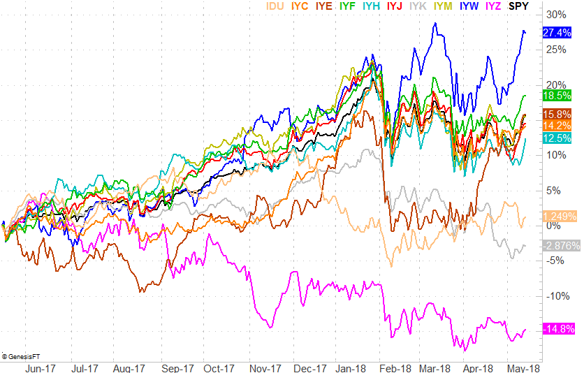
Last but not least, it's been a while since we've looked at it, but with some things being shaken up now, we can and should examine how each sector is now performing relative to all the others. As usual, we'll use the iShares sector ETFs as our proxies.
Sector Performance Comparison, One-Year Chart
 [10]
[10]
Source: TradeNavigator
Clearly energy stocks have been on a tear, though it remains to be seen if that strength will last. Meanwhile, though telecom has been trounced, it may be setting up for a wave of bullishness. The sneaky emerging leader in this mess is the financial stocks.
We'll keep tabs on this sector-performance chart and update you as needed.