 [1]The death blow has yet to be dealt, but the market is on the defensive. A couple more rough days could finally break the bulls' backs and kick-start a much more serious correction. Until it happens though…
That said, don't confuse a correction with a bear market. Any dip from here, if allowed to take shape at all, should be a buying opportunity.
We'll weigh it all, as always, below. Let's first recap last week's economic news and preview this week's major announcements.
Economic Data Analysis
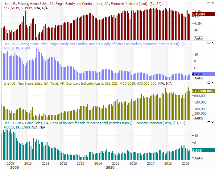
It was a relatively light week. In fact, the only items of interest were the reports on new and existing home sales, rounding out a so-so snapshot of the real estate market for April. The numbers could have been better. Sales of existing homes rolled in at a pace of 5.19 million, falling short of estimates, and coming in just below March's mediocre levels. New-home sales of 673,000 was better than forecasted, but fell from March's 723,000.
New, Existing Home Sales Charts
 [2]
[2]
Source: Thomson Reuters
It beats the alternative, but the broad real estate picture still isn't quite as solid as one would hope. It's not evidence that the market is thriving, particularly given that on both fronts, inventory levels ticked higher.
Everything else is on the grid.
Economic Calendar
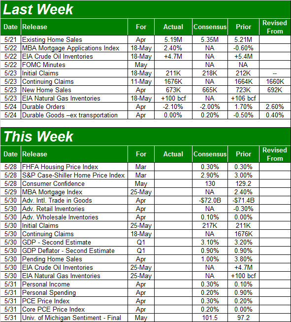 [3]
[3]
Source: Briefing.com
This shortened week is going to be a fairly busy one, starting with a completion of the real estate picture. On Tuesday, we'll hear not one but two measures of home price data. Although both are for March rather than April, it still paints a key part of the picture. The FHFA Housing Price Index is expected to rise 0.3% from February's level, while the Case-Shiller Index is projected to rise 2.9% versus February's 3.0% increase.
FHFA, Case-Shiller Home Price Charts
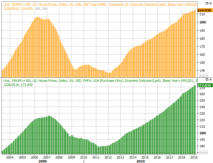 [4]
[4]
Source: Thomson Reuters
Although the recent readings pale in comparison to last year's growth, they're still positive.
It's also going to be a big week for looks at consumer confidence… perhaps the most telling data nugget on the table at this time. The economic numbers are healthy, though not impressive. The only clue to say that data may improve in the foreseeable future is sustained confidence.
Economists think we'll see it. The Conference Board's consumer confidence reading as well as the third and final look at the University of Michigan Sentiment Index for May are both in the queue, and both are expected to edge a little higher. Neither are expected to soar though, and both appear to have stalled out.
Consumer Sentiment, Confidence Charts
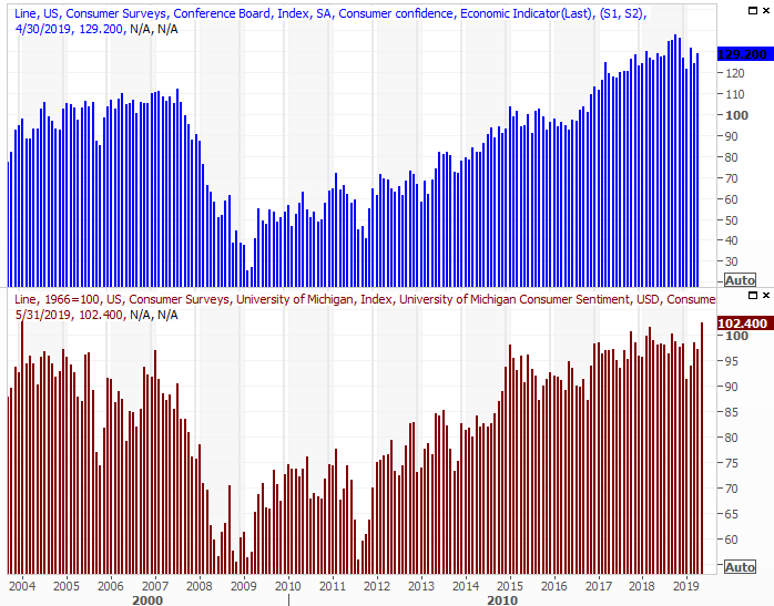 [5]
[5]
Source: Thomson Reuters
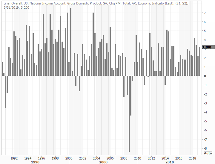
Finally, on Thursday we'll hear the second (of three) estimates about Q1's GDP growth rate. The first look a few weeks ago said it improved to the tune of 3.2%; economists have since dialed it back to an estimate of 3.1%. Even if they're still overestimating though, and pace near that level is a healthy one.
GDP Growth Chart
 [6]
[6]
Source: Thomson Reuters
Stock Market Index Analysis
The market had a chance to dig its way out of trouble last week. On Tuesday and Wednesday it even looked like it would. The fact that the budding rebound effort broke down before it gelled, however, is even worse than not trying at all. Now traders have good reason to doubt any recovery effort is going to get off the ground here.
Had stocks instead edged a little low and found support where support is most expected, it would have been easy to spin the whole thing into a bullish scenario.
Still, the market has yet to slip into major trouble. There are multiple technical floors still intact. It would only take one or two more bad days, however, for those last floors to snap. The fact that this is supposed to be a tepid time of year for stocks, and the market headed into May overbought and ripe for selling.
Take a look at the daily chart of the S&P 500. The index broke below the 50-day moving average line (purple) a couple of weeks ago, tried to move back above it last week, but failed to do so. On the flipside, the green 200-day and gray 100-day moving average lines have yet to be broken. What we're watching most, however, is the VIX's dance with resistance at 18.0. The Volatility Index moved briefly above that level earlier this month, but it appears to be a ceiling again now… one working in conjunction with the S&P 500's longer-term moving average lines.
S&P 500 Daily Chart, with VIX, Volume
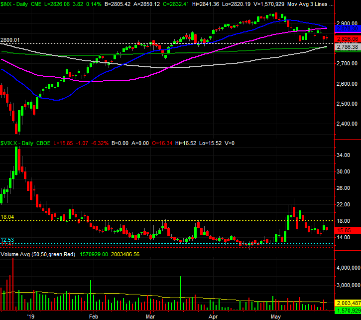 [7]
[7]
Source: TradeStation
The same goes for the NASDAQ Composite, although it fully tested its 100-day moving average line on Thursday. The NASDAQ's Volatility Index also is once again grappling with its own ceiling, near 21.3.
NASDAQ Composite Daily Chart, with VXN, Volume
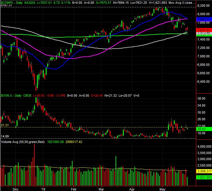 [8]
[8]
Source: TradeStation
Zooming out to the weekly chart of the S&P 500 adds some important perspective. Namely, we can see from here the full scope of the big rally and then the recent rollover. We're near a bearish MACD crossunder, which for the broad market usually leads into a prolonged pullback. This long-term look also reveals that the floor near 2798 that took shape over the past couple of weeks has been a relatively important ceiling in the recent past as well. That makes it a more important line in the sand now, even if it's since become a floor.
S&P 500 Weekly Chart, with Volume
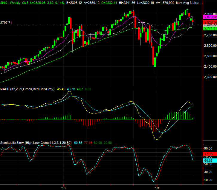 [9]
[9]
Source: TradeStation
Though not shown above, last week's advancers and decliners as well as the market's up and down volume are still leaning in a net-bearish direction. It's inconsistently bearish, but bearish more often than not at this time.
Still, this is a situation in which anything could still happen. It would be unwise to dig in deep with trades in either direction.
The good news is, the make-or-break levels are clear enough. The aforementioned floors put in place by the convergence of the 100-day and 200-day moving average lines will signal a more pronounced downtrend, while the converged 20-day (blue) and 50-day moving averages around 2878 will keep the S&P 500 in check until the bulls are ready to stage a true recovery/breakout effort.
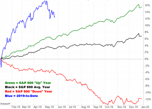
With that as the backdrop, the annual day-to-day performance graphic for the S&P 500 below tells a tale in and of itself. May's weakness was not only not unusual, but exaggerated by the big start to the new year. We actually should, if history repeats itself, see a bullish starts to June, but that effort stumbles. It tends to recover in July, but just barely… and then stagnates through September when a modest lull ultimately gives way to year-end-bullishness.
S&P 500 Day-to-Day Annual Performance
 [10]
[10]
Source: TradeNavigator
That's not the big take-away here though. Notice that, while the average is just average, good years move higher in a straight line through early October, and in bearish years, the S&P 500 tends to move lower in a straight line for several months. If the potential breakdown does take shape, we can't rule out the possibility that it persists for an uncomfortable amount of time.
It still won't be the beginning of a bear market though.