Once again the bulls were tested, and once again they fought back when they were dangerously close to the edge of the cliff. And, once again they failed make a decisive bullish move that shakes off the marketwide lethargy. Translation? A corrective move is still a distinct possibility. Stocks just continue to ride the fence.
As was the case a week ago though (and as we saw come into play last week), we know exactly what to watch for. The lines in the sand then are still the lines in the sand… make-or-break levels for the key indices.
We'll take a detailed look at those lines in a moment, with an emphasis on what didn't happen last week as much as what did. First though, let's recap last week's top economic reports. Last week's big news was of course real estate's headwind, although it's difficult to say it's a sign of economic weakness.
Economic Data Analysis
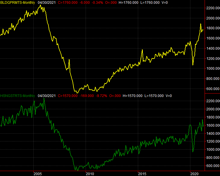
Real estate is in a pinch. It's not so much bad as it is constrained. Nevertheless, we're left with the results of what's happening rather than what could have happened or might be happening. Namely, though issued building permits came in near March's levels as expected, actual housing starts fell from an annualized pace of 1.73 million to 1.57 million, versus estimates of 1.70 million.
Housing Starts and Building Permits Charts
 [1]
[1]
Source: Census Bureau, TradeStation
Still, you have to like the bigger trend. The permits reading was being compared to a rather healthy figure.
Notice, however, that May's Homebuilder Index (no chart shown) was still in line with April's level, as projected. Builders feel good about their prospects and demand. But, with high lumber costs and a labor shortage, what's to feasibly start?
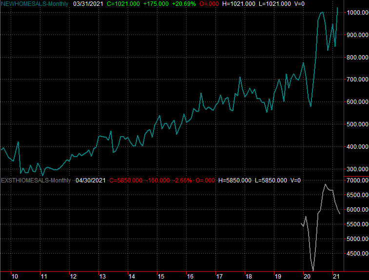
It's a bit curious that existing home sales fell to a pace of 5.85 million in April from March's clip of 6.01 million though. A lack of inventory? That's at least part of the bottleneck, though it's not clear to what extent we can blame a limited selection – inventory levels improved by 100,000 units in April to reach 1.16 million. It's still below last May's peak near 1.6 million, but it is progress.
New and Existing Homes Sales Charts
 [2]
[2]
Source: National Board of Realtors, Census Bureau, TradeStation
We'll hear about April's new home sales this week, which should shed some more light on the housing market's true condition.
Everything else is on the grid.
Economic Report Calendar
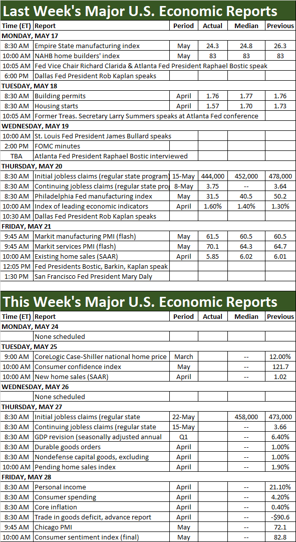 [3]
[3]
Source: MarketWatch
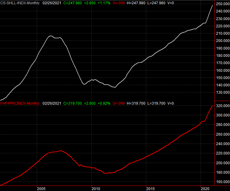
New home sales data isn't the only real estate market barometer we'll be seeing updated this week though. On Tuesday look for March's Case-Shiller Home Price Index report, and while it's not listed on the calendar, we'll also hear the FHFA's measure of home pricing on the same day. Both have been rising firmly, and should continue to do so. The stumbling block really is connecting more buyers with sellers. Coming to a healthy price isn't a problem.
FHFA Housing Price Index, Case-Shiller Home Price Index Charts
 [4]
[4]
Source: FHFA, Standard & Poor's, TradeStation
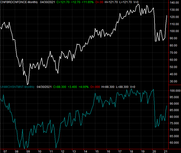
It's also going to be a key week for sentiment. On Tuesday the Conference Board will reveal its consumer confidence score for May, while on Friday we'll get the third and final look at the University of Michigan's consumer sentiment reading. The market really can't afford a setback on this front.
Consumer Sentiment Charts
 [5]
[5]
Source: Conference Board, University of Michigan, TradeStation
Note that Q2's second (of three) growth estimates is coming Thursday. It should be good; the first guess was 6.4%. Just bear in mind that it's difficult to determine a meaningful comparison given the economic upheaval seen over the past year. Don't sweat a lower print, and don't get too excited over a big raise. Everyone's still mostly guessing.
Stock Market Index Analysis
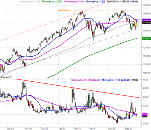
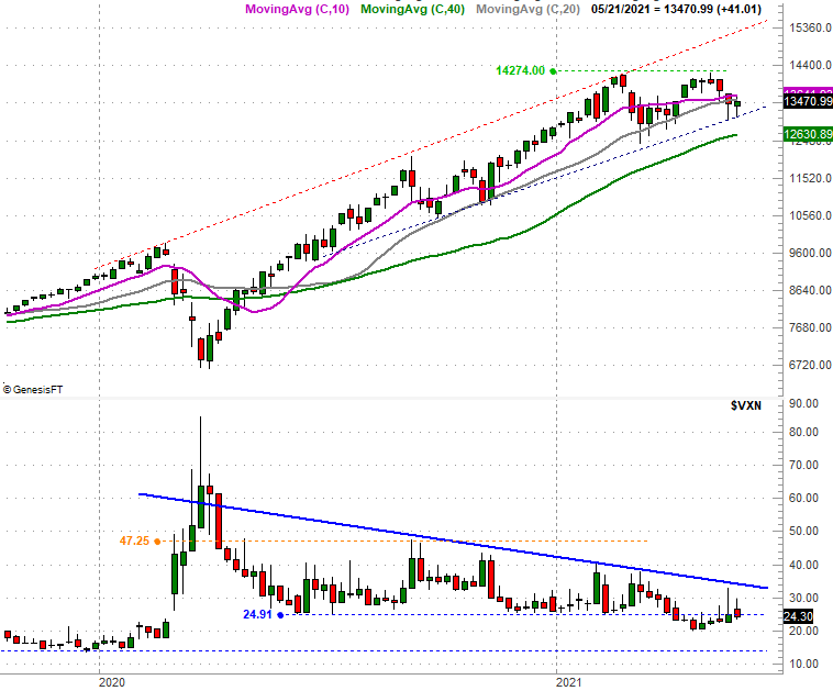
This week's review kicks off with a look at a close-up view of the NASDAQ Composite's daily chart, though look at it knowing we'll be zooming out to a long-term view of the week chart; a lot of things are coming together here. For now, just notice that when the composite bounced back from last week's low, the rally effort was stopped and somewhat reversed by the 20-day moving average line (blue). This is all highlighted.
NASDAQ Composite Daily Chart, with VXN
 [6]
[6]
Source: TradeNavigator
This doesn't necessarily end the recovery effort. It doesn't bode well for it though. As you'll also notice on the NASDAQ's daily chart, the composite continues to put pressure on the lower edge of the rising trading range that's been steering it higher since July of last year (the dashed lines). This rising – and expanding – trading range is easier to make out on the weekly chart of the composite below, which also offers a bit more clarity about the recent loss of bullish momentum. Namely, the gap between the 50-day (purple) and the 100-day (gray) moving average lines is as narrow as it's been since early 2020, and it's still getting thinner.
NASDAQ Composite Weekly Chart, with VXN
 [7]
[7]
Source: TradeNavigator
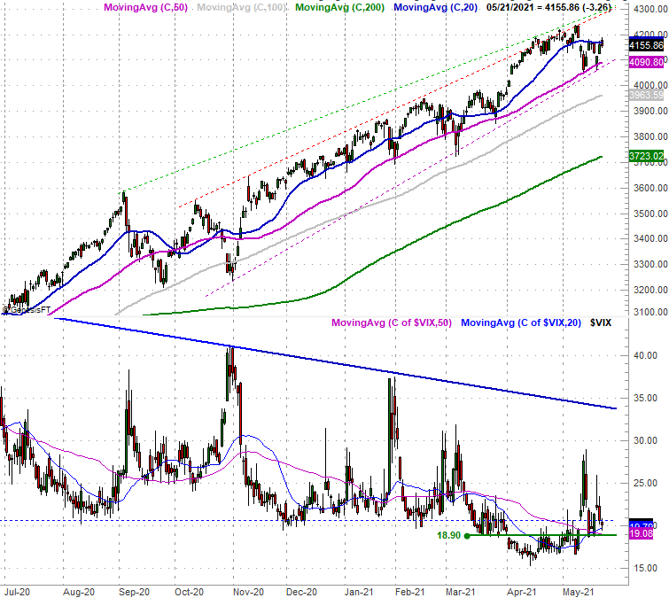
The S&P 500 isn't in quite as much technical trouble. In fact, with nothing more than a quick glance the S&P 500 looks pretty darn healthy. The 50-day moving average line (purple) and/or the straight-line support line (purple, dashed) that's been keeping the index moving higher since October are still intact. And, like the NASDAQ's volatility index, the S&P 500's VIX has yet to punch through its falling resistance line (blue) that first started to take shape in March of last year.
S&P 500 Daily Chart, with VIX
 [8]
[8]
Source: TradeNavigator
Things aren't quite as bullish for the broad market as they seem, however.
We've talked about it on occasion for the past few weeks, typically to no avail. It's a detail too important to overlook though. That is, while the uptrend is still technically intact, we're seeing dents and dings. Namely, the amount of daily bullish volume has been inching lower since late last month, and the amount of daily bearish volume has been edging higher… even in phases where stocks are gaining. This is more true of NASDAQ-listed stocks than NYSE-listed names, so we'll limit our look to just the composite's breadth (advancers vs. decliners) and depth (bearish and bullish volume), the latter of which is at the bottom of the image below.
NASDAQ Composite Daily Chart, with Up/Down Volume Comparison and Daily Up/Down Volume
 [9]
[9]
Source: TradeNavigator
It's a red flag simply because a well-supported rally would be marked by rising (or at least stable) daily bullish volume paired with falling (or at least steady) daily bearish volume.
The calendar, of course, isn't exactly helping either. This is typically a lethargic time of year, and we started it well overbought and ripe for profit-taking.
None of it really matters though… at least not yet. As long as the S&P 500 and the NASDAQ Composite hold above their technical support lines discussed above (4091 and 13,072, respectively), the uptrend is still alive. We can only be prepared for the what-if scenario. We don't want to be presumptive of it. the good news is, it'll be crystal clear when stocks trip up and start to take a tumble. The lines in the sand are very well defined.