Weekly Market Outlook - Just as Scripted, Stocks End the Year on a Bullish Foot
Given the timbre of most of this year, it can't be surprising that the market finished 2020 on a high note. Traders took a brief break from their buying early in the week, but when forced to make the decisions, most people decided they'd rather start the new year with existing positions instead of waiting to add them as we moved into 2021. This of course only ups the odds of the usual strong start to the new year.
None of this dynamic changes the fact, however, that the market is overbought and ripe for profit-taking. When that might happen isn't clear. It may not happen for another month.
We'll take a detailed look at the unlikely rally and its future below. First, let's recap last week's economic announcements and preview what's coming this week.
Economic Data Analysis
The only item of interest from last week was the S&P Case-Shiller Home Price Index report. As could have been expected, home prices grew once again, reaching record highs. The Case-Shiller figure was up 7.9% year over year.
FHFA and Case-Shiller Home Price Charts
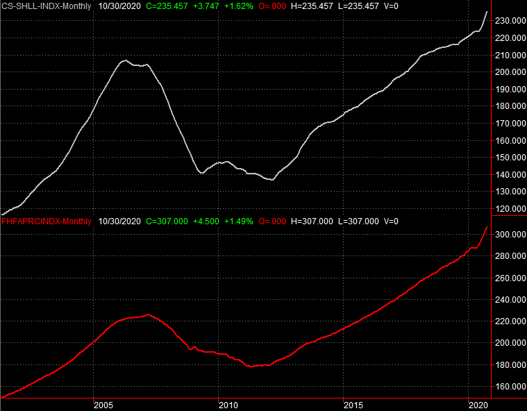
Source: Standard & Poor's, FHFA, TradeStation
Bear in mind that number was for October, which is obviously a little dated. It's not an ancient figure though. Real estate trends tends to remain in place for a while, so the more recent economic and sentiment slowdown shouldn't bring a sudden reversal to the good real estate pricing news. On the other hand, October's unusually strong improvement only sets the stage for a notable slowdown in future home price growth.
Everything else is on the grid.
Economic Report Calendar

Source: Briefing.com
This week -- the first (and full) week of the new year -- things are back in full swing. The party starts in earnest on Tuesday, with last month's ISM Manufacturing Index update. On Wednesday we'll hear about December's ISM Services (non-manufacturing) Index. Both are expected to fall a bit from November's levels, though both should remain above the critical 50 level. On the flipside, that would be the second straight months of declines for both indices. It's just more evidence of a headwind now that the post-COVID reality is starting to set in.
ISM Manufacturing and Services Index Charts
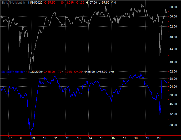
Source: Institute of Supply Management, TradeStation
The biggie of course will be Friday's jobs report. Economists aren't expecting much. In fact, the 100,000 (net) new jobs economists are expecting shouldn't even be enough to lower the unemployment rate from November's level of 6.7%. A better-than-expected report would be a welcome surprise for stocks... and the bar is set relatively low. But, that's not something traders can count on.
Payroll Growth and Unemployment Rate Charts
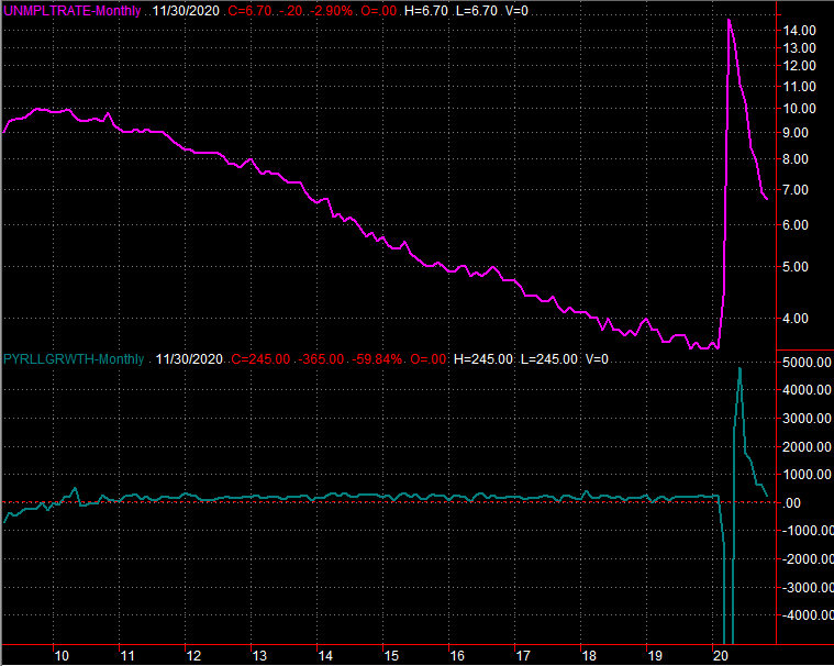
Source: Department of Labor, TradeStation
Stock Market Index Analysis
The bulls did it again, logging another weekly win. Though the advance faltered on Wednesday and struggled on Thursday (the market was closed on Friday), the S&P 500 still managed to end the shortened trading week up 1.4%. That's 71% higher than March's low, and up 16.6% 2019's last trade. So much for worries that the pandemic would stand in the market's way.
There are some important, concerning nuances to the gain though... short-term and long-term. The biggest of these is the fact that with last week's gain, the S&P 500 is now testing an important resistance line. It's also just above another important one. Both are dashed on the weekly chart below (as is a major support line). Though it goes all the way back to 2018 to get started, the index is within a pretty well defined diverging wedge pattern.
S&P 500 Weekly Chart, with VIX and MACD
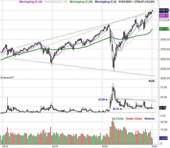
Source: TradeNavigator
The weekly chart also shows us something else important... the VIX isn't falling anymore. It isn't rising either, which would be decidedly bearish. But, the fact that traders aren't pushing the VIX any lower suggests a waning degree of confidence.
The weekly chart also shows us, of course, the incredible span the rally since March has covered. It's uncanny.
The NASDAQ Composite's weekly chart looks pretty similar, but with one big exception - the trading range isn't diverging. The NASDAQ's long-term support line (pink, dashed) is rising. Even so, the composite is bumping into a major technical ceiling after its 94% advance from its March low. It doesn't take a genius -- or even an idiot -- to recognize this rally has also been quite unusual.
NASDAQ Weekly Chart, with VXN and MACD

Source: TradeNavigator
While overdue for profit-taking, that doesn't necessarily mean stocks will start to sell off here and now. The calendar continues to work in its favor, mostly.
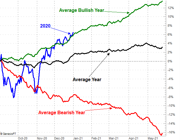
The image below paints this picture, comparing the S&P 500's performance since September to its usual performance between then and through January. Also plotted on the chart are how the index performs differently during this stretch during bullish and bearish years. As is usually the case, stocks suffered in September...even more than usual. Also as is usually the case, the market saw gains from early October through late-December... once again even more than usual. The rally was red-hot, in fact, but through the four-month span, the index has only fought its way back to where it would normally be in a bull market.
S&P 500 Average Performance From September, vs. Bullish & Bearish Periods
Source: TradeNavigator
The Santa Claus rally that unfurled over the course of the past couple of weeks could have been expected. Even in bad years, this is a bullish time of year. January is usually a good month too, on average, though it can be rough when a bear market is in place. Either way, the bullishness starts to fade here even when the environment is bullish.
In other words, don't assume the last half of January is the norm. That's even the case right now (and especially the case) given that the S&P 500's recent bullish performance has put it above where it would normally be for this period.
Zooming into a daily chart of the S&P 500 doesn't tells us a whole lot more about what's likely to lie ahead. It does show us where any pullbacks might finally come to and end, however. The 20-day moving average line (blue) was a key support line last month, and the 200-day moving average line (green) has now made its way to the September and October low around 3230 (blue, dashed). Just bear in mind that the 200-day average will be above that mark before it could be tested as support.
S&P 500 Daily Chart, with VIX and Volume
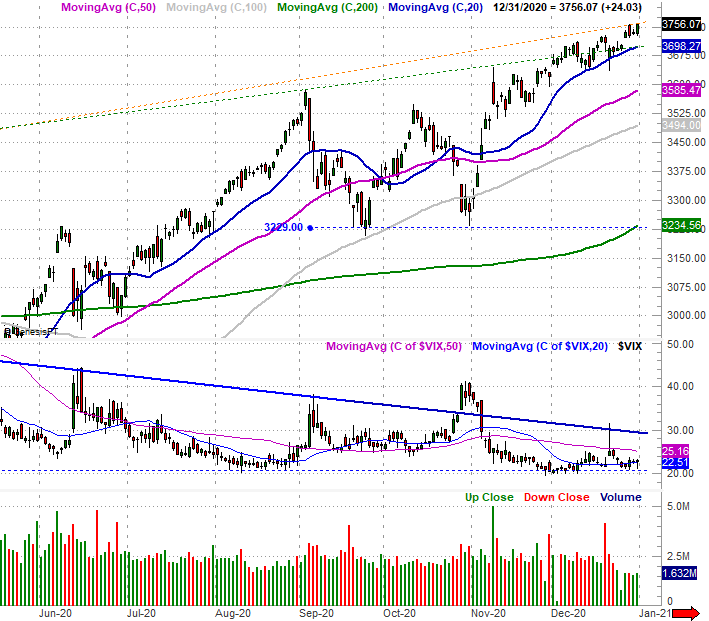
Source: TradeNavigator
We can also somewhat see the VIX is trying to curl its way higher into an uptrend...at least that what it somewhat appears to be doing on the daily chart. It will be difficult to say the VIX is in an uptrend - and stocks are in a corresponding downtrend - until the VIX punches through the falling resistance line (blue) that's been pushing it lower since April. A couple of the S&P 500's technical floors would probably already be broken by that time that could happen.
As the old saying goes, don't fight the tape. The momentum is clearly bullish. Just know that the rally looks much closer to the end of its life than the beginning. The hard part is still spotting and timing that reversal.