
It was hardly a disastrous week. In fact, most stocks made gains. The advance was anemic though, and faded as the week wore on. The bulls just didn't show up when it came time to push through February's peak.
A sign of bigger trouble ahead? Maybe. It's certainly the right time of year for it. Even if it wasn't though, as the end of earnings season approaches it would be short-sighted to not at least start making a plan for the overdue wave of profit-taking.
We'll talk specifics below, as always. First, let's recap last week's big economic news and preview what's coming this week. Healthier-than-expected consumerism, as it turns out, is supporting better-than-expected pricing power. Translation: We're seeing a little inflation, in a good way.
Economic Data Analysis
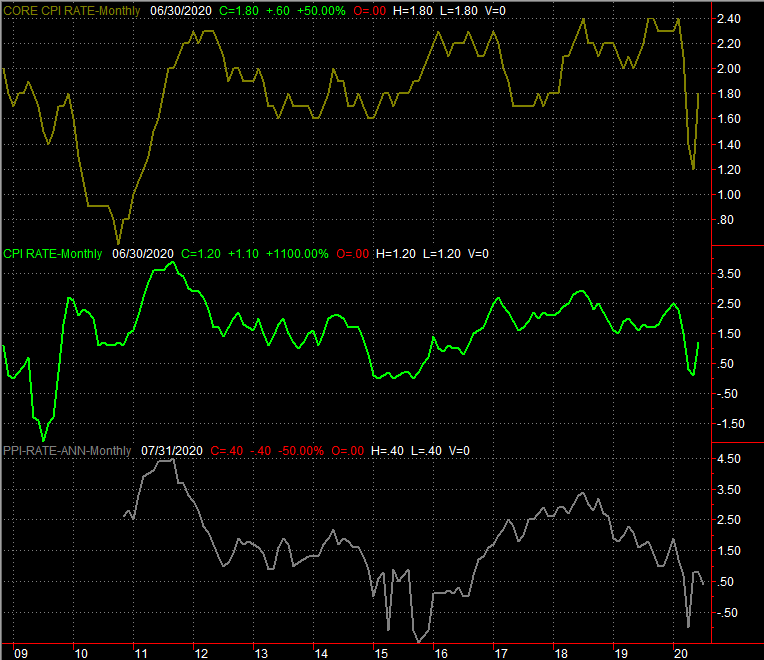
Yes, there's inflation… and more of it than anticipated. Consumer prices were up 0.6% last month (from June's adjusted levels) on a core as well as a non-core basis. Producers, or the factories and plants that buy supplies and goods, felt the same pinch. Producer costs were up 0.6% not counting food and energy prices too. The annualized inflation rate for consumers now stands at 1.0%, though the annualized PPI rate still stands in slightly negative territory.
Consumer, Producer Inflation Rate (Annualized) Charts
 [1]
[1]
Source: Bureau of Labor Statistics, TradeStation
Demand – at least from consumers – is driving some of that inflation. Retail sales not counting cars was up 1.9% last month, easily topping expectations. The car market isn't rebounding quite as firmly as planned, growing 1.2% in July versus expectations for a 1.8% improvement. Even so, as the coronavirus continues to spread, shoppers are finding ways to work around it. This points to a recovery some didn't think possible just a few weeks ago.
Retail Sales Charts
 [2]
[2]
Source: Census Bureau, TradeStation
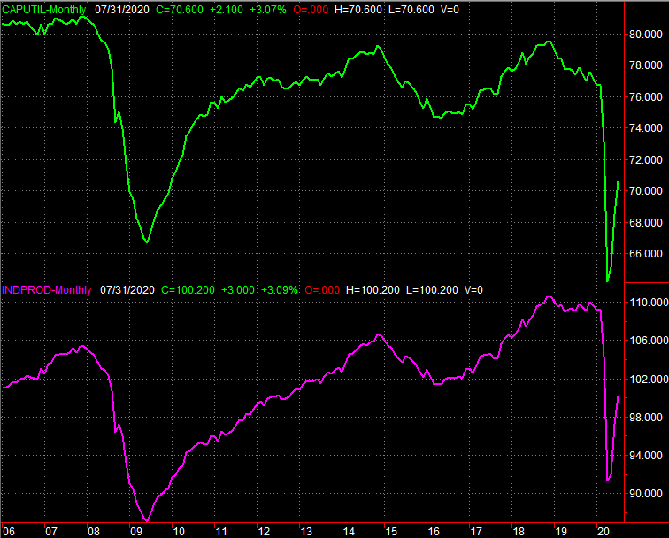
Finally, it should come as no surprise (given the inflation that factories and plants are facing unexpected levels of inflation) that capacity utilization and industrial productivity for last month rolled in more than expected. The nation is now utilizing 70.6% of its output potential, topping expectations of 70.0%. Industrial production grew 3.0%, versus anticipated growth of 2.9%. On this front as well, the recovery is taking shape quite nicely.
Industrial Production and Capacity Utilization Charts
 [3]
[3]
Source: Federal Reserve, TradeStation
Everything else is on the grid.
Economic Calendar
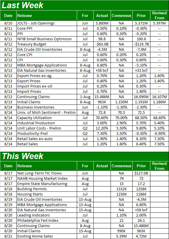 [4]
[4]
Source: Briefing.com
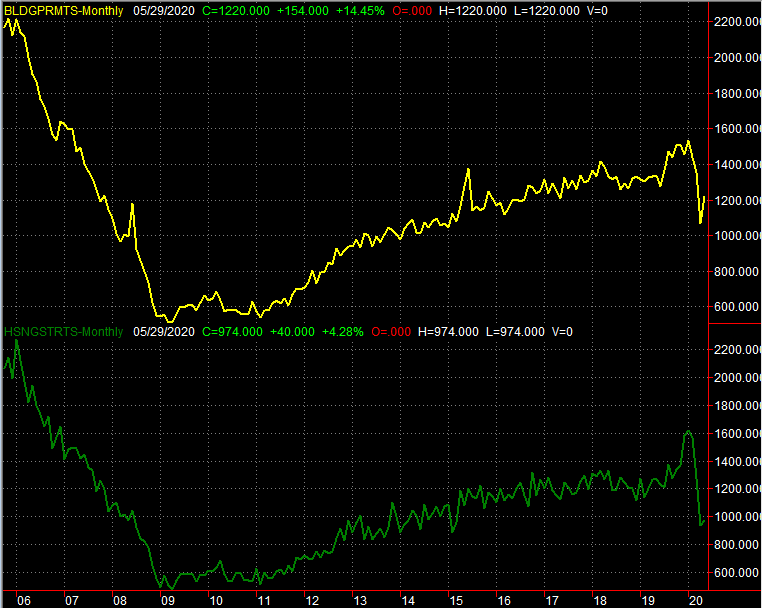
This week won't be anywhere near as busy. But, it will be the beginning of a busy time for real estate data. On Monday look for housing starts and building permits for July – both should have perked up a little from June's pace – and on Friday we'll get the existing home sales figure from the National Association of Realtors. We should see a major surge there, prompted by record low mortgage interest rates; the complementary new-home sales numbers come the following week.
Housing Starts and Building Permits Charts
 [5]
[5]
Source: Federal Reserve, TradeStation
Broader economic indicators like the Philadelphia Fed Index and the Empire State Manufacturing Index are also in the lineup for this week. But, they've not been particularly helpful data nuggets of late… a little lagging at best, and misleading at worst.
Stock Market Index Analysis
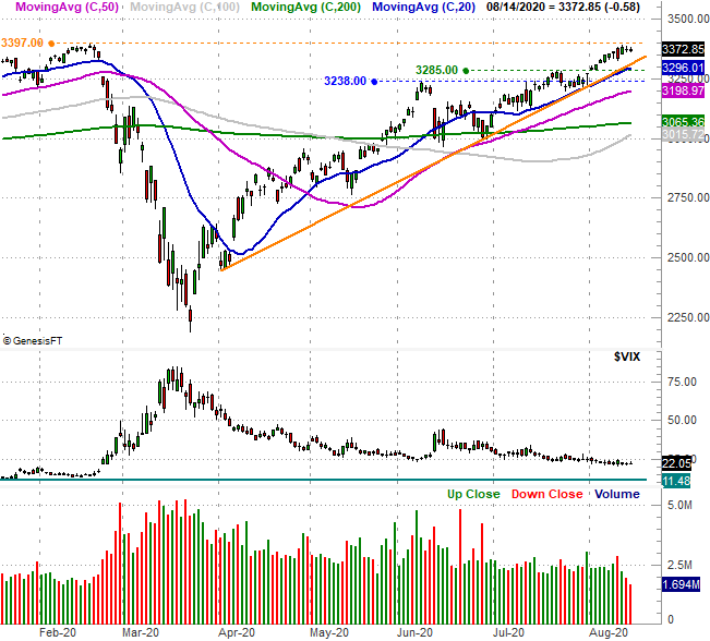
The fact that the S&P 500's advance slowed last week is no surprise; things have been hot and cold, two-steps-forward-one-step-back for a while now. What's troubling, however, is where it started to roll over. Last week's high of 3388 was essentially in line with the February peak of 3393.
S&P 500 Daily Chart, with VIX and Volume
 [6]
[6]
Source: TradeNavigator
It's not the end of the world. The S&P 500 remains above all of its key moving average lines, and above the straight-line support (orange) that connects all the key lows going back to the early April low. The multi-month advance, however, not only failed to grow much-needed volume on the way up, but volume waned as we approached the 3390 area.
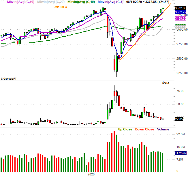
That volume fell off the cliff last week. It's probably not a coincidence. February's peak was something of a landmark everybody's been watching, so rather than make a big bet in either direction, traders are opting to make no bet at all. The weekly chart puts that reality in even more perspective, as it does the sheer speed and distance of the rebound since March's low. That's a 54% gain, altogether.
S&P 500 Daily Chart, with VIX and Volume
 [7]
[7]
Source: TradeNavigator
There's another nuance only evident on the weekly chart. The 200-day moving average line (green)? The index is now 10% above it. That was about how far the S&P 500 was able to separate from the 200-day line in February, and while March's meltdown was rooted in very unusual circumstances, that's typically about as far ahead of the long-term moving average line the index is capable of getting.
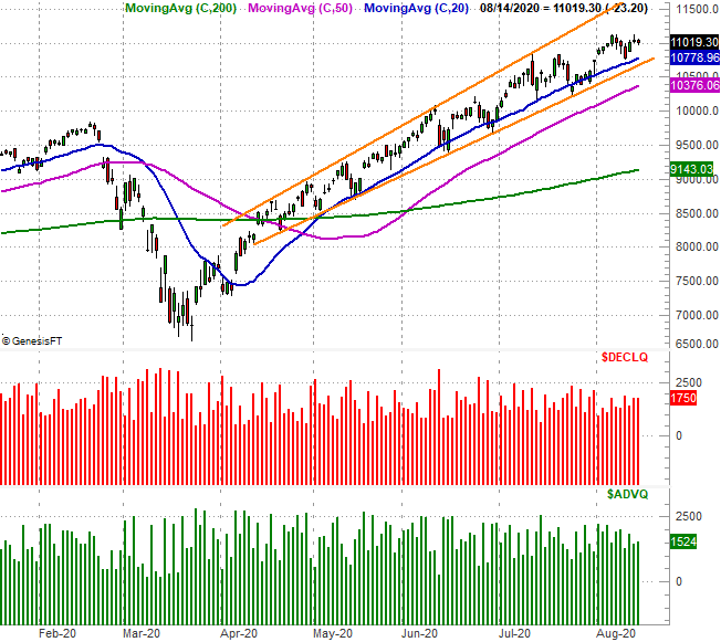
The NASDAQ Composite hasn't had as much of a problem blasting past prior highs or breaking away from its 200-day moving average line (green). It's also still above the lower boundary of a rising trading range that extends back to April. The composite, however, seems to be losing steam in its own way. That technical floor is within striking distance, as it's the semi-pivotal 20-day moving average line (blue).
NASDAQ Composite Daily Chart, with Advancers/Decliners
 [8]
[8]
Source: TradeNavigator
Curiously, while it was the slowest to rebound from its February/March tumble, the Dow Jones Industrial Average's chart is actually the most encouraging right now.
This is something we've discussed a couple of times of late. The broad market may be rising, but we're starting to see tech and growth names lose their luster relative to more blue chips and value-like names.
Dow Jones Industrial Average Daily Chart, with Volume
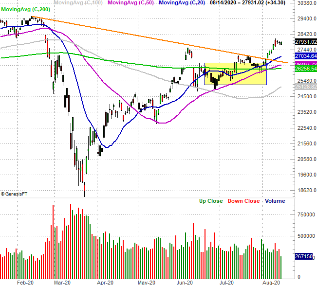 [9]
[9]
Source: TradeNavigator
That doesn't necessarily mean the Dow's going to rise if the NASDAQ breaks down though; all three major indices tend to move as a herd, given enough time. It does suggest, however, that the Dow and Dow-like names may hold up better should things get as hairy as it's starting to look like they could… as we enter the second half of August and get closer to September.
To that end, bear in mind that September is – on average and more often than not – a loser for stocks. Given the backdrop of incredible gains since March despite coronavirus-crimped earnings (as short-lived as the headwind may be), we can't be surprised to see that play out again this year. Fortunately, the technical floors that will indicate the beginning of a selloff are quite clear.