Stocks started and ended last week on a bullish note, leading to a net gain for the five-day stretch. But, what happened in between exposed the market's vulnerability. We reached new multi-week lows on Friday before the big bounceback, snapping some technical support in the process. And, the bullish volume never quite outpaced the bullish volume…even on Friday when the indices mustered gains.
Translation: Confidence in the rally since last March is being shaken. It remains to be seen if it's shaken enough to spark a more serious correction, but that's a distinct possibility here.
We'll look at the matter in some detail below – as always. First though, let's recap last week's big economic reports and look at what's in the cards for this week.
Economic Data Analysis
There's no reason not to start with last week's biggest report… February's jobs numbers. The Department of Labor says we added 379,000 new payrolls, which was just enough to pull the unemployment rate down from 6.3% to 6.2%. Both were better results than expected.
Payroll Growth and Unemployment Rate Charts
 [1]
[1]
Source: Department of Labor, TradeStation
There weren't any gimmicks supporting employment progress either. Unemployment numbers fell, and the size of the labor force grew too. More people are just working, and they're working a few more hours for a little more pay. None of the metrics were great, but all of them showed a slight improvement. Go figure.
There is one red flag, however. The ADP Employment Change report – which more or less moves in tandem with the DOL's payroll growth figure – didn't do so this time around. ADP says there were only 117,000 newly created positions for last month, falling well short of the expected 180,000. It'll be interesting to see of the government's figure is revised a month from now.
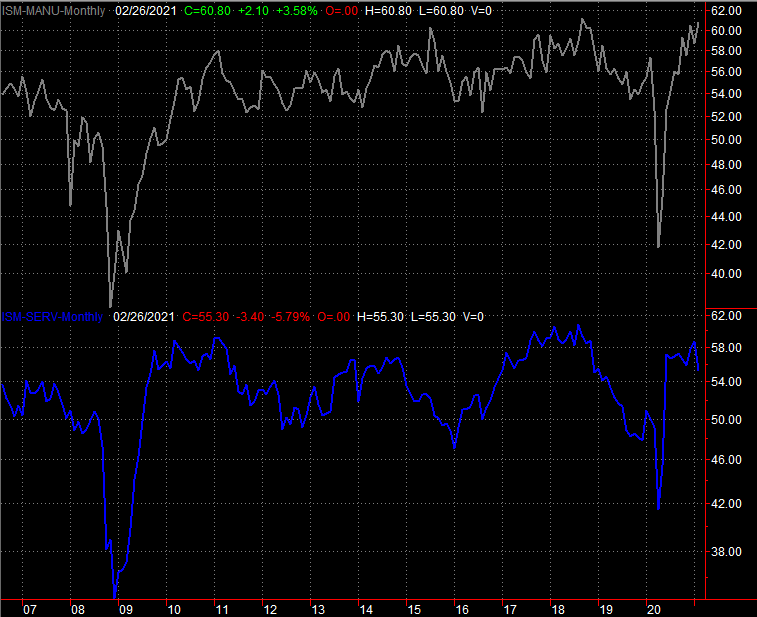
The only other data set of interest from last week is the Institute of Supply Management's manufacturing and service index readings. The former improved to a multi-year high level of 60.8, jibing with job growth and suggesting the economy is picking up steam. The latter fell from 58.6 to 55.3, but that's still above the 50 level that separates growth from contraction.
ISM Service and Manufacturing Index Charts
 [2]
[2]
Source: Institute of Supply Management, TradeStation
Everything else is on the grid.
Economic Report Calendar
 [3]
[3]
Source: Briefing.com
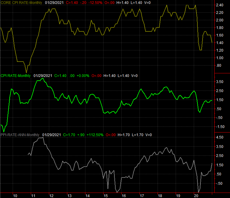
This week is going to be pretty tame. We'll get our first look at t he University of Michigan's sentiment reading, though it's revised twice before the month ends. We're far more interested in February's inflation figures for consumers and producers. Both are expected to rise, though not dramatically so.
Consumer, Producer Inflation Charts
 [4]
[4]
Source: Bureau of Labor Statistics, TradeStation
This is something to watch closely. Whispers that inflation is ready to race out of control are circulating, and rising bond yields are supporting that thesis. The Fed will do its best to curb it before it happens, but given how much cheap money is already out there, those efforts may be too little, too late. Just keep your eyes peeled and your ears open.
Stock Market Index Analysis
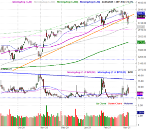
This week's review starts with a zoomed-in look at the daily chart of the S&P 500, as that's where a subtle but critical change made last week is evident. Namely, the rising support line (orange) that's been guiding the index higher since last March's low was broken… on Thursday. Friday's rally dragged the S&P 500 back above the support line, but the dent's already made. From here it will be easier for the bears to take another swipe, and that next swipe might not be immediately met with a rebound.
S&P 500 Daily Chart, with VIX and Volume
 [5]
[5]
Source: TradeNavigator
Here's a weekly version of the S&P 500 chart, with the VIX and volume bars again. But, with an added indicator – the MACD lines. From this perspective we can see how the rally since March of last year is not only slowing down, but also see how the index is starting to put more and more pressure on its technical support. The MACD indicator is showing us a new bearish divergence, in fact.
S&P 500 Weekly Chart, with VIX, MACD, and Volume
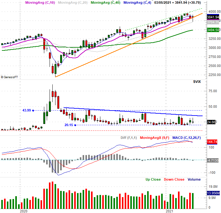 [6]
[6]
Source: TradeNavigator
Problem: The VIX hasn't surged higher, as we'd expect it too when things start to get alarming and traders start to hedge their bullish bets (or outright bet on a pullback). That's not to say it won't happen in the near future. It's just to note that it hasn't happened yet, if it's going to.
And we're still concerned of that possibility for the same reason it was a concern a week ago. That is, the market's breadth (advancers versus decliners) and depth (bullish volume versus bearish volume) are still leaning bearishly.
Curiously, this is more evident with the NASDAQ's listings than it is with the NYSE's listings, perhaps because the biggest of the big tech names (which almost exclusively trade on the NASDAQ) have proven the biggest losers of late. Friday was an exception to this trend, but through Thursday of last week the trend is clear. Bearish volume and decliners have been growing, while bullish volume and advancers have been shrinking.
NASDAQ Daily Chart, with Advancers, Decliners, Up and Down Volume
 [7]
[7]
Source: TradeNavigator
Also notice on the daily chart of the NASDAQ that it too has started to attack its most important support levels, and briefly traded below its 100-day moving average line (gray) on Friday. The last time this floor was tested back in October it led to a multi-week rally. You'll also see on the daily chart of the NASDAQ Composite that its volatility index, the VXN, hasn't yet poked above a major technical ceiling (red) currently near 38.8. It's close though, and its horizontal ceiling at 40.0 is almost as close.
NASDAQ Daily Chart, with VXN
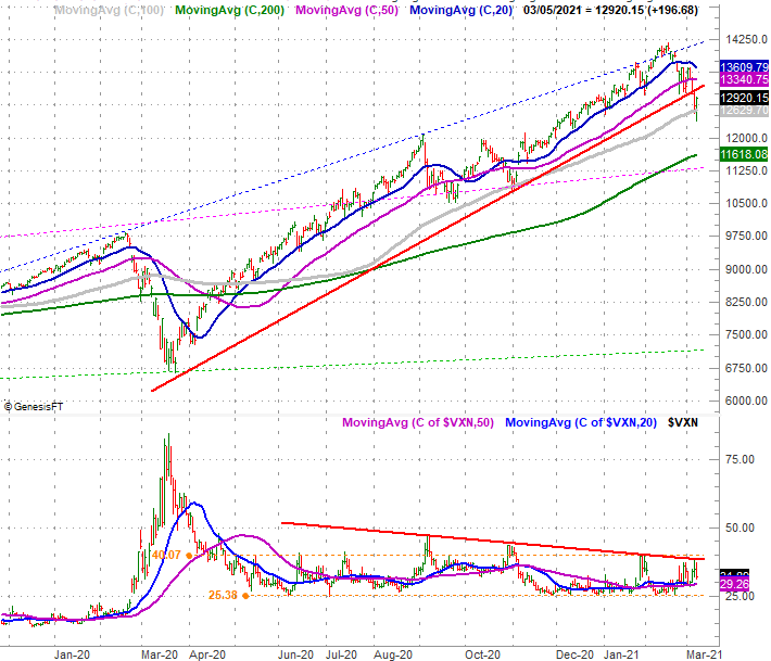 [8]
[8]
Source: TradeNavigator
The point is, it wouldn't take much for the NASDAQ's technical scales to tip so bearishly that it can't stage a quick recovery.
The good news? The NASDAQ's 200-day moving average line (green) isn't too terribly far below its current level. This is the next-best/next-most-likely floor in play right now, and could end any pullback before it raced too far out of control. Of course, if the 200-day moving average doesn't quell the selling – should it be in a position to do so – that presents a huge problem. There's no other likely support level until 11,330, where a 38.2% Fibonacci retracement line (not shown) presently lies. We'll look at that in the future, if needed.
These are all simply what-ifs though. Technically speaking, the rally is still alive even if it feels like it's running on borrowed time. Don't trade too presumptuously just yet.