 [1]The bulls may have started last week with a bang, but they certainly didn't end it on a high note. At one point on Wednesday, the S&P 500 was up a little more than 1.4% for the week. By Friday's close of 2901.52, the gain had been pared back to only a little more than 0.9%. The surge just couldn't draw out the kind of sustaining volume it needed.
Still, the August gain of 3.0% was not only impressive, it was unusually strong for a month that's generally just a so-so one for the market. The big move also leaves the S&P 500 especially vulnerable to the usual September weakness. On average, the index loses 0.64% this month, and has historically posted a loss more often than a gain for the month.
We'll weigh the odds and the tendencies below, as always, after a rundown of last week's and a preview of this week's economic news.
Economic Data
The economic-data dance card was relatively full last week, though without any real showstoppers on it. And, a couple of the bigger data nuggets we got were in conflict with one another.
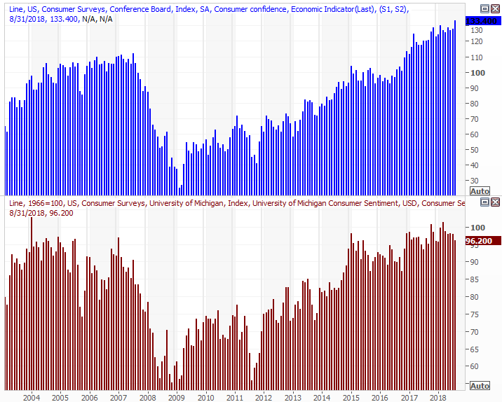
We're of course talking about consumer sentiment. The Conference Board's Consumer Confidence measure reached a multi-year high of 133.4, but the Michigan Sentiment Index fell to a seven-month low of 96.2.
Consumer Sentiment Charts
 [2]
[2]
Source: Thomson Reuters Eikon
The two readings aren't created the same way, but it's still a curious disparity all the same.
Of the two, the Conference Board's reading is the one designed to be more consistent and scientific in nature. Either way though, both remain in decided uptrends.
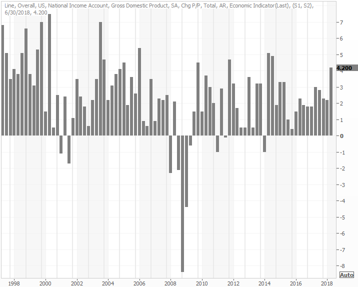
Another noteworthy data drop this past week was the second (of three) readings for the second quarter's GDP growth rate. The first estimate was 4.1%, and that was not only something of a relative letdown, many observers were fearful the follow-up readings would drift lower. Nope. Instead, it actually edged a little higher, to 4.2%.
GDP Growth Charts
 [3]
[3]
Source: Thomson Reuters Eikon
There's still a chance it could change with the third and final reading later this month, but adjustments from this point on are rare. More important though, we're seeing strong, consistent growth now. The pros are predicting Q3 GDP growth of a whopping 5.0%.
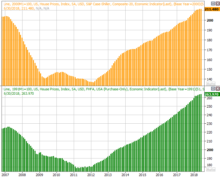
One more notable data point from last week, only because it offers a much-needed glimmer of hope on this front… the S&P Case-Shiller Home Price Index grew 6.3% year-over-year for July.
Home Price Index Charts
 [4]
[4]
Source: Thomson Reuters Eikon
It's month-old data now, but suggests that despite slowing purchase activity and a slight rise in homes available for sale, at least home prices are holding value, and appreciating in price. The market can survive one or the other, but seeing headwinds on both fronts would be especially troubling.
Even so, it appears the pace of home price increases is still slowing.
Everything else is on the grid.
Economic Calendar
 [5]
[5]
Source: Briefing.com
This week is going to a bit busier, with all the data crammed into just four workdays. More than that though, more of this data is harder-hitting.
The biggie is Friday's jobs report for August, of course, but the party starts bright and early with Tuesday's open. That's when well hear about last month's ISM Manufacturing Index reading for August, followed by the Services version of the index on Thursday.
ISM Index Charts
 [6]
[6]
Source: Thomson Reuters Eikon
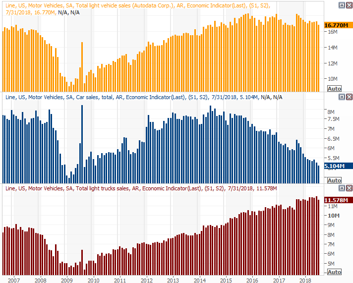
Brace for last month's automobile sales figures on Wednesday. No outlooks are available, but the general trend has been lethargic, at best. Even truck sales are leveling off, and there wasn't a lot about August to suggest things got dramatically better last month — at least not without significant incentives.
Auto Sales Charts
 [7]
[7]
Source: Thomson Reuters Eikon
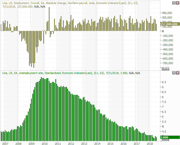
As for the jobs report, economists are looking for more of the same. That's a good thing.
Payroll Growth, Unemployment Rate Charts
 [8]
[8]
Source: Thomson Reuters Eikon
We've noted it before but it bears repeating now: Net-growth in jobs and reductions in unemployment aren't the most telling measures right now. Most everyone who wants to work can find a job. The real measure of progress on this front from here is hourly pay and hours-worked per week. We'll have that deeper look at the whole report at the website shortly after the Department of Labor releases its basic figures.
Index Analysis
Skeptical that the market has managed to come as far as it has in just a few months? You're not crazy. The 12% gain since early May is rather amazing, to the point of being uncomfortable.
Yet, it's not as if we've not seen the likes of this before. More important, it's not like we haven't seen this before, with the market managing to continue on to higher highs. Conversely, it's not like we haven't seen this kind of move before, and not seen it end in disaster.
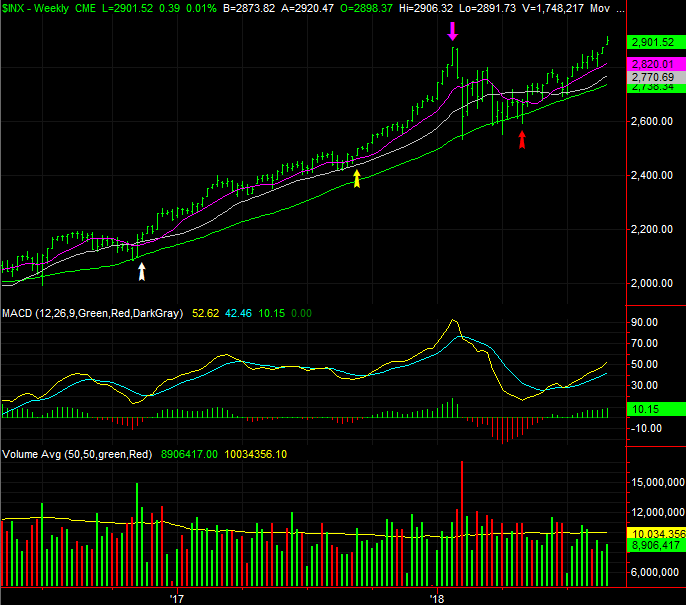
The weekly chart of the S&P 500 below gives us plenty to think about. If the red arrow – the beginning of the current advance – ends up being like the pivot into bullish mode like the one we saw in November of 2016 (the white arrow), then great! That gain was an uninterrupted march. If instead this move end up being like the acceleration of the rally we saw take shape in September of last year (yellow), then that could be trouble. It was a fun ride while it lasted, but it didn't last very long. It was the unbridled pace of that move that ultimately ended up creating a clear peak and setting the stage for a wave of profit-taking (purple).
S&P 500 Weekly Chart, with Volume
 [9]
[9]
Source: TradeSation
There's no way of knowing for sure what the underlying nature of this move is. That's the point. For the crowd that's saying "too much, too fast," we've rallied right through worse. For the crowd that's shouting "onward and upward," we're burning fuel at what's usually an unsustainable pace.
We only make the point just so there's no misunderstanding – anything can happen here. Be ready for all of it.
That mindset also helps us get a grasp and what the daily chart of the S&P 500 is and is NOT telling us.
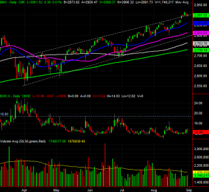
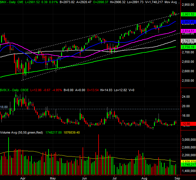
We mentioned a week ago how the S&P 500 was approaching the upper boundary of a rising trading range (white, dashed) that had been in place since April. But, the upper ceiling of that range ended up not capping the rally; the S&P 500 punched right through it on Monday, and put some distance between itself and that resistance on Wednesday. Perhaps it was more of a problem than it seemed at the time though, and just needed a few days to take effect. The follow-through on the breakout effort completely petered out on Thursday and Friday, with the weight of the gains proving a tough load to shoulder.
S&P 500 Daily Chart, with VIX and Volume
 [10]
[10]
Source: TradeStation
The index is also now 6.3% above its 200-day moving average line (green), which is about as much divergence as has been historically witnessed. It's a small miracle when the S&P 500 manages to get 8% above its 200-day moving average line, and that's usually a condition that's corrected with a decent pullback.
You'll also notice on the daily chart that the volume levels have been subpar on the way up. Maybe that's just the usual seasonal lull, or maybe it's actually a sign that there aren't a whole lot of bullish believers here.
The other wrench in the works: We're now into September, which is more often than not a loser for stocks. The average September performance for the S&P 500 is a 0.64% loss, and we're starting this September out in the shadow of one of the best August performances we've seen in a long while.
We're usually willing to offer an educated, qualified call, or at least talk about an if-then scenario. This is one of those rare times, though, where the smart move is to wait on the sidelines and see how this all takes shape. The market is pretty much hijacked by sentiment and headlines right now, making things tricky, and making any conventional interpretation of charts a moot exercise. Follow the tape. Period.
For what it's worth though, any breakdown that includes the VIX pushing above its recent ceiling around 19.0 is a major red flag. Just as much of a red flag is a breakdown that drags the S&P 500 any or all of its key moving average lines.
Until then, just stay buckled up and ride through the one-sided volatility as long as you can.