
Most traders recognized the market was overbought and ripe for some profit-taking at the beginning of last week. Most traders, however, didn't appear to think it would actually happen. Last week, the S&P 500 lost almost 1.0% of its value… the worst week since June.
 [1]And yet, as rough as last week was, it wasn't devastating. The market took a hit, but when push came to shove the S&P 500 remains above one key line in the sand, while the VIX remains below an important technical ceiling. It's still overbought, but it's still holding most of its ground.
We'll identify that support and resistance below, and offer up some likely outcomes from here. First though, let's paint a bigger picture with a look at last week's and this week's economic data.
Economic Data
There's no reason to ignore the 800 pound gorilla in the room. Friday's jobs report for September was a head-turner. But, let's save that look for a grand finale, and instead run through last week's economic news in order of appearance.
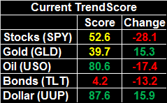
That puts last month's ISM Manufacturing Index report first in the queue, rounding out the ISM Services Index update from a week earlier. And, unlike the ISM Services report, the manufacturing version of the data not only fell for the month, it came in below expectations.
ISM Index Charts
 [2]
[2]
Source: Thomson Reuters
It's not a problem yet, but it's something to watch. We'd really rather see progress on the manufacturing front rather than the services front.
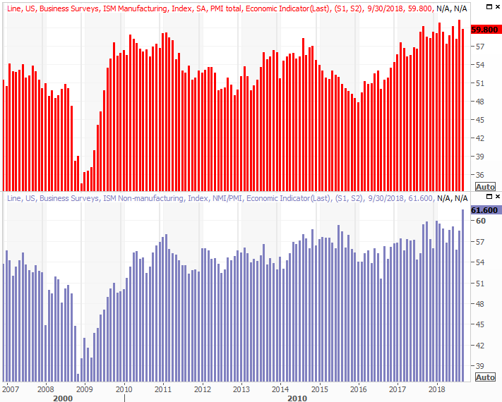
Take Tuesday's big automobile sales figures with a grain of salt. They were up from August's numbers, but some of that perk-up may have been the initial purchases stemming from insurance reimbursements. Hurricane Florence wasn't devastating, but it certainly wasn't minor either.
Automobile Sales (Annualized) Charts
 [3]
[3]
Source: Thomson Reuters
If history is any guide, that surge won't last long, allowing the auto sales trend to resume its broad downtrend that's been in place since 2016.
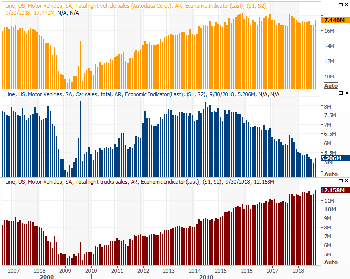
And last but anything but least, September's jobs report… it was incredible, mostly. The unemployment rate fell to a 47 year low of 3.7%. The country only added 134,000 new jobs, falling well short of estimates, but the impediment wasn't a lack of need. It was rooted in the fact that anybody who wants a job has one, and wants to keep the one they have.
Payroll Growth, Unemployment Rate Charts
 [4]
[4]
Source: Thomson Reuters
For more perspective on why the job-growth shortfall wasn't a problem but a benefit, we've got a detailed look at all the facts and figures at the website. While unemployment is stunningly impressive, interestingly, there were a couple of other figures that might normally be a big concern.
Everything else is on the grid.
Economic Calendar
 [5]
[5]
Source: Briefing.com
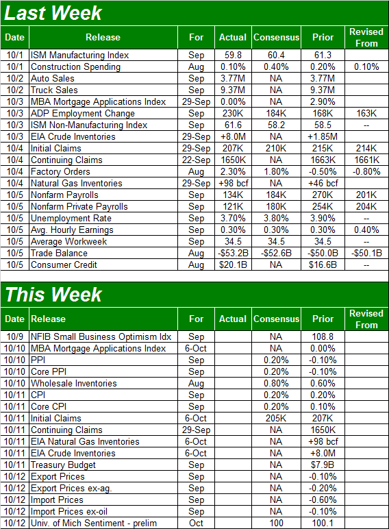
This week won't be nearly as busy, but it will be an important one. On Tuesday we'll get a look at last month's producer inflation data, and on Wednesday we'll hear September's consumer inflation report. Economists are looking for more slow and steady growth, but already at uncomfortable levels that continue to force the Fed to ratchet up rates, a little more inflation will be no minor matter.
As of August, the consumer inflation rate is 2.7% (2.2% on a core basis), while producers are facing an inflation rate of 3.6% (or 2.9% on a core basis). Inflation appears to be somewhat tempered, but not tempered enough to suit the Federal Reserve just yet.
Inflation Rate (Annualized) Charts
 [6]
[6]
Source: Thomson Reuters
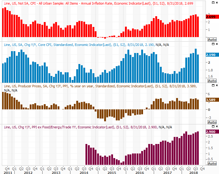
Finally, it's not a data set we've looked at a great deal lately, as there's been no need to. But, with time to do so this week, keep an eye and ear out for Thursday's natural gas and crude oil inventory report. Though crude stockpiles ticked up a week ago, one week doesn't snap the much-needed downtrend. Two weeks, though, may be a different story.
Crude Oil, Natural Gas Inventory Charts
 [7]
[7]
Source: Thomson Reuters
Index Analysis
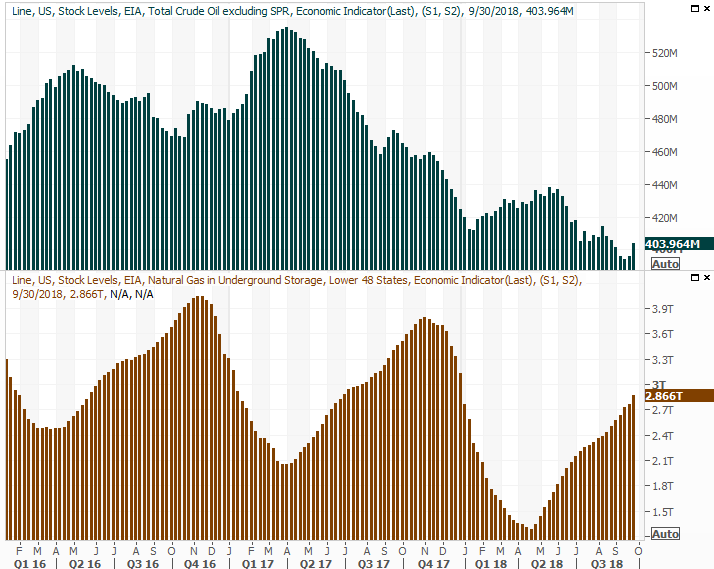
At first glance it's a bit concerning. The market took a sizeable hit last week, at a time of year that's generally known for marketwide weakness. A closer look at the charts, however, reveals that the indices aren't in any real trouble they can't dig their way out of. In fact, even if we do see the 'worst case scenario' pan out, that worst case scenario really isn't all that bad. Indeed, we're almost inviting the worst-case scenario here to use as a buying opportunity.
Take a look at the daily chart of the S&P 500. The rising support and resistance lines (dashed, white) that have guided the market higher since April are still intact. You'll also notice that the 50-day moving average line (purple) stopped the selloff from the S&P 500 on Friday.
S&P 500 Daily Chart, with Volume
 [8]
[8]
Source: TradeStation
There are a couple of other hints on the chart that suggest the market may not necessarily implode here either. One of them is the fact that the VIX appears to be capped at resistance near 17/0 (yellow, dashed). The other is that, despite a sizeable pullback last week, it's not like the volume behind last week's losing days was all that dramatic.
The same basic premises more or less apply to the NASDAQ Composite, but with some tweaks. Rather than the 50-day moving average line acting as a last-ditch floor for the NASDAQ, it was the 100-day line (gray). And, the NASDAQ's Volatility Index (VXN) appears to have bumped into a prior technical ceiling around 24.22.
NASDAQ Composite Daily Chart, with Volume
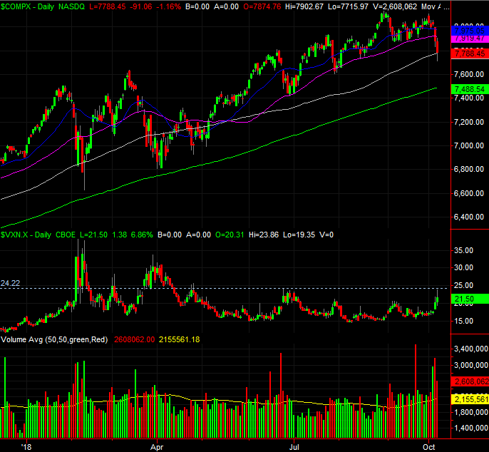 [9]
[9]
Source: TradeStation
The daily NASDAQ chart isn't bulletproof though. Unlike the S&P 500, there was plenty of volume behind last week's selloff. Traders were dumping the very smallest and very biggest of NASDAQ stocks… including FANG stocks. Taking the NASDAQ's daily chart at face value, we have to conclude it's in trouble, given the selling volume.
The weekly chart of the S&P 500 also puts last week in perspective. It's difficult to deny that stocks are overextended here. Assuming a reversion to the mean is in the making, there's an argument to be made that we're due for a dip all the way back to the 200-day moving average line (green) at 2768. That line was certainly a huge support area earlier in the year.
S&P 500 Weekly Chart, with Volume
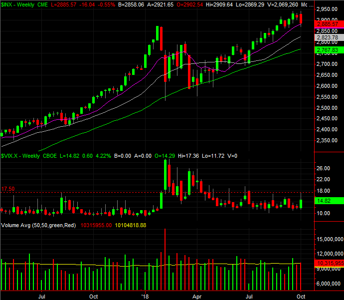 [10]
[10]
Source: TradeStation
Also working against both indices and the overall market is the calendar… sort of.
The graphic below compares the S&P 500's performance this year to its overall average, its average 'up' year, and its average 'down' year. As you can see, the September/October period is generally a lackluster one for the overall market. Not a killer, but a tough one. Clearly the index started out this year's September/October phase well above its norm, leaving it a little more vulnerable to profit-taking pressure.
S&P 500 YTD Performance Chart, vs. Average YTD
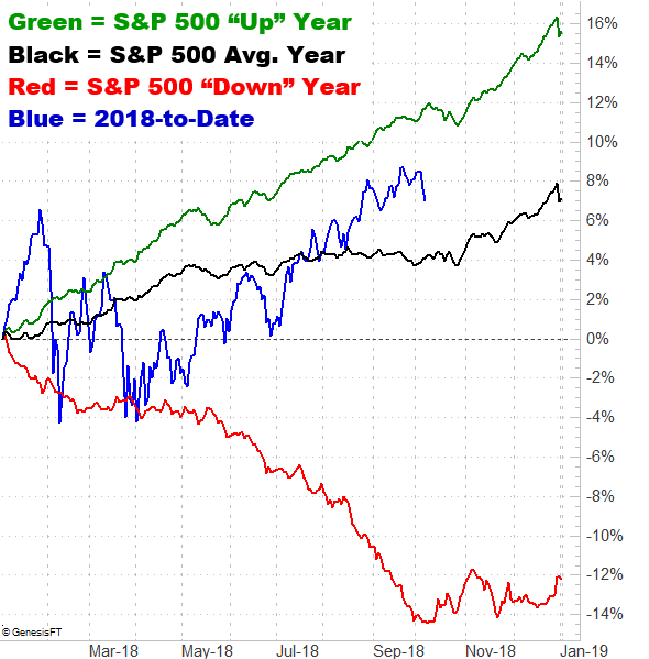 [11]
[11]
Source: TradeNavigator
Notice that even in bullish years, the latter part of October is usually a tough one. In all cases though, that October lull kicks off a strong end-of-year rally.
Putting it all together, the potential for a bigger pullback after last week's dip is undeniable. Just as undeniable, however, is the fact that both the S&P 500 and the NASDAQ Composite found support at critical moving average lines.
In many regards though, this current indecision is ideal in that we know exactly where the make-or-break lines are. If the S&P 500 breaks below the 50-day average and the NASDAQ breaks below its 100-day line and the VIX and VXN poke above their established ceiling, it may be difficult if not impossible to stop a retreat back to the 200-day moving average line. Unless that happens though, the bigger uptrend is still intact.
Updates to come as needed.