
Didn't we just leave this party? Having toyed with what could have turned into an ugly meltdown just a week ago, for a short while it looked like the bulls may get to work again and rekindle the bigger rally. Traders aren't quite ready for that to happen though, hitting the "sell" button hard and often on Friday as the week came to a close.
And yet, stocks managed to remain above what's arguably the market's most critical line in the sand right now, leaving most traders unsure about stocks' true nature at this time.
We'll look at the technical floor in detail below, but first, let's explore last week's and this week's major economic announcements.
Economic Data
It was a big week last week, data wise, kicking off with March's ISM data. Both the manufacturing version and the services version fell from February's levels, but both remain in attractive, bigger-picture uptrends.
ISM Index Charts
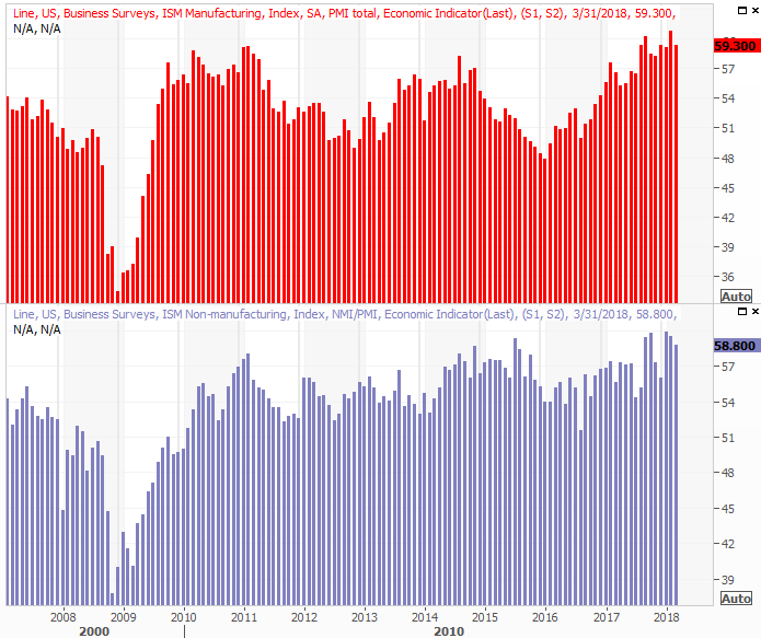 [1]
[1]
Source: Thomson Reuters
We also heard about March's auto sales last week. It was an encouraging report. After a few months of faltering demand, we saw a healthy uptick. It's not enough to say we're in the same kind of growth trend we were in between 2010 and 2016, but at least it's not another step in the wrong direction.
Auto Sales (Annualized) Charts
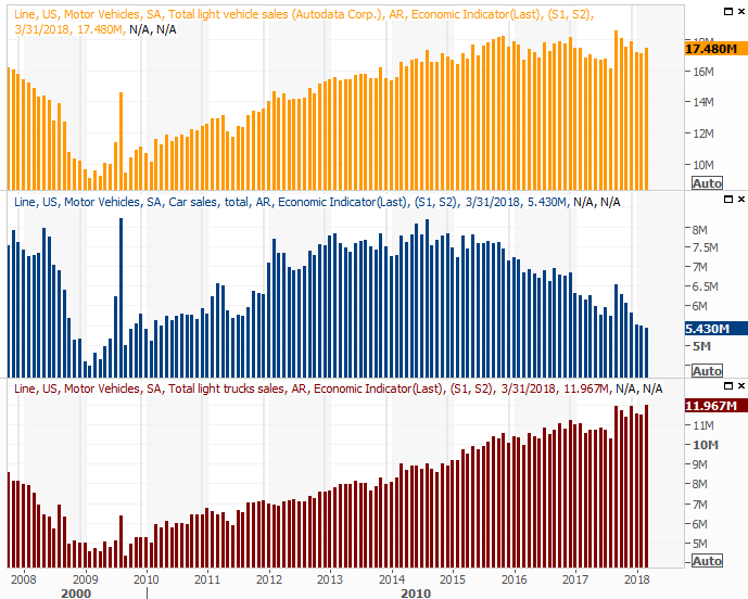 [2]
[2]
Source: Thomson Reuters
Last week's biggie, of course, was March's jobs report.
Following Wednesday's big ADP numbers, indicating another 241,000 new positions, hopes were high heading into Friday's report from the Department of Labor. Big mistake. The pros were modeling 175,000 new jobs, but we only saw 103,000. That translated into a slight uptick in the unemployment rate, from 4.0% to 4.1%.
Payroll Growth and Unemployment Rate Charts
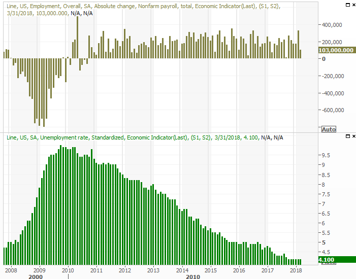 [3]
[3]
Source: Thomson Reuters
As is usually the case though, there's more to the story. Namely, the lingering winter weather has put a great deal of construction-related hiring on hold. And, a closer look at all the data suggests there just aren't enough available workers to hire… in a good way. You can review the rest of our analysis of the March jobs report here [4].
Everything else is on the grid.
Economic Calendar
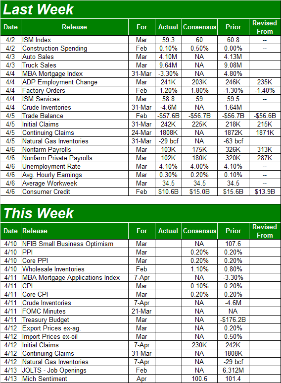 [5]
[5]
Source: Briefing.com
This week is going to be fairly busy, though there are only a couple of items we're really interested in.
One of those is the release of the minutes from the most recent FOMC meeting. Though it's not going to be accompanied by any decision on the Fed's target base interest rate, the minutes do reveal a little bit of what the Fed's governors are thinking that we didn't already know.
Speaking of interest rates, we will get an important data nugget that could impact them this week. On Tuesday we'll hear about last month's producer inflation rate, and on Wednesday we'll hear last month's consumer inflation information. Broadly speaking it's been fairly tame, and is expected to be so again for March. A big deviation from expectations could accelerate or slow the Fed's present plan for three more rate hikes this year.
Producer and Consumer Inflation (Annualized) Charts
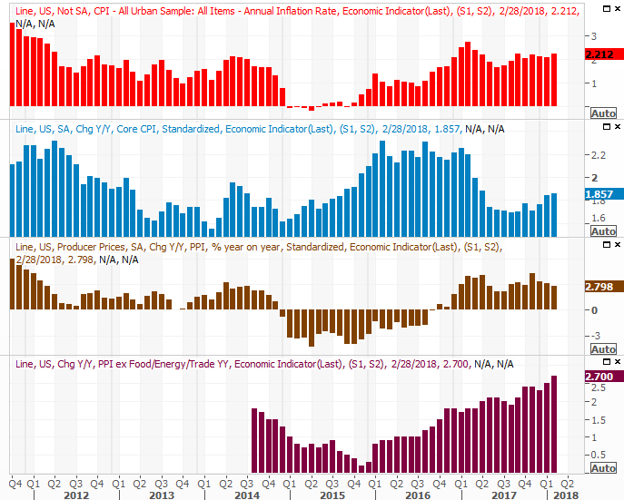 [6]
[6]
Source: Thomson Reuters
For what it's worth, we'll also get the job openings and labor turnover report (JOLTS) for February this week. We saw record job openings for January with the report we got a month ago, jibing with the idea that tepid payroll growth isn't a sign of a weak jobs market. Rather, it's a hint of full or near-full employment.
Also keep your eyes and ears peeled on Wednesday for last week's change in the amount of crude oil we've got stockpiled. It ticked a little higher earlier in the year, reversing a massive drawdown in the latter half of 2017 that helped buoy the price of oil. But, it started to slide again a week earlier, suggesting a renewed depletion of supply that could continue to help lift prices.
Crude Oil Inventory (U.S.) Charts
 [7]
[7]
Source: Thomson Reuters
Index Analysis
Once again the bears took just enough of a bite out of the market to let the bulls keep thinking there's a chance things won't get any worse. And, who knows? Maybe stocks won't slide any lower. The market is certainly playing with fire though, and one small misstep could start a chain reaction of selling.
The proverbial line-in-the-sand we were discussing above is the 200-day moving average line. On the daily chart of the S&P 500 below, it's plotted in green. As you can see, the index brushed it briefly on Friday, but when push came to shove the bears didn't have the guts to leave it below that level by the time the closing bell rang. Who can blame them, given the occasional (and sometimes surprising) resiliency of this market?
S&P 500 Daily Chart, with VIX and Volume
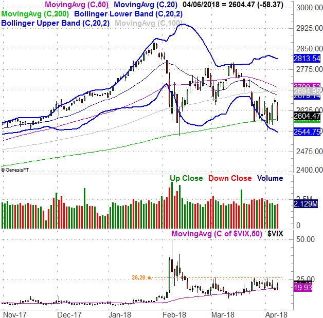 [8]
[8]
Source: TradeNavigator
Also notice the VIX didn't break above its big ceiling at 26.2, though it does seem to be finding support at its 50-day moving average line (purple).
The stable VIX is actually an indirect concern. Were traders "freaking out" when they were selling, out of fear, we could conclude the selling effort would come to a climax pretty soon… a capitulation. We're not seeing that though. Rather, the stagnant VIX implies not only that this selling is not scary, but has been more or less expected. More of the same is expected as well.
To that end, our pending call on the VIX is the same as it has been. That is, a modest move above 26.20 is a red flag, but a surge or spike from the VIX will likely mark a trade-worthy bottom.
Zooming out to a weekly chart of the S&P 500 doesn't show us anything else – almost – but it does add some perspective on how this selling effort materialized so quickly.
The horizontal lines on the weekly chart of the S&P 500 are key Fibonacci retracement lines. The short explanation of Fibonacci lines is, they show you where a chart is most likely to find support or resistance when there's no other context for such pivots. Clearly there's a potential floor at 2465, which isn't too far away. But, it's certainly lower than where we are now.
S&P 500 Weekly Chart, with VIX
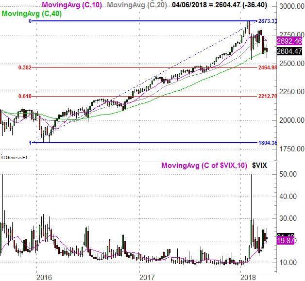 [9]
[9]
Source: TradeNavigator
A slide back to the 2465 level would be a 14.2% correction from the recent peak… a fairly typical corrective move.
For the record, April is usually a good month for the market; the S&P 500 averages a 1.0% gain. When it's a bearish year though, April is an especially rough month. April tends to dish out a 1.8% loss. This year so far is shaping up rather bearishly, so don't rule anything out. Momentum is half the battle.
S&P 500 YTD Performance (vs. Bullish, Bearish & Avg. Yr.)
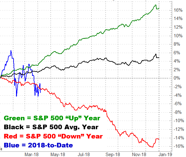 [10]
[10]
Source: TradeNavigator
That's not necessarily a bearish call… just a caution to not assume anything. We'd love for stocks to rebound, but we have to respond to what the market is doing. To accept what it is doing, we have to be willing to acknowledge what it's capable of doing.
In the meantime, keep a close eye on the 200-day moving average line. That looks like it's going to be the battleground.