It was a less-than-thrilling effort, but stocks tacked on enough gains last week to get then over key technical humps that were a bit problematic a week earlier.
Still, they were losing steam all the way up, logging closes closer to the lower ends of the daily ranges than the higher ends. Part of that can be chalked up to the calendar, while another part of that can be attributed to the fact that stocks are still just so overbought. Regardless of the reason, it's clear that any more gains made from here are going to be hard-fought and slow-going. Not even great economic news like continued drops in new unemployment claims and healthy personal income and personal spending could light a real fire under the market.
We'll dissect the action below, but first, let's run down last week's big economic announcements and take a look at what's coming this holiday-shortened week.
Economic Data Analysis
Last week's economic data is a mixed bag. Take consumer sentiment as an example of the sore spots. The Conference Board's measure of consumer confidence fell just a bit from April's level, not living up to the expected score of 118.7, and stalling before moving back to pre-pandemic levels. The University of Michigan sentiment index fell even more, back to a score of 82.9 for May, also failing to move back anywhere near its pre-pandemic peak.
Consumer Sentiment Charts
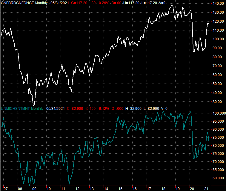 [1]
[1]
Source: Conference Board, University of Michigan, TradeStation
The flipside? Real estate appears to still be rolling. Yes, sales of new houses fell from March's pace of 917K to 863K in April, although the lack of inventory on this front is just as much a problem here as it is for existing home sales, which also fell last month. Demand is still pretty firm.
New and Existing Homes Sales Charts
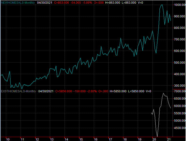 [2]
[2]
Source: National Board of Realtors, Census Bureau, TradeStation
How do we know the demand is still there and that it's just a limited supply of houses that's a bottleneck? Prices. Both the FHFA Housing Price Index and the Case-Shiller Price Index not only continued to rise through the month of March, but accelerated their pace of progress.
FHFA Housing Price Index, Case-Shiller Home Price Index Charts
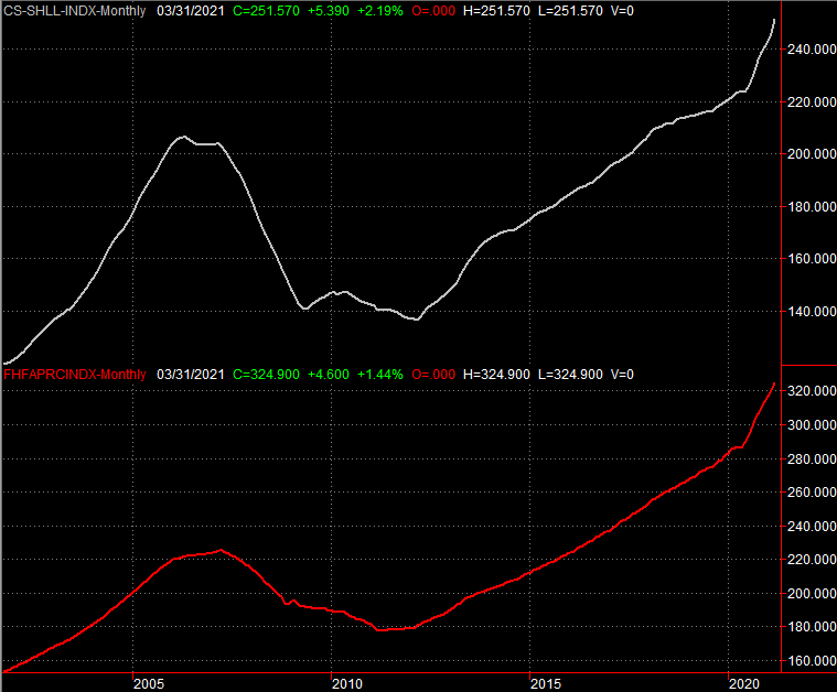 [3]
[3]
Source: FHFA, Standard & Poor's, TradeStation
There is one subtle but important nuance to note here. That's the timing of this data. The home price reports are only through March and the home sales numbers are only through April, but some of the economy's turbulence didn't materialize until this month. We can only wait and see where this is going.
Everything else is on the grid.
Economic Report Calendar
 [4]
[4]
Source Briefing.com
This four-day week doesn't have a whole lot for us, but what little we're getting could most definitely be market-moving.
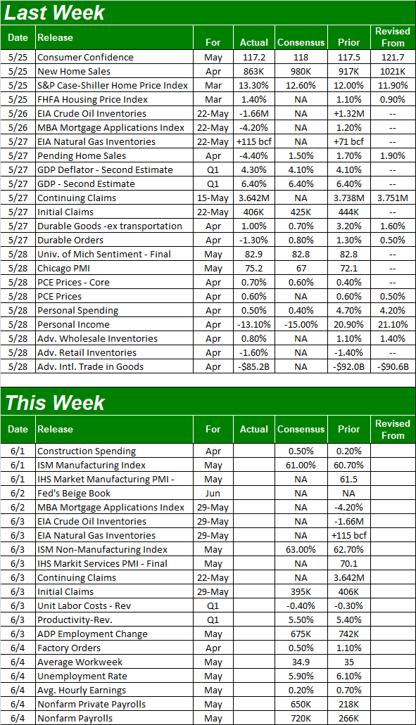
The first couple of biggies in the lineup are the ISM manufacturing and service index updates, due on Tuesday and Thursday, respectively. Both have lingered well above the critical 50 level for some time now, and while there's not much room left for higher scores, that's ok. Their current levels are plenty healthy.
ISM Services and Manufacturing Index Charts
 [5]
[5]
Source: Institute of Supply Management, TradeStation
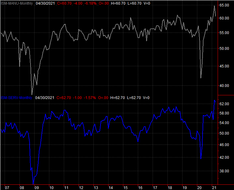
On Friday look for May's jobs report. You May recall the previous month's numbers from the Department of Labor were shockingly disappointing. Rather than the forecasted 1 million newly-created jobs, we only added 266,000. That coupled with March's downward revision of 916,000 new payrolls to only 770,000 led the unemployment rate to inch up from 6.0% to 6.1%… the first step back we'd seen since the height of the pandemic's impact in April of last year.
Payroll Growth and Unemployment Rate Charts
 [6]
[6]
Source: Department of Labor, TradeStation
For better or worse, expectations for this week's employment update are relatively high. Maybe economists are on to something, but any shortcoming here could easily torpedo this fragile market. Speaking of…
Stock Market Index Analysis
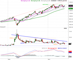
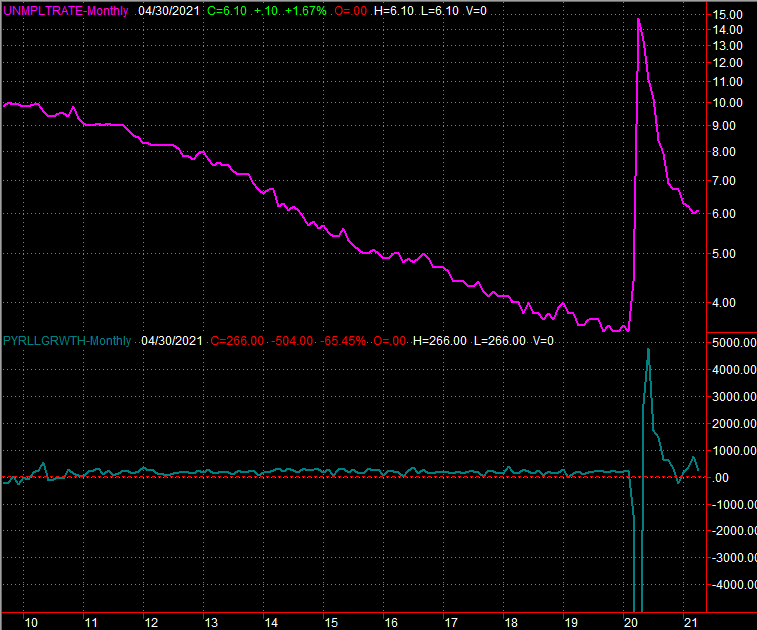
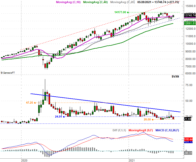
Check out the close-up daily chart of the NASDAQ Composite immediately below. Namely, notice how most days last week the close was pared back from the high. Also notice each day's high was less progressive than the previous day's advance. Yes, the NASDAQ might have bounced off a major support line (dashed) and moved back above a trio of key moving average lines. But, that gain is already slowing down at the exact same time the NASDAQ's volatility index (VXN) neared its low of 20.5 from April… right before stocks topped out and pulled back.
NASDAQ Composite Daily Chart, with VXN
 [7]
[7]
Source: TradeNavigator
The point is, the rally looks like it's already running out of steam.
Zooming out to a long-term weekly chart of the composite puts this reality in perspective. From this viewpoint it's clear that the NASDAQ is just a few rough days away from breaking below the lower edge of a long-term trading range (framed with dashed lines) that goes all the way back to June of last year. Also note that the MACD indicator has shown a bearish divergence ever since February's stumble.
NASDAQ Composite Weekly Chart, with VXN and MACD
 [8]
[8]
Source: TradeNavigator
The one piece of both charts above that's not yet "playing ball" with the bears is the VXN. Not only has it not yet punched through a falling resistance line (blue, solid) that coincides with the bottom half of the composite's rising trading range, it looks like it's getting — or maybe remaining — comfortable with its downtrend. That's ultimately bullish, in that there's still room for the VXN to inch lower before bumping into pre-pandemic lows closer to 13.5.
Be at least a little wary of what you can see on the surface, however.
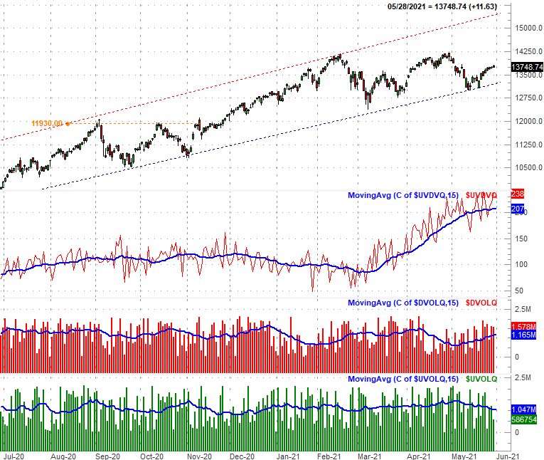
We talk about it from time to time, and we've talked about it more of late, but it bears a refreshed look now… the volume behind the market's daily ebb and flow is tilting in a bearish direction again… more so than a glance at just the NASDAQ's chart would suggest.
The graphic below quantifies this somewhat qualitative idea. From the bottom up we're looking at the NASDAQ Composite's daily "up" volume (green bars), the composite's daily "down" volume (red bars), and the somewhat jagged line immediately below the NASDAQ's daily bars and the daily "down" volume bars is a daily comparison of the exchange's up-vs-down volume. The blue lines overlaid on the bottom three sets of data is simply a moving average of each day's data, to smooth out the information into a discernible trend.
NASDAQ Composite Daily Chart, with Up/Down Volume Comparison and Daily Up/Down Volume
 [9]
[9]
Source: TradeNavigator
There's little doubt about it. Since early May the bullish tide has turned bearish.
Granted, we've seen this happen before to little avail. We've not seen it happen quite like this in a long, long time though. The daily up/down volume comparison reached heights of around 240 earlier this month, which hasn't been seen since 2017 when investors were celebrating unexpected economic tailwinds. It's also clear that the up/down volume comparison's rising trend is flattening out, suspiciously at the same time the NASDAQ Composite itself is within striking distance of a major technical support level.
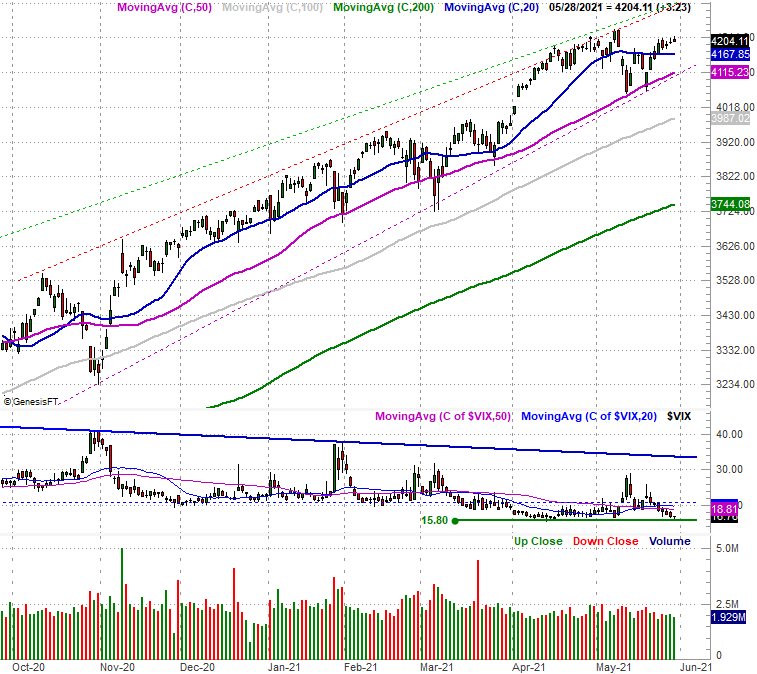
For the sake of continuity we'll throw in a daily chart of the S&P 500 here. It looks to be less prone to a breakdown, setting in the middle of its well-established bullish trading channel (framed in dashed lines).
S&P 500 Daily Chart, with VIX and Volume
 [10]
[10]
Source: TradeNavigator
Given that the NASDAQ tends to lead the S&P 500, however, the S&P 500's continued strength isn't quite enough to blindly assume the next few months are going to be as bullish as the past few have been. Also notice that the S&P 500's daily volume bars at the bottom of the chart are waning, and notice how the S&P 500's recent daily closes are mostly well under the daily highs, and each daily high itself is less gainful than the prior day's. This isn't necessarily bearish, but it certainly isn't the type of trading interest to suggest the rally remains well supported.
Just keep tabs on the straight-line support plotted on the charts above. That's the key to signaling the beginning any major selloff.