No, we've never seen anything quite like it, at least in terms of sheer speed. As of Wednesday's close the S&P 500 is down almost 30% from its February 19th high. That's a typical bear market in the span of less than a month, and at one point on Wednesday the index was down nearly 33% from its February peak. That's crazy.
It's not quite as crazy as Black Monday and Tuesday that kicked off the Great Depression in 1929. That two day rout took a toll of about 24.5% on the Dow in just two days. But, that was the full extent of the initial wave of selling then, and there was little that regulators could do then to stop it. Just in the past couple of weeks the exchange's circuit breakers were triggered, halting trading at mid-day as a way of cooling the selling off. It helped a little, but clearly didn't help a lot. This has been nuts, mostly as a result of coronavirus scares.
There is one (prospective) upside to the plunge though. That is, it wasn't inspired by the normal factors one usually sees at the end of an economic growth cycle… like shrinking earnings and hyper-inflation that the Fed can't control. Inflation remains quite tame, and the Fed's looking for ways/reasons to lower interest rates rather than fearing what another rate hike would do. Literally, rates can't get any lower than they are now.
The grand irony? As terrified as people are now, self-quarantining isn't nearly as effective at keeping people home as some anti-contagion people were hoping it would. With money to spend and a willingness to do it, consumers don't seem too terribly scared about what lies ahead, even if investors have clearly planned for the worst. That's another hint that maybe this selloff is all bark and no bite.
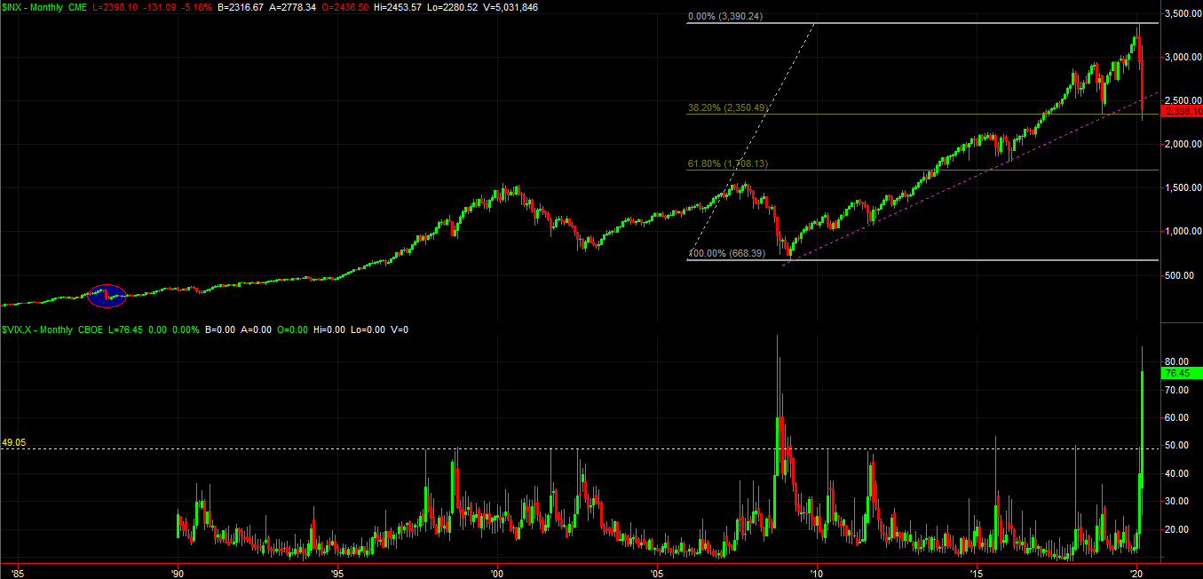
In any case, the image below puts it all in perspective… a monthly chart of the S&P 500 going back to 1985. We truly are in uncharted waters here.
 [1]
[1]
There is a strange bright spot buried in here though, maybe. The sheer speed and span of the selloff seems to have finally been tested with Wednesday's low of 2280 for the S&P 500. It bumped into the 38.2% Fibonacci retracement line end-capped by the 2009 low and February's high — the entire bull market from start to what may be its finish.
The Q&D explanation of Fibonacci retracements, which you may or may not remember talking about in your high school math class: Nature, and biology, and maybe the market (since it's driven by emotional people) often repeats itself with amazing precision and reliability. Also sometimes referred to as the "golden ratio," Fibonacci is the mathematician who found that the fractions 3/8 and 5/8 and many variations thereof — like 13/8, 18/8, and -3/8 — are witnessed or replicated in the shape of circular seashells, numbers of flower petals, the number of knobs on a pineapple, the expanding circular shape of the human ear (seriously), and so on.
The application to stock charts is, since human nature dictates how "the crowd" thinks and moves as a herd and likely collectively decides when and where a stock or market has fallen too far or raced too far ahead, the same natural principal would apply in spotting where retracements of already-covered ground would likely stop and reverse.
The big stumble since late February is, so far, a near-perfect 5/8 (or 38.2%) retracement of the entire bull market. If the bulls were going to make a stand and push back, this would be an ideal place to do it.
It's only a possibility of course. The majority of the trading crowd has to agree to commit to it, and such a decision means the coronavirus scare can't get any worse… something humans can't really control. But, if there's any semblance that the world is going to be able to gain control, then the crowd's psychology is well-primed for a bounce here.
The flipside: If for some reason the 2350 fails to hold up as a technical floor, there may be little to stop it until it falls back to the 1700 area. That would be a 5/8 (61.8%) retracement of the bull market.
It's just a theory… one of many that may or may not apply or matter right now. But, it's a theory supported by a couple of other subtle clues that came into view on Wednesday. To see them though, we have to zoom back into the daily chart.
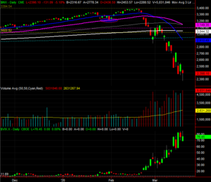
Take a look, at two items in particular. First is the shape of the S&P 500's daily chart. It still ended the day down to the tune of 5%, but that's well above the low for the day that at one point was in the red by around 12%. This intraday reversal and the subsequent hammer shape of the bar suggests the last of the would-be sellers have been flushed out and we saw the transition from a net-selling to a net-buying environment in the middle of the day. That "point" could be the pivot of a "V" shapes turnaround.
 [2]
[2]
The other (related) clue is the volume, or lack thereof. The market keeps digging its way deeper into trouble, and volume is growing alongside that move. But, the volume growth pace has clearly slowed at a time more and more people would presumably be too terrified to stay in stocks. In other words, the volume should grow each time the market hits a new low, inspiring more selling, driving new lows, etc. It appears that fear itself has already peaked. People who are still in are staying in, and people who ever wanted out may well be out… a capitulation, albeit a weird one.
Again, it's just a possibility, and one that could be wrecked in an instant by the continued, unbridled spread of COVID-19. Smart traders keep their mind open to all prospects though, particularly when we've just seen something we've not seen in nearly a century (and really, not ever seen).