Weekly Market Outlook - The Bears Miss a Good Chance

As of Wednesday of last week, the market was teetering on the edge of a long-awaited (and a little overdue) correction. The bears just couldn't deal a death blow though. By Friday, the bulls were back in the same buying mood they've been in since late August.
 Nevertheless, the stumble did verify that the market is vulnerable now that it's an overbought condition. Vulnerability isn't quite a reason to bet on a pullback just yet though. The good news is, we've got some very clear lines in the sand that will show us when stocks move past the tipping point.
We'll look at those make-or-break levels after a review of last week's economic data and a preview of this week's economic numbers.
Economic Data
Last week was chock-full of data to sift through, so let's get to it.... in order of appearance, starting with October's inflation data.
In short, the Federal Reserve has every reason and plenty of room to ratchet up interest rates by the expected quarter point next month, though it isn't urgent or absolutely crucial that it do so. We're in that Goldilocks environment, which -- economically speaking -- is right where you'd want to be. Inflation edged a little higher last month by all measures, and on an annualized basis is right around the Fed's target of 2.0%.
Inflation Rate (Annualized) Charts
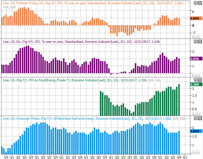
Source: Thomson Reuters Eikon
Retail sales were also up last month, though not overheated as they were in September when preparations for the hurricane were in full swing. We've said before and we'll say again, consumers are doing their part to keep the economy humming.
Retail Spending Growth Charts
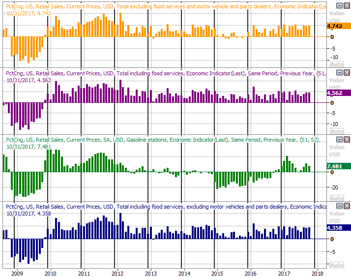
Source: Thomson Reuters Eikon
On Thursday we got what might be the most important (though often overlooked) piece of economic news that matters to investors... capacity utilization and industrial productivity. Both were up again, and both by more than expected. In each case we're seeing a sustained string of improvement, with a move to multi-year highs on both fronts last month. (The hurricane response helped, though didn't carry all the weight.)
Capacity Utilization and Industrial Productivity Charts
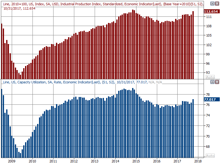
Source: Thomson Reuters Eikon
The capacity utilization and industrial production show a very strong correlation with corporate earnings, which in turn shows a strong correlation with the long-term market trend. It can't drive short-term ebbs and flows (for better or worse), but it does indicate which way the undertow is pointed.
Finally, last month's housing starts and building permits soared beyond all expectations. Some of the surge may have been attributable to the post-hurricane rebuilding effort, but bear in mind the trend was pointed mostly upward even before September's hurricanes.
Housing Starts and Building Permits Charts
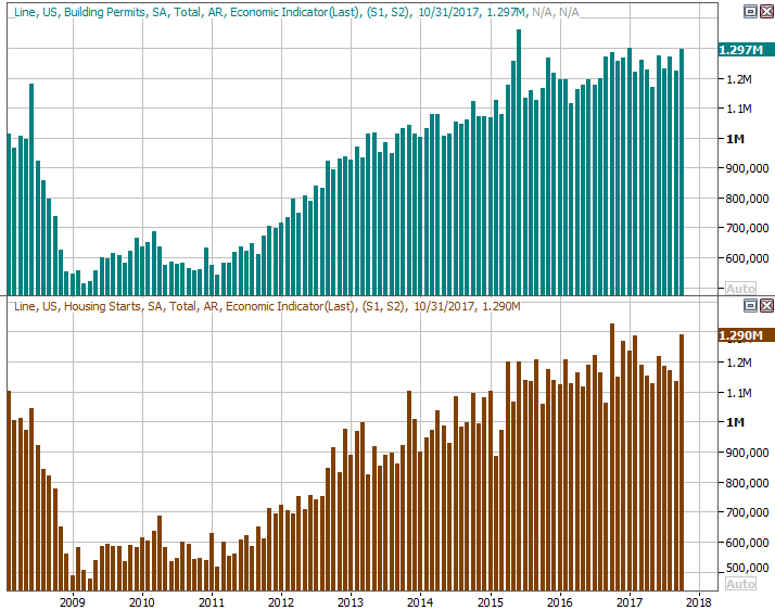
Source: Thomson Reuters Eikon
Everything else is on the grid.
Economic Calendar
Source: Briefing.com
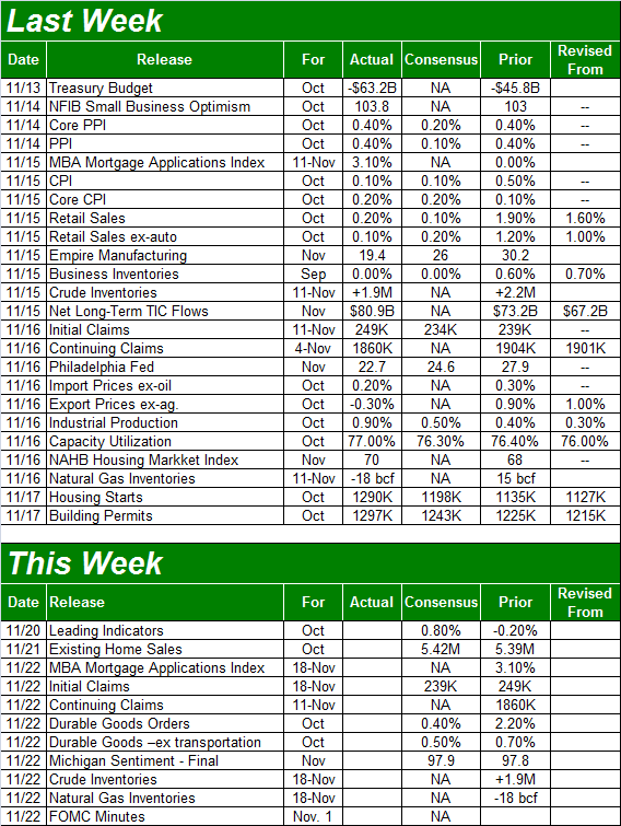
This week will be nowhere as busy. In fact, the only items of interest will be Tuesday's existing home sales report -- as an addendum to last week's starts and permits report. The pros are calling for a decent improvement. Notice that a sheer lack of inventory could be a key to the reason home sales aren't even stronger.
New and Existing Home Sales Charts
Source: Thomson Reuters Eikon
The new home sales figures for October will be posted next Monday, rounding out the bigger real estate picture.
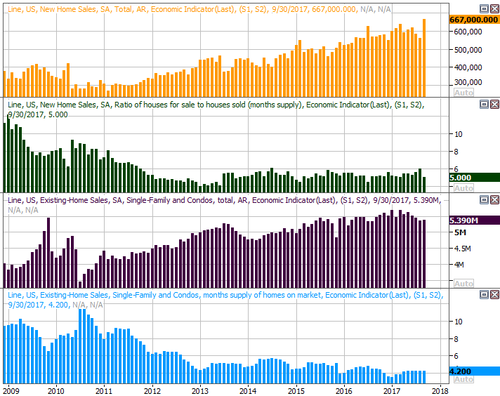
Later in the week we'll get last week's look at crude oil and natural gas stockpile levels. Oil levels have edged a little higher the past couple of weeks, though it's tough to call this the beginning of an unhealthy rebuild though.
Crude Oil, Natural Gas Stockpile Charts
Source: Thomson Reuters Eikon
Meanwhile, natural gas levels have already started their normal drawdown for November, having never peaked at prior peak levels.
To that end, know that natural gas prices are starting to test higher highs, while crude prices are on the move towards multi-year highs again... suggesting traders aren't impressed by a couple weeks of slightly higher inventories.
Index Analysis
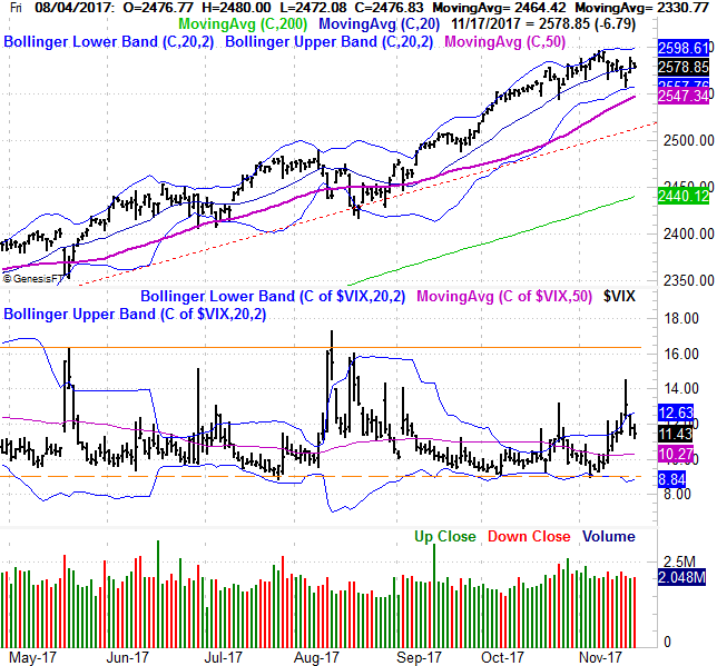
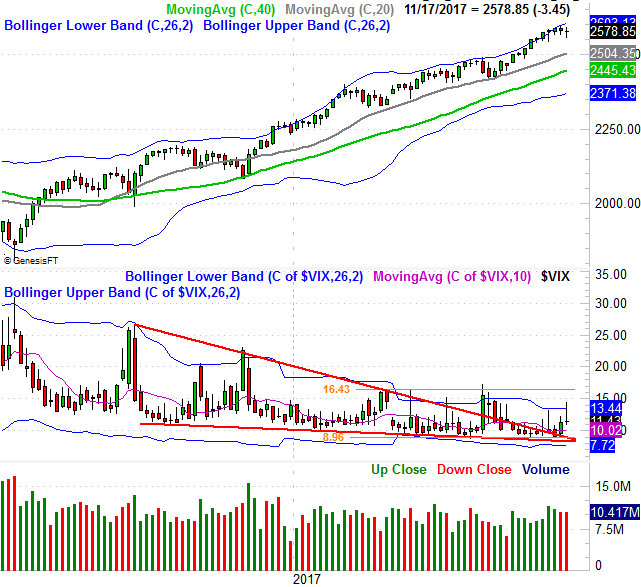
It could have been worse. The market was hanging by a thread on Wednesday, but Thursday's bounce brought it back from the edge. Friday's loss wasn't dire enough to drag the S&P 500 back under the all-important 20-day moving average line. On the other hand, the second weekly loss in a row (for the past ten weeks) coupled with a lower low and a lower high should give traders -- and even true long-term investors -- something to think about.
The daily chart of the S&P 500 below illustrates the headwind the market has hit of late. For the first time since August the index has toyed with its lower Bollinger band, though a closer look makes it clear that there's a slowdown on the radar. In retrospect, this just looks like the usual ebb and flow we've seen for years now... two steps forward and one step back. There's also room for the VIX to keep sliding lower, giving the bulls some leeway to march on to higher highs.
S&P 500 Daily Chart
Source: TradeNavigator
The weekly chart of the S&P 500 puts this idea in more perspective, showing us a mostly-unprecedented advance since early November of last year. It's the weight of the gains linked to this strangely persistent rally that has may traders (at least in the back of their minds) fearful we're now nearing the beginning of an overdue pullback.
S&P 500 Weekly Chart
Source: TradeNavigator
The problem? We're now at the beginning of the most bullish three-month stretch of the year, and as bullish as the market has been so far this year, this strength isn't above and beyond the strength we'd normally see from the S&P 500 in a winning year for the index.
S&P 500 Year-to-Date Performance, vs. Averages
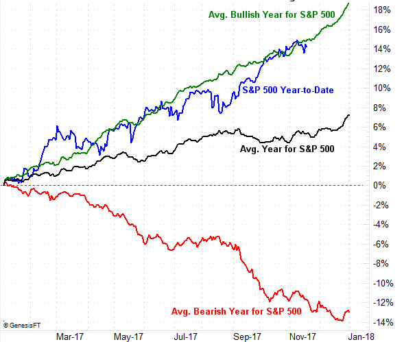
Source: TradeNavigator
To that end, Price Headley explained to CNBC last week that he's expecting the market to follow its typical bullish path for the year-end. Go here for full details, and to see the interview.
In support of that premise is the NASDAQ's chart, which looks decidedly more bullish than that of the S&P 500. Indeed, the NASDAQ Composite mustered a gain last week, closing at a record high weekly close of 6782.79. It matters, simply because the NASDAQ tends to lead the rest of the market, higher and lower. In this case, the undertow looks tilted higher.
NASDAQ Composite Weekly Chart

Source: TradeNavigator
The best -- and maybe only -- real sign that the bigger uptrend is in real trouble would be a breakdown under some established support levels that really aren't in play yet.
They're both on the daily chart of the S&P 500. One of them is the 50-day moving average line (purple) at 2547, and the other is the straight-line support (red, dashed) that tags most of the past key lows going back several months. It's currently at 2492. Until the S&P 500 falls under those big floors, the bigger-picture uptrend is still intact.