
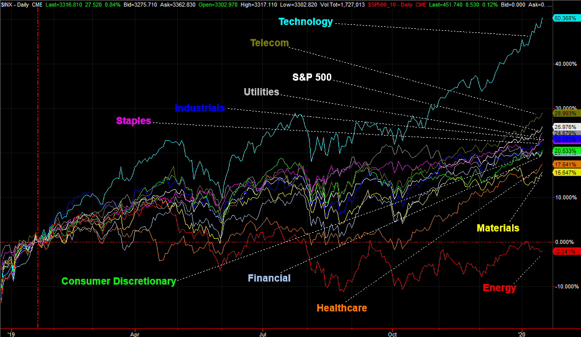
If you think the past few days — or the past few weeks for that matter – have been typical ones for the stock market, think again. It looks normal with just a quick glance, but a closer look reveals it's all been radically imbalanced. That imbalance is the market's leading and laggard sectors. Yes, technology had led the way, and energy has weighed the stock market down. But, both have done so to extreme degrees that may not be sustainable.
The graphic below tells the tale, comparing the percentage return of all the major sectors since the middle of January of last year. Tech stocks are up 50%, and energy stocks are down 2%. The S&P 500, for perspective, has gained 26% during that period. Here's the odd part…. the next best sector is the telecom sector, but with only a 29% gain. The next worst sector is materials, but it's still mustered a 16% gain. Tech and energy are crazy outliers.
 [1]
[1]
Maybe it's merited, but if history repeats itself, technology stocks won't lead the next twelve months, and energy stocks won't be at the bottom of it.
That's not the top take-away here though. The subtle clue buried within the graphic is the degree of Imbalance here. A healthy, sustainable advance would be better balanced, and consist of more even participation. Tech has led the way, and Apple (AAPL) alone has led tech. It's just not enough.
The other interesting and alarming aspect of this chart: Telecom's second-place finish is hardly a sign that investors are thinking aggressively, seeking out growth. Underscoring that idea is the third-best sector – utilities. There's another detail in this light that's not readily evident on the chart above but there to traders willing to look closely. That is, tech is still in the lead since the lull from the beginning of this year, but utility stocks are still right behind them. Traders are still seeking safety.
Another take-away that might be just as noteworthy as the first… healthcare stocks may be in the back of the pack but they're catching up with the rest of the herd very quickly. They've got room and momentum, and that's something. It may not be enough to keep the group moving higher should the broad market finally start to melt down. But, it's still an above-average bet.
It seems like a bit of overkill to drill down this deeply into the market's inner workings to look for opportunities, but it isn't. Sectors tend to move more (or less) than the broad market. Indeed, the broad market itself is actually rather boring, and doesn't move much. Spotting a sector-based trend can deliver much more tradeworthy action. The trick is finding those trends in the first place. Our chart above makes it relatively easy to do so.
One trick to that end… look for crosses of these lines. If one sector's lines start to cross above or below other sectors' performance lines, they tend to continue doing so for a while.
We continually monitor this chart, and post updates when there are noteworthy developments. So, stay tuned.