There's an old saying… nothing lasts forever. It's true in most facets of life, including the stock market. Winners eventually become losers, and losers eventually become winners again. The trick is figuring out when things are changing. Spotting such shifts early can often mean big trading opportunities.
With that as the backdrop, we're starting to see some rotation among the market's leading and lagging sectors. Traders would be wise to heed the subtle shifts.
It's called sector rotation, and though it's often unpredictable only semi-cyclical (never even mind that sector-rotation timeframes are inconsistent), it's a reality nonetheless.
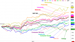
The past several months have been dominated by the technology sector's oversized performance, up 32% for the past twelve months. For the same timeframe, energy and telecom stocks are essentially tied for last, both down a little more than 5%. As the 12-month performance-comparison chart tells us though, some areas are heating up again while others are cooling off.
The tech sector is still leading, and as much as trading momentum is generally fruitful, that's one rally running on borrowed time. On the flipside, though telecom and energy are still at the bottom of the pile, it's possible the energy sector may be trying to recover; we'll still need a couple more weeks to know for sure.
The most interesting possibilities among the key sectors, however, are some of the ones that haven't been at either extreme. Namely, healthcare stocks seem to be heating up quite nicely after a long period of sub-par performance, as are materials stocks. (Click on the chart to enlarge it.)
 [1]
[1]
It's not all good. The industrials sector seems to be struggling under the weight of its recent gains, and consumer goods just can't get going either. Neither is in full-blown bearish mode yet, but both are on notice.
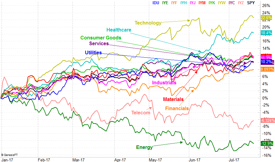
Zooming into a daily, year-to-date chart doesn't actually tell us anything new, but it does give us some detailed perspective on the current state of sector rotation. It's in this timeframe we can see how well healthcare is rolling, and how much energy is still lagging. The daily version of the sector performance chart also hints that the financial sector is toying with a new bullish thrust after a disappointing first half to 2017. A higher high in the foreseeable future would seal the deal.
 [2]
[2]
The daily chart also shows us how the technology sector is once again struggling to maintain its sizeable lead, as most of those names have created big profit-taking opportunities.
It seems like tedious work, keeping track of each and every sector's performance all the time. And, it is, unless you have a tool that makes it easy (like the one we're using right now). It's worth the effort though. It's been estimated that 40% of an individual stock's movement can be attributed to its sector's performance. Point being, if you pick the right sector, the battle is nearly half-won.
Avoiding the wrong sector is also just as fruitful.
The obvious challenge with this strategy — and our tool — is that it requires some interpretation. There are no clear-cut buy/sell signals. In that it's an art rather than a science, some investors might balk at the idea. Using the strategy doesn't have to be complicated or complex though. In fact, the simpler the interpretation is, the better.
Check back for updates on sector rotation. We look at this chart on a pretty regular basis.