Take it with a grain of salt, since it may have more to do with the end of the year and politics than the sector's themselves. But, there's some strange sector rotation going in you may want to note.
Never heard of it? Don't sweat it – it's not at complicated as it may sound. Sector rotation simply means some industries' stocks are gaining at the expense of other industries' stocks, as investors rethink the relative values of each group. It matters, just because these ebbs and flows can get surprisingly big once they are put into motion.
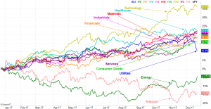
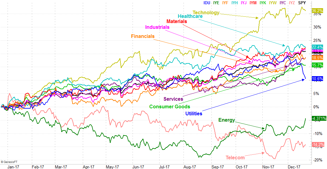
There are several ways to spot sector rotation, but we've found the easiest and most effective means of doing so is our visualization of each sector's performance going back a certain timeframe. In this case, we're going back exactly one year.
Take a look. While technology is still on top of the world, those names haven't been getting much traction since early November. Telecom stocks continue to flounder at the bottom of the pile. There are obviously some far more interesting trend in motion now though. Namely, the utilities are unraveling, materials stocks are heating up, and services names — which had been pretty tepid — are starting to race higher in a big way. Energy continue to chip away at a recovery as well.
 [1]
[1]
The meltdown of utility stocks likely has to do with rising interest rates. Since they're primarily dividend vehicles and more or less work like bonds, when rate move up and bond value move down to make yields market-based rates, utility stocks do something similar.
The unexpected rekindling of services stocks is mostly about the revival of retail. Many of these names were zombies… victims of a so-called retail apocalypse. Consumer spending has perked up significantly in recent months though, with many brick-and-mortar names saying they're seeing sales growth again.
Materials and energy names are doing better, partly because the U.S. dollar is weakening, but partly just because economic growth is driving higher demand for both.
Another noteworthy curiosity on the graphic…. healthcare stocks have lost some of the prior zip. There may not be a specific reason why, other than the fact that there's so much other stuff for investors to think about that the healthcare chatter has been displaced by everything else.
The reasons for the rotation, though, don't entirely matter. What does matter is knowing that things are taking on a new shape. Once these trends start, they don't often stop until they're fully played out. It's actually quite unusual for one sector to lead the way for two years in a row, and just as it's unusual to see a sector drag the bottom two years in a row. In other words, you should count on these changes. It's just a question of when these changes get going. It looks like a few of them just got going.
It's also important to understand that like any other tool or clue, this sector rotation/comparison chart is hardly immune to fakeouts and false starts. It's possible some or even all of these budding trends could peter out before they get going in earnest. That's ok though. It's still better to know a trend might be underway that doesn't pan out than miss one altogether by not even knowing it might happen.
We'll update this chart as it becomes relevant.