In retrospect, one can help but wonder if the recent bullishness only took shape because traders felt there was no other alternative. Some of the broad market's underlying barometers certainly suggest this is the case.
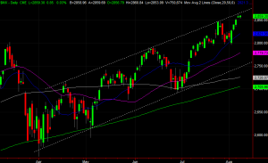
What script? The daily chart of the S&P 500 below spells it out pretty plainly, in pictures. A key resistance line – the one that's served at the upper edge of the bullish trading range since April – was merely brushed on Tuesday, and sure enough, the rally effort faded.
 [1]
[1]
It sounds insane (on the surface) to suggest little more than trading psychology could play such a big role in determining when and where the market takes a turn, especially in light of the fact that most investors don't pay that much attention to charts. Don't dismiss it though. The market hasn't been about fundamentals in a long while. Right now the driving force is FOMO… fear of missing out. To the extent traders care to look at charts or fundamentals, they're looking through a lens that largely only shows them information that affirms their predetermined assumptions.
In other words, when traders are only looking for bullish clues, that's all they'll find.
Whatever the underlying cause, the fact of the matter is, the rally was stopped in its tracks when the upper boundary of the rising trading range was touched. We should at least respect the hint, even if we're not going to take it.
On that note, do know that while the market is hovering around breakeven levels today, the underpinnings say more investors have doubts than optimism.
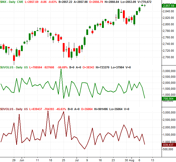
The two images below will look familiar to regular readers of BigTrends analysis. The first one is a comparison of the S&P 500 to the NYSE's "Up" volume and its "Down" volume. Though overall volume is down at the mid-point of the trading sessions, there's more down volume than up volume on Wednesday.
 [2]
[2]
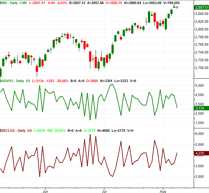
The chart below is similar, but not quite the same. It's a plot of the S&P 500 versus the number of total advancers versus the number of total decliners through Wednesday. More stocks are losing ground than gaining ground today, even though the broad market is more or less breaking even.
 [3]
[3]
What this tells us isn't tough to decipher. It's a clear message that faith in this rally effort has all but evaporated. If traders are thinking it, there's a good chance they'll soon act on their assumptions.
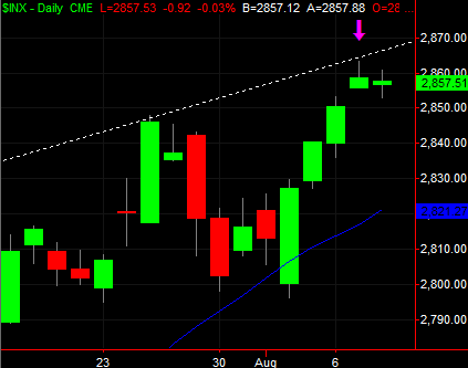 [4]There's one final red flag to note – the shape of Tuesday's bar. The S&P 500 started high and then ran higher, right up to a well-established resistance line. Then it peeled back, giving up most of its intraday gain to form a shape that more or less looks like an upside-down hammer. Such bars often indicate a transition from a net-buying environment to a net-selling one… a transition that started in the middle of the trading day.
The confirming clue hasn't taken shape… yet. That's just a lower close the next day (today/Wednesday). We may or may not get it. If we do get it though, it's yet-another thing for the bulls to worry about.
Etched in stone? No, nothing is etched in stone in this crazy environment. Though we can have faith that the technical clues and patterns we can identify will more often than not pan out, we can also have faith that in a geopolitically-charged, rising-rate, earnings-season-minded environment like the one we're in right now, anything is possible even if it's not likely. We still have to remain ready for all possibilities.
All the same, we also have to respect the hints being given to us, and not choose to ignore them simply because we don't like them.