
Contrary to popular belief, not every part of the market is unraveling here. Oh, to be fair, every part of the market you hear about on a daily basis is getting hit as the week comes to a close. The financial media isn't digging too deeply though, remaining focused on only the biggest of the big names. If you're willing to look in the further-out, more obscure corners of the market, you'll find some areas that have been and should continue to be curiously bullish.
It seems like such an exercise is easier said than done. When you have the right tools though, nothing is ever too terribly difficult.
Our tool for spotting these mostly overlooked trends is simple but powerful… powerful because it's took few other traders have, and a tool that even fewer traders take advantage of. It's a simple performance comparison of each sector's performance – day by day – for the past year, segmented by market cap. In other words, not only can we see how the energy sector is doing relative to the telecom sector, we can compare small cap telecom stocks to small cap energy stocks.
And the fact that this is a purely visual depiction makes it super-easy to interpret.
But, first things first. The graphic below is a comparison of all the S&P 500's stocks (large caps) stratified by sector. These are the names we're least interested in here because, as you can see, none of them are doing all the well. They've all got bearish momentum. Not even the technology sector is looking all that hot any longer, after a great 12-month runup.
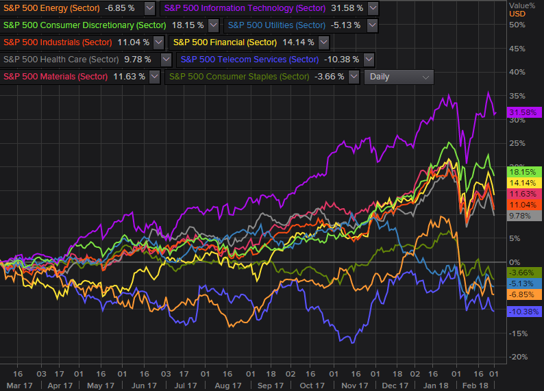 [1]
[1]
This across-the-board lackluster performance is unique to the large cap segment of the market though. If we drill down into just the mid cap portion of the market and limit our look to the S&P 400's stocks, we can see slightly more enthusiasm from these technology stocks. And, we can see an encouraging recovery effort from the S&P 400's telecom names.
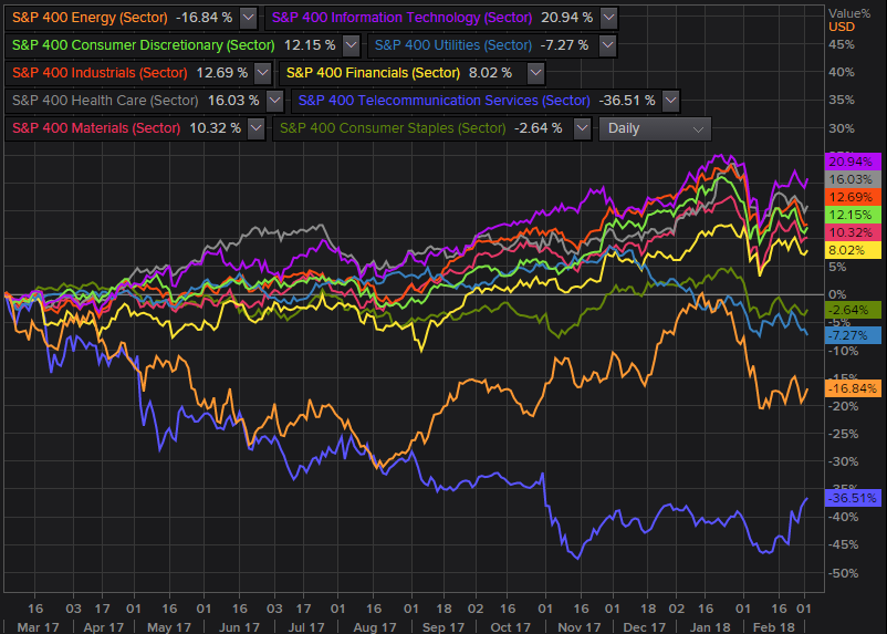 [2]
[2]
We can do even better than that, however. We can also stratify our visualization by small caps, limiting our search to only S&P 600 stocks. In this grouping we find that healthcare stocks are running higher even if nothing else is.
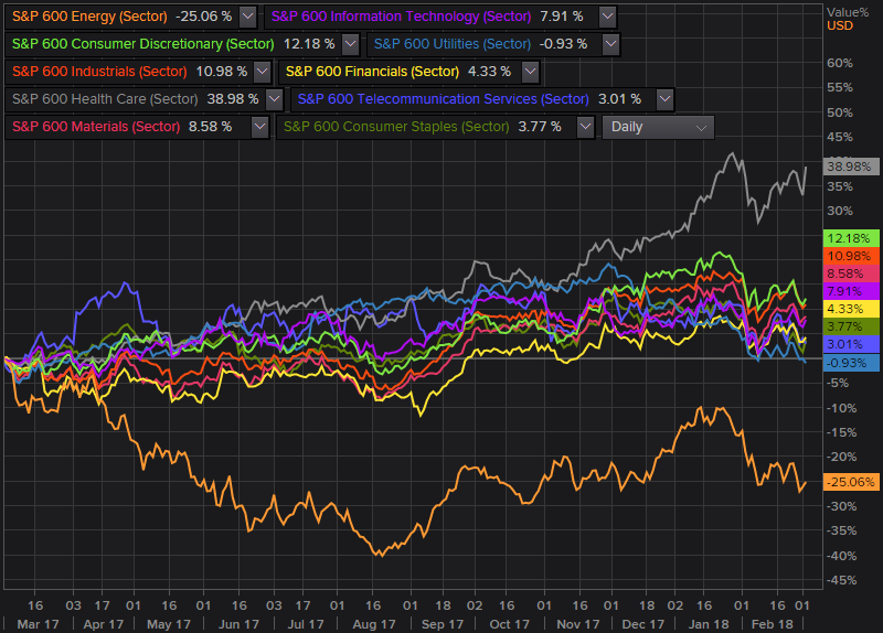 [3]
[3]
It's an unusual kind of analysis to be sure, but not a bad one. In fact (and as was noted), it's a powerful one because most people aren't using it. You can't be part of a herd and expect to do better than the herd.
Whatever the case, the comparison charts above are a quick and easy way not just to spot relative momentum, but absolute momentum. Though stocks can and do change direction, at the very least you've got an inkling of what's happening now… an undertow to at least find a new trade. That's more than most traders open up a new position with.
By the way, the same approach works just as well – and even better – when you drill down into each sector and market cap grouping, breaking them up into more finite industry groups. That's an analysis we'll have to save for another time though.