
We had to know it was going to happen sometime. We were probably hoping now wouldn't be that time.
It's far from earth-shattering so far, but since Monday's multi-week peak, the S&P 500 has logged three straight days of lower highs. We've seen worse, even during what's become an 18% rally from the late-December low. But, this is the first we've seen of a market trying to keep itself propped up under the weight of that big runup. Thus far, the jury's still out. The good news is, we shouldn't have to wait very long before getting our answer as to just how tough this market is. The bad news is, the market isn't likely as tough as many traders currently think it is.
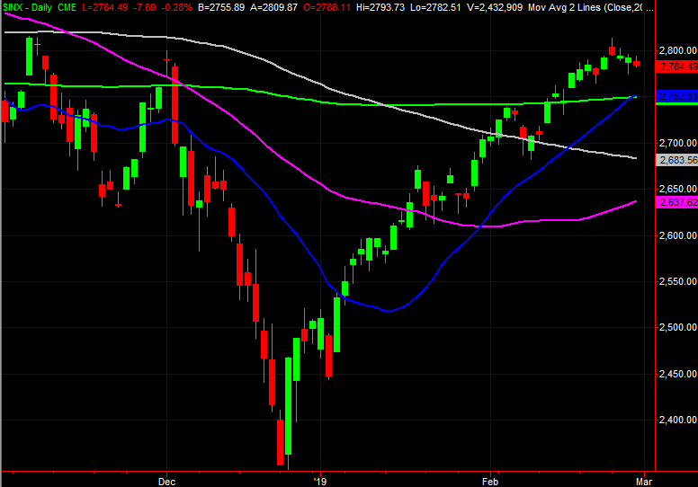
The first test is likely to be right around the corner. It's going to come, ideally, when the S&P 500 pulls back to bump into its 200-day moving average line (green) and/or its 20-day moving average line (blue), both around 2750. They'll either act as support, or they won't. If not, the next stop is somewhere around the 2650-ish area.
 [1]
[1]
And we're not headed into that test with a bowlful of bullishness. The market's breadth and depth are leaning bearishly, and have been for a while.
Breadth and Depth
Breadth and depth are two-dollar terms for describing how (respectively), the market's advancers compare to its decliners on any given day, and how the market's buying volume compares to its selling volume. Generally speaking, solid rallies are marked by more bullish volume than bearish volume, and more rising stocks than falling stocks. It's when we see those numbers start to tilt in a bearish direction that we need to worry.
We're seeing such a leaning right now.
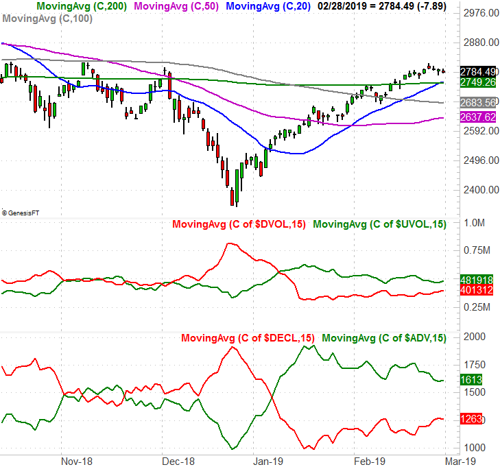
The graphic below plots, from top to bottom, the S&P 500, the NYSE's 'down' volume, the NYSE's 'up' volume, the NYSE's decliners, and the NYSE's advancers for any given day. The colored lines that intertwine with the S&P 500 are all of its key moving averages. The single lines that more or less trace the daily bars and breadth and depth are moving averages of that respective data, intended to help spot a true trend; the daily data is just to erratic. If you look closely, you'll see the volume data and the advancer/decliner has been increasingly bearish, and/or not bullish.
 [2]
[2]
Still, that chart is tough to read. A more effective way to compare the underlying trends is to remove the daily data altogether and overlay the up/down volume trends on one another, and overlay the advancer/decliner trends on one another. The graphic below accomplishes this; the bullish data is still in green, while the bearish data remains in red.
 [3]
[3]
We're alarmingly close to see the bearish volume trend line move above the bullish volume trend, which has historically signaled a short-term pullback for stocks. One only has to look back to October and December to see.
The advancer/decliner comparison isn't quite as bearish yet, but it's getting close. It tends to move a little faster than the depth/volume data does once it gets moving.
Looking Ahead for the S&P 500
Maybe it won't matter. Perhaps the market will bounce back without ever breaking below its 20-day and 200-day moving average lines, and without ever forcing the depth and breadth trends to turn officially bearish.
Or, maybe things will pan out exactly as the early red flags say they will.
There's the rub. Even after the S&P 500 breaks below its key support lines – if it does – and even if the breadth and depth trend lines flip to a net-bearish condition, some bulls will resist the notion. They may even be vindicated in the end. They're fighting the odds though, founded on hopes that the clues don't apply … the "this time is different" argument.
Whatever's in the cards, even if the potential red flags turn into clear-cut warnings, the potential pullback is actually quite limited. A repeat of December's drubbing is quite unlikely.
One thing is for sure though. That is, once a corrective move has run its course, the recovery move will be signaled by the exact same indicators and tools. Those will be the S&P 500's cross back above key moving average lines, and fresh bullish crossed of the advancer/decliner trend lines and the up/down volume trend lines. The track record for this approach – especially for bullish signals – is actually quite impressive.
Stay tuned. We'll try to post updates as often as it's relevant to do so.