For weeks now we've been keeping close tabs on two familiar indices… the S&P 500, and the NASDAQ Composite. Between the two, we typically see all we need to see.
This time around though, perhaps we should have been watching the Russell 2000 Small Cap Index. It's drawn some major lines in the sand that may tell us better than any other index where the market is, and how close it is to a breakdown.
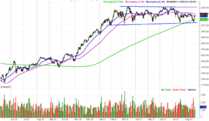
Take a look. Since January the Russell 2000 has been getting squeezed into a narrowing trading range framed by blue lines on the chart below; last Thursday's low marks the fourth node for that floor currently at 2116. It pushed up and off that floor on Friday, with some zeal. Even with that move though, the index remains below its 50-day moving average line (purple). And, the broader trend just looks bearish here, with lower highs still being made despite Tuesday's gain.
 [1]
[1]
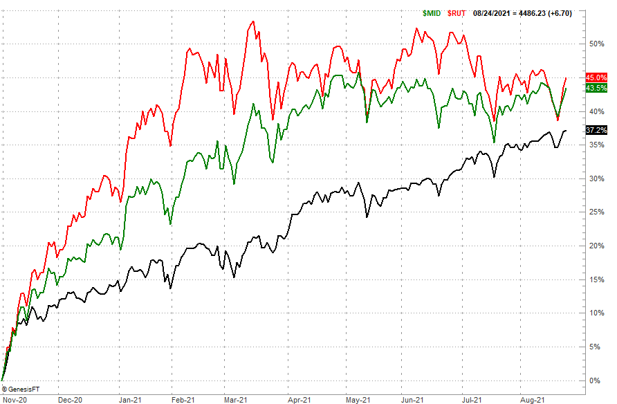
Here's a look at the same idea from a different vantage point… a comparison of the performance of the Russell 2000 (red) to the S&P 400 Mid Cap Index (green) and the S&P 500 Large Cap Index (black) since November's low. Small caps tore out of that lull with a vengeance, outpacing large caps by a country mile. Until March of this year, when large caps began to overtake mid and small caps. Indeed, small caps have lost ground to mid caps as well. A little bit more of this disparity and small caps will be lapped by large caps.
 [2]
[2]
This is not a minor clue. While we usually suggest the NASDAQ Composite leads the market higher and lower, small caps arguably do just as good of a job – if not a better job – of indicating traders' true feelings. They loved the market in November, plowing into aggressive small caps at an even faster clip than they scooped up most NASDAQ stocks. Now small caps are clearly falling out of favor. They're being traded in for large caps, but that may be a temporary trend. If the market continues to shed small caps, it's only a matter of time before the rest of the market follows suit.
That's the theory anyway. Like most market theories, this one's not etched in stone. From an odds-making perspective though, it can't hurt to keep tabs on all of the market's inner workings.
The key to any real red flag here, of course, is the Russell 2000's break below its current floor around 2116 and the subsequent bearish cross of the 50-day moving average (purple) under the 200-day moving average line (green)… a so-called death cross. It's worth watching as this one is more likely to happen before the S&P 500 or the NASDAQ Composite break below their most meaningful technical floors.
Just another thing to put on your radar.