Bullish vs. Bearish: Demographic Trends and the Stock Market
Bullish vs. Bearish: Demographic Trends and the Stock Market
Bullish - Demographic Tailwind Until 2028:
There are several points made in support of a transition process occurring from a secular bear to a secular bull market.
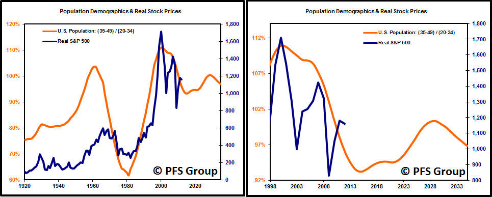
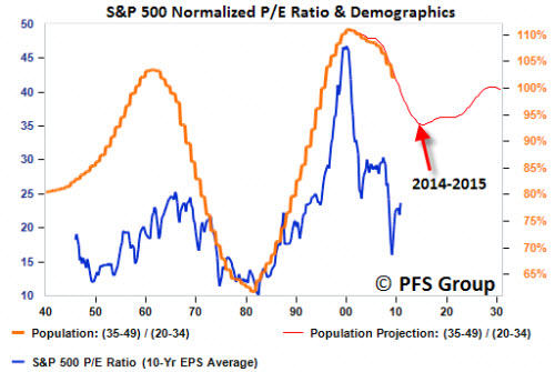
Among them, the ratio of high income to lower income working age groups correlates to major bottoms and tops in the market as shown below. The peak in 2000 in the 35-49 age cohorts relative to the 20-34 groups correlated with the technology bubble and a low is projected to occur between 2014-2015. From there we get a small demographic boost in the age cohorts with the next peak expected to occur in 2028. The demographic bump in relative cohorts is not expected to be as large as what occurred from the 1940 to 1961 boom or as dramatic as the 1981 to 2000 surge, but the fact that it won't be a headwind is a major improvement from t he tailwind it has been since the 2000 top.
Part of the reason why stocks tend to do well with rising demographic shifts is the tendency for valuations to rise as sentiment for stocks improves. Based on the rising demographic trend that starts next year through 2028 we are likely to see a rising trend in the S&P 500's (SPX) (SPY) price-to-earnings (PE) ratio. A rising PE ratio coupled with a slow rise in earnings-per-share should lead to strong gains in stocks over the coming decade.
by Chris Puplava
Bearish - Secular Bull and Bear Markets:
by Doug Short
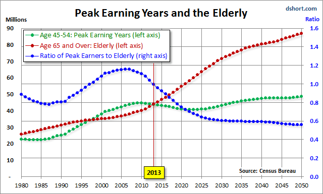
Chris's commentary above includes some interesting demographic analysis based on the ratio of the higher earning, bigger spending age 35-49 cohort to less financially empowered age 20-34 cohort. Unfortunately this ratio is being savagely trumped by a far more powerful demographic shift: The ratio of the elderly (65 and over) to the peak earning cohort (age 45-54). The next chart, based on Census Bureau historical data and mid-year population forecasts to 2050, illustrates this rather amazing shift.
Peak Earning Years and Elderly Demographic

The year 2013 is an inflection point in the chart above, with the elderly cohort dramatically increasing in numbers. The ratio of the two, the blue line in the chart, peaked in 2007 and began its long rollover in 2008, coincident with the beginning of the last recession. We have many years to go before this ratio approximately levels out around 2030.
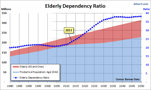
Even more disturbing is the elderly dependency ratio, the label given by demographers to the ratio of the 65 and older population to the productive workforce, which for developed economies is usually identified as ages 20-64. The next chart illustrates the elderly dependency ratio with Census Bureau forecasts to 2050. Note that in this chart I've followed the general practice in demographic research of multiplying the percent by 100 (e.g., the mid-year 2013 elderly dependency ratio is 23.3% x 100 = 23.3).
As the chart painfully illustrates, the elderly dependency ratio is in the early stages of a relentless rise that doesn't begin to level out until around 2036, over two decades from now. Given the unprecedented demographic headwinds for today's investors, I'm unable to share the Chris's confidence that the US is now in a new secular bull market.
Courtesy of Chris Puplava and Doug Short, advisorperspectives.com


