
S&P 500 is threatening to follow this frustrating template
by Simon Maeirhofer [1]
Please join me for a quick walk down memory lane. I'll tell you in a moment why.
We'll turn the dial of our imaginary time machine to August 2011. The S&P hit an air pocket and lost 18%, causing panic on Wall Street. Following the initial August panic low, stocks are going nowhere fast for weeks.
Does this sound familiar?
Perhaps too familiar. So far, 2015 has been an eerily accurate copy of 2011. I first noticed the similarities between 2011 and 2015 in June, and wrote about it in the column, “2015 is Shaping up to Look a lot like 2011 [2].” The original June article listed the following parallels along with the chart below.
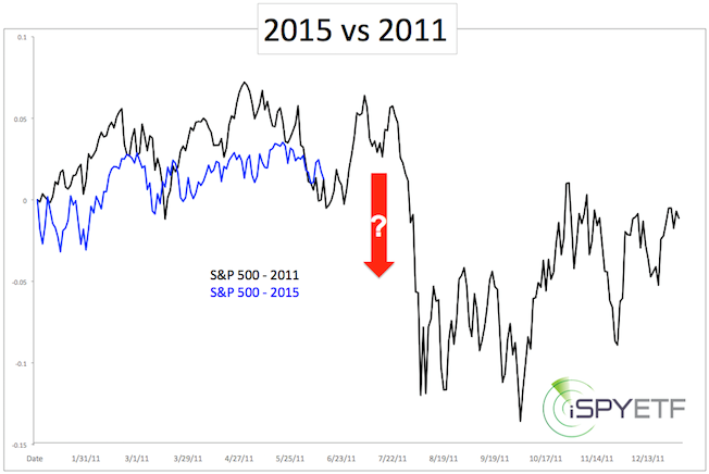 [3]
[3]
- Based on real volatility — actual price movements, not the VIX — 2015 is the most volatile year since 2009, and thus far, mimics 2011.
- Like 2011, 2015 is a pre-election year.
- Thus far, the 2015 chart looks like the 2011 chart.
- Stocks are internally weak right now, like they were before the 20% drop in 2011. Internally weak in this instance means that more and more stocks are falling below their 50-day simple moving averages, despite new S&P 500 highs.
Here is an updated look at the same chart.
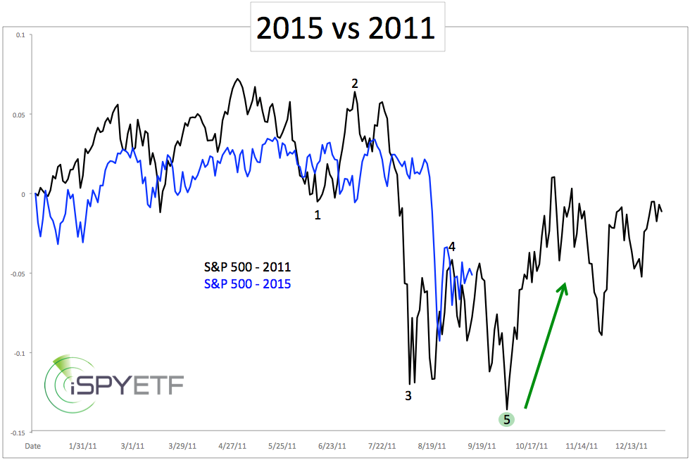 [4]
[4]
Worth noting is that the 2011 decline unfolded in 5 waves (particularly interesting for Elliott Wave aficionados). The initial 2011 panic low (end of wave 3) was followed by weeks of choppy and directionless trading.
Partially based on this template (along with technical analysis and investor sentiment), the August 24 Profit Radar Report stated that: "It looks like today's low (1,867 for the S&P 500) marks the end of wave 3. Next should be a choppy (and potentially violent) wave 4 rebound."
We cannot yet say with certainty — never can — but the choppy action since Aug. 24 appears to be a wave 4. If that is correct, we should see more sideways trading followed by another low. Based on S&P 500 seasonality, a tradable low in October would be ideal.
Yes, I know, many credible investment pros have already declared this bull market to be over.
One indicator to strongly disagree with the 'bull market RIP' assessment of many market timers is investment sentiment. Investor sentiment suggests that immediate down side is limited, and outweighed by potential fourth-quarter up side. This may sound extremely contrarian, but that's exactly what this chart from last week says (by the way, the chart includes the 2008 financial crisis).
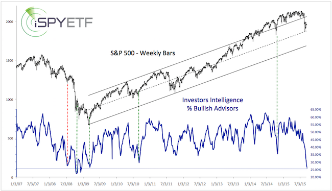 [5]
[5]
Courtesy of marketwatch.com [6]