Will Friday's Selloff Have Legs? - Weekly Market Outlook
Will Friday's Selloff Have Legs? - Weekly Market Outlook
Though it wasn't necessarily a bullish week, the market was holding up well enough... until Friday's implosion. That one bad day pulled the market under some key support levels, and as such we now have to entertain the possibility that some selling weakness has been opened. And yet, there's still a beacon of hope for a quick rebound.
We'll dissect the broad market's odds below. First, let's paint look at the bigger picture painted by the economy.
Economic Data
Though last week was jam-packed with economic news, none of it was as important - or as impactful - as Friday's grand finale... February's employment data. It was much better than expected, sparking a chain reaction of events that may have caused some of the selling on Friday and could have longer effects.
The good news was, the nation's unemployment rate fell from 5.7% all the way to 5.5% on the heels of 295,000 newly-created jobs. That's the lowest unemployment rate number we've seen since 2008, when it was on the way up. Though we've seen even stronger monthly job-growth numbers since then, last month's 295,000 new payrolls extends what's become an unusually prolonged period of firm growth.
Unemployment Rate & Payroll Growth Chart
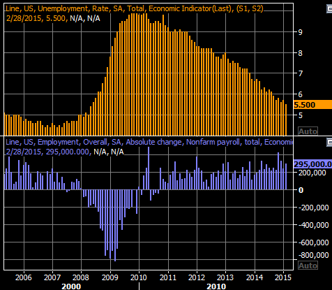
Source: Thomson Reuters Eikon
The good news ended up being bad news, in a sense, as tepid employment was one of the factors behind the Federal Reserve's decision to hold off on any interest rate hikes. With that worry abating, the odds of Fed rising interest rates went up considerably on Friday. Since higher rates mean potentially slower economic growth, the relative attractiveness of stocks fell sharply.
Though it remains to be seen if "if-then" concern is merited, the worry alone was enough to up-end the market on Friday, and perhaps trigger further weakness.
We also heard updates of a few other economic data points last week, but of particular interest were the ISM Index and the ISM Services Index. They weren't interesting because they were firmly higher, nor because they plunged. They were interesting because both have been slowly, quietly fading for a few months now.
ISM Indices Chart

Source: Thomson Reuters Eikon
Last but not least, you may have heard factory orders fell 0.2% in January. What may not have been made as clear is that the 0.2% dip was based on the seasonally-adjusted data. Such an adjustment is usually merited, but making this adjustment can sometimes obscure an important reality... like January's factory orders. The chart below plots the whole-dollar, non-seasonally-adjusted total of factory orders placed two months ago. It was the weakest spend we'd seen since 2011.
Factory Order Totals - Not Seasonally Adjusted Chart

Source: Thomson Reuters Eikon
Everything else is on the grid.
Economic Calendar
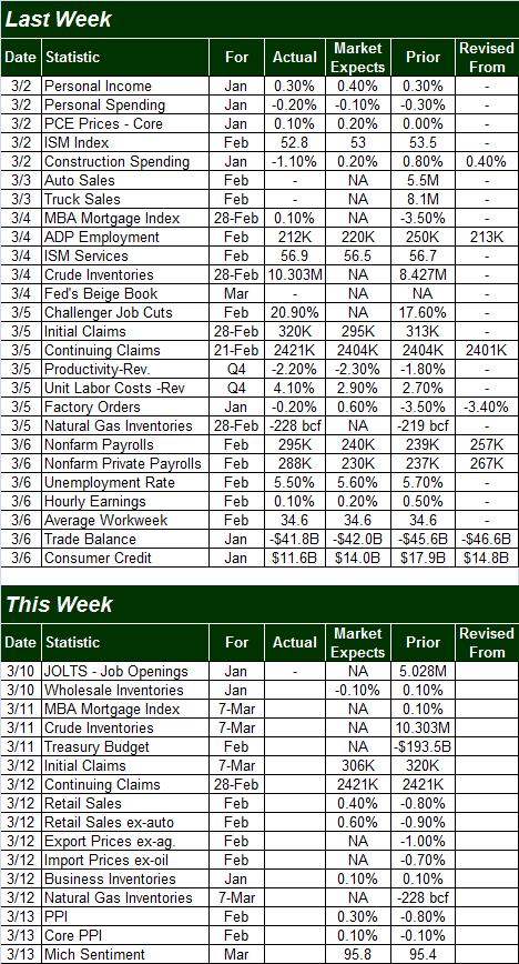
Source: Briefing.com
The coming week isn't going to be nearly as busy, though we'll still be getting a couple of key economic announcements. February's retail sales will be posted on Thursday, and last month's PPI figures will be reported on Friday.
Economists are currently looking for a slight uptick in retail spending for last month following January's fairly significant lull; gasoline prices are a tad higher now than they were then. As for producer inflation, economists are looking for a modest improvement there as well after dancing with deflation in January. Again, slightly higher oil prices may be the root cause for the PPI figure moving back into positive territory.
Stock Market Index Analysis
At first glance, there's only one way to interpret Friday's action... bearish. The S&P 500 (SPX) (SPY) broke under its 20-day moving average line on better-than-average volume, and the MACD lines actually widened their bearish divergence from Thursday. It is what it is. And yet, we at least have to acknowledge there's one thing working in the bulls' favor from here - the selloff was stopped cold at the key 2064 level, where the 50-day moving average line has joined up with a fairly important ceiling from January. If the bulls are going to make a stand, this is where they'd want to do it.
S&P 500 & VIX - Daily Chart
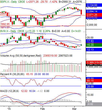
Chart created with TradeStation
It may irrelevant in the grand scheme of things. That is, if the short-term pullback may have only coincidentally paused there, and will resume its bearish course this week. The possibility of a bounce, however, can't be ruled out. That being said, the market could simply waffle for a couple of days without moving back above the 20-day moving average line and then break under 2064 later in the week.... which would be another bearish sign.
Zooming out to a weekly chart of the S&P 500 doesn't show us anything new, but it does give us some perspective. It's on this timeframe we can see the index was nearing - though hadn't yet reached - the upper edge of a long-term bullish trading range. It's also in the weekly timeframe we can see the CBOE Volatility Index (VIX) (VXX) has modestly started an upward move.
S&P 500 & VIX - Weekly Chart
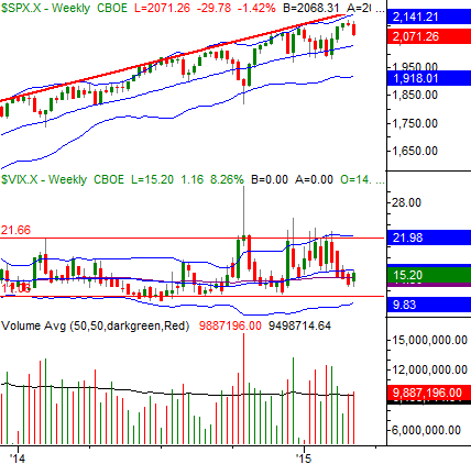
Chart created with TradeStation
As before, even if the S&P 500 continues to edge lower (whenever it might), the 26-week moving average line at 2029 is still a highly-likely floor. Or, at the very least, it's a key checkpoint for any dip.
On the flipside, if the bulls can hold the line at 2064 for a few days, set up a new technical base, and the break back above 2110 or so, it may well establish another round of multi-day bullishness.
With all of that being said, we're going to switch our focus to the chart of the NASDAQ Composite (QQQ) (COMP), as it may be the more telling of the two charts... the daily and the weekly versions.
On the daily chart we can see that, though the composite has yet to break under its 20-day line at 4910. But, we can see the Nasdaq Volatility Index (VXN) has made a much better-organized turnaround effort than the VIX has.
NASDAQ Composite & VXN - Daily Chart
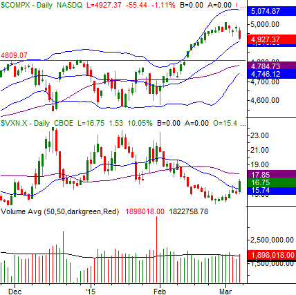
Chart created with TradeStation
The weekly chart of the NASDAQ Composite, though, is really interesting. It's here we can see what may have been one of the key technical cues for the pullback - the NASDAQ ran into a ceiling (dashed) that extends back to last July. If the pattern repeats itself - and it seems likely it will - the composite could revisit its 26-week moving average line (blue) or its 20-week moving average line (gray), both near 4740 at this time. We can also see the 40-week (green), or 200-day, moving average line currently at 4591 has been a floor as well... back in April of last year. It may well reprise that role now.
COMP & VXN - Weekly Chart
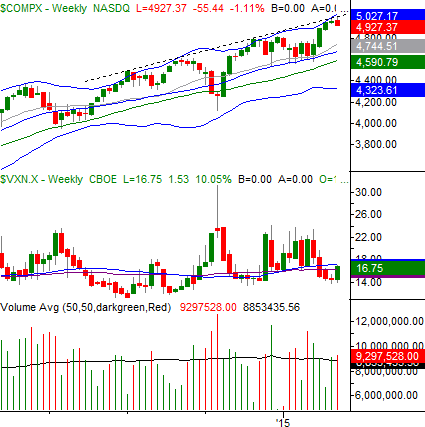
Chart created with TradeStation
Bottom line? While it seems reasonable to assume some sort of pullback is underway, there are still a few ways the bulls could fend it off. Namely, the S&P 500 needs to firmly break under 2064 to get the selloff going in earnest. But, if and when it starts, both weekly charts above have some major, proven support lines that could actually quell the selling rather quickly. If those floors on the weekly chart don't hold up, then there's something to worry about. We'll cross that bridge when we come to it.
Trade Well,
Price Headley
BigTrends.com
1800-244-8736