Why This Narrow Bull Market May Be In Serious Trouble
Why this 'bull market' is really a myth
by Sven Henrich
Despite having made marginal new highs on select indices, markets haven't been in a bull market since GAAP earnings peaked during the spring of 2015. If this thesis is correct, volatility is still much too low, and investors can expect volatility to rise into 2017.
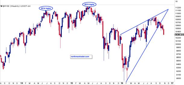
The recent pullback has brought the S&P 500 SPX, -0.12% back below its December 2014 highs, highlighting the fact that the larger market has gone nowhere over the past two years. It is true that select indices have made new highs this summer yet, as I highlighted in September (Time to Get Real), these new highs came on major negative divergences flashing warning signs. More troubling is that the broader indices have failed to make new highs and the recent pullback has caused further technical damage by breaking key support trend lines to the downside.
Example 1: The broader NYSE NYA, +0.00% index:
Example 2: The FTSE All-World Index:
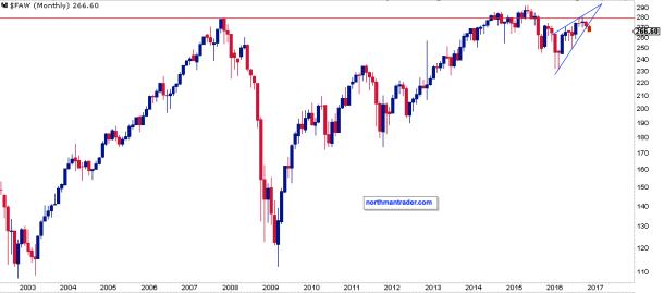
These charts convey a larger message: They show lower highs, broken trend lines and are below year 2007 highs.
In May of 2015 the SPX made an all-time high, and indeed, this made sense as GAAP earnings made new highs as well. However, earnings have continued to fall since the spring of 2015 and are now down 18% over that time period.
Consider the underlying price damage as a result. Compared to the market close of May 22, 2015, through Nov. 3, 2016, we can observe the following price developments:
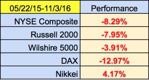
These numbers suggest that this bull market is a myth. And these broad performance measurements highlight why so many funds are underperforming.
Where is the bull market? It's in a very select group of high-cap tech winners that are largely responsible for propelling indices such as the SPX and the Nasdaq 100 NDX, -0.35% to record highs this summer. Consider that 51% of the market cap of the Nasdaq 100 is concentrated in just 10 stocks, the winners, the monopolies that have emerged and taken control of the virtual economy. Facebook FB, +0.65% Google GOOG, +0.01% Amazon AMZN, -1.71% etc. The few that control the global distribution network, eyeballs and attention of consumers. Their growth has been staggering, virtually excluding the possibility of anyone else succeeding.
Yet their strength highlights the fragility of this market: Narrow leadership holding up a broader market that is weak. So should anything happen to these few leaders, markets are at risk of major damage beyond what we have already seen.
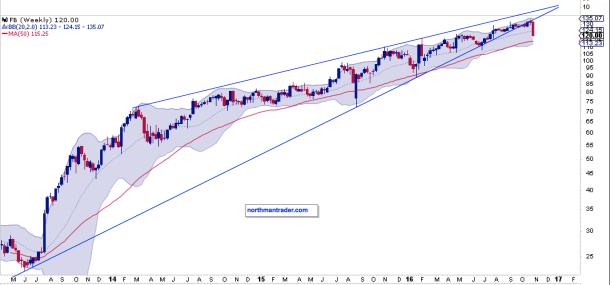
Worse, all of these winners are extended, and in some cases are just starting to show technical damage. Take Facebook as an example as it broke its rising trend line this week:
No, the stellar performance of these select few stocks has successfully masked a stark reality: The 2016 rally off of the February lows was manufactured via massive artificial central-bank liquidity that has made its way into a select few stocks as the desperate search for yield pushes money into any growth story it can find.
Let me highlight the enormity of this liquidity: It costs $1.7 trillion per year to operate all the militaries in the world combined. In comparison, global central banks are currently engaged in QE programs exceeding $2.2 trillion per year. That's $500B more per year in artificial liquidity than to operate all the world's armies. Ponder this.
So, yes, the distortions run deep, the biggest one of which is the myth that this is a bull market.
Considering all these facts, then, is volatility too low?
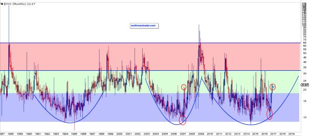
Structurally we can observe that the CBOE S&P 100 Volatility Index VXO, +5.38% the old VIX VIX, +1.68% is repeating a rounding bottoming pattern:
Indeed, currently we may be repeating a pattern similar to what was observed in 2007. The message: Any bounces in markets in the fourth quarter, even if they were to make news highs on some indices, suggest they are an opportunity to get long volatility.
For now we can observe that the SPX has broken two key trend lines which are now resistance. The chart below highlights key support and resistance zones into the fourth quarter:
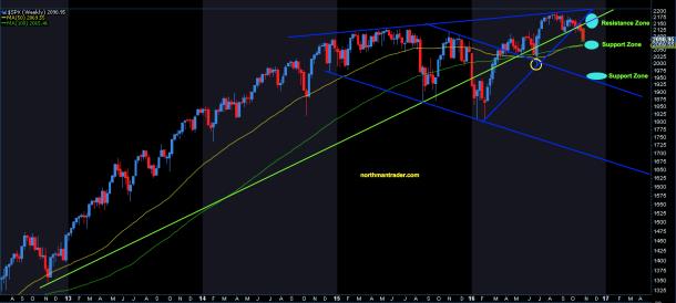
And it is the longer term time frame chart on the S&P that highlights why the next support zone is mission critical:
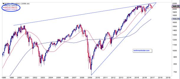
A break of this zone would verify what the larger market has already signaled: This bull market is a myth.
Courtesy of marketwatch.com