Weekly Market Outlook - Key Levels To Watch
Weekly Market Outlook - September 12, 2016
Things were going fine last week... until Friday, when it all came completely unraveled. Friday's 2.45% stumble in the S&P 500 (SPX) (SPY) was not only the biggest single-day loss since June when the United Kingdom voted to leave the European Union, it carried the market to its lowest close since early-July. Some key support levels were snapped too.
Bad news? Maybe, though ironically, the sheer size of Friday's meltdown has a shot at spurring a dead-cat bounce (not unlike the post-Brexit vote plunge did). The question is whether or not such a bounce can rekindle the bigger uptrend. Friday was awful, but a 2.45% stumble isn't enough in its own to truly hit the "reset" button for stocks.
We'll look at it in detail below, after examining last week's and this week's key economic news.
Economic Data
There wasn't much in the way of economic data posted last week. In fact, the only items of interest were last month's ISM Services Index and July's job openings (JOLTS) report.
The ISM Services Index rounds out the prior week's ISM Manufacturing number. Neither was impressive, but at least the ISM Service's score didn't break under the crucial 50 mark. All the same, the broad trends from both are concerning.
ISM Index Chart
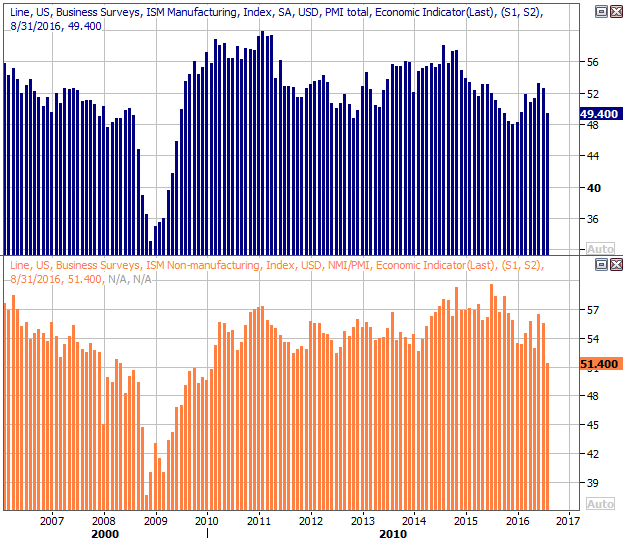
Source: Thomson Reuters
As for the JOLTS (Job Openings and Labor Turnover Survey) trend, though it's two months old, it's still showing good strength.
JOLTS (Job Openings and Labor Turnover Survey) Chart
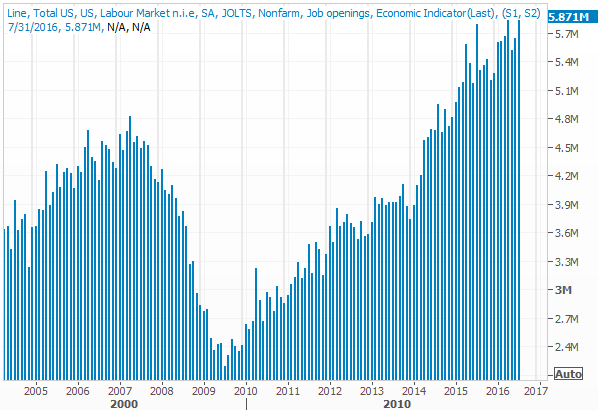
Source: Thomson Reuters
Everything else is on the following grid:
Economic Calendar
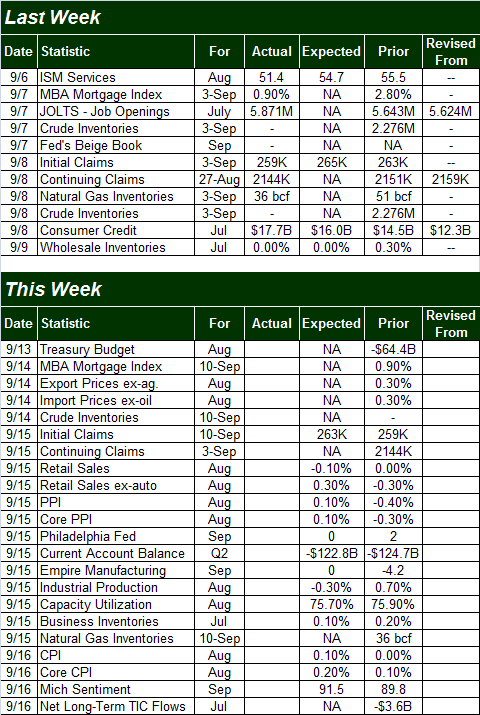
Source: Briefing.com
The coming week will be a little busier. Highlights include last month's retail sales, inflation, and August's capacity utilization and industrial productivity figures.
Inflation rates remain time, though slightly on the rise. Cheap gas, oil, and food are making prices seem more contained than they really are. Taking them out of the equation we can see inflation -- consumer inflation anyway -- is possibly putting some pressure on the Fed to make a move.
Annualized Inflation Chart
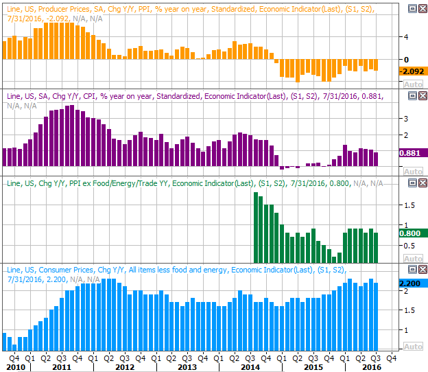
Source: Thomson Reuters
On Thursday we'll get retail sales numbers for last month. Year-over-year growth has been mostly positive, with the exception of gasoline stations (due to low-priced oil). Growth rates do seem to be slowing though, and that slowing trend isn't expected to change much for August.
YOY Retail Sales Growth Chart
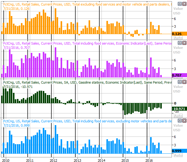
Source: Thomson Reuters
Last but not least, also on Thursday we'll get last month's capacity utilization and industrial productivity numbers. Both were weakening for a while, but we've seen a couple months of strength here. The pros are expecting weakness for last month. If we get progress instead, it could be vindicating for the bulls. Even if either or both fall though, one tepid month doesn't necessarily make a trend.
Capacity Utilization and Industrial Productivity Chart
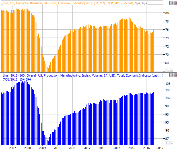
Source: Thomson Reuters
Stock Market Index Analysis
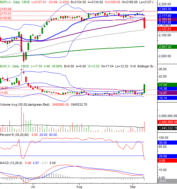
While Friday's plunge qualifies as a technical breakdown -- in that it pulled the indices under some critical levels -- the sheer size of the meltdown makes it difficult to handicap what comes next. The big setback could very easily spark a buy-in. Or, it could motivate the remaining sellers to go ahead and take care of business. Even if the bulls do push back here, however, for how long can they do so before bumping into resistance. Whether they play it now or later, the bears have tipped their hand.
The daily chart of the NASDAQ Composite (COMP) illustrates this idea better than the S&P 500's chart does, so let's start there this week. As it plainly shows, the selling didn't abate until the composite bumped into the 50-day moving average line (purple), which is often a support or resistance level.
NASDAQ Composite & VXN Daily Chart
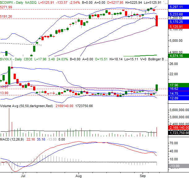
Chart created with TradeStation
We can see on this same chart the Nasdaq Volatility Index (VXN) finally punched through a ceiling at 16.27, yet still has room to run. As was suggested already though, we can't be surprised if the bulls end up making some kind of pushback effort early this week. It's a question of how well that effort works. If the bounce doesn't carry the NASDAQ back above the 20-day moving average line currently at 5233, the risk of further downside remains significant.
The daily chart of the S&P 500 doesn't look all that different, save for the fact that the S&P 500's pullback didn't find a bottom at a specific support line. The 100-day moving average line (gray) was close to being a floor, but wasn't likely a factor in where the selloff stopped.
S&P 500 & VIX Daily Chart
Chart created with TradeStation
Still, the daily chart of the S&P 500 waves plenty of red flags, not the least of which is the big volume behind Friday's dip. It was a majority opinion (at the time anyway), to be sure.
The daily chart also sets up what could be the most important bearish confirmation we need to keep our eyes peeled for. That is, a Percent R line that ticks higher without moving back above the 20 threshold, and then moves downward again on the same day the S&P 500 index breaks to a low below last week's low of 2127.81.
Yes, it sounds obscure, but it's a good way of distinguishing between just a little volatility and a more serious change of direction for the market's undertow.
Like the NASDAQ, the S&P 500 would need to get all the way back above its moving average line (currently at 2177.6) to even start entertaining the idea that the rally has been rekindled.
Zooming out to a weekly chart of the S&P 500 doesn't tell us anything new, but it does give us some perspective on how and why this weakness developed so quickly. The index had rallied 21% from February's lows, and was clearly overextended. It's also in this timeframe we can see how much more room the CBOE Volatility Index (VIX) (VXX) has to move higher before it bumps into a major ceiling around 31.8.
S&P 500 & VIX Weekly Chart
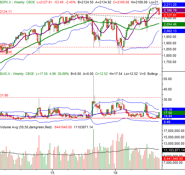
Chart created with TradeStation
A move back to the 2000/2050 area isn't out of the question. That's where the lower 26-week Bollinger band and the 200-day moving average line are set to converge. A move to that area would translate into a pullback of 7.7%, but pullbacks of that size aren't unheard of in September.
Over the past 66 years, the S&P 500 has lost more than 5% in September a total of 12 times, or 18% of all Septembers. That easily makes it the worst month for stocks. It's also got the highest odds for a pullback, losing ground 56% of the time. As overbought as the market was heading into this year's September in particular, last week's sharp tumble -- largely out of nowhere -- may be a warning sign.
Trade Well,
Price Headley
BigTrends.com
1-800-244-8736