Underestimated dangers lurk within ‘the world’s most deceptive chart’
Is your portfolio prepared for the next drop?
By Shawn Langlois, MarketWatch
In theory, the buy-and-hold approach is the surest way to make your retirement dreams come true. The market goes up over time. Always has, always will.
Of course, it’s not really that simple, and Clarity Financial economist Lance Roberts revisited the oft-overlooked risks of that approach in his latest post for the Real Investment Daily blog.
He focused on one chart, in particular, that he says has been floating around cyberspace in various forms over the last few months. It’s meant to minimize the impact of bear markets, to make them appear “harmless” and “relatively small.”
With the S&P 500 (SPX) and the Dow (DJIA) continuing their push into uncharted territory, it’s not hard to understand the need for some reassurances for investors who are growing increasingly skittish about the potential dying of the bull.
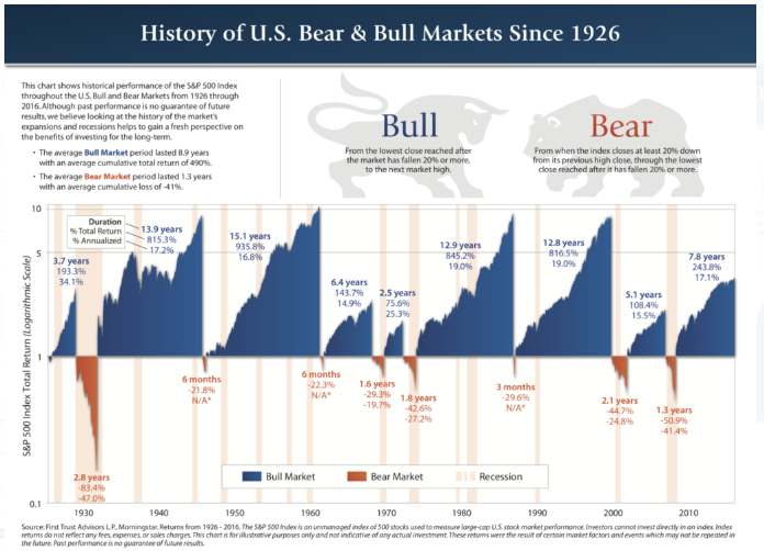
As you can see, this chart should help soothe the nerves:
But, as Roberts points out, it’s deceptive. And worse, dangerous. In fact, you absolutely must worry about corrections, he warns.
“Let’s look at this realistically,” Roberts wrote. “The average American faces a real dilemma heading into retirement. Unfortunately, individuals only have a finite investing time horizon until they retire. Therefore, as opposed to studies discussing ‘long-term investing’ without defining what the ‘long term’ actually is – it is ‘TIME’ that we should be focusing on.”
Investors, for the most part, don’t really start focusing on retirement savings until their mid-40s, after putting the slog of young adulthood behind them.
“This leaves most individuals with just 20 to 25 productive work years before retirement age to achieve investment goals,” he said. “This is where the problem is. There are periods in history, where returns over a 20-year period have been close to zero or even negative.”
Then there’s the math.
The chart uses percentage returns, which he says are “extremely deceptive.” Essentially, if an index goes from 1,000 to 8,000, that’s a 700% return. Then, if it corrects 50%, who cares? But that kind of hit cuts your gains to just 300%. “Then,” he says, “the problem now becomes the issue of having to regain those 4,000 lost points just to break even.”
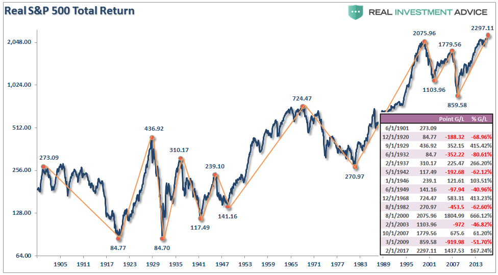
Roberts posted this inflation-adjusted chart as a much more accurate depiction of market behavior. The table on the right shows how there have been several periods where gains have been entirely, or almost entirely, erased during a reversal.
“Before sticking your head in the sand, and ignoring market risk based on an article touting ‘long-term investing always wins,’ ask yourself who really benefits?” Roberts said. “This time is ‘not different.’ If the last two bear markets haven’t taught you this by now, I am not sure what will. Maybe the third time will be the charm.”
Courtesy of MarketWatch